Beautifully Brief: A Collection of Stunning Single-Page Sites
Why Single-Page Design Is Having a Moment

Great one page websites deliver a complete, compelling message without asking you to click through multiple pages. Here are the key characteristics that make them work:
- Single scroll experience – Everything flows vertically in one smooth journey
- Focused narrative – You tell one clear story (without detours)
- Clear call-to-action – You guide visitors toward one main next step
- Mobile-optimized – Fast loading, thumb-friendly, and easy to steer
- Visual storytelling – Strong imagery, simple motion, and intentional section flow
Have you noticed how some of the most memorable sites lately don’t make you hunt around? You land, you scroll, and it just makes sense.
One page. One story. One smooth glide from “Hi” to “Let’s talk.”
That’s the magic of a single-page site when it’s done well. It’s not just a design trend, it’s a strategic choice for moments when you want your message to be clear, your experience to be easy, and your next step to be obvious.
And since 94% of first impressions are based on design, you really don’t get a second chance to make that first scroll feel great. A well-built one-pager reduces distractions and helps you guide a visitor from curiosity to action without friction.
That said, not every business should be a one-page site, and you don’t need to force it. The real win is knowing when this format fits your goals, and how to build it so it loads fast, reads clearly, and converts.
I’m Fred Z. Poritsky, founder of FZP Digital, and I’ve helped businesses across Philadelphia, Newtown, and Richboro build websites that do more than look good, they drive results. If you’re considering a one-page site, you’re in the right place.

Great one page websites glossary:
- create a website
- best website builder
- wordpress website design
What Makes Great One Page Websites So Effective?
So, what exactly defines a one-page website, and why are they so good at making an impact? At its core, a one-page website is exactly what it sounds like: a site where all essential content lives on a single, continuously scrolling page. Instead of clicking through a menu to different sections like “About Us” or “Services,” visitors simply scroll down to reveal more information.
The core characteristics of these sites are their streamlined nature and focused delivery. They’re designed to be fully loaded either in one initial go, or with “page zones” that replace content on demand, creating a smooth, uninterrupted flow. This continuous experience is key to their effectiveness.

When we talk about what makes great one page websites effective, we’re really talking about a masterclass in user experience and visual communication. It’s about designing a narrative flow that feels natural and intuitive. Your eye is drawn from one section to the next, almost like reading a story. This deliberate guidance is often achieved through a strong visual hierarchy, where important elements stand out and lead you gracefully through the content.
Think about the primary advantages:
- Seamless Storytelling: A one-page site excels at telling a compelling story or conveying a brand narrative. We can craft a journey that unfolds as you scroll, using visuals, animations, and carefully chosen text to build anticipation and deliver a clear message. This is often called “scrollytelling,” and it’s fantastic for creating an emotional connection.
- Focused Message: Without the distraction of multiple pages, it’s easier to keep your message crystal clear. You have one goal, one call to action, and every piece of content supports that goal.
- Improved Engagement: When designed well, with smooth transitions and interactive elements, a one-page site can feel incredibly dynamic and engaging. Visitors are less likely to get lost or distracted because the path is so clear.
- Strong First Impression: As we mentioned, 94% of first impressions are based on design. A clean, modern, and visually appealing one-page site can instantly convey professionalism and attention to detail, setting a positive tone for your brand.
- Mobile-Friendly by Nature: With a single-column layout often being the default, one-page sites are inherently well-suited for mobile devices, offering a great user experience on smaller screens.
Visual design and branding play an enormous role here. A strong hero image, consistent color palette, unique typography, and interactive elements all contribute to a memorable experience. It’s about crafting a digital space that instantly communicates who you are and what you offer, without overwhelming the visitor. We’ve seen this with our clients in Philadelphia and Bucks County; a well-designed one-pager can make a huge difference in how a brand is perceived.
The Pros and Cons of Going Single-Page
Choosing between a one-page and a multi-page website isn’t about one being inherently “better” than the other. It’s about finding the right tool for your specific goals. Let’s break down the advantages and disadvantages, so you can make an informed decision, just like we help our clients do every day.
| Feature | One-Page Websites | Multi-Page Websites |
|---|---|---|
| User Experience | Pros: Streamlined, continuous flow, intuitive navigation (scrolling), less clicking, easier to guide users through a narrative. | Pros: Clear segmentation of content, users can jump directly to specific topics, suitable for extensive information. |
| Mobile Performance | Pros: Often faster loading (fewer HTTP requests, though can be heavy if not optimized), simplified navigation for touchscreens, excellent for over 60% of visitors accessing sites on mobile devices. | Cons: Can be slower due to more page loads, requires careful responsive design for each page. |
| Conversion Rates | Pros: Excellent for specific campaigns or lead generation due to clear, singular call-to-action (CTA). Optimized pages can convert at 20–30% or higher. | Cons: Multiple CTAs can dilute focus, users might get lost exploring. |
| Content Strategy | Pros: Forces concise, impactful content; ideal for storytelling; every word and image must earn its place. | Cons: Can lead to content bloat if not managed, requires careful internal linking strategy. |
| SEO | Cons: Limited to one primary keyword or theme per page, harder to rank for a wide range of terms, can be challenging to update frequently. | Pros: Each page can target specific keywords, easier to build authority for diverse topics, more opportunities for fresh content. |
| Scalability | Cons: Not ideal for businesses with a lot of content, diverse services, or plans for significant future expansion. Adding too much content can make the page long and slow. | Pros: Easily expandable, new pages can be added without impacting existing structure, suitable for growing businesses with evolving content needs. |
| Maintenance | Pros: Generally easier and quicker to build and maintain, especially for smaller projects. | Cons: Can be more complex to manage, especially large sites with many pages and intricate navigation. |
From our experience, the content strategy for a one-page website differs significantly. You have to be ruthless with your content. Every word, every image, every section must contribute to the single, overarching goal. It’s about distilling your message to its absolute essence, making it impactful and easy to digest. For a multi-page site, you have the luxury of delving into more detail across various topics. With a one-pager, it’s all about precision and punch.
So, when is a one-page website the most suitable choice? We’d recommend it for:
- Portfolios: Especially for creatives like artists, designers, or photographers.
- Landing Pages: For specific marketing campaigns, events, or product launches.
- Small Businesses/Services: If you offer one or two core services and want a strong online presence without extensive content.
- Personal Brands: For consultants, speakers, or authors.
- Events: A simple, direct site for an event with all key information.
- App/Product Showcases: To highlight features and drive downloads or purchases.
If you’re a complex business with a vast product catalog, a blog with hundreds of articles, or multiple distinct services, a multi-page site is likely a better fit. But for focused impact, the great one page websites truly shine!
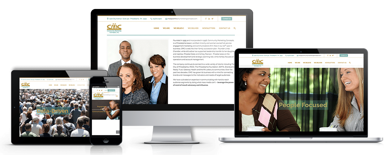
10 Inspiring Examples of Great One Page Websites
Sometimes the easiest way to get one-page design is to see it out in the wild. So here’s a curated set of great one page websites that show how powerful a single scroll can be.
A quick heads-up: we’re not sharing private client work here, but these examples reflect the kind of clear messaging, strong hierarchy, and conversion-focused layout we build for businesses around Philadelphia and Bucks County.
Creative Portfolios and Personal Brands
These are perfect if you’re showcasing you or your creative work. Notice how each one uses a simple, guided flow to build personality and trust.
- Sonja van Duelmen: Sonja van Duelmen’s website uses bold visuals and a magazine-style layout, with a full-screen hero that sets the tone instantly.
- Noah De Meuldre: Noah De Meuldre’s art director portfolio puts cinematic visuals first, using a full-screen slideshow that makes his work the headline.
- Sophie Bolotin: Sophie Bolotin’s professional portfolio balances a modern dark theme with crisp typography to highlight her work clearly.
- David Milan: David Milan’s website keeps things minimal and image-led, letting vibrant work do the talking.
- Seth Hampton: Actor Seth Hampton’s portfolio has distinct sections (bio, gallery, press, contact) that stay easy to steer without leaving the page.
Business, Events, and Service Showcases
If your goal is leads, bookings, or sign-ups, these examples show how a one-page site can build confidence fast, then make the next step obvious.
- Jords+Co: Jords+Co’s website pairs a minimal layout with confident copy and clear section breaks.
- ACID: ACID’s website builds excitement for an event using simple interactions (like hover effects) and clean typography.
- V-Labs: Tech company V-Labs stays simple and product-focused, using white space and clear cards to explain value quickly.
- Zayne Heyes Catering: Zayne Heyes Catering uses strong food imagery and a straightforward layout to keep you scrolling (and hungry).
- Plumbing Gurus: Plumbing Gurus is a great lead-gen example, with a clear CTA and trust-builders like testimonials.
- Mazzey Law: Mazzey Law uses bold typography and a polished, professional layout to communicate authority without feeling cluttered.
- Inward Travel: Inward Travel opens with a high-energy full-screen video, then reinforces credibility with logos and calls to action.
The big takeaway? You don’t need a huge site map to make a strong impression. When the story is focused and the layout is intentional, one page can absolutely be enough.
Best Practices for Designing Your Own Single-Page Masterpiece
Designing a one-page website that really works isn’t about cramming everything onto one screen. It’s about guiding your visitor in a way that feels effortless, like you’re having a great conversation: you answer the obvious questions, you build trust, and you make the next step simple.
Here’s how we approach building great one page websites at FZP Digital.
First, remember: on a one-page site, the scroll is the navigation. So you’ll want to be intentional about how people move.
- Scrolling effects and animations (use them lightly): Subtle reveals or gentle motion can make the page feel alive and help you emphasize key points. But too much can distract people (and slow things down). If it doesn’t help the story, it doesn’t belong.
- Anchor links and sticky menus: If your page has multiple sections, give visitors an easy way to jump around. Anchor links to “Services,” “Work,” or “Contact” make the experience feel in control, not endless. A sticky menu keeps those links handy.
- Mobile-friendly design: This is non-negotiable. With over 60% of visitors accessing sites on mobile devices, you need a layout that’s easy to read and easy to tap.
- Fast loading times: Big visuals are great, but they must be optimized.
- Legible typography: If someone has to pinch-zoom to read, you’ve already lost them.
- Touch-friendly buttons: CTAs should be thumb-ready, with breathing room around them.
- The magic of white space: Want your site to feel premium instantly? Give your content room to breathe. White space improves readability, reduces overwhelm, and makes your message feel more confident.
- The essential sections: Most high-performing one-pagers include: a strong hero, a simple “what you do,” proof (logos/testimonials), a clear offer, and an easy contact or booking step.
Templates can be a solid starting point if you need something quick, but if you want the site to match your brand perfectly and convert consistently, custom design tends to be the difference-maker. That’s where our “Develop . Design . Deliver” process helps, we collaborate with you, shape the story, and build something that feels like it could only belong to your business.
Optimizing SEO for Great One Page Websites
Now let’s talk about the big question: can a one-page site rank on Google? Yes, it can, but you have less room for error, because you’re asking one URL to do a lot of work.
Here’s what matters most for SEO on great one page websites:
- Keyword-rich headings (done naturally): Use a clear H1 and helpful H2/H3 section headings so both people and search engines understand what the page covers.
- Content quality and clarity: One page doesn’t mean “thin content.” Google still rewards pages that genuinely answer what someone searched for.
- Alt text for images: Describe what the image is and how it relates to the content. It helps SEO and accessibility.
- Page speed is critical: If your one-pager is heavy, people bounce. You’ve got about 3 seconds to keep someone from leaving.
- Image compression: Almost always the biggest win.
- Clean, efficient code: Less bloat, faster load.
- Avoiding unnecessary scripts: Keep the experience smooth.
- Technical SEO basics: Make sure the page is crawlable, indexable, and structured clearly. Anchor-link navigation can also reinforce that structure.
SEO can feel like a lot, especially when you’re trying to balance design, speed, and content on a single page. That’s exactly where expert guidance matters, because small mistakes (like oversized images or confusing headings) can quietly limit your visibility.
Crafting the Perfect Call-to-Action
Your one-page site can be gorgeous, but if it doesn’t tell people what to do next, you’re leaving results on the table. So what’s the one action you want visitors to take, book a call, request a quote, schedule a consult?
The average landing page conversion rate is 6.6%, but optimized pages can convert at 20-30% or higher. Your CTA plays a huge role in closing that gap.
Here’s how we make CTAs work on great one page websites:
- Action-oriented language: “Get a Free Quote,” “Book a Consultation,” or “Request Pricing” beats “Submit” every time.
- Visual prominence: Use contrast, spacing, and button styling that looks obviously clickable.
- Above-the-fold placement (plus smart repetition): Put the primary CTA near the top, then repeat it after high-trust sections like services or testimonials, and again at the end.
- Make conversion easy: Short forms. Click-to-call on mobile. No friction.
- Trust signals nearby: A quick reassurance, a testimonial snippet, or a mention of results can help someone feel confident taking the next step. And yes, landing pages with video can boost conversions by up to 80% when it’s used to clarify value quickly.
That’s a big part of what we do at FZP Digital: we blend design and conversion strategy so your site doesn’t just look modern, it helps your business grow across Philadelphia and Bucks County.
Frequently Asked Questions about Single-Page Sites
We get a lot of questions about one-page websites, and for good reason! They’re a unique beast in the digital landscape. Let’s tackle some of the most common inquiries we hear.
Do one-page websites rank well on Google?
Yes, they absolutely can! But, and this is a big but, they require a very focused SEO strategy. As we discussed, a one-page site is typically optimized for a narrower set of keywords or a single core topic. This means you need to be crystal clear about your primary search intent.
Here’s our perspective:
- Search Intent Focus: You need to identify the absolute core search queries you want to rank for. If your site is about “web design in Philadelphia,” then every section needs to reinforce that.
- Keyword Optimization: Use your main keywords in your page title, meta description, H1 heading, and naturally throughout your content. For a one-pager, you’re building authority for one specific theme.
- Content Structure: Even on a single page, a clear, logical content structure with distinct sections (using H2s and H3s) helps Google understand your content. Anchor links can also help Google index specific sections.
- Authority Building: Just like any website, backlinks from reputable sources are crucial. Social signals and user engagement also play a role.
- The Trade-off: The main limitation is that it’s harder to rank for a wide array of diverse keywords compared to a multi-page site, where each page can target a specific niche.
If SEO feels like a tangled web, don’t worry! Expert guidance from FZP Digital makes all the difference. We specialize in increasing organic search rankings for our clients, ensuring your one-page site gets the visibility it deserves.
When should I choose a one-page layout over a multi-page site?
This is perhaps the most critical question! Choosing the right structure depends entirely on your project goals and the amount of information you need to convey.
Fred Z. Poritsky always advises clients to consider these factors:
- Project Goals: Is your primary goal to generate leads, showcase a portfolio, promote a single event, or sell one product? If the answer is a singular, focused objective, a one-page site is often ideal.
- Content Volume: Do you have a relatively small amount of highly impactful content? If your information can be concisely presented and understood in a linear fashion, go for one page. If you foresee needing dozens of pages for FAQs, extensive product details, or a robust blog, a multi-page site is better.
- Single Service Focus: If your Philadelphia or Bucks County business offers one core service (e.g., “premium responsive WordPress website design”), a one-page site can effectively highlight its benefits and drive inquiries.
- Lead Generation: One-pagers are fantastic landing pages for marketing campaigns, guiding visitors directly to a conversion point with minimal distractions.
- Simple Brand Introduction: For new businesses or personal brands that need a strong, neat online presence without overwhelming visitors with too much information initially.
If your content is complex, diverse, or you plan on frequent content updates (like a blog), a multi-page WordPress website is generally the more scalable and SEO-friendly option.
Are one-page websites better for mobile users?
In many ways, yes! Great one page websites are inherently well-suited for the mobile experience, which is incredibly important given that over 60% of visitors access sites on mobile devices.
Here’s why they often excel on mobile:
- Responsive Layouts: A single-column, scrollable layout translates beautifully to smaller screens. There’s no complex navigation to shrink or rearrange, making the design process for mobile more straightforward.
- Fast Loading: When optimized properly (with compressed images and efficient code), a one-page site can load faster than a multi-page site because it often involves fewer HTTP requests. This is crucial for mobile users who might be on slower connections.
- Simple Navigation: Swiping and scrolling are natural gestures on mobile. A one-page site leverages this, eliminating the need for fiddly menus or multiple taps to find information. Anchor links or sticky menus still provide quick jumps, but the primary interaction is a smooth scroll.
- User Retention: A continuous flow means users don’t have to wait for new pages to load, reducing friction and bounce rates. This leads to a more enjoyable experience and better user retention.
- Touch-Friendly Buttons: With a focused design, CTAs and interactive elements can be made large and easy to tap, improving usability.
At FZP Digital, our mobile-first design approach ensures that every website we build, whether one-page or multi-page, delivers an exceptional experience across all devices. We understand that a seamless mobile experience isn’t just a nice-to-have; it’s a must-have for today’s digital world.
Conclusion
We’ve journeyed through the dynamic world of great one page websites, exploring what makes them tick, their advantages and disadvantages, and how to craft them for maximum impact. From their ability to tell a compelling story to their mobile-friendly nature and conversion-driving potential, single-page sites are a powerful tool when used strategically.
The key lies in understanding your goals, distilling your message, and executing with impeccable design and technical precision. Whether it’s a stunning portfolio, a high-converting landing page, or an neat business showcase, a one-page website can deliver a memorable and effective online presence.
At FZP Digital, we’re passionate about helping businesses in Philadelphia & Bucks County harness the power of premium responsive WordPress website design. Our “Develop. Design. Deliver.” process focuses on creating digital experiences that not only look beautiful but also drive results, boosting your organic search rankings and ensuring your brand shines online.
Ready to explore how a beautifully brief and effective one-page website can lift your digital presence? Or perhaps a multi-page site is the perfect fit for your growing needs? Either way, we’re here to guide you.
Partner with our web design and development experts—let’s create something beautiful and effective together!