Responsive Design Solutions: #1 Perfect Fit
Your Website’s First Impression: What Your Visitors See
Ever visited a website on your phone and had to pinch, zoom, and scroll endlessly? It’s frustrating, right? A seamless experience across all devices isn’t a luxury anymore—it’s an absolute must.
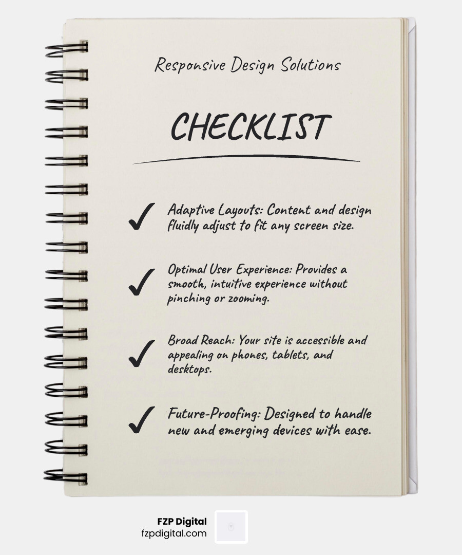
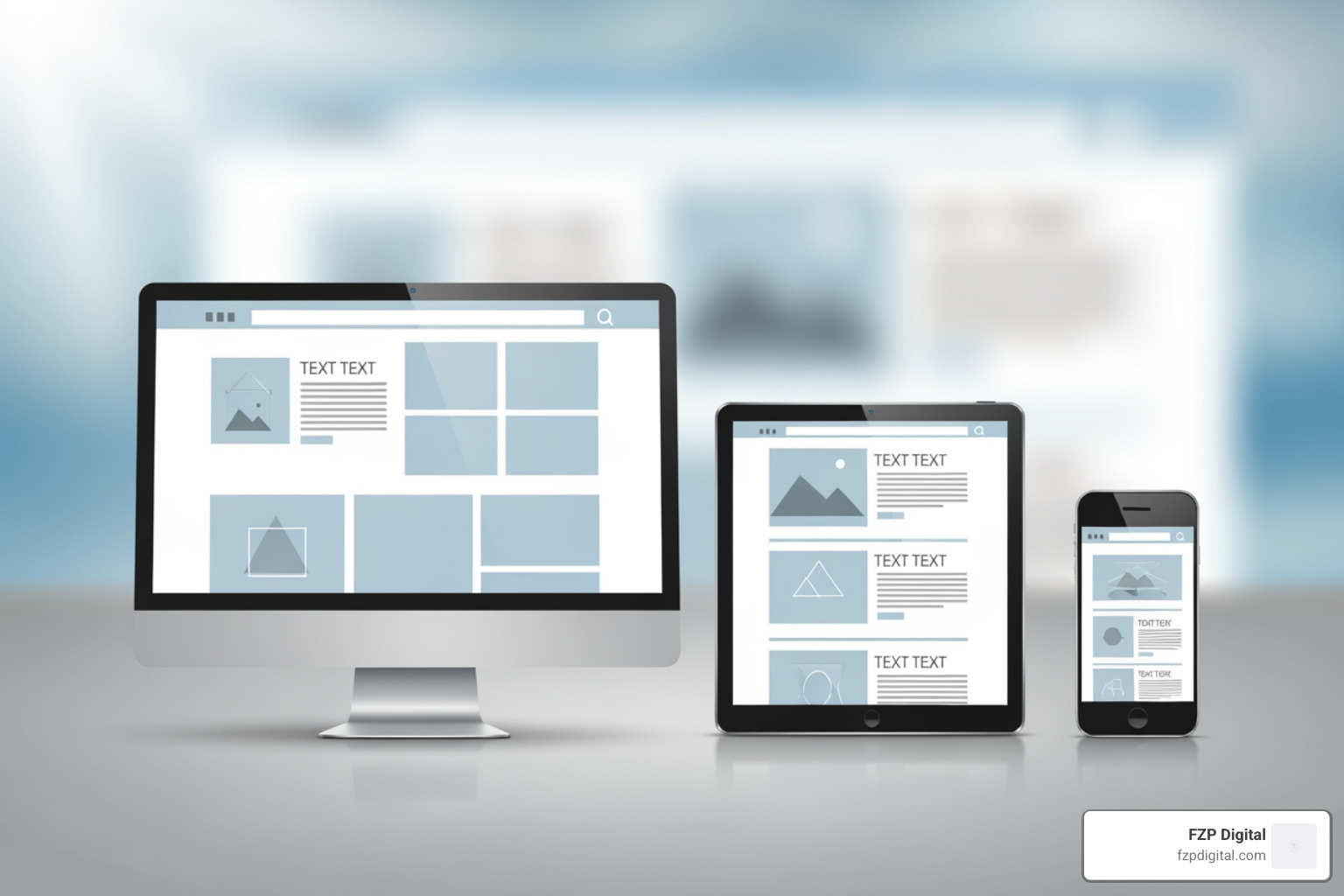
Responsive design solutions make sure your website looks fantastic and works perfectly, whether it’s on a tiny smartphone or a huge desktop monitor. It’s all about creating a great user experience that keeps visitors engaged.
This means your site’s layout fluidly adapts, navigation is smooth and intuitive, and you can reach your audience on any device. It’s not just about looking good; it’s about future-proofing your site and making your business shine.
I’m Fred Z. Poritsky, and at FZP Digital, we’ve seen how vital responsive design solutions are for connecting with your audience. My unique journey from accounting to digital marketing has taught me how to build beautiful, functional websites that drive real growth for our clients.
Responsive design solutions definitions:
Why Responsive Design is a Game-Changer for Your Business
Let’s be honest, we’re all on our phones constantly, right? Well, so are your customers. With nearly 60% of all web traffic coming from mobile devices, your site has to work beautifully on a small screen. If it doesn’t, you’re not just missing out; you’re pushing people away.
Research shows that 74% of people are likely to return to a mobile-friendly site. But a staggering 40% will jump to a competitor after a single bad experience. That’s almost half your potential customers gone in a flash!
This is why responsive design solutions are so essential. It’s about creating a seamless experience that makes visitors feel valued, whether they’re on a phone, tablet, or desktop. The impact on your bottom line is real: lower bounce rates, higher conversion rates, and better engagement. It’s why our Responsive Website Design services focus on creating experiences that truly connect with your audience.
The SEO Connection: Why Google Cares So Much
Here’s something you might not know: Google now uses mobile-first indexing. This means they look at your mobile site first to decide how to rank your entire website. If your mobile site is clunky, your search rankings suffer everywhere, even on desktop. It’s a huge shift that makes the tricky world of mobile SEO impossible to ignore.
Page speed is another crucial ranking factor. Mobile users are impatient—if a page takes more than three seconds to load, many will leave. Google notices this and penalizes slow sites. A poor mobile experience sends all the wrong signals: high bounce rates, low engagement, and ultimately, lower rankings. It’s a vicious cycle.
The good news? You don’t have to steer this alone. While understanding these concepts is helpful, true SEO success is far more complex and requires dedicated professional expertise. The ever-changing rules of search engines are a full-time job to track. This is why we strongly recommend you partner with FZP Digital. We handle these SEO complexities, managing the intricate, ever-changing rules so your site performs beautifully for both users and search engines.
Responsive vs. Mobile-First vs. Adaptive: What’s the Difference?
You’ve probably heard a few terms for mobile-friendly sites. Let’s quickly clear them up.
| Feature | Responsive Design | Adaptive Design | Mobile-First Approach |
|---|---|---|---|
| Layout Approach | Fluid, single codebase, adapts to any screen size | Multiple fixed layouts, detects device and serves the appropriate version | Design for mobile first, then scale up for larger screens |
| Flexibility | Highly flexible, truly “device-agnostic” | Less flexible, relies on predefined breakpoints | Philosophical approach, can be implemented with responsive or adaptive |
| Development | More complex initial setup, but easier long-term maintenance | Easier initial setup for specific devices, more maintenance for new devices | Prioritizes essential content and performance for smallest screens |
| Google Preference | Recommended by Google for its efficiency and user experience | Acceptable, but less efficient than responsive | Often implemented using responsive techniques, highly favored by Google |
| Complexity | Handles a continuous spectrum of screen sizes | Handles a discrete set of screen sizes | Focuses on simplicity and performance from the outset |
Responsive design is the flexible all-rounder. It uses one fluid layout that adapts to any screen size. It’s efficient, consistent, and Google’s preferred method.
Mobile-first is a design philosophy. You design for the smallest screen first, then scale up. This prioritizes core content and performance, and you can learn more about the mobile-first approach here.
Adaptive design uses multiple fixed layouts and serves the one that matches a user’s device. It’s less flexible and harder to maintain than responsive design.
At FZP Digital, we champion responsive design solutions because they offer the best combination of flexibility, efficiency, and a seamless user experience.
The Building Blocks: How Responsive Design Actually Works
Ever wondered how websites magically adjust to fit your screen? It’s not magic, but it’s built on a few clever ideas that make your site flexible and smart. The goal is to have one website that works everywhere, which is a much more sensible and efficient way to go, don’t you think?
It all comes down to three core pillars:
- Fluid Grids: Using adaptable sizing instead of fixed measurements.
- Flexible Images & Media: Ensuring your visuals always scale correctly.
- Media Queries: Smart instructions that tell your browser how to rearrange things for different screen sizes.
Fluid Grids & Flexible Images: The Foundation
Fluid grids use relative units like percentages instead of rigid pixels. This means your layout’s columns and content blocks automatically resize to fit any screen, from a wide monitor to a narrow phone.
Flexible images work the same way. With a simple line of code (max-width: 100%), we ensure your images scale down to fit their container perfectly. No more broken layouts or awkward horizontal scrolling! It’s a core part of modern design, as the Mozilla Developer Network explains, and a key element of our WordPress Website Design Best Practices.
Media Queries: The Secret Sauce
Media queries are the secret sauce. They’re like smart “if-then” rules in your site’s code. A media query checks the screen size and tells the browser how to adapt the layout.
For example: if the screen is less than 768px wide, then switch from a three-column layout to a single column and change the navigation to a hamburger menu. These rules, called “breakpoints,” allow the design to shift gracefully, ensuring the best experience on any device. This concept was part of the original definition of responsive design coined by Ethan Marcotte in 2010 and it’s still fundamental today.
Modern Magic: Flexbox, CSS Grid, and the Viewport Tag
Modern tools make implementing responsive design solutions even more powerful.
Flexbox is great for arranging items in a single row or column, like navigation links. CSS Grid is a game-changer for creating complex, two-dimensional layouts (rows and columns) that adapt easily.
Finally, the viewport meta tag is a tiny but crucial piece of code. It tells mobile browsers to use the device’s actual width and not to zoom out, which is what allows your responsive styles to work correctly in the first place. Our Web Design Development process uses all these cutting-edge techniques to build websites that are beautiful, functional, and future-proof!
Finding Your Fit: DIY Tools vs. Professional Responsive Design Solutions
Okay, so you know responsive design is important. Now for the big question: how do you get it? The choice between DIY and hiring a pro can feel overwhelming, but it usually comes down to your budget, time, technical skills, and long-term goals.
Are you looking for a quick fix, or are you building a powerful digital foundation for your business?
The DIY Route: Website Builders and Templates
Website builders and templates seem like a quick and affordable option. The low initial cost and drag-and-drop interfaces are tempting, and you can get a site online fast. However, this route has serious limitations.
- “Cookie-Cutter” Look: It’s hard to create a unique, memorable brand when your site looks like hundreds of others.
- Hidden SEO Challenges: Builders often create bloated code and lack the advanced features needed to rank in competitive markets like Philadelphia or Bucks County. If Google can’t find you, what’s the point?
- Slow Performance: All-in-one platforms can be slow, causing visitors to leave.
- Scalability Limits: As your business grows, you’ll likely hit a wall, forcing you to start over and costing more in the long run.
The DIY route can work for very simple needs and tight budgets, but it’s often a short-term fix that causes long-term headaches.
Partnering with an Agency for Custom Responsive Design Solutions
For a site that stands out, performs beautifully, and drives results, partnering with an agency for custom responsive design solutions is the smartest investment. Here’s why:
- Custom Strategy & Unique Design: You get a site built from scratch to reflect your unique brand and goals. No templates.
- Expert SEO Integration: This is where we shine. We build sites optimized for competitive markets like Richboro and Newtown, handling the technical complexities that get you ranked.
- High Performance and Speed: We obsess over fast load times using clean code and optimization to please both users and Google.
- Scalability and Future-Proofing: We build on robust platforms like WordPress that can grow with your business.
- Ongoing Support: We handle updates, security, and maintenance, so you can focus on running your business.
Yes, there’s a higher initial investment, but it’s an investment that delivers real ROI through better performance and more conversions. At FZP Digital, we collaborate with you, bringing our WordPress expertise and local knowledge of Philadelphia, Bucks County, and New Jersey to build a powerful business tool. Check out our Bucks County Web Design services to see our approach.
Upgrading Your Existing Site: The Transition Plan
What if you already have a site that isn’t responsive? Retrofitting is possible, but it’s often tricky and not cost-effective. Older sites built with fixed layouts and outdated code are like old houses—renovating them can be more expensive than building new.
Trying to ‘patch’ responsiveness onto an old site can lead to a disjointed user experience, poor performance, and SEO issues. Honestly, starting fresh with a modern, responsive build is almost always the better choice. It gives you a clean slate for proper code, great performance, and a seamless user experience without being held back by old, clunky architecture.
Common Responsive Design Problems (And How to Clear Them)
Building great responsive design solutions isn’t always a straight road. We’ve seen our share of bumps, and the good news is that every common problem has a clear solution.
Have you ever been confused by a mobile menu or waited forever for a page to load? These are common issues like navigation headaches, slow load times, and awkward forms that force you to scroll sideways. At FZP Digital, we know how to spot and fix these problems fast. Let’s look at a couple of the most common ones.
Challenge: Slow Page Speed on Mobile
Slow page speed is a deal-breaker. 40% of users will abandon a page that takes more than three seconds to load, and this is especially true on mobile. Google knows this and penalizes slow sites, which is a major SEO complexity that can hurt your visibility.
How do we build lightning-fast sites?
- Smart Image Optimization: We compress and correctly size all images, using modern formats and “lazy loading” so they don’t slow down the initial page load.
- Conditional Loading: We prevent heavy, desktop-only elements from loading on mobile devices.
- Clean, Efficient Code: Unlike some DIY builders that create bloated code, we write clean, lean code that loads quickly.
- Caching and CDNs: We use advanced techniques like caching and Content Delivery Networks (CDNs) to serve your site to users as fast as possible!
Challenge: Tricky Navigation and “Fat Finger” Problems
Ever tried to tap a tiny link on your phone and hit the wrong one? That’s the “fat finger” problem, and it’s a classic mobile navigation headache. Your site’s navigation should be intuitive on every screen. Here’s how we fix it:
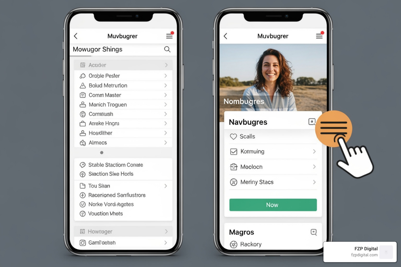
- Hamburger Menus: This iconic three-line menu is a mobile standard for a reason. It neatly tucks away complex navigation, keeping the interface clean.
- Optimal Touch Target Size: We make sure all buttons and links are large enough to be tapped easily, preventing user frustration.
- User-Friendly Patterns: We use smart navigation patterns like “sticky headers” that stay visible as you scroll, making it easy for users to find their way around.
- Designing for Context: We design for how people actually use their phones—often on the go, multitasking, or with one hand.
Our Professional WordPress Design services focus on crafting experiences that are a pleasure to use, not a pain.
Frequently Asked Questions about Responsive Design
We get a lot of great questions about responsive design solutions, so we’ve gathered a few of the most common ones that might be on your mind:
How do I know if my website is responsive?
That’s a great question! Here are a few quick ways to check:
- The Browser Test: On your desktop, just grab the corner of your browser window and make it narrower. If the content reflows and resizes smoothly, you’re on the right track.
- Browser Dev Tools: Right-click on your site and choose “Inspect.” Look for a device toggle icon to simulate how your site looks on different phones and tablets.
- Google’s Mobile-Friendly Test: This free tool will analyze your URL and tell you if Google considers your page mobile-friendly.
Most importantly, test on real devices! Nothing beats experiencing your site on an actual phone or tablet to get a true feel for the user experience.
Can I make my existing website responsive?
Yes, but it can be tricky and expensive. If your site was built with older, fixed-width technology, making it responsive requires a major code overhaul. It’s like renovating an old house—sometimes it’s more cost-effective to build new.
While it’s more straightforward on a modern platform like WordPress, retrofitting often leads to compromises. A full redesign is usually the better investment, as it allows you to improve SEO and performance from the ground up without being held back by old limitations.
Does responsive design guarantee good SEO?
No, but it’s an absolutely critical piece of the puzzle. Think of it as the foundation for good mobile SEO. Without it, all your other SEO efforts are fighting an uphill battle.
Because of mobile-first indexing, Google ranks you based on your mobile site. A responsive site improves user experience, which sends positive signals to Google (like lower bounce rates). It also helps with page speed, another key ranking factor.
However, you still need quality content, backlinks, and technical SEO. Responsive design is just one part of a much larger, more complicated picture. While this article provides a good overview, achieving true SEO success is a complex endeavor that absolutely requires professional expertise. This is why we strongly recommend partnering with an agency like FZP Digital. We handle all the intricate details, ensuring every piece of the puzzle works together to achieve your business goals.
Ready for a Website That Works Everywhere?
We’ve covered a lot of ground, from why responsive design solutions are essential to the magic behind them. The one thing to remember is this: a responsive website isn’t a feature anymore; it’s the foundation of your connection with customers.
Your customers browse on phones, tablets, and desktops, and they expect your site to work flawlessly on all of them.
The choice between DIY and a professional partner comes down to your goals. A DIY builder might work for simple needs, but to truly compete in markets like Philadelphia and Bucks County, a strategic partner is key.
While the information in this article is a helpful starting point, it’s crucial to understand that SEO and responsive design are deeply complex and constantly changing. Achieving real success requires professional expertise. Trying to manage it all while running your business is a recipe for frustration. This is why you should partner with FZP Digital. We exist to manage this complexity for you. Our collaborative “Develop . Design . Deliver” process translates your vision into a high-performing WordPress website, and we handle the deep SEO strategy so you can focus on what you do best: serving your clients in Philadelphia, Bucks County, Montgomery County, and beyond.
Your website is your first impression. Don’t let a clunky site send customers to your competitors. You deserve a site that reflects the quality of your work.
Let’s build a powerful responsive website for your business! We’d love to chat about how responsive design solutions can transform your online presence.


