Charity website design: Stellar Guide 2025
Your Website is Your Digital Heartbeat

Charity website design is the art of creating an online presence that communicates your mission, builds trust, and inspires action—whether that’s donating, volunteering, or spreading the word.
First impressions are everything, right? Your website is often the first handshake with a potential supporter. It’s your 24/7 storyteller and fundraiser, working tirelessly for your cause.
Here’s a sobering statistic: research shows that 75% of people judge a charity’s credibility based on its website design. This means your website isn’t just a nice-to-have—it’s absolutely essential to your mission’s success.
But creating a site that looks beautiful and converts visitors is incredibly complex. You’re juggling user experience, visual design, storytelling, and technical optimization. It’s a lot for any nonprofit leader to tackle while also serving your community.
I’m Fred Z. Poritsky, and I’ve spent decades helping nonprofits build digital presences that drive results. At FZP Digital, we understand the unique challenges you face and know how to create websites that inspire action. Let’s explore how to make your site a powerful tool for good.

Basic charity website design vocab:
The Foundation: Nailing the Essentials for a User-Friendly Site
Think of this as building a strong, welcoming house for your cause. Before you hang the artwork, the walls need to be solid and the doors need to open smoothly. It’s all about making it easy and enjoyable for visitors to understand who you are and how they can help.
Your Mission, Front and Center
Your mission is the beating heart of your organization, and it should be clear the moment someone lands on your site. Visitors should instantly grasp what you do and why it matters. Start with a clear, concise mission statement on your homepage.
But don’t just tell—show your impact. Use powerful statistics, captivating videos, and imagery to demonstrate your real-world results, like The END Fund does with its compelling data. Clearly showcase your programs and make your contact information easy to find on every page. Your About Us page is the perfect place to share your story, your values, and the passionate people behind your mission. It’s about pulling back the curtain and letting supporters see the real humans working to change the world.
Want to dive deeper into crafting a compelling identity? Check out our guide on how to develop a strong brand message.
Making Navigation a Breeze
Imagine walking into a maze when you’re just trying to find the donation page. Frustrating, right? Your charity website design needs an intuitive menu that guides people effortlessly. Your navigation bar should be simple, logical, and use clear, jargon-free language that your supporters understand. Many successful charities, like the Fredericksburg Regional Food Bank, nail this with clean layouts and well-organized menus.
A “sticky header”—a navigation bar that stays at the top as users scroll—is a great pro-tip. It ensures your menu is always accessible.
And let’s talk about your “Donate” button. It needs to be prominent, visible, and on every single page. Use a standout color and place it where it’s impossible to miss. This simple tweak can dramatically boost support.
Want to see how we’ve helped other organizations create seamless user experiences? Take a look at examples of clear navigation in our work.
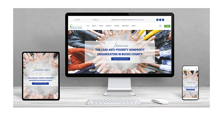
Mobile-First is Non-Negotiable
Let’s be honest: we live in a mobile-first world. For nonprofits, this isn’t just a trend—it’s critical. The numbers don’t lie: more than half of nonprofit website traffic comes from mobile devices. If your site isn’t perfectly optimized for mobile, you’re turning away half of your potential supporters.
Responsive design ensures your site automatically adjusts to fit any screen, from a smartphone to a desktop. But it’s more than that. Your mobile site needs touch-friendly buttons, fast load times, and legible fonts on small screens. A slow or clunky mobile site doesn’t just frustrate visitors—it sends them straight to the back button. Don’t let poor mobile optimization be the reason someone doesn’t support your cause.
Accessibility for All Supporters
Just as your mission serves diverse communities, your website must be accessible to everyone, regardless of ability. This is not only the right thing to do, but it’s also often a legal requirement under laws like the Americans with Disabilities Act (ADA).
Following the Web Content Accessibility Guidelines (WCAG) ensures your site is usable for all. This includes common-sense features like:
- Alt text for images: Descriptive text that screen readers can voice to visually impaired users.
- High-contrast colors: Sufficient contrast between text and background to ensure readability.
- Keyboard navigation: Allowing users to steer your site using only a keyboard.
- Captions for videos: Providing transcripts for hearing-impaired users.
Making your website accessible isn’t just about compliance; it’s about extending your reach to every potential supporter. You can learn more about why web accessibility is crucial for your brand.
The Heartbeat: Building Trust and Connection Through Storytelling
Now that you have a solid foundation, it’s time to make your website sing! This is where the real magic happens. Once visitors can find their way around, the goal is to capture their hearts with powerful visuals and compelling stories, turning a curious visitor into a passionate supporter.
The Power of Visuals: A Picture is Worth a Thousand Donations
In charity website design, a picture can be worth a thousand donations. Visuals aren’t just decoration; they’re powerful tools for sparking emotion. One authentic image can tell a story more effectively than pages of text. Think about how The Wilderness Land Trust’s “imagery-rich” website instantly connects you to the lands they’re protecting.
We always recommend using authentic, high-resolution photos and impactful videos that show your real work. Did you know that 57% of people who watch a charity’s video go on to donate? It’s also crucial that your visuals—from your logo to your color palette—are consistent with your brand. Colors evoke emotion, so use them strategically to align with your mission. Blue can feel trustworthy, while green suggests growth.
Our graphic design team at FZP Digital knows how to craft a visual identity that tells your story. Explore how our graphic design team can help create your visual identity.

Weaving Your Story into the Design
People connect with stories, not just statistics. Your charity website design should be a vibrant canvas for your narrative, making visitors feel like part of your journey. Share your origin story, showcase success stories of the lives you’ve impacted, and feature testimonials from beneficiaries and volunteers. BuildOn’s blog does a fantastic job of this, sharing individual stories that show their value.
The Ronald McDonald House Charities (RMHC) revamped their site with a “storytelling with heart” approach, using family stories to forge deep emotional bonds. It’s all about creating an emotional connection by showing the wonderful human element behind your hard work.
Building Unshakeable Trust and Credibility
Trust is the cornerstone of any successful charity. Your charity website design must actively cultivate credibility. People want to know their contributions will make a difference, and transparency is the key.
Show your accountability by making financial information, such as annual reports and Form 990s, easily accessible. The Southern Conservation Trust does this well by providing detailed information on its board, bylaws, and donor policies. Showcasing partners, sponsors, and staff and board member bios also adds a huge layer of credibility by putting faces and reputable names to your mission.
By proactively sharing this information, you demonstrate accountability and build invaluable confidence with your supporters. If you need help building and maintaining a sterling online reputation, we can help. Learn more about how to manage your online reputation effectively.
The Action Plan: How to Encourage Donations and Engagement
You’ve built the foundation and captured their hearts. Now what? It’s time to make it incredibly simple for them to take the next step. This is where your charity website design transforms inspiration into real-world impact, bridging the gap between “I care” and “I’m doing something about it.”
Designing the Perfect Donation Page
Your donation page is arguably the most critical page on your website. A convenient, inspirational donation page is the centerpiece of your fundraising efforts. The Oahu SPCA’s page is a perfect example, using a cute photo and a clear mission reminder to keep donors emotionally connected.
To make your page effective, ensure the form is branded to match your site, maintaining trust. Guide donors by offering suggested donation amounts and make recurring donation options prominent and easy to select. Offer multiple payment methods (credit cards, PayPal, etc.) and keep your form fields minimal—only ask for what’s essential. Finally, use clear impact messaging to show donors exactly what their contribution will achieve. “Your $50 helps feed three families” is far more compelling than just “$50.”
Your donation page is one of your most important assets. For more insights, check out why a great donation page is your most important asset.
More Than Just Donations: Inspiring Volunteer Sign-Ups
Donations are vital, but so are the hands and hearts that power your mission. Your charity website design should make it just as easy to volunteer as it is to donate. Start with a clear call-to-action, like a prominent “Get Involved” button.
When someone clicks, lead them to a simple sign-up form that doesn’t overwhelm them. Be specific about volunteer roles and their impact, and consider adding an event calendar for upcoming opportunities. It’s also a great idea to offer various ways to get involved beyond a regular time commitment, such as serving as a social media ambassador. This inclusive approach recognizes that everyone has different skills and capacities to offer.
Boosting Engagement with Interactive Elements
A static website can feel like a one-way conversation. To truly connect, your charity website design needs interactive elements that invite participation. These features transform passive visitors into active participants in your mission.
Quizzes and polls can turn education into a fun experience. Interactive maps, like the one used by the Elton John AIDS Foundation, are fantastic for visually showcasing your global impact. Integrating social media feeds directly onto your site shows you’re active and encourages visitors to join the conversation.
Creative ideas like e-card fundraising or interactive timelines can also tell your story in a dynamic way. And don’t forget the power of video—we know that 57% of people who watch a nonprofit’s video go on to donate. These tools don’t just entertain; they educate, inspire, and create a memorable experience that reinforces your mission.
The Megaphone: An SEO-Focused Approach to Charity Website Design
So, you’ve created an amazing charity website design. It’s beautiful, tells your story, and makes it easy to connect. But what if no one can find it? It’s like planning an incredible event but forgetting to send invitations! This is where Search Engine Optimization (SEO) comes in.
While the information in this guide is a helpful starting point, we need to be honest: achieving true SEO success is incredibly complex and requires dedicated professional expertise. Navigating its ever-changing algorithms and keyword strategies is a full-time job. To get the results your mission deserves, you need more than just tips—you need a partner. We strongly recommend partnering with the experts at FZP Digital to ensure your website gets found by the people who need to see it.
Keywords: Speaking Your Supporters’ Language
When you’re looking for something, what do you type into Google? Your potential supporters are doing the same thing. SEO starts with keyword research—figuring out those exact words and phrases. A great way to start is by answering user questions (tools like Answer the Public can help). You should also target donor-intent keywords (like “donate to animal shelters in Philadelphia”) and focus on local SEO if you serve a specific community like Bucks County or South Jersey.
On-Page SEO for Your Charity Website Design
Once you know your keywords, the next step is to weave them into your website. This is “on-page SEO,” and it’s like giving Google a roadmap to your mission. This includes crafting optimized titles and meta descriptions for search results, using image alt text (which helps with accessibility and SEO!), and internal linking to guide users and search engines through your site. A blog is also an amazing asset for regularly publishing fresh content and targeting a wider range of keywords.
If this sounds like walking through a dense forest, don’t worry! Our team is here to help. Learn the fundamentals of SEO with us and see how we make it accessible for nonprofits.
The Power of Google Ad Grants
Now for some truly exciting news: the Google Ad Grants program. This incredible initiative offers eligible charities a whopping $10,000 per month in free advertising on Google Search. Yes, you read that right—free!
This grant allows you to reach a wider audience, drive traffic directly to your donation page, and promote volunteer opportunities. Applying can be tricky, but the payoff is immense. When these ads work hand-in-hand with your expert charity website design, it can dramatically expand your reach.
At FZP Digital, we have extensive experience helping nonprofits secure and optimize these grants for real, tangible results. Let our experts help you improve your search ranking and open up this powerful resource.
Frequently Asked Questions about Charity Website Design
We know you’ve got questions, so let’s tackle some common concerns about charity website design together, like we’re just chatting over coffee.
What are the most common mistakes to avoid in charity website design?
It’s easy to fall into a few common pitfalls, but we want to help you avoid them! The biggest mistakes we see are:
- A confusing mission: If visitors can’t tell what you do in seconds, they’ll leave.
- Poor navigation: A messy menu frustrates users and stops them from taking action.
- Not being mobile-friendly: With over half of traffic coming from phones, a site that isn’t responsive is a huge missed opportunity.
- A complicated donation process: Make it super easy to give. Too many steps or a form that looks insecure will cause people to abandon their donation.
- Low-quality visuals: Blurry or generic stock photos can make your organization seem less credible.
- Lack of trust signals: This is a crucial one. Since 75% of people judge a charity’s credibility by its website design, you must display financial transparency and proof of your impact.
What are the latest trends in charity website design?
The digital world is always evolving, and staying current helps your site feel fresh and trustworthy. Some of the latest trends we’re seeing include:
- Bold typography that grabs attention.
- Immersive video backgrounds that show your work in action.
- Interactive storytelling elements like quizzes, polls, and maps to engage users.
- Minimalist designs that let your powerful message and imagery shine.
- Dark mode options for user comfort and improved readability.
These trends aren’t just about looks; they’re about creating a more engaging and impactful experience for your supporters.
Should I use a template or get a custom design?
This is a great question! The answer really depends on your budget and long-term goals.
Templates can be a good first step for new charities on a tight budget. They can get you online quickly, but they often lack uniqueness and can be restrictive, making it hard to stand out.
On the other hand, a custom design is a real game-changer for maximizing your impact. A custom charity website design and development process, like the one we offer at FZP Digital, allows you to build a site that is truly unique to you. It perfectly reflects your brand, tells your story compellingly, and is optimized for your specific fundraising goals. While it’s a larger initial investment, a custom solution provides the flexibility and performance to grow with your organization, making it the better long-term choice.
Let’s Create Something that Inspires Action
Whew, that’s a lot to think about, isn’t it? Creating a charity website design that looks beautiful, builds trust, and drives donations is a complex dance of technology, psychology, and your heartfelt mission. Every piece of the puzzle matters, from user experience to the ever-changing world of SEO.
You’re already an expert at changing the world. So, why not let us be the experts who help you share that vital mission online? At FZP Digital, we combine our deep understanding of digital marketing with a genuine passion for helping nonprofits succeed. We’re here to take the complexity of your online presence off your shoulders.
Our collaborative “Develop . Design . Deliver” process is our promise to you. We work hand-in-hand to ensure your website is a powerful tool that amplifies your voice and inspires action. We specialize in crafting premium responsive WordPress website design, developing standout logo design, and increasing organic search rankings so more people can find your incredible work. Navigating SEO can feel like a full-time job, and we’re the necessary partner to help you achieve real results.
We’re proud to serve organizations in Richboro, Newtown, Philadelphia, Bucks County, Montgomery County, Delaware, New Jersey, and Pennsylvania. If you’re ready to create a digital presence that truly reflects the heart of your work, the team at FZP Digital is here to help.
Let’s build your new website together!