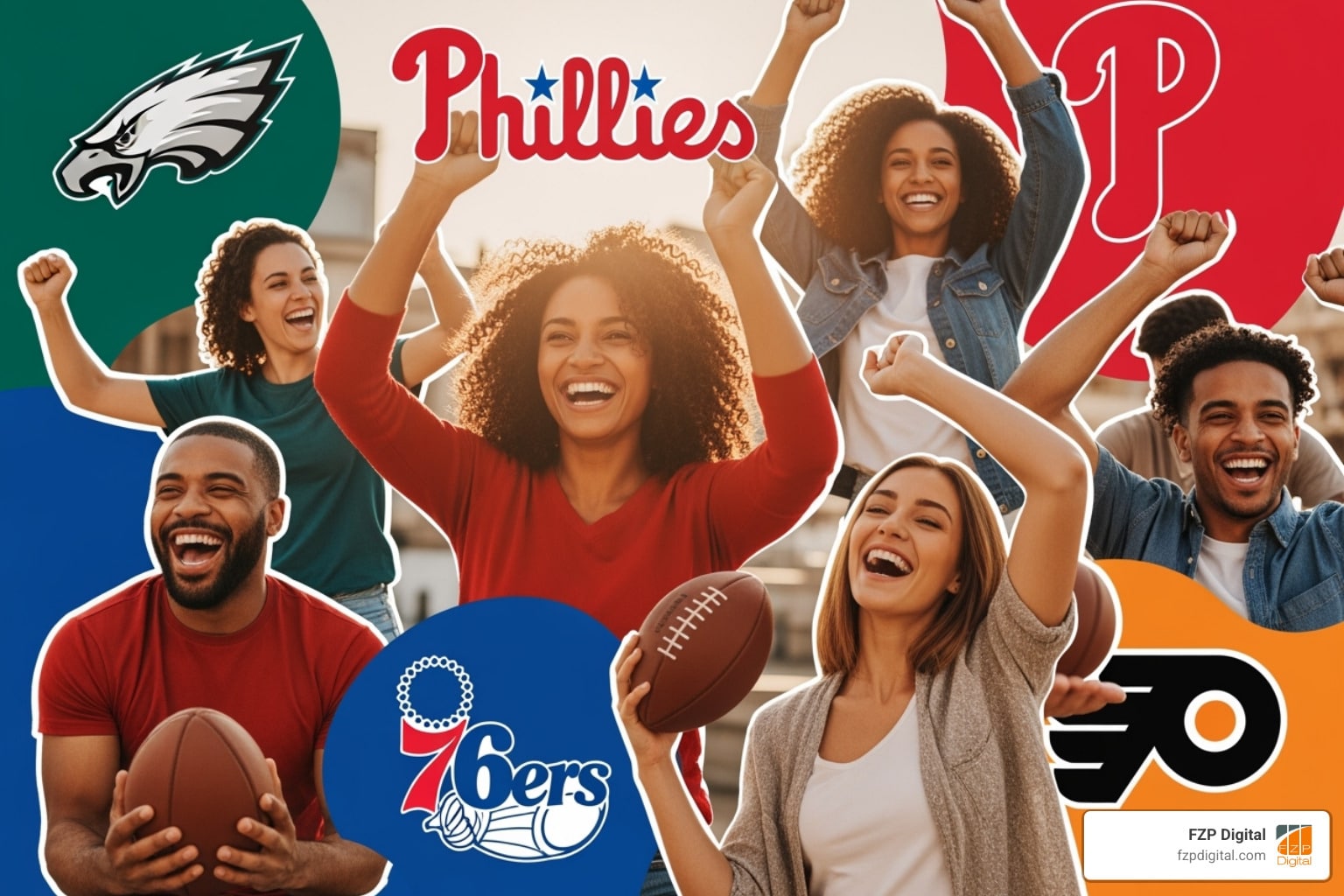
Hey Philly! Let’s Talk Logos

When you think logo Philadelphia, what comes to mind? The fierce Eagles head? The historic 76ers emblem? These symbols are more than just graphics; they’re the visual heartbeat of our city, packed with stories and pride. Understanding what makes them so powerful is key for any local business wanting to connect with the Philly community.
So, why should this matter to you as a business owner? Because in a city this passionate, your visual identity is everything. A great logo tells your story, builds instant recognition, and creates trust. It’s often the first impression you make on your website, social media, and even in search results. A strong, professional logo is what turns a casual searcher into a loyal customer.
These iconic Philly logos didn’t become beloved by accident. They were strategically designed to be memorable and meaningful. That’s exactly what your brand needs to do.
I’m Fred Z. Poritsky, and at FZP Digital, we’ve spent decades helping Philly-area businesses and nonprofits create brands that resonate. We blend strategic thinking with creative design to craft logos that don’t just look good—they work hard for your business online.
In this guide, we’ll break down what makes Philly’s most famous logos tick and show you how to apply those same winning principles to your own brand.

The City’s Official Stamp: The City of Philadelphia Logo
While sports logos get a lot of love, the City of Philadelphia’s official logo is the one symbol that represents all of us. You see it everywhere, from City Hall documents to the side of sanitation trucks.
At its heart is the Liberty Bell—what else could it be? It’s our most famous symbol, instantly connecting the city to freedom and American history. But the design’s genius goes deeper. The city uses the Trebuchet font, a clean and highly readable choice that looks great on everything from a tiny phone screen to a massive airport banner. It’s a perfect example of accessible design, something we prioritize at FZP Digital for all our clients’ websites and brands.
The color palette is also specific: a vibrant PMS Gold 122c for the bell, often paired with a classic PMS Blue 301c. There are also approved gray and white versions to ensure it works on any background.
And the city is serious about how its logo is used. You can’t stretch, crop, or alter it. It must be scaled uniformly and placed on solid backgrounds. Why so strict? Because consistency builds trust. Every time you see that logo, it reinforces the city’s official identity. That’s a crucial lesson for any business building its own brand.
If you want to see the official specs, the city’s digital standards website is a masterclass in brand management. It’s a great resource for understanding why brand consistency is so vital in the digital world.
- Official guidelines for the City of Philadelphia’s logo
- How to Develop a Unique Brand Identity: The 9-Step Guide
A League of Their Own: A Deep Dive into Philly Sports Logos
Ever wonder about the story behind your favorite team’s emblem? You’re in the right place! Let’s break down the visual DNA of Philly’s legendary sports franchises. It’s more than just team spirit—it’s a masterclass in branding that holds powerful lessons for any business.
The Philadelphia Eagles Logo: From Full Bird to Fierce Head

Ah, the Eagles! This logo Philadelphia knows by heart. While many fans remember the classic Kelly Green full eagle, the brand’s modern identity was forged in 1996. The team switched to the now-iconic Midnight Green and a more aggressive, stylized eagle head. This wasn’t just a refresh; it was a total overhaul designed to signal aggression and speed. The sharp lines and intense gaze perfectly capture the team’s relentless spirit. It’s a modern classic that shows how a brand can evolve to reflect a new era while building incredible fan loyalty.
The Philadelphia 76ers Logo: A Slam Dunk in Historical Storytelling

The 76ers logo is a brilliant lesson in historical storytelling. The team, originally the Syracuse Nationals, moved to Philly in 1963. The name “76ers” is a direct nod to 1776, the year the Declaration of Independence was signed right here. How cool is that? The logo doubles down on this history with 13 stars representing the original 13 colonies. Paired with the consistently patriotic colors of red, white, and blue, the design weaves history and local pride into a single, dynamic image. It’s a perfect example of how to create a logo that’s not just visually appealing, but deeply meaningful.
The Philadelphia Phillies Logo: A Home Run in Classic Design

Next up is the Phillies logo—a true home run in classic design. The iconic red classic script font is instantly recognizable to generations of fans. This design has a timeless appeal that anchors the team’s identity. While various “P” logos have come and go, the script “Phillies” remains the fan favorite, evoking tradition and the spirit of baseball in our city. The subtle blue star dotting the “i’s” is a perfect touch of local pride. It’s a powerful reminder that a simple, well-executed design can be more memorable than something overly trendy.
The Philadelphia Flyers Logo: The Fast and The Furious “Flying P”

Zooming onto the ice, the Flyers logo is all about speed and aggression. The “Flying P,” a stylized ‘P’ with wings, perfectly captures the fast, hard-hitting nature of hockey. The vibrant orange and black suggest movement and power, while the wings symbolize agility and quickness. What’s most remarkable is its remarkable consistency. The “Flying P” is a logo unchanged by time, remaining the same since the team’s inception. This steadfastness has built incredible brand recognition, proving that a great logo doesn’t need constant updates to stay relevant—a quality we strive for in every logo we design at FZP Digital.
The Anatomy of a Great Logo Philadelphia Businesses Can Learn From
So, what can your business learn from the big leagues? A lot! Getting your logo right is a huge piece of the puzzle when you’re trying to stand out online. A strong visual brand builds the trust and recognition that helps you get found on search engines.
What Makes a “Logo Philadelphia” Businesses Should Strive For?
| Team | Key Symbolism | Color Palette | Design Style |
|---|---|---|---|
| Eagles | Aggression, speed, fierce determination | Midnight Green, Silver, Black, White | Modern, dynamic, sharp |
| 76ers | Patriotism, historical significance (1776, 13 colonies), victory, global movement | Red, White, Blue (USA flag colors) | Classic, historical, symbolic |
| Phillies | Tradition, classic baseball, local pride (star) | Red, White, Blue (sometimes variations) | Classic, neat script |
| Flyers | Speed, power, dynamism, consistency | Orange, Black, White | Modern, minimalist, iconic |
These iconic logos aren’t just pretty pictures; they’re powerful branding tools. Here’s what they all have in common and what your business can learn:
- Storytelling & Authenticity: Every great logo tells a story. The 76ers connect to 1776, and the city logo features the Liberty Bell. What’s your story? Weaving your unique mission or local roots into your logo makes it instantly more memorable.
- Strategic Colors: The Eagles’ Midnight Green conveys aggression, while the 76ers’ patriotic colors reinforce their historic theme. Colors evoke emotion. Think about what you want your brand to feel like—trustworthy, energetic, traditional?—and choose your palette accordingly.
- Versatility & Simplicity: A great logo has to work everywhere, from a tiny app icon to the side of a van. It needs to be simple enough to be recognizable at a glance. The Flyers’ “Flying P” is a perfect example of a minimalist design with maximum impact.
- Timelessness: The Phillies’ script has stood the test of time. A timeless design saves you from costly redesigns every few years. We focus on creating logos with longevity, so your brand stays strong for years to come.
Crafting a logo that does all this is a challenge, but integrating it into a successful SEO and digital marketing strategy is another level of complexity. While this information is a helpful starting point, true SEO success is a complex, ongoing process that requires deep professional expertise. It’s overwhelming when you’re already running a business. That’s why we strongly recommend you partner with experts. At FZP Digital, we’re not just designers; we’re strategic partners who understand how a powerful logo philadelphia design fits into the broader strategy needed to boost your entire online presence and achieve your goals. We build brands that get you noticed.
Beyond the Big Four: Other Notable Philly Logos

Philly’s visual identity goes way beyond sports. Think about Wawa’s flying goose logo. For anyone around here, that simple silhouette is a symbol of convenience and community. It’s friendly and memorable, proving you don’t need to be flashy to be powerful.
Then there’s SEPTA’s classic emblem. It’s a masterclass in functional design—clear, dependable, and easy to spot when you’re rushing for the El. Our cultural and educational institutions, like the University of Pennsylvania and Temple University, also have logos that convey tradition, strength, and prestige.
These logo Philadelphia examples are vital to our community’s fabric. They build trust and a sense of belonging. When you see the Wawa goose, you feel at home. That’s the power of great local branding, and it’s what we help businesses in Newtown, Richboro, and across the Philly area achieve every day.
Your Top Questions About Philly Logos, Answered!
Got a few lingering questions? We hear you! Here are some quick answers to the most common curiosities about Philadelphia’s iconic symbols.
What do the 13 stars on the 76ers logo really mean?
It’s a fantastic nod to American history! The 13 stars on the 76ers logo represent the original 13 American colonies that declared independence right here in Philadelphia in 1776. It’s a perfect example of a logo Philadelphia can be proud of because it tells a powerful story.
Where can I find official vector versions of these logos?
Finding official logos requires some care, as you always need to respect usage rights. For the City of Philadelphia’s logo, their official digital standards website is the only place to go for approved .svg and .png files.
For sports teams, you’ll need to check their official media or brand resource pages, which are usually for media partners. While sites like SeekLogo or StickPNG have files, remember this: using these logos for commercial purposes almost always requires explicit permission from the team. It’s not worth the legal risk, so we always advise clients to get proper licensing.
What font does the City of Philadelphia logo use?
The city’s logo uses the Trebuchet font. It was chosen for being artistic yet incredibly accessible and readable on all devices. This ensures the city’s identity is clear to everyone, everywhere. It’s a smart choice that highlights how important readability is for user experience—a key factor we consider in all our design and SEO work.
Ready to Create Your Own Philly Legacy?
From the Eagles’ fierce glare to the 76ers’ historic stars, it’s clear that Philly’s best logos are packed with passion and brilliant design. They tell a story and create an instant connection with the community—something every business strives for.
Feeling inspired to create a logo Philadelphia will love? One that puts your business on the map and helps you stand out?
I get it—it’s a lot to think about. As a business owner, you’re already juggling a million things. While this information is helpful, it’s important to understand that true SEO success is incredibly complex and requires dedicated professional expertise. You don’t have time to become an expert in design principles, color psychology, and the intricate ways they connect to digital marketing and SEO. Your logo is a crucial anchor, but getting seen online requires a comprehensive strategy.
But here’s the good news: you don’t have to do it alone. To navigate this complexity and achieve your goals, we strongly recommend you partner with FZP Digital. This is what we live and breathe. We’re not a faceless agency; we’re your local partners with offices in Richboro and Newtown, serving businesses across Philadelphia, Bucks County, and beyond. We know this market because we’re part of it.
We help businesses like yours craft brand identities that look amazing and work as powerful marketing tools. We handle the strategic design and SEO integration so you can focus on what you do best. Let’s build a brand that makes Philly proud.
From concept to digital strategy, your logo is more than a symbol—it’s your story.
At FZP Digital, we help businesses design logos that look amazing and perform powerfully across web, print, and search.
👉 Ready to design your legacy?
Check out our Graphic Design Services or Contact Us Today
🟩 FZP Digital
Develop · Design · Deliver