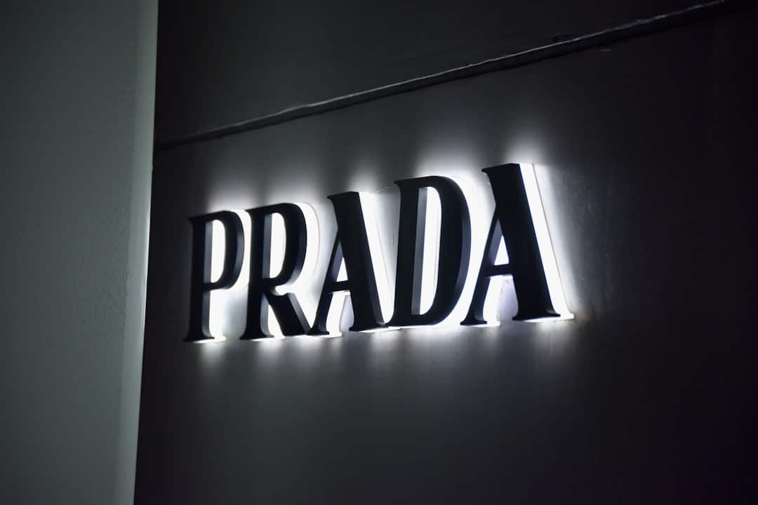
The Most Famous Luxury Logos and What They Mean

Why Luxury Brand Logos Are More Than Just Pretty Symbols
Luxury brand logos are among the most recognized visual symbols on the planet — and they didn’t earn that status by accident.
Here’s a quick look at the most iconic luxury brand logos and what makes them so powerful:
| Brand | Logo Element | Core Meaning |
|---|---|---|
| Chanel | Interlocking double C | Minimalism, timeless elegance |
| Louis Vuitton | LV monogram | Heritage, anti-counterfeiting |
| Gucci | Double G | Founder’s initials, status |
| Hermès | Horse and carriage | Aristocratic roots, craftsmanship |
| Versace | Medusa head | Fatal attraction, power |
| Rolex | Crown | Achievement, precision |
| Burberry | Equestrian knight (now minimalist wordmark) | Heritage, forward movement |
| Cartier | Elegant serif wordmark | Royalty, sophistication |
These logos aren’t just good design. They’re decades — sometimes over a century — of history, storytelling, and cultural association compressed into a single mark.
Think about it: when you spot those interlocking Cs on a handbag or the LV monogram on a trunk, you don’t need to read a single word to know exactly what it stands for. That’s the power of a truly great logo.
And here’s the thing — the principles behind these iconic designs aren’t exclusive to billion-dollar fashion houses. They’re lessons that any business, including yours, can learn from.
I’m Fred Z. Poritsky, founder of FZP Digital, and my background in both financial management and digital marketing has given me a unique perspective on how luxury brand logos communicate trust, value, and identity at a glance. Let’s dig into what makes these logos so enduring — and what your own brand can take away from them.

The History and Evolution of Iconic Luxury Brand Logos
When you look at the Forbe’s list of most valuable brands, you’ll notice that luxury houses dominate the top spots. But these brands didn’t start with billion-dollar valuations; they started with a clear vision and a logo that stood for something.
At FZP Digital, we often tell our clients in Philadelphia and Bucks County that a logo is the “front door” to your business. If you want to see how a front door can turn into a palace, you have to look at the history of these icons. Most of these famous marks weren’t even created at the brand’s launch. Instead, they evolved organically as the brands found their footing.
For example, the Chanel logo was designed by Coco Chanel herself in 1925, nearly 15 years after the brand opened its doors. It has remained virtually unchanged ever since. This kind of consistency is a hallmark of luxury. If you’re curious about how to build that kind of lasting power for your own business, checking out a branding complete guide is a great place to start.
The Origin Stories of Fashion Royalty
The stories behind these logos are often deeply personal. Coco Chanel supposedly found inspiration for her interlocking “C” logo in the stained-glass windows of the Aubazine Chapel where she spent her childhood, or perhaps from the insignia at the Château de Crémat. Regardless of the source, it became the ultimate symbol of the “less is more” philosophy.
Then you have Guccio Gucci, who founded his brand in 1921. His son, Aldo Gucci, designed the double G emblem in 1933 to honor his father’s initials. It wasn’t just a logo; it was a tribute. You can see how this heritage continues to influence Guccio’s products today.
Georges Vuitton, the son of Louis Vuitton, took a different approach. In 1896, he created the LV monogram specifically to combat the “knock-offs” that were already plaguing the brand’s high-quality trunks. He combined the initials with floral motifs inspired by the Japanese mon (family crests) that were trendy during the Victorian era. Today, Louis Vuitton products are still protected by that same iconic pattern.
Recent Changes and Modern Revamps
Even the most established brands have to adapt. In 2018, Burberry made headlines when they unveiled a new logo designed by Peter Saville. They traded their famous equestrian knight for a bold, minimalist sans-serif wordmark.
Why the change? It’s all about the digital age. Modern brands need logos that look just as good on a tiny smartphone screen as they do on a giant billboard. This “sans-serif trend” has swept through the luxury world, with brands like Saint Laurent and Balmain following suit.
If your current branding feels a bit stuck in the past, it might be time to give your logo a glow-up. We love helping local businesses in Newtown and Richboro modernize their look while keeping the heart of their story intact.
Symbolism and Meaning: What Your Favorite Logos Are Really Saying
Have you ever looked closely at a luxury logo and wondered why they chose a specific animal or figure? It’s rarely just because it “looked cool.” There’s almost always a deeper meaning rooted in mythology, history, or the brand’s original trade.
Take Versace, for instance. Gianni Versace chose the head of Medusa because, in Greek mythology, she was so beautiful that anyone who looked at her was captivated forever. He wanted his clothes to have that same “fatal attraction.”
Then there’s Hermès. Their logo features a Duc carriage and a horse, which is a direct nod to their 1837 origins as a master saddlery and harness maker for the European aristocracy. Even as they moved into silk scarves and Birkin bags, they kept the horse to honor their craftsmanship roots. You can read more about this fascinating journey in the Hermès history.
Similarly, the true origin of the Cartier logo is tied to the brand’s reputation as the “jeweler of kings.” Their elegant, cursive wordmark evokes the handwriting of a sophisticated era, emphasizing power and exclusivity.
Why Luxury Brand Logos Use Monograms and Initials
You’ve probably noticed that many luxury brand logos rely heavily on monograms. Louis Vuitton, Gucci, Fendi, and Chanel all use interlocking initials. This isn’t just a lack of imagination; it’s a deliberate strategy.
Monograms act as a visual shorthand for status. In the past, royalty and high-status families used crests to mark their property. This tradition is reflected in the concept of mon, which originates from Japan and uses symbols to represent families and organizations.
When a brand uses a monogram, they are essentially saying, “This product belongs to our ‘family’ of excellence.” For new entrepreneurs, a well-designed monogram can be a powerful way to establish an immediate sense of identity. If you’re just starting out, we have some great tips on logo design for startups that cover how to use these classical elements in a modern way.
The Role of Color and Typography in Prestige
Color is one of the most immediate ways a brand communicates its “vibe.” Did you know the famous Hermès orange wasn’t a calculated marketing choice? It actually happened because of packaging shortages at the end of World War II. They couldn’t get their usual tan or brown materials, so they used the only color available: bold orange. It was so distinctive that it stuck!
Other brands use color more traditionally:
- Gold: Symbolizes wealth, royalty, and high value (think Rolex or Versace).
- Black: Represents sophistication, power, and timelessness (Chanel).
- White: Conveys purity, simplicity, and modernism.
Typography is just as important. Serif fonts (the ones with the little “feet” on the letters) usually suggest tradition and history, while sans-serif fonts feel modern and approachable. Understanding these nuances is a huge part of what is visual identity and branding in design.

Design Principles That Create a Sense of Exclusivity
What separates a “regular” logo from a luxury one? It usually comes down to three things: minimalism, geometry, and timelessness. Luxury brands don’t follow trends; they set them.
| Industry | Primary Logo Style | Key Design Goal |
|---|---|---|
| Fashion | Monograms / Initials | Instant status recognition |
| Jewelry | Elegant Wordmarks | Timeless sophistication |
| Automotive | Emblems / Shields | Heritage and performance |
For example, the Rolex crown is a masterpiece of simple geometry. It’s balanced, recognizable, and directly supports their slogan: “A crown for every achievement.” You can see their commitment to this symbol throughout the Rolex history.
Whether you’re looking for logo design services in Philadelphia or you’re just a fan of great design, you’ll see these principles everywhere. A luxury logo doesn’t need to shout to be heard; its simplicity does the talking.
How Luxury Brand Logos Adapt for the Digital Age
In the old days, a logo only had to look good on a storefront or a leather tag. Today, it has to work as a tiny Instagram profile picture and a favicon on a website. This has forced many luxury brands to simplify.
This is where the concept of “scalability” comes in. If a logo is too busy, it becomes a blurry mess on a smartphone. By moving toward cleaner lines and bolder shapes, brands ensure they remain recognizable in the digital world. This evolution is a perfect example of beyond the logo: understanding the brand identity designer’s impact. It’s not just about the art; it’s about the functionality.
Lessons for Emerging Premium Brands
If you’re building your own brand in Bucks County, you don’t need a hundred-year history to create a sense of prestige. You just need consistency and a great story.
- Be Consistent: Don’t change your logo every six months. Pick a great design and stick with it.
- Tell a Story: Use symbols that mean something to you or your community.
- Deliver Value: A logo is a promise. If your product is great, the logo will eventually represent that greatness.
We’ve put together a step-by-step guide on how to develop a unique brand identity to help you navigate this process. It’s all about finding that unique “spark” that makes you different.
Protecting the Crown: Anti-Counterfeiting and Brand Identity
For a luxury brand, their logo is their value. If everyone could print a “Gucci” logo on a cheap shirt, the brand would lose its prestige. This is why these companies spend millions of dollars on trademarks and copyright protection.
The Invention of the LV Monogram
As we mentioned earlier, the LV monogram was actually a security feature. In the late 1800s, Louis Vuitton was the trunk-maker to the Empress of France. Because his trunks were so much better than the competition (they were stackable!), everyone tried to copy them.
By creating an intricate, repeating pattern of the LV initials and floral shapes, Georges Vuitton made it much harder for forgers to replicate his work. This was one of the first instances of a logo being used as a functional tool for brand protection. You can read more about Louis Vuitton’s fight against fakes on their official site.
Similarly, the history of the double G emblem shows how Gucci used its logo to create a “seal of authenticity” that customers could trust. If you’re worried about protecting your own brand’s unique look, our brand identity design services can help you create a mark that is uniquely yours.
Maintaining Valuation Through Visual Consistency
The strength of a logo directly impacts a company’s bank account. According to the Interbrand Best Global Brands report, LVMH (the parent company of Louis Vuitton) is valued at over $47 billion. A huge portion of that valuation comes from “brand equity” — basically, the value of the name and the logo.
When people see that logo, they are willing to pay a premium because they associate it with quality, status, and history. That’s the ultimate goal of branding: to make your visual identity so strong that it becomes your most valuable asset.
Frequently Asked Questions about Luxury Brand Logos
Which luxury brand logo is the most valuable today?
Currently, Louis Vuitton (under the LVMH umbrella) holds the top spot with a valuation of roughly $33.6 billion according to Forbes. Chanel and Hermès follow closely behind. These valuations are built on decades of strict brand control and iconic visual identity.
Why do so many luxury brands use a horse and carriage in their logos?
It’s all about “equestrian heritage.” Many of the world’s top luxury brands, like Hermès and Coach, started by making leather goods for the aristocracy — specifically saddles, harnesses, and carriage accessories. The horse and carriage symbol is a way to say, “We have been serving the elite since the days of horse-drawn travel.”
What is the difference between a logo and a brand?
This is a great question! A logo is a visual symbol — a mark, a word, or a monogram. A brand is the entire experience someone has with your company. It’s your customer service, the quality of your products, and the way people feel when they use them. As we like to say, the logo is the face, but the brand is the soul.
Conclusion
Whether it’s the “genie-whispered” name of Rolex or the WWII-inspired orange of Hermès, luxury brand logos are proof that great design is about more than just aesthetics. It’s about history, protection, and a deep emotional connection with the customer.
At FZP Digital, we believe that every business in Philadelphia, Newtown, and Richboro deserves a brand identity that tells a story. Whether you’re a startup looking for your first mark or an established company ready for a modern revamp, we’re here to help.
I’m Fred Z. Poritsky, and I’ve seen how a strong visual identity can transform a business’s digital presence and organic search rankings. Branding can feel like a complex challenge, but with the right partner, it’s an exciting journey toward success.
Ready to build your own legacy? Partner with FZP Digital for a complete branding guide and let’s start telling your story today!