Company Logos: 7 Iconic Secrets
More Than Just a Pretty Picture

Company logos are absolutely everywhere, aren’t they? You see them on your sneakers (that famous swoosh!), and you probably pass the golden arches on your morning commute. But have you ever stopped to think about what they really are, and why they’re so incredibly important for your business?
Simply put, a logo is a visual symbol that represents your brand, helping customers recognize you in an instant. Its main job is to make a great first impression, build trust, and set you apart from the crowd. There are all kinds of logos, from word-based ones like Google’s to iconic pictures like Apple’s, and they all follow a few key rules: they should be simple, memorable, timeless, versatile, and a good fit for your audience. And the investment? It can be anything from a free DIY tool to thousands for a pro design. Fun fact: Nike’s world-famous swoosh only cost them $35 back in the day!
Think of your logo as your brand’s first handshake. It’s the visual cornerstone that shows up on everything from your website to your business cards, playing a huge part in whether customers remember you and stick around.
The best logos tell a story without saying a word. Take a look at the FedEx logo—that clever arrow hidden in the negative space between the ‘E’ and ‘x’ screams speed and direction. Or how about Google’s logo? It uses primary colors with one little twist—the green ‘L’—to show that they don’t always play by the rules. It’s a subtle nod to their innovative spirit.
Whether you’re just starting out or giving your established business a fresh look, getting a handle on the psychology and strategy behind a great logo can be the difference between blending in and truly standing out. It’s a crowded market out there, and making your mark is tougher than ever.
I’m Fred Z. Poritsky, and I’m the founder of FZP Digital. After decades in accounting and nonprofit management, I found my true passion for the creative side of business. My unique background gives me a special lens on how company logos and visual identity are the bridge between the analytical side of a business and the creative spark that really connects with people.

So, you’re ready to make your mark, right? But how do you create a symbol that truly captures the essence of your business and leaves a lasting impression? It’s more than just aesthetics; it’s about strategic design that communicates your brand’s core message. This is where the power of persuasion in marketing truly begins, and your logo is often the first step in that journey. Want to dive deeper into how powerful communication can transform your business? Check out our insights on The Power of Persuasion in Marketing.
So, What’s the Secret Sauce of an Iconic Logo?
You know that feeling when you spot a logo from across the street and instantly know what brand it is? That’s not luck – it’s brilliant design strategy at work. The most iconic company logos aren’t just pretty pictures; they’re carefully crafted symbols that follow time-tested principles.
Think about it: what makes the Nike swoosh so powerful that you’d recognize it even without the company name? Or why can you spot those golden arches from a mile away? The secret lies in five core principles that turn simple designs into unforgettable brand assets. For a little inspiration, you can browse a huge gallery of the most famous company logos and emblems in the world.
Simplicity is your best friend when it comes to logo design. The simpler your logo, the easier it is for people to remember and recognize. Take Nike’s swoosh – believe it or not, a graphic design student named Carolyn Davidson created it in 1971 for just $35! It’s nothing more than a simple curve, yet it perfectly captures movement, speed, and victory. Nike’s executives weren’t even sure about it at first, but that simple swoosh became one of the world’s most recognizable symbols.
Memorability goes hand in hand with simplicity. Could someone sketch your logo from memory after seeing it just once or twice? The London Underground’s ‘Roundel’ logo has been doing exactly that for over a century – proof that a memorable design truly stands the test of time.
Here’s where timelessness comes into play. Great logos don’t chase trends; they create lasting impressions. The Shell logo, which was trademarked way back in 1900, looks just as fresh today as it did over 120 years ago. That’s the power of timeless design.
Your logo also needs versatility to work everywhere your brand shows up. Whether it’s squeezed into a tiny favicon, stretched across a billboard, or printed in black and white on a business card, it has to maintain its impact and clarity.
Finally, appropriateness ensures your logo fits your industry and speaks to your target audience. A playful, colorful logo might work perfectly for a children’s toy company, but it probably wouldn’t inspire much confidence in a law firm’s clients.
These principles guide everything we do when creating logos that aren’t just visually appealing, but actually work as powerful business tools. Want to see how these principles come to life? Check out Our Work to see some of the brands we’ve helped create lasting impressions for.
The Psychology of Color and Shape
Here’s something fascinating: colors and shapes aren’t just decorative choices – they’re psychological triggers that can make people feel specific emotions before they even read your company name. When we’re designing company logos, we’re essentially speaking directly to your customers’ subconscious minds. It’s a complex field, but getting it right is a game-changer.
Let’s talk about how color psychology works in the real world. Red gets your heart pumping – it screams excitement, passion, and urgency. That’s why you see it used so effectively by Coca-Cola and Netflix. Blue, on the other hand, makes you feel safe and secure. It whispers “trust me” and “I’m reliable,” which is exactly why financial institutions and tech companies like IBM and LinkedIn lean heavily on blue tones.
Green tells a story of growth, nature, and freshness – perfect for brands like Whole Foods and Starbucks that want to connect with health-conscious consumers. Yellow brings instant sunshine and optimism (hello, McDonald’s Golden Arches!), while black oozes sophistication and luxury – just ask Chanel or Prada.
Here’s a fun example of strategic color choice: Google’s logo uses mostly primary colors, but did you ever notice that sneaky green ‘L’? That wasn’t an accident. By breaking the primary color pattern with a secondary color, Google subtly communicates that they don’t always follow the rules – a perfect way to signal innovation and playful rebellion.
Shape symbolism is just as powerful. Circles make us think of community and completeness – the Olympic rings are a perfect example of how circular shapes can represent unity. Squares and rectangles feel stable and professional (think IBM’s striped blocks or the BBC’s classic design), while triangles can suggest power, growth, or direction depending on how they’re positioned.
Understanding how all these elements work together is how you create a logo that doesn’t just look good – it feels right to your audience. It’s about crafting a visual language that communicates your brand’s personality without saying a single word. If you’re curious about how current design trends influence these psychological choices, you’ll love our insights on 7 Graphic Design Trends That Will Dominate 2021.
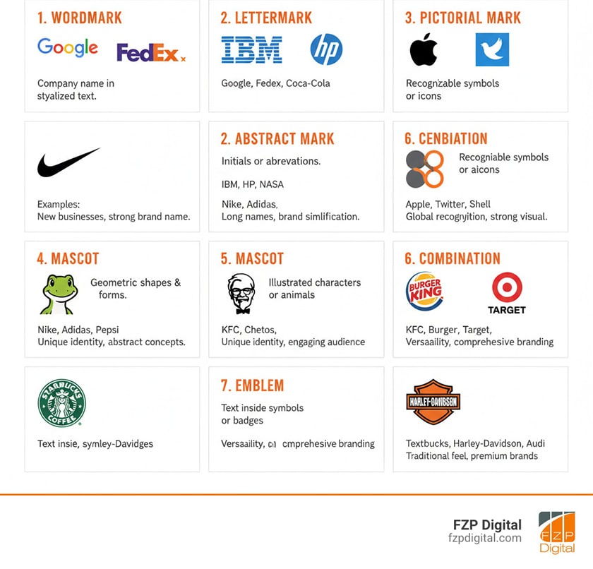
Making Your Mark: The Different Types of Company Logos
Not all company logos are created equal, and that’s a good thing! There’s a whole toolkit of logo styles to choose from, each with its own superpowers and perfect use cases. Understanding these differences helps you pick the right approach for your unique business needs.
| Logo Type | Description | Examples | When to Use |
|---|---|---|---|
| Wordmarks | Your company name styled in custom typography | Google, Disney | When you have a distinctive name you want people to remember |
| Lettermarks | Initials or abbreviations designed as a logo | IBM, HBO | Perfect for businesses with long names or well-known initials |
| Pictorial Marks | Recognizable symbols or icons that represent your brand | Apple, Twitter | Great when you want a symbol that instantly communicates what you do |
| Abstract Marks | Geometric shapes that create unique visual identities | Nike, Pepsi | Ideal for creating something completely unique to your brand |
| Mascots | Illustrated characters that become your brand ambassadors | WWF Panda, KFC’s Colonel | Excellent for family-friendly brands or when you want personality |
| Combination Marks | Text and symbol working together harmoniously | Most brands use this approach | The most versatile option – gives you the best of both worlds |
| Emblems | Text contained within symbols, badges, or crests | Starbucks, Harley-Davidson | Perfect for traditional industries or brands wanting heritage appeal |
Wordmarks work beautifully when you’ve got a distinctive company name that rolls off the tongue. Google and Disney have turned their names into instantly recognizable art forms. Lettermarks are your best friend when your business name is a mouthful – IBM sounds much better than “International Business Machines,” doesn’t it?
Pictorial marks tell your story at a glance. Apple’s bitten apple and Twitter’s bird immediately communicate something about what these companies represent. Abstract marks like Nike’s swoosh or Pepsi’s circle create something entirely unique to your brand – no one else can claim that exact shape.
Mascots bring personality and warmth to your brand. The WWF panda and KFC’s Colonel Sanders have become beloved characters that people genuinely connect with. Combination marks give you the best of both worlds – a symbol and text working together. This is often the most flexible approach, which is why so many brands use it.
Emblems have that classic, established feel that works perfectly for brands wanting to communicate heritage and tradition. Starbucks and Harley-Davidson use emblems to tap into that sense of timeless quality and craftsmanship.
The key is choosing the type that best fits your brand’s personality and goals. There’s no single “right” answer – just the right answer for your unique business story.
Designing for Everywhere: The Importance of Versatility
Here’s a reality check: your logo needs to work everywhere your brand shows up – and in today’s digital world, that’s a lot of places! From tiny favicons in browser tabs to massive billboards on highways, your logo has to maintain its impact and clarity across every single touchpoint.
Scalability is absolutely crucial. Your logo should look just as sharp and recognizable when it’s squeezed into a 16×16 pixel favicon as when it’s blown up for a trade show banner. This is where simple designs really shine – complex logos with lots of tiny details often turn into a blurry mess when they’re scaled down.
Think about all the different platforms where your logo appears: your website header, social media profiles, business cards, email signatures, mobile apps, and print ads. Each platform has its own technical requirements, and a logo that isn’t versatile creates a disjointed experience for your customers and can even hurt your online visibility.
The print vs. digital challenge is real, too. Colors that look vibrant on your computer screen might print differently, and what works in full color needs to be just as effective in black and white. Your logo should maintain its personality whether it’s on a newspaper ad or a high-resolution monitor.
Don’t forget about favicons and app icons! These tiny versions of your logo are often the first thing people see when they’re browsing online or scrolling through their phone. If your logo doesn’t work at this small size, you’re missing out on a huge opportunity for brand recognition.
Having black and white versions ready isn’t just practical – it’s essential. You’ll need to use your logo on colored backgrounds, in situations where color printing isn’t an option, or for things like sponsorship banners. A truly great logo works beautifully in monochrome, too.
This is where professional design really makes a difference. While the information in this article is a helpful guide, achieving true SEO success and building a powerful digital presence is a complex task that requires dedicated professional expertise. It’s not just about a pretty logo; it’s about a comprehensive strategy. To ensure your brand not only looks great but also achieves its business goals, we strongly recommend you partner with FZP Digital. We handle these challenges every day in our Web Design Development services, turning creative vision into tangible results.