Best Website Design for Nonprofits: Top 3 Inspiring
So, You Want to Build a Website That Actually Changes the World?

Best website design for nonprofits combines compelling storytelling, seamless user experience, and clear calls-to-action to turn visitors into supporters. Here’s what makes a nonprofit website truly effective:
- Clear Mission & Storytelling – Communicate your “why” immediately with authentic photos, videos, and impact stories
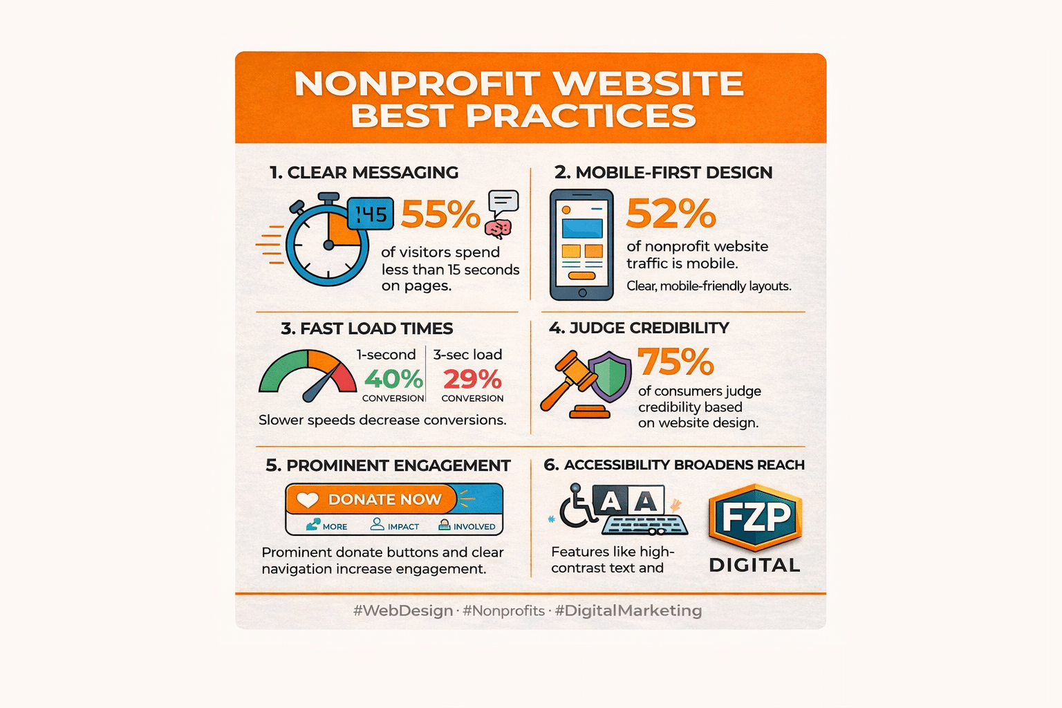
- Mobile-First Design – 52% of nonprofit traffic comes from mobile devices; your site must work flawlessly on every screen
- Prominent Donation Features – Make giving easy with visible “Donate” buttons, simple forms, and recurring gift options
- Fast Load Times – Pages loading in 1 second see 40% conversion rates vs. 29% at 3 seconds
- Accessibility for All – High-contrast text, keyboard navigation, and screen reader support welcome everyone
- Trust Signals – 75% of people judge your credibility based on your website design
You’re pouring your heart and soul into your mission, and your website should be your most powerful megaphone—not a confusing maze. But where do you even start?
It can feel overwhelming, right? Don’t worry. We’re going to break it down, step-by-step, and look at some amazing examples to get your creative juices flowing.
A great nonprofit website isn’t just about looking pretty; it’s about connecting with people, telling your story, and making it incredibly easy for them to join your cause.
When someone lands on your homepage, they shouldn’t feel like they’ve stepped into a maze of tabs, tiny fonts, and endless scrolling. Remember: 55% of visitors spend less than 15 seconds on a webpage. That’s your window to make an impression.
The good news? You don’t need a Silicon Valley budget to create a website that drives real impact. You need smart design choices, authentic storytelling, and a clear path for supporters to take action—whether that’s donating, volunteering, or simply learning more about your cause.
I’m Fred Z. Poritsky, founder of FZP Digital, and I’ve spent years helping nonprofits and organizations in the Philadelphia area transform their digital presence through best website design for nonprofits that actually converts visitors into supporters. My unique background—combining nonprofit financial management, accounting, and web design—gives me insight into both the mission side and the technical side of building websites that truly serve your cause.

Key best website design for nonprofits vocabulary:
The Heart of Your Site: Essential Elements for Connection and Trust
Think of your website as your digital front door. Is it welcoming? Does it clearly say who you are and what you stand for? Let’s make sure visitors don’t just stop by, but feel compelled to come inside and stay a while.
When someone first lands on your site, they’re not looking to read a novel. They’re scanning, absorbing bits of information, and trying to quickly understand if your mission resonates with them. In fact, research from the Nielsen Norman Group reveals that a staggering 79% of users scan content, while only 16% read every word. This means your message needs to be crystal clear and emotionally impactful from the get-go.
Compelling Storytelling: Your Mission, Your “Why”
Your mission isn’t just a statement; it’s the beating heart of your organization, your “why.” A great nonprofit website doesn’t just list what it does; it tells a story. It paints a picture of the problem you’re solving and the positive change you’re creating. This emotional connection is what turns a casual visitor into a passionate advocate.
We believe in using impactful visuals and concise, scannable copy to immediately convey your purpose. For example, featuring an image of a child smiling in a classroom or a restored natural habitat can tell a powerful story without needing many words. It helps visitors quickly grasp the essence of your work and feel a connection to your cause.

Crystal-Clear Navigation: Your User Experience (UX) Blueprint
Have you ever landed on a website and felt instantly lost? We want to avoid that! A simple, intuitive menu (think “About Us,” “Our Work,” “Get Involved,” “Donate”) helps people find what they need without getting frustrated. When we approach user-focused design, we’re always thinking about the visitor’s journey. Is it easy for them to learn about your programs, find volunteer opportunities, or make a donation?
A prominent “Donate” button, ideally in your header or main navigation, is non-negotiable. It should be impossible to miss. A bloated website with too many pages, confusing navigation, and dense copy doesn’t inspire action; it drives people away. We want to guide them effortlessly to where they need to go.
Strong, Consistent Branding: Building Trust at a Glance
Your brand is more than just a logo; it’s the entire identity of your organization—your colors, fonts, images, and even the tone of your voice. Consistency builds trust. Research shows that 75% of online consumers would trust an organization based on its website design. A cohesive brand identity makes you look professional, reliable, and serious about your mission.
From your logo to your chosen color palettes and image styles, every element should reinforce who you are. We can help you develop a distinctive voice that reflects how you want supporters to perceive your organization. Learn more about Brand Identity Design and how it can lift your nonprofit.
Proof of Impact: Showing, Not Just Telling
Donors and supporters want to know their contributions make a difference. That’s why showcasing your impact is so crucial. Don’t just tell them you’re doing good; show them the tangible results. This could be through:
- Statistics: “We’ve helped 5,000 families this year.”
- Testimonials: Heartfelt quotes or video stories from those you’ve helped.
- Annual Reports: Transparently sharing how funds are used and what’s been achieved.
Nonprofits that clearly report on programs, outcomes, and use of funds build immense trust and encourage continued support. When you share real numbers, real stories, and real results, visitors feel confident that their time and donations are genuinely moving the needle.
How to tell your story and connect with your audience effectively
Your story is your superpower. It’s not just about what you do, but why you do it. It’s the emotional core that inspires people to act. To truly connect, you need to be authentic.
- Authenticity: Use real photos and videos of the people you help, your volunteers, and your team in action, not generic stock images. This creates a genuine emotional connection that stock photos simply can’t replicate.
- Video Stories: Short, compelling videos can convey emotion and impact in a way text alone cannot. Consider showcasing testimonials or behind-the-scenes glimpses of your work.
- Personal Testimonials: Share powerful quotes and stories from individuals whose lives you’ve touched. This puts a human face on your mission and allows visitors to see the real-world impact of your work.
We understand the power of visual identity in storytelling. See how we help clients develop their visual identity to ensure your website truly reflects the heart of your mission.
Why simple navigation is a game-changer for user experience
A good website’s navigation should be like a friendly guide, not a confusing labyrinth. A good rule of thumb: can a first-time visitor figure out how to donate or volunteer in under 10 seconds? If not, it’s time to simplify.
- User-Friendly Menus: Keep your main navigation clear, concise, and intuitive. Avoid overwhelming visitors with too many options.
- Minimal Clicks: Aim for visitors to reach their desired information or action (like donating) in as few clicks as possible.
- Clear Labels: Use straightforward language for menu items. Instead of jargon, think “Our Programs,” “How to Help,” or “Our Impact.”
- Mobile Navigation: With 52% of all visits to nonprofit websites coming from mobile devices, your mobile menu is just as important, if not more so, than your desktop one. It needs to be easy to tap and steer on smaller screens. Ever wondered about the “hamburger” menu icon? Our own Fred Z. Poritsky explains it in his Fredtalks: The Hamburger video!
Inspiring Action: Real-World Nonprofit Website Inspiration
Okay, enough theory! Let’s look at some real-world examples of nonprofit websites that are absolutely nailing it with their design and impact. We’ll break down what makes them so effective and what you can borrow for your own site. These examples demonstrate the best website design for nonprofits in action.

Best for Storytelling & Visuals: Impactful Nonprofit Sites
Some nonprofit websites grab you from the first second with stunning photography and videography. They don’t just tell you they’re making a difference; they show you.
Think about elements like:
- Hero videos that immediately drop you into your mission
- High-quality imagery that feels real and human
- Impact maps that show where your work is happening
- Individual stories that highlight the people behind the numbers
When you combine strong visuals with a clear, emotionally resonant message, visitors understand your “why” almost instantly—and that’s what makes them want to learn more, share, or give.
Best for Donor Experience & Clear CTAs: Seamless Giving Journeys
The best nonprofit sites make donating a seamless, inspiring, and reassuring process. They understand that every click counts. Notice how effective donation experiences usually include:
- Urgent, action-focused headlines that explain why giving now matters
- Simple, uncluttered donation forms
- Suggested giving levels plus the option to choose a custom amount
- Recurring giving options (monthly, quarterly, annually)
- A clear sense of what each gift level makes possible
When your “Donate” buttons are prominent, your forms are easy to complete, and supporters know exactly how their gift will be used, you remove friction and build confidence. That combination is what turns intent into action.
Best for Accessibility & Inclusivity: Welcoming Everyone
A truly great website is one that everyone can use. The most effective nonprofit sites prioritize accessibility, ensuring that people with disabilities can steer and interact with their content. This isn’t just good practice; in many cases, it’s a legal requirement under guidelines like the Americans with Disabilities Act (ADA).
Some powerful accessibility and inclusivity features to consider:
- Multi-language options so more people in your community can fully understand your content
- High-contrast text so pages are readable for people with low vision
- Keyboard navigation for visitors who can’t use a mouse
- Clear headings and logical page structure so screen readers can interpret your content correctly
- Alt text for images so people using assistive technology can still understand your visuals
- Interactive tools and maps that are built with accessibility in mind
We are passionate about creating inclusive digital experiences. Learn about our Web Accessibility services and how we can help your nonprofit reach everyone.
Your Website Toolkit: Making It All Happen (Without Breaking the Bank)
Feeling inspired but also a little worried about the “how”? Deep breaths. You don’t need a Silicon Valley budget to create a high-performing website. It’s all about being smart with your resources and choosing the right tools and partners to bring your vision to life.
WordPress: Your Versatile Content Management System (CMS)
Have you heard of WordPress? There’s a good reason why a whopping 58% of nonprofits use WordPress.org as their Content Management System (CMS). It’s a free, open-source software that offers incredible flexibility. Think of it as a powerful, endlessly customizable foundation for your digital home. With a huge world of plugins (for adding features like event calendars or donation forms) and themes (for styling your site), WordPress can be custom to fit almost any need.
At FZP Digital, we’re huge fans of WordPress, and we specialize in WordPress Website Design Best Practices. We use its power to build robust, scalable, and easy-to-manage websites for nonprofits right here in the Philadelphia and Bucks County areas.
Mobile-First Design: Because Everyone’s on Their Phone
We’ve said it before, and we’ll say it again: your website must be mobile-friendly. With 52% of all nonprofit website traffic coming from mobile devices, it’s not an option; it’s a necessity. A Responsive Website Design automatically adjusts your content to look great and function perfectly on any screen size, from a big desktop monitor to the smartphone in your supporter’s hand.
This means big, touch-friendly buttons, text that’s easy to read without pinching and zooming, and super-fast loading times. Did you know that when pages load in just 1 second, the average conversion rate is almost 40%? But at 3 seconds, it drops to 29%. Every second counts when it comes to keeping visitors engaged and inspiring them to donate!
Accessibility: A Must for Inclusivity and Compliance
A great website is a website that everyone can use. Beyond just being the right thing to do, accessibility is crucial for nonprofits. Legal regulations like the ADA require websites to be accessible to all visitors, including those with disabilities. Not meeting these guidelines can even lead to legal trouble.
Following the Web Content Accessibility Guidelines (WCAG) helps you create a welcoming online space for all. This includes things like providing “alt text” for images (so screen readers can describe them), ensuring your text and background colors have enough contrast, and making sure your site can be steerd with just a keyboard. It’s surprising that only 22% of nonprofits have websites designed for those with visual and hearing disabilities. By prioritizing accessibility, you not only expand your reach but also live out your mission of inclusivity.
Donation Tools & Website Platforms: Making Giving Easy
Your donation process should be as smooth and painless as possible. You can use dedicated donation platforms like Donately that integrate into your site, offering customizable forms and recurring gift options.
But what about the website platform itself? Choosing the right one is a big decision. Here’s the thing: while there are various DIY website builders out there, they often come with significant limitations that can hold your nonprofit back as you grow. That’s why we’re such strong advocates for WordPress – it’s the professional-grade platform that gives you room to expand without hitting a ceiling.
Think of it this way: DIY builders are like renting an apartment – you’re limited by what the landlord allows. WordPress is like owning your own home – you have complete control and can renovate however you need. DIY options might seem easier at first, but nonprofits often find themselves outgrowing these platforms quickly. They hit walls with customization, struggle with SEO limitations, and find themselves paying more in the long run for features that WordPress offers freely.
We frequently help organizations migrate from restrictive platforms to WordPress, giving them the power, flexibility, and professional features they need to truly thrive online. It’s amazing to see how much more they can accomplish when they’re not held back by platform limitations!
Choosing the right platform is about balancing your budget, technical comfort level, and long-term goals. That’s where having an experienced partner like FZP Digital makes all the difference – we help you make the smart choice from day one, setting you up for sustainable growth rather than future headaches.