

Your Brand Mark Is the Silent Ambassador of Your Business
A brand mark is a symbol, image, or graphic that represents your business — with no text required. Think of the swoosh that makes you think of athletic excellence, or the arrow-shaped smile that signals a package is on its way. No words needed. Just a shape, and your brain does the rest.
That’s the power of a great brand mark.
Here’s a quick breakdown of what a brand mark is and how it compares to similar terms:
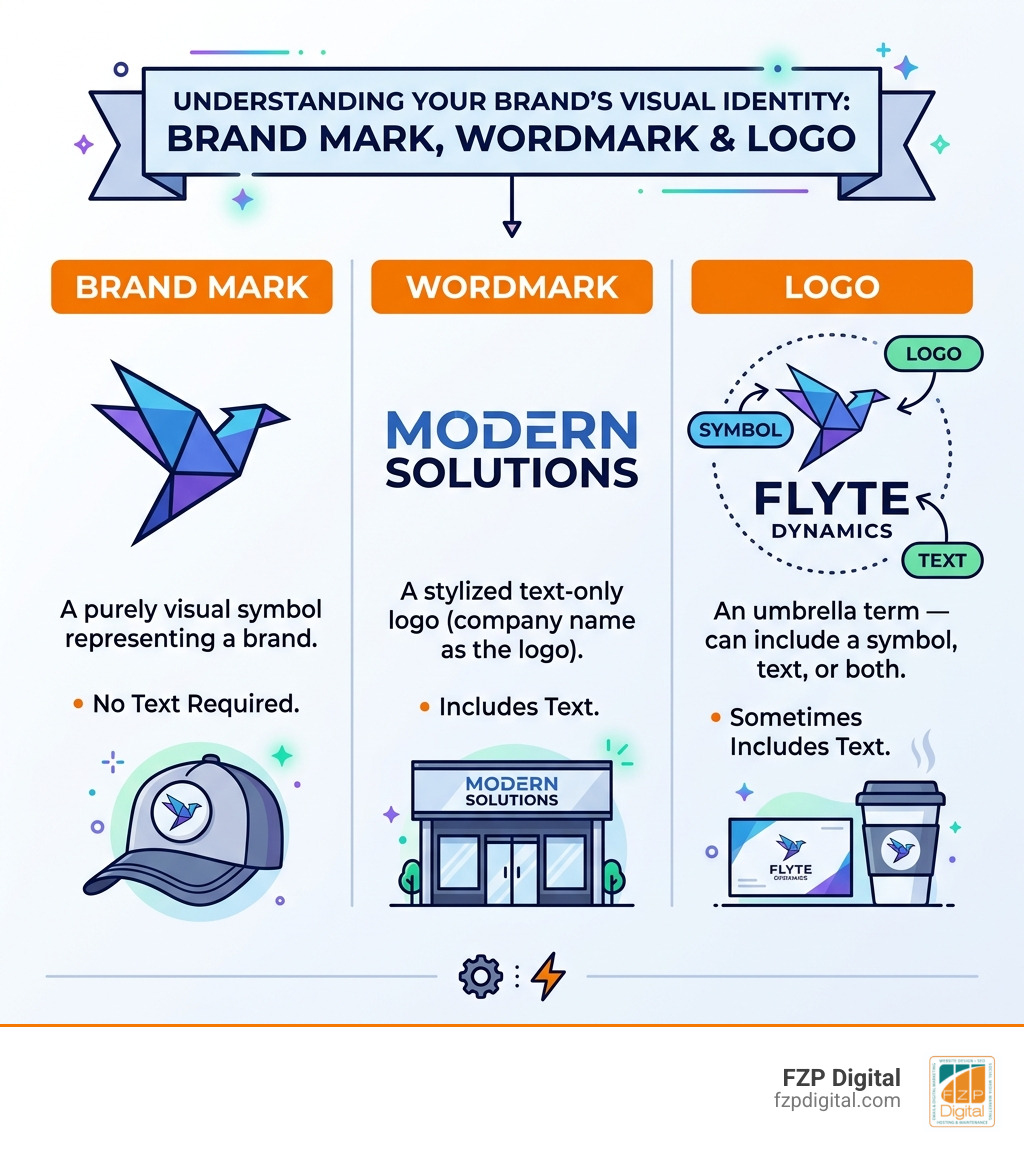
| Term | What It Is | Includes Text? |
|---|---|---|
| Brand Mark | A purely visual symbol representing a brand | No |
| Wordmark | A stylized text-only logo (company name as the logo) | Yes |
| Logo | An umbrella term — can include a symbol, text, or both | Sometimes |
So if you’ve been using “logo” and “brand mark” interchangeably, you’re not alone — but they’re not quite the same thing.
Here’s why this matters for your business: 65% of people are visual learners. A strong brand mark taps directly into how most of your potential customers actually process and remember information. It’s not just a pretty graphic. It’s a memory trigger, an emotional cue, and a trust signal — all rolled into one compact image.
And yet, so many small businesses in the Philadelphia area either skip the brand mark entirely, slap together something generic, or end up with a symbol that looks like every competitor on the block.
That’s exactly what this guide is here to help you fix.
I’m Fred Z. Poritsky, founder of FZP Digital — a digital marketing agency built on decades of experience in business, finance, and creative strategy — and I’ve helped businesses of all sizes think through what a meaningful brand mark actually looks like in practice. If you’re ready to stop blending in, let’s dig in.
Simple guide to brand mark:
What Exactly is a Brand Mark?

When we talk about a brand mark, we are talking about the “soul” of your visual identity. Technically speaking, a brand mark is a design element—such as a symbol, icon, or graphic—that identifies a brand without using its name. It is the non-verbal part of your branding.
Think about it: if you saw a small blue bird icon, you’d immediately think of a specific social media platform. You do not need to read the name to know who it is. That is the magic of visual identity and branding in design. It allows a company to communicate its essence, values, and energy through a single, static image.
Brand Mark vs. Logo: What’s the Real Difference?
It’s easy to get these confused, but here is a simple way to look at it: every brand mark is part of a logo, but not every logo is a brand mark.
A logo is the “whole package.” It might include a wordmark (the company name in a specific font) and a symbol. When you strip away the words and are left with just the graphic emblem, you have the brand mark. For many businesses in Philadelphia and Bucks County, having a standalone mark is vital because it offers versatility. It can be used as a social media profile picture, a favicon on a website, or an embroidered hit on a polo shirt where text might be too small to read. Understanding these brand identity design services is the first step toward building a professional presence.
How a Brand Mark Influences Consumer Memory
Why do we put so much emphasis on a symbol? Because our brains are wired for it. Statistics show that 65% of people are visual learners. We process images 60,000 times faster than text!
When you use a consistent brand mark, you are helping your customers build “brand recall.” This is the ability of a consumer to remember your brand when prompted by a category. If you’re a local contractor in Newtown or a boutique in Richboro, you want people to see your symbol and immediately think of the quality service you provide. Successful luxury logos work because they evoke an emotion—prestige, speed, or reliability—the moment they hit the eye.
The Evolution of the Brand Mark: From Ancient Symbols to Modern Icons
The history of the brand mark is actually quite fascinating—and a bit rugged! The word “brand” itself comes from the Old Norse word brandr, which means “to burn.”
As far back as 2700 BCE, ancient Egyptians were branding livestock to indicate ownership and prevent theft. This was the earliest form of a brand. It wasn’t about marketing back then; it was about “This is mine.” Similarly, ancient potters would engrave a unique mark) on the bottom of their ceramics to identify their handiwork.
From Medieval Guilds to the Industrial Revolution
As society moved into the Middle Ages, hallmarks) became the standard for gold and silver. Guilds used these marks to certify the quality and origin of goods. If a sword or a piece of jewelry didn’t have the right mark, it wasn’t trusted.
The real explosion happened during the Industrial Revolution. With the rise of mass production, companies needed a way to stand out on crowded shelves. In 1876, Bass Brewery’s red triangle became the first registered trademark in the UK. This shifted the brand mark from a sign of ownership to a tool for competition and marketing.
Modernism and the “Less is More” Movement
In the mid-20th century, designers like Paul Rand revolutionized the industry by championing simplicity. The “Modernist” movement taught us that a brand mark should be stripped of all unnecessary detail.
Today, in our digital-first world, this is more important than ever. Your mark needs to look just as good on a giant billboard in Downtown Philadelphia as it does on a tiny smartphone screen. This “less is more” approach is a core part of our logo design Philadelphia guide, focusing on scalability and instant recognition.
Designing for the Ages: Best Practices and Common Pitfalls
Creating a brand mark that lasts decades rather than months requires a strategic approach. You aren’t just looking for something “cool”—you’re looking for something timeless. At FZP Digital, we always tell our clients in Richboro and Philadelphia that a great mark should be simple, memorable, and versatile.
If you try to pack too many ideas into one small icon, it becomes a “visual mess.” Think about the most famous marks in the world—they are often just one or two shapes. To make a mark that truly resonates, you have to find the “heart” of your business and distill it down to its simplest form.
The Dos and Don’ts of Visual Consistency
Consistency is the “secret sauce” of branding. If you change your colors or stretch your logo to fit a space, you’re diluting your brand’s power.
| Feature | The “Do” | The “Don’t” |
|---|---|---|
| Aspect Ratio | Maintain original proportions always | Never stretch or “squish” the mark |
| Color | Use your approved brand palette | Don’t use random colors for “fun” |
| Legibility | Ensure it works in black and white | Don’t add complex gradients that disappear |
| Spacing | Give the mark “room to breathe” | Don’t crowd it with text or other icons |
If your current symbol feels a bit dated, you might not need a total overhaul. Sometimes, you just need to give your logo a glow-up by simplifying the lines or updating the color palette to modern standards.
Integrating Your Mark into a Broader Identity System
A brand mark doesn’t live in a vacuum. It’s part of a larger family that includes your fonts, your colors, and even the “voice” of your writing.
When we help a client develop a unique brand identity, we look at color psychology—for example, blue often conveys trust, while red can signal energy or passion. Your brand mark should feel like it “belongs” with your typography and website design. This creates a unified experience that makes your business look professional and established.
Protecting Your Identity: Trademarks and Legal Essentials
Once you have a brand mark you love, you need to protect it. This is where trademarks come in. A trademark is a legal protection that identifies the source of your goods or services and distinguishes them from others.
In the United States, you gain some “common law” rights just by using your mark in business. However, registering your mark with the USPTO provides much stronger, nationwide protection. It prevents others from using a “confusingly similar” mark in your industry. While there is a cost involved, it’s often much cheaper than fighting a legal battle later. We often discuss these brand identity design costs with our clients to ensure they are making a smart long-term investment.
Navigating the World of AI-Powered Design Tools
You’ve probably seen the rise of AI logo generators lately. These tools can be a fun way to brainstorm ideas or get a quick start if you’re a startup on a tight budget.
However, there’s a catch. AI tools often rely on templates, which means your “unique” symbol might look very similar to a thousand other businesses. A brand mark should be a reflection of your specific story and mission. While AI can assist in the process, the human touch—the strategy, the local market knowledge, and the creative intuition—is what turns a generic icon into a powerful brand asset.
Frequently Asked Questions about Brand Marks
Can a brand mark exist without a company name?
Absolutely! Think of Apple or Target. However, this usually happens after years of consistent marketing. For smaller businesses in Philadelphia, we recommend using a “lockup”—which is your brand mark and company name together—until your symbol becomes widely recognized on its own.
How do I know if my brand mark is too complex?
Try the “business card test.” Shrink your mark down to the size of a postage stamp. If you can’t tell what it is, or if the details become a blurry smudge, it’s too complex. A great brand mark should be recognizable even if it’s small or printed in a single color.
Is a brand mark the same as a trademark?
Not exactly. A brand mark is a design element. A trademark is a legal status. You can have a brand mark that isn’t trademarked, but you cannot have a trademarked symbol that isn’t some form of a mark!
Conclusion: Ready to Make Your Mark?
Building a business is hard work, but you don’t have to do it alone. Whether you’re located in Newtown, Richboro, or right in the heart of Philadelphia, your visual identity is often the first thing a potential customer sees. It’s your handshake before you even meet.
At FZP Digital, Fred Z. Poritsky and our team specialize in taking the “vibe” of your business and turning it into a professional, responsive, and memorable brand. We don’t just “make logos”—we develop identities that help you grow. Our collaborative “Develop . Design . Deliver” process ensures that you are involved every step of the way, resulting in a brand mark that you’re proud to put on everything from your website to your front door.
If you’re ready to stop blending in and start standing out, we’d love to chat. Check out our complete guide to branding for more deep dives, or start your branding journey today by reaching out to us for a consultation. Let’s make something great together!