

Steal These Ideas: ADA Compliant Website Examples That Actually Look Good
Good Design Includes Everyone: A Look at Web Accessibility Examples That Work
Web accessibility examples are everywhere once you know what to look for — from the “skip to main content” link that appears when you press Tab on GOV.UK, to the thick focus borders on Scope’s charity site, to the perfectly written alt text on Apple’s product pages.
Here’s a quick look at some of the best real-world web accessibility examples to inspire your next project:
| Website | Standout Accessibility Feature |
|---|---|
| BBC | Inclusive design principles, skip links, and responsive fluid layouts |
| GOV.UK | Plain English, ARIA landmarks, keyboard navigation, and auto-focus on forms |
| NHS.uk | High contrast, large readable text, plain language, and consistent navigation |
| Barclays | Visible skip links on first tab, bold focus styles, and tailored support details |
| Patreon | Screen reader support, keyboard-first navigation, and semantic HTML structure |
| Costco | Content-driven accessibility, clear selected states, and keyboard-operable checkout |
| Apple | Detailed alt text, captions, audio descriptions, and voice control support |
But here’s the thing most people miss: the best accessibility features are nearly invisible to users who don’t need them — and absolutely essential to those who do.
Roughly 16% of the world’s population lives with some form of disability. If your website isn’t built with accessibility in mind, you’re quietly turning away a massive slice of your potential audience — customers, donors, or clients who simply can’t use what you’ve built.
And in April 2026, the stakes got even higher. The U.S. Department of Justice now requires all public university digital content to meet WCAG 2.1 accessibility standards — a signal of where broader compliance expectations are headed for businesses of all sizes.
I’m Fred Z. Poritsky, founder of FZP Digital, and after years of building WordPress websites for businesses and nonprofits across the Philadelphia area, web accessibility examples have become a core part of how I approach every design project. In the list below, I’ll walk you through the sites doing it best — and show you exactly what you can borrow for your own.
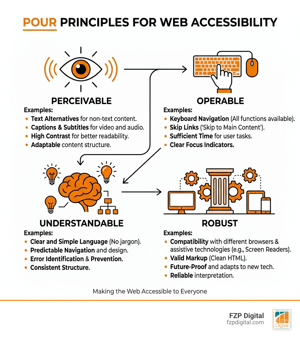
Terms related to web accessibility examples:
Why Web Accessibility Matters in 2026
If you’ve ever tried to navigate a website while the sun was glaring off your phone screen, or tried to watch a video in a noisy coffee shop without headphones, you’ve experienced a “situational disability.” This is the secret sauce of inclusive design: when we build for people with permanent disabilities, we actually make the web better for everyone.
What is Web Accessibility? At its heart, it’s about removing barriers. Whether someone is using a screen reader because they’re blind, a “switch” device because of motor impairments, or simply needs high contrast because of low vision, your website should welcome them.
In 2026, this isn’t just a “nice to have.” As of April 24, 2026, the U.S. Department of Justice has mandated that public university content meet strict WCAG 2.1 standards. For businesses in Philadelphia, Newtown, and Richboro, this signals a major shift. The legal landscape is tightening, and making your website ADA compliant the easy way is now a business priority.
Beyond the law, learning how website accessibility can help grow your brand is just good business. Did you know that 58% of business leaders say digital accessibility drives business impact? Plus, search engines love accessible sites. A clear heading structure and proper alt text don’t just help screen readers; they tell Google exactly what your page is about. To see where you stand, checking a WebAIM’s WCAG 2 Checklist is a great first step.
The Legal and Moral Landscape
We often talk about the “stick”—the lawsuits and the European Accessibility Act requirements—but let’s talk about the “carrot.” Access to information is a basic human right recognized by the UN. When we ignore accessibility, we’re essentially putting a “No Entry” sign on our digital front door for one in four adults.
Whether it’s Section 508 for government contractors or ADA Title III for local shops in Bucks County, the goal is social inclusion. At FZP Digital, we believe that every click should be an open door.
5 Gold-Standard Web Accessibility Examples to Inspire You

Looking for inspiration? You don’t have to sacrifice style for function. In fact, the most accessible websites on the internet ranked often feature the cleanest, most modern designs. Here are some of our favorite web accessibility examples that prove beauty and compliance go hand-in-hand.
- The BBC: They pioneered responsive design, ensuring their site looks great whether you’re on a massive monitor or a small smartphone. Their use of “skip to content” links and fluid layouts makes them a benchmark for 13 modern accessible website examples to inspire you.
- Scope: This disability equality charity doesn’t just talk the talk. Their site features thick, highly visible focus borders that make it impossible to lose your place while tabbing through with a keyboard.
- Patreon: A great example of a modern B2B/B2C hybrid that uses semantic HTML to ensure screen readers can easily navigate creator pages.
- Barclays: This banking giant provides tailored support details and bold focus styles, proving that even high-security financial sites can be inclusive.
- Apple: Known for aesthetics, Apple’s site is a masterclass in descriptive alt text. They describe their products with such detail that a screen reader user gets the same “premium” feel as a sighted visitor.
How Government Sites Master Web Accessibility Examples
Government sites like GOV.UK and NHS.uk are often the gold standard because they have to be. They serve everyone, often during stressful times. Their secret? Utilitarian design that prioritizes “cognitive ease.”
They use plain English (aiming for an 8th-grade reading level), high contrast, and ARIA landmarks that act as digital signposts. Even here in our neck of the woods, the Digital Standards for the City of Philadelphia emphasize that functional design is the most beautiful design when you’re looking for essential info.
Commercial Web Accessibility Examples: E-commerce Done Right
Think e-commerce can’t be accessible? Look at Costco. They focus on “content-driven” accessibility. This means clear selected states (you always know which button you’re about to click) and a checkout process that is fully keyboard-operable.
If you’re worried about your shop’s compliance, FZP Digital UserWay web accessibility solutions can help bridge the gap. An accessible checkout means fewer abandoned carts. If a customer can’t navigate your “Pay Now” button with their keyboard, you’ve lost the sale.
The “Invisible” Features of Accessible Design

Many of the best web accessibility examples involve things you can’t even see. This is where the code does the heavy lifting. How to design for everyone and their screen reader starts with semantic HTML—using tags like Using the Checklist from The A11Y Project is a brilliant way to ensure you aren’t missing these “invisible” essentials like ARIA landmarks, which tell screen readers exactly what a section of the page does. Ever tried to read a book where the chapters were in random order? That’s what an illogical heading hierarchy feels like to a screen reader user. You should always use H1 for your title, followed by H2 for main sections, and H3 for subsections. Never skip a level just because you like the font size of an H4 better! Breadcrumbs and descriptive link text are also vital. Instead of saying “click here,” use descriptive phrases like “Download our 2026 Accessibility Guide.” This gives users context and helps them navigate with confidence. If you have video, you need captions. It’s estimated that one in eight people has some form of hearing loss. But captions also help people in quiet libraries or loud trains! Other best practices include: Maintaining an accessible site isn’t a “one and done” project; it’s an ongoing commitment. A professional website accessibility audit is the best way to find the “keyboard traps” or missing alt text that automated tools might miss. While tools like WAVE and Lighthouse are fantastic for a quick scan, they only catch about 30-40% of issues. Manual testing—literally trying to use your site with only the Tab key—is where the real insights happen. To keep your site in tip-top shape, we recommend a mix of: The most frequent offenders are missing alt text on images (which leaves screen reader users in the dark), poor color contrast, and “keyboard traps” where a user can get into a menu but can’t get back out. Using non-descriptive links like “read more” is also a major hurdle. Yes. Under ADA Title III, websites are considered “places of public accommodation.” Even if you’re a small boutique in Newtown, you’re expected to provide equal access. Beyond the legal risk, it’s about brand reputation—being known as a business that cares about everyone. Absolutely! Some of the most stunning sites today use “dark mode” support and fluid layouts, which are inherently more accessible. High-quality typography and generous white space don’t just look “premium”—they make your content easier to read for everyone. Creating a website that works for everyone isn’t just about checking boxes or avoiding lawsuits—it’s about empathy. It’s about ensuring that a veteran in Philadelphia with a service-connected disability or a senior in Richboro with declining vision can use your services just as easily as anyone else. At FZP Digital, we don’t think you should have to choose between a gorgeous website and an accessible one. Our founder, Fred Z. Poritsky, takes a collaborative “Develop . Design . Deliver” approach to ensure your WordPress site is a shining example of inclusive design. Ready to make your corner of the internet a little more welcoming? Whether you need a fresh logo, a boost in organic search rankings, or a comprehensive accessibility audit, we’re here to help you navigate the complexities of the digital world. Let’s build something beautiful—for everyone., , and
WCAG Level
What it Means
Business Context
Level A
Basic accessibility
The bare minimum; many barriers still exist.
Level AA
The Global Standard
Required for most legal compliance (ADA/EAA).
Level AAA
The Gold Standard
Specialized support for the most inclusive experience.
Mastering Navigation and Structure
Media and Interaction Best Practices
How to Audit and Maintain Your Site’s Compliance
Tools for Success
Frequently Asked Questions about Web Accessibility
What are the most common accessibility barriers?
Is web accessibility a legal requirement for small businesses?
Can an accessible website still look modern and beautiful?
Conclusion