
5 Simple Steps to Find Logos with Names You’ll Love
Finding the perfect design for your brand name can feel overwhelming when you’re staring at thousands of font combinations. But when you break the creative process down into simple, manageable steps, it becomes an exciting journey of discovery. Whether you’re starting a new local business in Philadelphia or refreshing an established brand in Bucks County, here is our proven step-by-step guide to discovering logos with names that truly represent your vision.
Step 1: Understand Wordmarks, Monograms, and Brand Recognition
Before diving into font choices or visual styles, it helps to understand why text-based logos are so effective. A name logo—often referred to as a wordmark or logotype—relies entirely on typography, spacing, and color rather than graphic icons to build brand equity.
When you focus on your company’s actual name, you eliminate friction for your audience. People don’t have to guess who you are or translate an abstract symbol into a business identity. They simply read your name and instantly remember it.
Here are the main categories of name-based logos you can choose from:
- Wordmarks (Logotypes): These feature your full company or personal name written out in custom or tailored typography. Think of global tech powerhouses like Google or Coca-Cola. Wordmarks work exceptionally well if your business name is short, distinctive, and easy to pronounce.
- Lettermarks: If your business name is on the longer side (like British Broadcasting Corporation becoming BBC), a lettermark condenses your full name into clean, recognizable initials.
- Monograms: Monograms take lettermarks a step further by overlapping, interlacing, or artfully arranging two to four letters. Overlapping monograms create a high-end, classic signature look that works beautifully for personal brands, creative studios, and professional service providers.
When building early brand recognition, keeping your design simple and uncluttered gives you a massive advantage. If you want to explore how minimalism creates lasting impact, check out our guide on Minimalist Logo Design Secrets For Bold Brands. Choosing the right style is the foundation of building a cohesive visual strategy, which we dive into deeper in The Ultimate Guide To Creative Logo Design And Brand Identity.
Step 2: Draw Inspiration from Famous Brand Logos with Names
When you look at the world’s most recognized brands, you’ll quickly notice that many of them rely entirely on their names or simple monograms. Studying these iconic examples gives us clear clues on how simple text can carry enormous weight and meaning.
Let’s take a look at a few famous examples and what we can learn from them:
- FedEx: This classic wordmark is world-famous for its clever use of negative space. If you look closely between the letters ‘E’ and ‘x’, you’ll spot a hidden arrow pointing forward, which subtly reinforces the brand’s commitment to speed and movement.
- Google: By using primary colors for most of its letters and dropping a single secondary color (green) on the letter ‘l’, Google playfully signals that it doesn’t always follow rigid rules.
- Shell: Dating back to its original trademark in 1900—which is the oldest of over 22,000 trademarks owned by the company today—Shell has demonstrated how maintaining long-term visual heritage builds incredible trust across generations.
- Nike: While famous for its Swoosh (designed by student Carolyn Davidson in 1971 for just $35), Nike frequently pairs its iconic mark with strong, bold typography that conveys energy and athleticism.
- Founder-Named Luxury Brands: Iconic houses like Chanel, Prada, and Gucci demonstrate how family last names paired with clean monograms or geometric serif typography can evoke timeless elegance and heritage. To learn more about how top fashion houses craft their identities, explore our article on The Most Famous Luxury Logos And What They Mean.
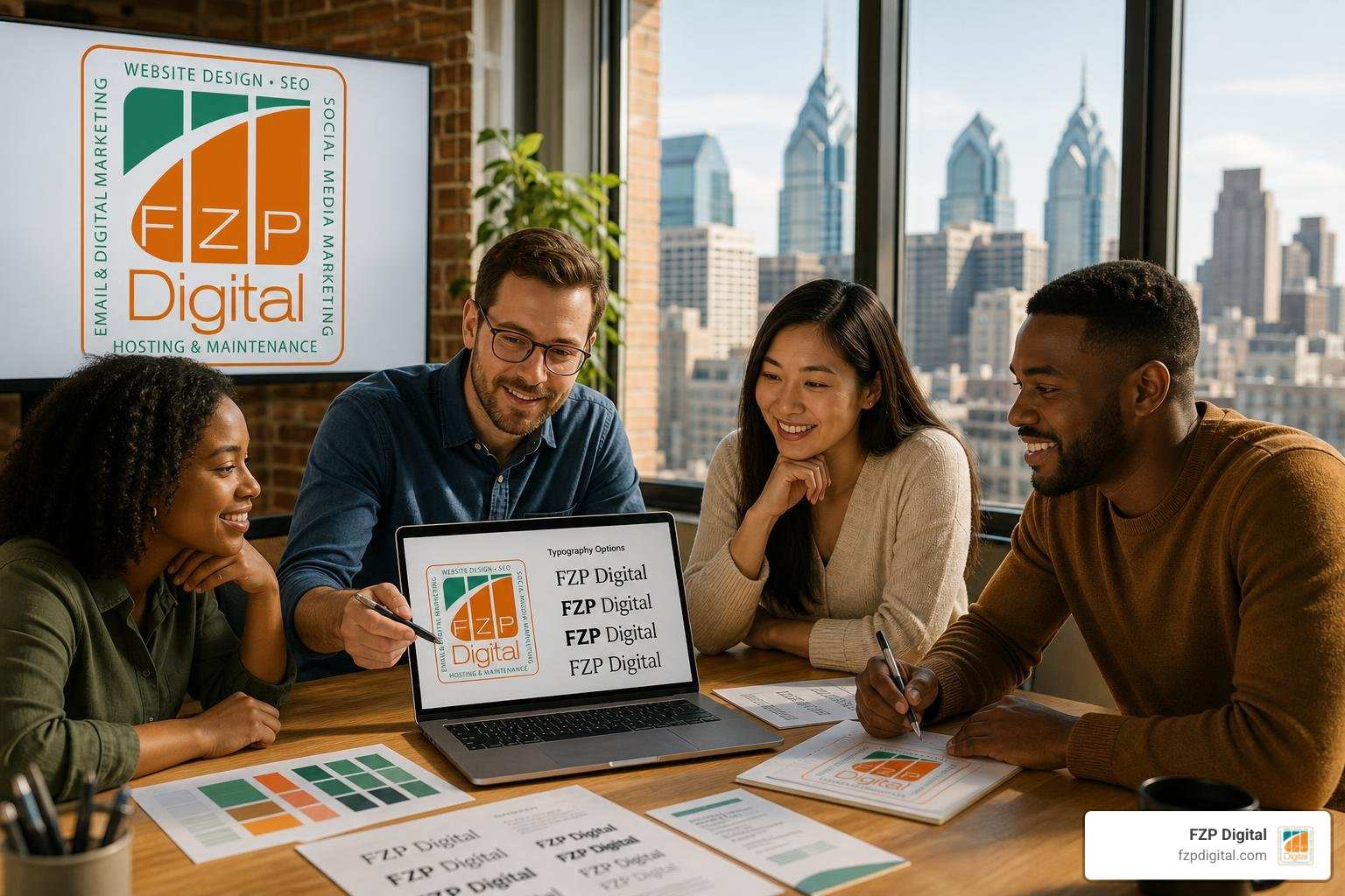
What do all these famous logos have in common? They keep things clean, readable, and focused. They don’t overcrowd the layout with unnecessary graphics. Instead, they rely on small, intentional details to leave a memorable impression.
Step 3: Select Typography and Color Psychology
Typography is the heart and soul of any name-based logo. The font family you choose acts as your brand’s voice before a customer even reads a word of text.
To help you match your brand’s personality with the right typographic style, we’ve broken down the main font families below:
| Font Category | Visual Characteristics | Emotional Perception | Best Industry Fit |
|---|---|---|---|
| Serif | Decorative feet or strokes at the ends of letters | Heritage, trust, authority, traditional elegance | Law firms, financial advisors, luxury, academic institutions |
| Sans-Serif | Clean, modern lines without decorative strokes | Modernity, simplicity, innovation, approachability | Tech startups, digital agencies, modern retail, lifestyle brands |
| Script | Fluid, calligraphic, or handwritten letterforms | Elegance, personal connection, warmth, creativity | Boutiques, wedding services, artisan goods, personal brands |
| Display / Bold | Strong, high-contrast, geometric or condensed forms | Confidence, energy, strength, boldness | Fitness centers, athletic gear, entertainment, media networks |
Beyond selecting the overall font style, fine-tuning letter spacing (known as tracking) and adjusting the space between individual letter pairs (known as kerning) makes a world of difference. Giving your letters a bit of room to breathe can transform an ordinary font into a refined, high-end mark.
The Power of Color Psychology
Did you know that strategic color choices can boost brand recognition by up to 80%? Color triggers instant emotional responses in our brains:
- Blue: Symbolizes security, trust, stability, and professional integrity.
- Red: Evokes passion, energy, urgency, and excitement.
- Green: Communicates growth, health, sustainability, and tranquility.
- Black & Gold: Signifies luxury, exclusivity, sophistication, and prestige.
When pairing typography and color, ensure there is high contrast so your name remains crystal clear whether it’s printed on a business card or displayed on a mobile screen.
Step 4: Test Online Tools and Preview Logos with Names
Once you have an idea of the styles, fonts, and colors you like, it’s time to start experimenting with visual ideas! Interactive prototyping tools make it easy to quickly see how your business name looks across different typography arrangements and layout configurations.
Here are two fantastic online utilities to kickstart your creative brainstorming:
- Text Layout & Tagline Testing: Using tools like designerdahlia: Text-Only Logo Preview Tool allows you to type in your brand name alongside a tagline. You can easily test horizontal versus stacked layouts, tweak letter spacing parameters, adjust font weights, and see how your name looks in title case or all caps.
- Monogram Prototyping: If you are leaning toward an initial-based mark, the Best Overlapping Name Logo Generator | Vondy helps you visualize overlapping letter combinations. Overlapping logos tend to look best when limited to two to four letters, keeping the mark clean, elegant, and instantly recognizable.

Testing different layouts gives you immediate clarity on what works and what doesn’t. You’ll quickly see if your brand name looks better stacked vertically or laid out in a single horizontal line, helping you narrow down your vision before finalizing your assets.
Step 5: Refine, Avoid Pitfalls, and Animate for Digital Media
Now that you’ve explored several design concepts, the final step is polishing your selection into a professional asset that scales everywhere.
Common Pitfalls to Avoid
As you refine your design, be sure to avoid these common design mistakes:
- Following Short-Lived Trends: Avoid trendy font distortions or temporary gimmicks. A great name logo should feel timeless and serve your brand for decades without looking outdated.
- Ignoring Scalability: Your logo must look just as sharp as a tiny 16×16 pixel website favicon or social media profile icon as it does on a large highway billboard.
- Over-Complicating Font Pairings: If you are pairing a primary business name with a secondary tagline, stick to maximum contrast (such as a bold sans-serif name paired with a clean, lightweight tagline font). Never pair two decorative script fonts together!
- Poor Kerning: Awkward gaps between specific letters can make your design look unpolished. Pay close attention to tricky letter combinations like ‘AV’, ‘AW’, or ‘P A’.
Bringing Your Name Logo to Life with Animation
In today’s digital landscape, static image files are only half the equation. Modern brands rely heavily on video content across social media, YouTube, and website landing pages.
By utilizing dynamic video branding tools like the Typography Logo Maker – Create Text-Based Logos with AI – VEED, you can easily convert your static name logo into an animated video intro or dynamic watermark. Subtle entrance effects—such as gentle fades, elegant letter slides, or smooth pop transitions—add a layer of polish to your video content that leaves a lasting impression on viewers.
How Small Businesses and Personal Brands Can Stand Out
If you’re launching a new venture or growing a personal brand, establishing a strong identity early on sets you up for long-term success. But many small business owners ask us: Should I create my logo myself using online templates, or invest in custom design services?
While DIY logo tools are great for early visual exploration, relying solely on pre-made templates can result in a look that feels generic or identical to thousands of other businesses.
When hiring a professional design agency, pricing typically ranges anywhere from $300 to $5,000+ depending on project scope, custom typography work, and full brand guideline development. Investing in professional design ensures that your logo is built on scalable vector formats (like SVG and EPS) that look crisp on everything from embroidered staff uniforms to custom vehicle wraps and responsive WordPress websites.
To discover how strategic design empowers early-stage companies to thrive, explore our insights on Logo Design For Startups.
At FZP Digital, our founder, Fred Z. Poritsky, brings a unique blend of financial strategy, accounting precision, web design, and digital marketing expertise to every branding initiative. We know that building an impactful brand identity isn’t just about making things look pretty—it’s about driving measurable growth, establishing trust, and building long-term equity.
We serve local businesses and organizations right here across Philadelphia, Downtown Philadelphia, Newtown, and Richboro, guiding them through a seamless visual journey:
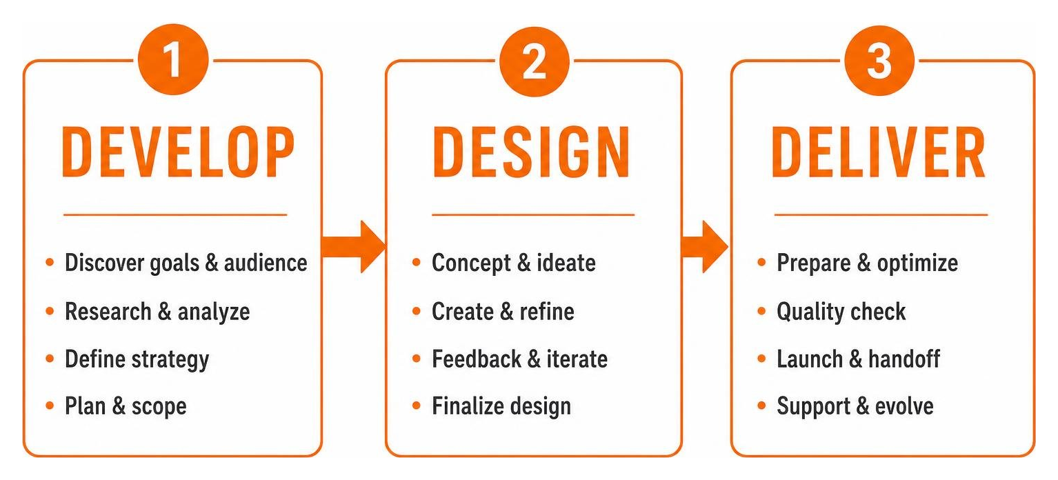
By pairing bespoke visual design with custom responsive WordPress website development and targeted organic search optimization, we help local businesses stand out in competitive markets and turn website visitors into loyal clients.
Frequently Asked Questions About Name Logos
What is the difference between a wordmark and a lettermark logo?
A wordmark uses your complete company or personal name written out in stylized typography (such as Google or Visa). A lettermark condenses a longer business name into its primary initials (such as IBM, CNN, or HBO). Wordmarks are ideal for shorter names that you want audiences to remember in full, while lettermarks work best for longer corporate names or compact social media profile spaces.
How do I make a text logo look unique without adding icons?
You don’t need decorative graphics to make a text logo memorable! You can create a distinctive look through bespoke font customization, strategic negative space (like the hidden arrow in FedEx), custom letter pairings, unique color palette choices, and refined kerning. Small, deliberate visual details give text logos personality without adding visual clutter.
How much does a professional name logo cost?
Professional logo design typically ranges between $300 and $5,000+ depending on the complexity of the project, whether custom font licensing is required, and the depth of brand identity guidelines included. While free or low-cost AI tools are helpful for early brainstorming, partnering with a professional agency ensures your logo is uniquely crafted, legally protected, and fully optimized for print, web, and video media.
Conclusion
Finding logos with names that you truly love doesn’t have to be a confusing or stressful process. By taking time to understand the differences between wordmarks and monograms, drawing inspiration from timeless brand examples, choosing fonts and colors that match your brand’s personality, and testing your ideas across digital media, you can create an identity that instantly connects with your target audience.
Your logo is often the very first touchpoint a potential client or customer experiences when discovering your business online. Investing in a clean, recognizable, and scalable identity pays dividends for years to come.
If you are ready to elevate your visual identity and want an expert team to bring your vision to life, we would love to help! Whether you need custom typography design, a complete brand identity refresh, or a custom responsive WordPress website optimized for search rankings, our team at FZP Digital is here for you.
When it comes to hosting your new responsive website smoothly, we always recommend top managed WordPress hosting solutions like GoDaddy and WP Engine to keep your site fast, secure, and reliable.
Take a look at our guide on How To Hire A Brand Identity Designer to learn what to look for in a design partner, or check out our Complete Branding Guide to explore our comprehensive design services. Reach out to us at FZP Digital today, and let’s craft a visual identity you’ll be proud to share with the world!