

Creating Balanced Wordmark and Combination Logos for Modern Brands
How to Create a Company Logo with a Name That Works Everywhere

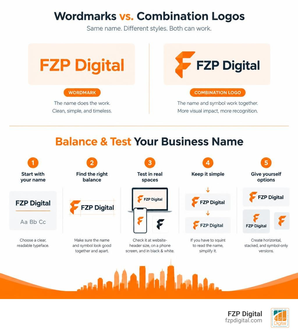
Start with your business name in a readable typeface. If you add a symbol, make sure the name and symbol look balanced together and still work separately. Test the logo at website-header size, on a phone screen, and in black and white. If you have to squint to read the name, simplify it before choosing colors or finishing the design.
Why plan for those different uses now? A long name may fit beautifully on a sign but feel cramped in a small website header. Creating horizontal, stacked, and symbol-only versions gives you options without changing your identity.
I’m Fred Z. Poritsky, founder of FZP Digital. My background in business, web design, and digital marketing shapes how I approach a company logo with name: it should look good and help people recognize you wherever they find your business. To build a cohesive visual presence, explore how to create memorable logos with names, pair them with an effective brand mark logo, and understand how every element fits into your broader brand identity.
Anatomy and Types: Wordmarks vs. Combination Marks
When you set out to build an identity for your business, one of your first big decisions is deciding how to pair your name with graphic elements. In the design world, we generally look at two primary approaches: standalone wordmarks and combination marks.
A wordmark (often called a logotype) relies entirely on custom text styling, unique typographic treatments, and letter spacing to convey brand personality. A combination mark, on the other hand, unites a distinct graphic icon—a brand mark or symbol—with the spelled-out company name in a unified lockup.
Choosing between them isn’t just about what looks pretty on a screen; it comes down to usability, market context, and brand maturity. Exploring brand mark logo design shows just how much visual weight each shape brings to a layout.
| Feature / Criterion | Standalone Wordmark | Combination Mark |
|---|---|---|
| Primary Focus | Typographic styling & custom letterforms | Harmony between graphic symbol & typography |
| Brand Awareness Needed | Low to High (reads immediately) | Low to High (builds dual association) |
| Small-Scale Versatility | High (scales cleanly across horizontal spaces) | High (icon can detach for favicons/apps) |
| Visual Complexity | Low to Moderate | Moderate to High |
| Distinct Identity Anchor | Font geometry, kerning, color | Icon shape, silhouette, text lockup |
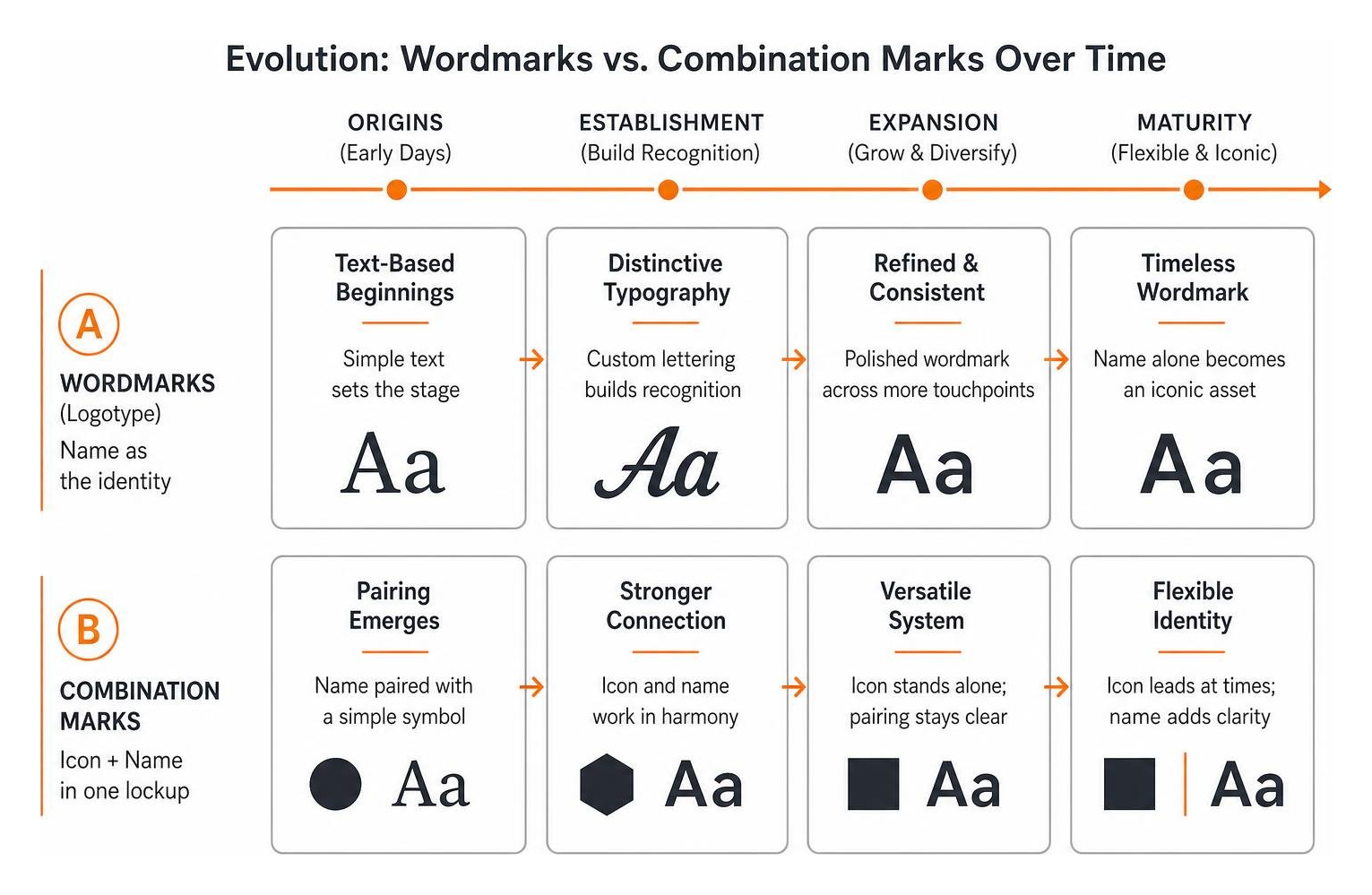
Both structures offer unique benefits. Wordmarks establish instant name recognition because there’s no abstract symbol competing for attention. Combination marks give you a flexible toolbox: you get the clarity of your name alongside an icon that can later stand alone as your brand footprint expands.
Choosing the Right Style for Your Company Logo with Name
How do you know which route fits your organization best? It helps to look at how world-class organizations have approached this choice over time.
Consider historic script wordmarks. The Coca-Cola logo is a classic example of a pure wordmark. Originally penned in Spencerian script by bookkeeper Frank Mason Robinson in the late 19th century, the flowing cursive became a globally recognized asset without ever needing an auxiliary emblem. Because the brand name is the artwork, every marketing dollar directly builds textual recall.
On the flip side, look at the Microsoft logo (2012). When Microsoft updated its identity, it transitioned to a balanced combination mark featuring four colorful geometric squares alongside the company name set in Segoe UI. The simple geometric shapes reflect diverse product ecosystems (Windows, Office, Xbox), while the adjacent name provides grounding and instant corporate clarity.
For emerging businesses, pairing an evocative symbol with a clean wordmark ensures potential clients never have to guess what you’re called or what you represent.
Symbol Evolution and Standalone Brand Power
Can a symbol ever completely replace a company name? Yes, but it requires substantial time, marketing investment, and market saturation.
The Nike Swoosh logo offers the gold standard for this trajectory. Created in 1971 by graphic design student Carolyn Davidson) for just $35 (roughly equivalent to $278 in 2025 purchasing power), the fluid mark was designed to embody motion, speed, and the wing of the Greek goddess of victory. Initially, Nike locked the Swoosh together with the brand name in bold uppercase lettering.
Over several decades of consistent brand building—and with Nike spending roughly 10% of its annual revenue on marketing and promotions—the Swoosh accumulated immense equity. By 1995, the standalone mark was so recognizable that Nike removed the text entirely. By 2015, the brand was valued at $26 billion, climbing to an impressive $90 billion valuation by 2025.
For small and mid-sized businesses, dropping your name prematurely can confuse prospective customers. That’s why mastering minimalist logo design helps you build an iconic mark while keeping your business name front and center during your growth stages.
Designing a Company Logo with Name: Step-by-Step Methodology
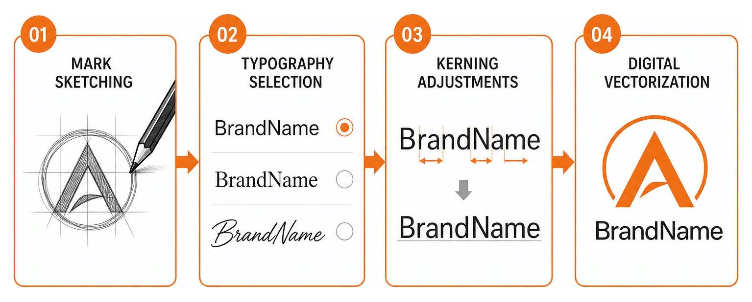
Crafting a balanced logo isn’t a matter of slapping clip art next to a downloaded font. It requires a structured, intentional design workflow to ensure the resulting mark performs seamlessly across digital headers, printed collateral, signage, and mobile screens.
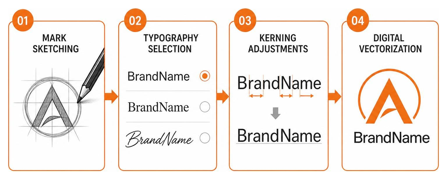
Our team approaches visual identities through a collaborative “Develop · Design · Deliver” framework. Creating a comprehensive brand identity design means treating every curve, counter, and serif as part of a larger communication system.
Establishing Visual Weight and Hierarchy
Visual hierarchy determines which element the viewer’s eye notices first and how naturally their gaze flows across the design. When pairing an emblem with text, neither element should overpower the other.
- Mark-to-Name Proportions: As a general rule, an icon placed to the left of your name should match or slightly exceed the cap height of your primary typography. If the icon sits on top (a vertical lockup), it should typically occupy between 40% and 50% of the total lockup height to prevent top-heaviness.
- Horizontal vs. Vertical Lockups: Always produce both configurations. Horizontal lockups excel in modern website headers, digital navigation bars, and invoice headers where vertical height is limited. Vertical (stacked) lockups shine on social media profile cards, retail packaging, and apparel.
- Optical vs. Geometric Alignment: Math doesn’t always equal visual balance. Rounded letters like “O” or angled letterforms like “A” and “W” create optical empty space. Designers must adjust spacing by eye rather than relying solely on automated software alignment tools to ensure the symbol and name feel anchored.
Typography Pairing and Custom Lettering
Typography carries emotional tone. A tech brand might favor clean, geometric sans-serifs, while a law practice or medical provider might convey stability through structured serifs.
When planning logo design for startups, avoid trendy, overly intricate display fonts that degrade into unreadable blobs when scaled down on mobile viewports. Customizing standard letterforms—such as refining a terminal curve, adjusting a crossbar, or dialing in precise kerning (the spacing between individual characters)—transforms off-the-shelf typography into a proprietary company asset. Always verify commercial desktop and web font licensing before standardizing your corporate font kit.
Essential Brand Guidelines for Logo Usage and Placement
Once your logo lockup is finalized, you must protect its integrity. Consistent implementation builds trust, while haphazard stretching or arbitrary color adjustments dilute your brand authority. Establishing clear branding guidelines ensures that everyone on your team applies your assets correctly.
Clearspace, Background Contrast, and Keylines
A logo needs room to breathe. Crowding your mark with nearby copy, UI buttons, or busy background images degrades legibility and cheapens your presentation.
- Clearspace Rules: Define clearspace using a proportional element derived directly from the logo itself. For example, official Netflix brand logo guidelines define clearspace as equivalent to the width of one leg of the “N” symbol or the width of the “T” in the wordmark. This guarantees proportional spacing regardless of how large or small the asset is scaled.
- Contrast Ratios: Legibility depends on strong contrast. Industry standards recommend maintaining a minimum contrast ratio of 2.25:1 against underlying background colors, though ratios exceeding 4.5:1 provide superior visibility across digital displays.
- Keyline Borders on Dark Surfaces: When a dark or vibrant logo sits on an uncooperative background, applying an intentional keyline maintains boundary integrity. For instance, HP brand visual identity standards require a specialized white keyline around their circular blue emblem when placed on dark or textured surfaces, ensuring the logo never gets lost against its backdrop.
Technical Rules to Protect a Company Logo with Name
To maintain consistency across marketing campaigns, establish a clear list of technical rules and common mistakes to avoid:
- Never Distort or Stretch: Always scale the logo proportionally by locking the aspect ratio.
- Never Alter Approved Colors: Use only exact HEX, RGB, CMYK, and Pantone (PMS) values specified in your brand kit.
- Avoid Unauthorized Reorientations: Never rotate the mark, skew the typography, or rearrange lockup components outside approved horizontal and vertical configurations.
- Maintain Pure Vector Formats: Always export production master files as scalable vectors (SVG, EPS, PDF) so assets render sharply on everything from a 16-pixel favicon to a highway billboard.
Co-Branding, Partnerships, and Multi-Platform Adaptation
Modern businesses rarely operate in isolation. Whether you’re sponsoring a community event in Richboro or Newtown, co-hosting a webinar with a partner agency, or integrating third-party software, your logo will frequently appear alongside other corporate marks.
Co-branded lockups require strict visual equality. Neither brand should appear subordinate unless the context is an explicit subsidiary relationship.
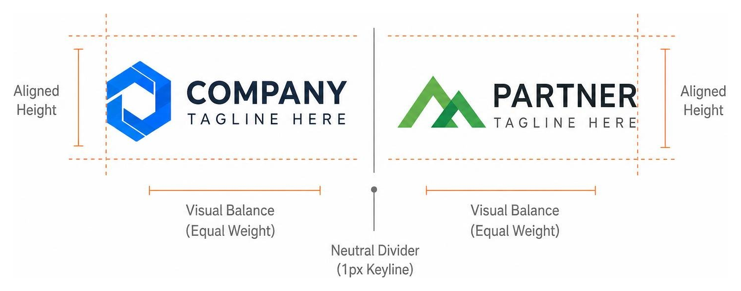
When building partner lockups:
- Align both logos along a shared horizontal or vertical baseline.
- Separate the two assets using a neutral, thin divider line (such as a 1px keyline in 30% gray) or an approved plus sign (+).
- Match the visual mass (optical area) of both marks rather than matching strict pixel dimensions, compensating for logos with differing aspect ratios.
On the digital front, your logo must dynamically adapt to different screen dimensions. In small responsive layouts, swap a wide horizontal combination mark for a compact icon or stacked variant. Understanding visual identity in design ensures your business looks polished across desktop monitors, tablet screens, and smartphone interfaces.
Frequently Asked Questions about Wordmark and Combination Logos
What is the difference between a wordmark and a combination mark?
A wordmark is a typographic logo consisting purely of a company’s stylized name (such as Coca-Cola or Google). A combination mark pairs that stylized text with an accompanying graphic symbol, abstract shape, or mascot (such as Microsoft’s four-color window icon alongside its name). Combination marks offer added flexibility because the symbol can be decoupled for social avatars and app icons.
When should a brand drop the name from its logo?
A company should only remove its name from its primary logo when the standalone graphic symbol has achieved overwhelming consumer recognition. Global giants like Nike, Apple, and Starbucks spent decades and hundreds of millions of dollars establishing that association before dropping their names. Emerging and mid-sized businesses should almost always retain their business name to maximize brand recall.
How do you maintain logo legibility across dark and light backgrounds?
To preserve readability on any background, your brand identity kit should include approved color variants: a full-color version for white and bright backgrounds, a reversed all-white version for dark photography or colored panels, and an all-black monochrome version for single-color print production. For complex colored icons placed on dark surfaces, adding an approved subtle keyline border prevents edges from blending into the backdrop.
Conclusion
Your company logo is the visual cornerstone of your business. Whether you choose a classic, custom-lettered wordmark or a flexible combination mark, balancing typography with visual weight ensures your brand communicates credibility across every touchpoint.
Building a memorable visual identity is an exciting journey, but achieving perfect typography balance, responsive scaling, and search-optimized web integration can be challenging. Navigating these design decisions requires experienced strategic guidance.
At FZP Digital, founded by Fred Z. Poritsky, we help businesses across Philadelphia and Bucks County develop complete visual systems and responsive WordPress websites that turn visitors into loyal customers. If you are ready to craft a lasting identity, explore our complete guide to business branding and let our team bring your brand vision to life!