
Why Modern Minimalist Logo Design Is the Smartest Move for Your Brand
Modern minimalist logo design is one of the most powerful tools a business can use to make a lasting first impression — and it’s simpler than you might think.
Here’s a quick breakdown of what it means and how to get started:
| Element | What It Means for Your Logo |
|---|---|
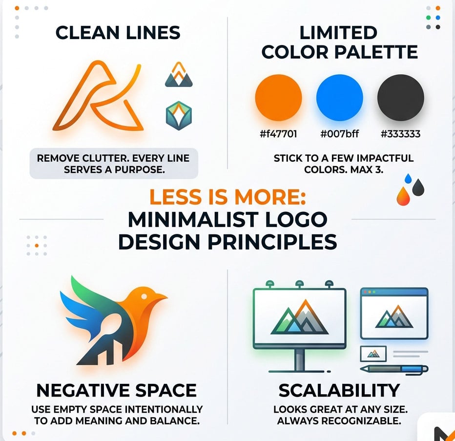
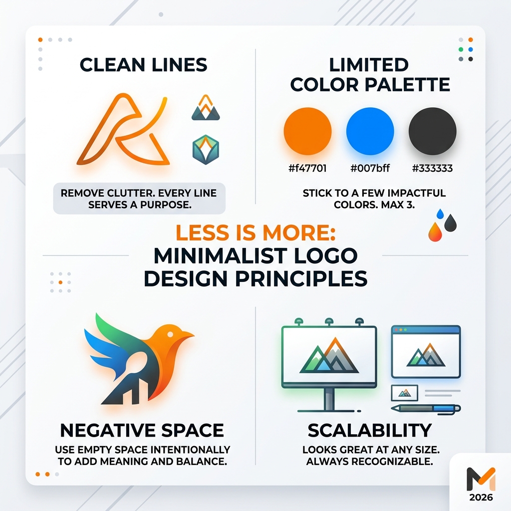
| Clean lines | Remove clutter; every line must serve a purpose |
| Limited colors | Stick to one, two, or three colors maximum |
| Simple typography | Use bold, clear fonts that are easy to read at any size |
| Negative space | Use empty space intentionally to add meaning or balance |
| Geometric shapes | Circles, squares, and triangles communicate trust and clarity |
| Scalability | Looks great on a business card and a billboard |
The core idea? Less is more. A minimalist logo strips away everything that doesn’t need to be there — and what’s left is pure, memorable brand identity.
Think about the most recognizable logos in the world. They’re not complicated. They’re confident. And that confidence is exactly what your brand deserves.
I’m Fred Z. Poritsky, founder of FZP Digital, and my background in both business and creative strategy has shaped how I approach modern minimalist logo design for small businesses, nonprofits, and professional service firms across the Philadelphia region. If you’ve ever felt like your logo doesn’t quite represent who you are, you’re in the right place — let’s fix that together.
Modern minimalist logo design terms to learn:
- e-commerce wordpress development
- graphic design agencies philadelphia
- graphic design companies in philadelphia
What is Modern Minimalist Logo Design?
Have you ever looked at a logo and felt an instant sense of clarity? That is the magic of modern minimalist logo design. At its heart, minimalism is about stripping away the “noise” until only the essential remains. According to the Minimalist logo design | Complete beginner’s guide | Adobe, this style relies on design strength alone, without the need for shadows, gradients, or complex textures to hide behind.
In our work at FZP Digital, we see minimalism as a strategic choice. It is not just “simple” for the sake of being easy; it is “strategically simple.” This means every curve, every dot, and every letter has been scrutinized. We use flat design—a style that avoids 3D effects—to ensure your brand looks modern and professional across every medium, from a tiny favicon on a browser tab to a massive sign on a building in Newtown.
Key Principles of modern minimalist logo design
To master this look, we follow several core principles that ensure your brand doesn’t just look “empty,” but looks “full of purpose”:
- Strategic Simplicity: We ask, “What can we take away?” rather than “What can we add?” If an element doesn’t help tell your brand story, it’s gone.
- Clean Lines: Whether they are straight or curved, lines should be crisp and deliberate. Think of the iconic Nike “Swoosh”—it’s a single, fluid line that conveys speed and movement perfectly.
- Monochromatic Palettes: Many of the best minimalist logos work in black and white. If a design doesn’t work in high-contrast black and white, it isn’t strong enough.
- Brand Essence: The logo must act as a visual shorthand for your company’s mission. A minimalist logo for a Philadelphia law firm will look very different from one for a Bucks County yoga studio, but both will use simplicity to convey their unique “vibe.”
Why Your Brand Needs a Minimalist Makeover
You might be wondering, “Why should I go minimal when I could have a detailed illustration?” The answer lies in how our brains process information. We live in a world of constant digital clutter. A complex logo can get lost in the shuffle, while a clean, modern minimalist logo design cuts through the chaos like a beacon.
Minimalism offers incredible versatility. Because these logos rely on basic shapes and few colors, they are much easier to scale. Have you ever tried to print a highly detailed logo on a pen or a small business card? It usually turns into a blurry mess. A minimalist design, however, remains sharp and recognizable at any size. This is a key part of make-a-mark-the-ultimate-guide-to-crafting-your-perfect-logo, where we emphasize that a logo must be a workhorse for your brand.
Furthermore, company-logos that embrace minimalism tend to have a much longer shelf life. Trends like “grunge” or “glossy 3D” come and go, but a clean, typographic mark is timeless. When you invest in a minimalist design, you’re often saving yourself from a costly rebrand five years down the road.
Standing Out in a Cluttered Market
In competitive markets like Philadelphia and Richboro, instant recognition is everything. You want a customer to see your logo for half a second and know exactly who you are. This creates a “flag” for your business—a symbol that represents your ethos and strategy.
Minimalism also builds customer trust. A cluttered logo can look amateurish or “busy,” which might subconsciously tell a client that your business is disorganized. On the other hand, a sleek, minimalist mark suggests a brand that is confident, sophisticated, and focused. It tells the world you don’t need to shout to be heard.
The Anatomy of an Effective Minimalist Logo
What actually goes into a modern minimalist logo design? It’s like a puzzle where you only have three or four pieces, so each one has to be perfect.
- Typography: We often lean toward sans-serif fonts. They are clean, modern, and lack the “little feet” (serifs) that can make a design feel dated. However, sometimes a very simple, bold serif font can add a touch of luxury and tradition.
- Color: We usually limit the palette to three or fewer colors. Often, a single bold color against a neutral background is enough to create a lasting impression.
- Negative Space: This is our favorite “secret weapon.” Negative space is the area around and between the subjects of an image. Think of the famous FedEx logo—did you ever notice the arrow hidden between the ‘E’ and the ‘x’? That’s negative space at work, adding a layer of cleverness without adding clutter.
Comparison: Minimalist vs. Illustrative
| Feature | Minimalist Logo | Illustrative Logo |
|---|---|---|
| Complexity | Low (Basic shapes) | High (Detailed drawings) |
| Scalability | Excellent (Works anywhere) | Difficult (Loses detail when small) |
| Recognition | Instant | Requires more “eye time” |
| Longevity | Timeless | Often tied to current art trends |
| File Size | Small/Efficient | Large/Complex |
Shapes and Symbols in modern minimalist logo design
Every shape carries a psychological weight. Circles often represent unity, community, and completeness. Squares and rectangles suggest stability, balance, and reliability. Triangles can imply direction, power, or growth.
When we design, we look for ways to use these basic geometric forms to create abstract symbols. For example, a simple mountain peak made of two lines can represent a tourism brand or a high-performance tech company. As seen in 5 MIND BLOWING Minimalistic Logo Design TIPS – YouTube, using these “primitive” shapes is the key to creating a design that feels both ancient and futuristic at the same time.
How to Create a modern minimalist logo design That Lasts
Creating a logo that stands the test of time requires a disciplined process. It’s not just about opening a design program and doodling; it’s about deep research and careful refinement. Whether you are a brand-new startup or looking to give-your-logo-a-glow-up-easy-ways-to-re-edit-and-revitalize, the workflow remains the same.
We start by looking at your brand strategy. Who are your competitors? What is your unique value proposition? For logo-design-for-startups, this phase is critical because your logo will likely be the first thing a potential investor or customer sees. We gather inspiration through moodboards—collections of colors, fonts, and textures that capture the “feeling” of your brand before we ever draw a single line.
Step-by-Step modern minimalist logo design Workflow
- Brand Discovery: We sit down (virtually or in person in our Philadelphia offices) to understand your mission and values.
- Research & Moodboarding: We look at industry trends and create a visual direction.
- Sketching (The “Black & White” Phase): We start with rapid sketching. We always work in black and white first. Why? Because if a logo doesn’t look good in black and white, no amount of color will save it. We iterate through dozens, sometimes hundreds, of ideas.
- Refinement: We select the top 2-3 concepts and polish them. We pay attention to “kerning” (the space between letters) and line weights.
- Final Delivery: Once you’ve chosen your favorite, we provide a full brand kit, including various file formats for web and print.
Avoiding Common Mistakes and Finding the Right Partner
One of the biggest mistakes people make with modern minimalist logo design is overcomplicating it. They get nervous that the design is “too simple” and start adding extra lines or shadows. Trust the process! Simplicity is a sign of confidence.
Another pitfall is using generic icons. We’ve all seen the “vague blue globe” or the “generic leaf.” These don’t tell your story; they just fill space. You want a design that is unique to you. Poor typography is another silent killer—if your font is hard to read or doesn’t match your brand’s voice, the whole logo fails.
That’s where having a professional partner makes all the difference. At FZP Digital, Fred Z. Poritsky and our team bring years of experience to the table. We don’t just “make a logo”; we build a visual foundation for your business. We’ve helped many clients navigate the logo-design-philadelphia-complete-guide to find a look that truly resonates with their local audience.
Choosing a Professional Design Service
When you’re on a logo-quest-navigating-the-world-of-design-services, look for an agency that values collaboration. Our “Develop. Design. Deliver.” process ensures you are involved at every major milestone. You shouldn’t just be handed a logo; you should understand why it works.
2024 Minimalist Trends to Watch:
- Monoline Designs: Logos made with a single consistent line weight for a clean, modern look.
- Negative Space Magic: Hiding symbols within the letters or shapes.
- Geometric Monograms: Using the company’s initials to create a unique geometric shape.
- Abstract Nature: Simple, geometric interpretations of natural elements like leaves, mountains, or water.
- Muted Palettes: Moving away from neon colors toward sophisticated, earthy tones.
Frequently Asked Questions about Minimalist Logos
How much does a professional minimalist logo cost?
Pricing for a modern minimalist logo design can vary wildly. You might see services online for $10, or agencies charging $10,000. At FZP Digital, we believe in providing high-value, professional results that fit the budgets of small to mid-sized businesses.
Think of your logo as a long-term investment. A cheap, poorly designed logo will eventually need to be replaced, costing you more in the long run in terms of reprinting materials and lost brand recognition. As a small-business-logo-designer, we focus on creating quality that lasts for years. Factors that influence price include the complexity of the research phase, the number of revisions, and whether you need a full brand style guide.
What is the typical turnaround time for a logo project?
A professional logo isn’t made overnight. While some platforms promise a logo in 24 hours, those are usually templates that thousands of other people are using. A custom, strategic design typically takes between 2 to 4 weeks.
This allows time for deep research, several rounds of sketching, and feedback loops where we refine the design based on your input. If you’re looking for a logo-designer-philadelphia-pa-guide, we always recommend starting the process well before your planned launch date to ensure nothing is rushed.
How do I ensure the logo captures my brand essence?
The secret is in the research phase. We don’t just ask what colors you like; we ask what you want people to feel when they see your brand. Are you traditional and trustworthy? Bold and disruptive?
By aligning the visual elements—like the “sharpness” of the shapes or the “weight” of the font—with your mission, we create a visual story. You can see how this works in our look at the-most-famous-luxury-logos-and-what-they-mean. Even the simplest logos for brands like Chanel or Apple are packed with meaning and history.
Conclusion
Creating a modern minimalist logo design is about finding the perfect balance between beauty and utility. It’s about making sure your brand is heard in a noisy world without having to scream. Whether you are located in the heart of Downtown Philadelphia, the quiet streets of Richboro, or the bustling community of Newtown, your business deserves a visual identity that is as professional and dedicated as you are.
At FZP Digital, we take pride in our “Develop. Design. Deliver.” philosophy. We don’t just stop at logos; we specialize in premium responsive WordPress website design and increasing your organic search rankings so your beautiful new logo actually gets seen by the right people.
Ready to give your brand the bold, minimalist look it deserves? We’d love to chat about your vision and help you make your mark in Bucks County and beyond. More info about Philadelphia design services is just a click away, or you can reach out to us directly to start your project. Let’s create something timeless together!