
A Comprehensive Guide to Quality Logo Design Tips
Why Good Logo Design Matters for Your Brand
A good logo design is simple, distinctive, easy to read, and flexible enough to work everywhere your organization appears – from a website header and social profile to signage, print materials, and a tiny browser icon.
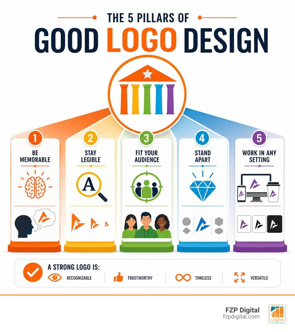
Before you choose colors or fonts, make sure your logo can do these five things:
- Be memorable: Give people a visual cue they can recognize again.
- Stay legible: It should remain clear at both large and very small sizes.
- Fit your audience: Its style, color, and type should reflect the people you want to reach.
- Stand apart: Avoid looking so much like competitors that customers confuse you.
- Work in any setting: A strong logo holds up in black and white, on light or dark backgrounds, and across print and digital media.
Your logo is not your entire brand. Your brand is the impression people carry with them after interacting with you; your brand identity is the larger system of colors, typography, imagery, voice, and design choices that shape that impression. The logo is the visual anchor that helps people recognize that system quickly.
That distinction matters. A clever graphic alone cannot build trust, but a clear, consistent logo can make your website, marketing, donor materials, packaging, and social presence feel connected.
Professional designers consistently point to memorability, creativity, and legibility as leading qualities of effective logos. The strongest marks do not try to explain every service you provide. Instead, they create a recognizable signal that gains meaning as people experience your organization over time.
I’m Fred Z. Poritsky, founder of FZP Digital. My experience in nonprofit financial management, web design, and digital marketing helps me approach good logo design as both a creative decision and a practical business asset that needs to support your wider online presence.
Good logo design vocabulary:
Fundamental Principles: What Defines Good Logo Design?
Have you ever wondered why you can instantly identify certain brands from a split-second glance at a highway billboard or a tiny mobile app icon? That immediate spark is visual cognitive recall in action. When human eyes process visual stimuli, our brains register shapes and colors long before reading individual letters of text.
An effective logo succeeds because it respects fundamental visual principles. In industry surveys of working creative professionals, design attributes rank distinctly: memorability leads the pack at 44%, followed closely by creativity at 33% and legibility at 32%. Nearly 80% of graphic designers emphasize that industry relevance and brand identity alignment are critical to long-term success.
A mark shouldn’t try to tell your company’s entire life story. Instead, it serves as an unmistakable visual shorthand that anchors emotional connection and customer trust.
Core Characteristics of a Good Logo Design
The most enduring marks across modern commerce share a set of uncompromising traits:
- Uncomplicated Silhouettes: Simple geometry cuts through visual noise. When a shape is clean, your brain stores it effortlessly.
- Aesthetic Timelessness: Chasing fleeting design fads leaves you with an outdated mark in two years. Exploring minimalist logo design secrets helps uncover forms that age gracefully.
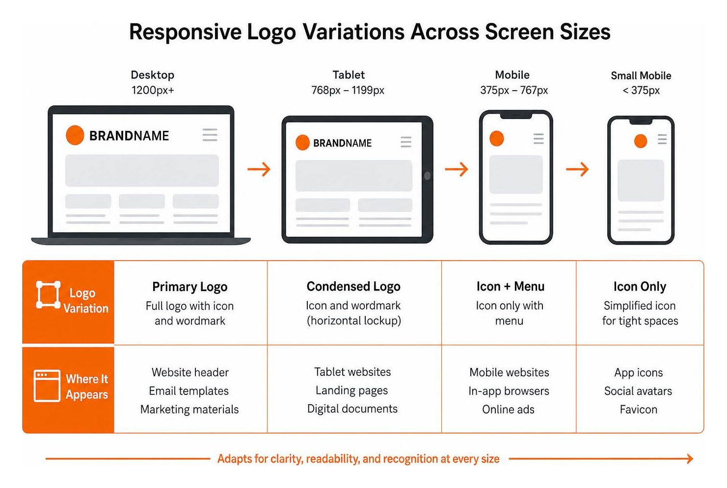
- Cross-Platform Versatility: A design must translate smoothly from an embroidered staff shirt or vehicle wrap down to a 16×16 pixel browser favicon.
- Scalable Vectors: Professional marks are built using mathematically defined vector paths rather than static raster pixels, ensuring crisp reproduction at any scale.
- Monochrome Validation: If an icon relies solely on shiny gradients or specific hues to be understandable, the underlying structure is weak.
- Abstract Longevity: Abstract marks often hold greater staying power than literal illustrations because they allow your company to expand into new product lines without outgrowing its mark.
Logo vs. Brand Identity: Understanding the Difference
It is easy to mix up these terms, but distinguishing them keeps your marketing organized:
- Brand: The gut feeling, emotional perception, and reputation customers hold about your business.
- Brand Identity: The holistic visual and verbal system engineered to shape that perception—including your typography suite, color palette, image styling, and tone of voice. Our guide to creative logo design and brand identity breaks down how these interlocking pieces work as one.
- Logo: The primary graphic mark that acts as the signature of that identity system.
Think of your brand as a complete building, your brand identity as its interior architecture and design palette, and your logo as the polished sign hanging above the front door.
The 7 Types of Logos and When to Use Them
Selecting the right structural format establishes clear visual hierarchy and ensures category appropriateness.
| Logo Type | Key Defining Feature | Optimal Use Case | Real-World Example Style |
|---|---|---|---|
| Wordmark | Styled typographic text of company name | Distinctive, shorter business names | Clean tech wordmarks |
| Lettermark | Monogram or initials (1-4 letters) | Long or multi-word business names | Cable television networks |
| Brand Mark | Standalone pictorial symbol | Established brands with broad recognition | Iconic silhouette fruits |
| Abstract Mark | Non-literal, custom geometric form | Conveying conceptual movement or innovation | Global sportswear arcs |
| Mascot | Illustrated character or ambassador | Family-friendly, energetic consumer brands | Cereal & sports figures |
| Emblem / Crest | Text enclosed inside a badge or frame | Traditional institutions, schools, auto | Heritage automotive badges |
| Combination Mark | Unified pairing of icon and wordmark | Startups & growing businesses needing clarity | Modern retail & service firms |
Wordmarks, Lettermarks, and Brand Marks
Wordmarks rely purely on custom typography to communicate personality. If you have a unique or memorable name, a carefully kerned typographic treatment gives you immediate clarity without requiring customers to decode a separate symbol.
Lettermarks (or monograms) condense lengthy organizational names into readable initials. However, brand-new companies should note that abbreviated monograms often require heavier initial advertising investments so audiences learn what the letters represent.
A pictorial symbol or brand mark logo uses a stylized graphic to represent the company. While powerhouse global brands can use a standalone icon without text, emerging businesses usually pair their symbols with their written name to solidify marketplace recognition.
Combination Marks, Emblems, and Mascots
Combination marks bring together a graphic icon and a wordmark, offering maximum flexibility. You can deploy the complete locked-up version on your primary website header and isolate the standalone icon for mobile app tiles or social media avatars.
Emblems integrate text directly within an illustrative badge or crest. They evoke tradition, heritage, and security, making them popular for universities, craft breweries, and government agencies. Mascots introduce an illustrated character to give your business an approachable, friendly ambassador that shines in community-driven marketing campaigns.
Color Psychology and Typography in Modern Branding
Color and typography carry deep subconscious meaning. Before someone reads a single word on your page, their nervous system is already responding to your palette and font weight.
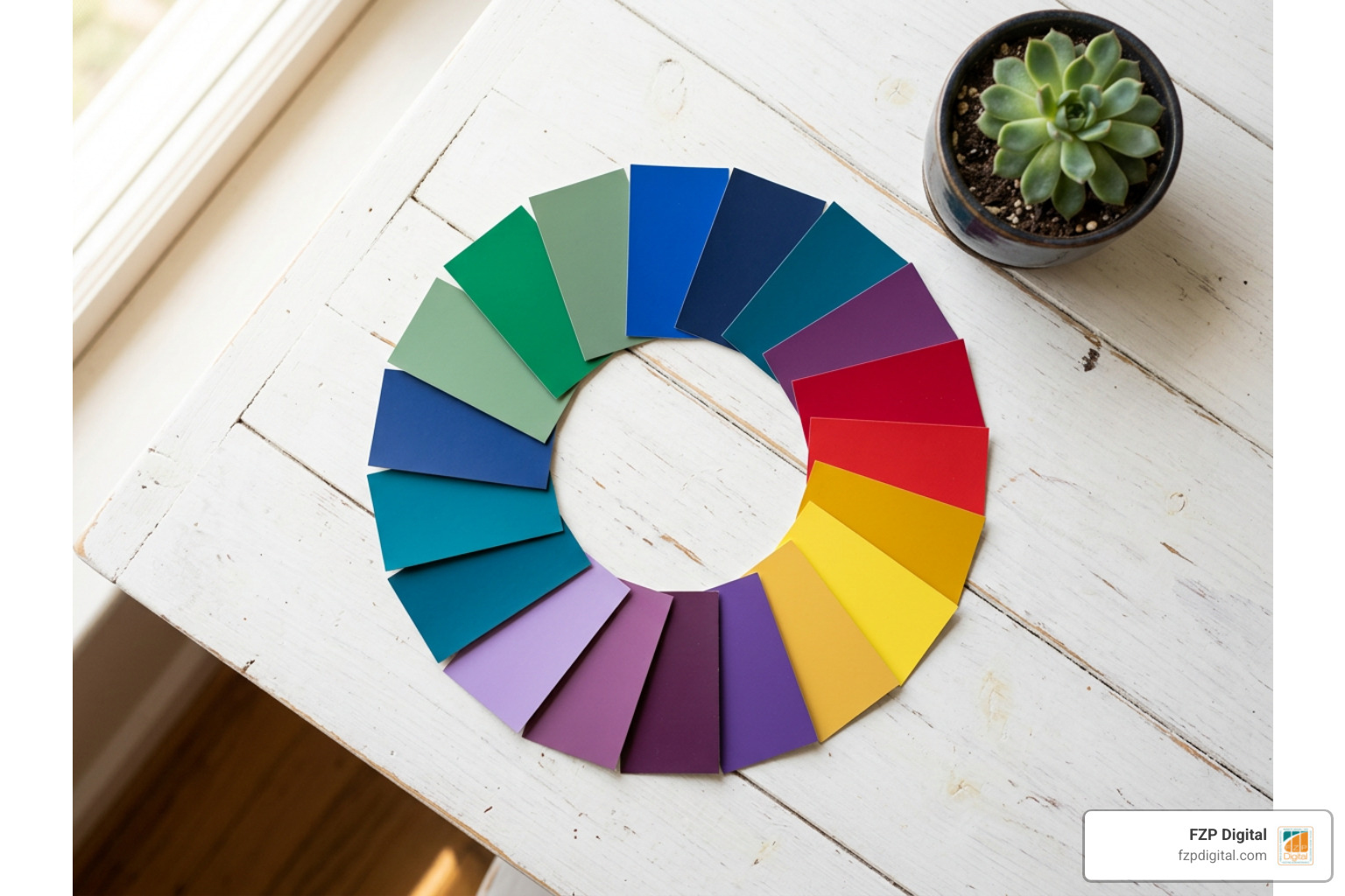
Strategic Color Associations and Visual Impact
Graphic designers evaluate color through psychological associations to match a brand’s strategic purpose:
- Green (86% Designer Association: Eco-friendly / Sustainable): Represents vitality, balance, environmental awareness, and financial health.
- Red (71% Designer Association: Power / Strength): Elicits excitement, urgency, bold action, and physical energy.
- Pink (72% Designer Association: Youthfulness / Fun): Communicates approachability, playfulness, creativity, and warmth.
- Black (62% Designer Association: Sophistication / Luxury): Delivers elegance, modern authority, premium quality, and minimalism.
- Blue (54% Designer Association: Trust / Reliability): Inspires stability, security, calm confidence, and corporate dependability.
Balancing high contrast ratios is essential for accessible viewing across different screen brightnesses and outdoor lighting conditions.
Typography Trends and Font Selection
Your font choice speaks volumes about your operational style. Professional designers frequently turn to proven typefaces: Helvetica is favored by 41% of designers for text logos, followed by Futura at 39% and Montserrat at 34%.
- Geometric Sans-Serifs: Offer crisp legibility, modern efficiency, and effortless scalability across digital interfaces.
- Classic Serifs: Convey editorial authority, historical depth, trust, and timeless sophistication.
- Custom Lettering: Ensures complete uniqueness that competitors cannot replicate with an off-the-shelf font download. When you are crafting your perfect logo, avoiding generic font templates preserves distinct character.
Strategic Execution: Creating Scalable and Timeless Marks
Over 30% of graphic designers reported debranding a visual identity within the past year—a process of stripping away unnecessary textures, drop shadows, and complex gradients in favor of clean vectors that render instantly on mobile screens. Furthermore, 42% of designers support the ultra-minimalist movement, with 75% affirming its authenticity when executed strategically.
Avoiding Common Mistakes in Good Logo Design
Steering clear of common pitfalls protects your brand equity:
- Overcomplicated Geometry: Fine, intricate lines blur into muddy smudges when reduced to mobile browser sizes.
- Font Clutter: Combining more than two typefaces creates visual chaos and undermines professionalism.
- Chasing Fleeting Trends: Hyper-trendy visual gimmicks date your business rapidly, necessitating expensive rebrands later.
- Neglecting White Space: Crowded elements without room to breathe look claustrophobic.
- Poor Kerning: Uneven spacing between letters distracts the eye and reduces readability.
Preparing for Design: Strategy, Budgeting, and File Formats
Before engaging a design team, clarify your target audience, core values, and competitive landscape. If you are launching a new venture, reviewing foundational logo design for startups helps frame your requirements. When you are ready to explore comprehensive design resources, reviewing The Ultimate Guide to Logo Design | by Ian Paget | Logo Geek or articles like The Best Logo Design Services for Startups and Entrepreneurs can provide valuable perspective on industry workflows.
Always confirm your final brand handoff includes proper production file formats:
- Vector Formats (
.SVG,.EPS,.AI): Infinitely scalable master files needed for signage, vehicle wraps, and web development. - Transparent Raster Files (
.PNG): High-resolution assets formatted with transparent backgrounds for digital presentations and web layouts. - Standard Web Formats (
.JPG,.WEBP): Optimized, lightweight image files for quick-loading digital touchpoints.
Frequently Asked Questions About Logo Design
What is the most important element of an effective logo?
Memorability is paramount. An effective logo relies on a clear, uncomplicated silhouette that the brain can process instantly. When your mark is paired with high legibility and appropriate industry relevance, it creates lasting visual recall across every customer touchpoint.
How much should a small business invest in a professional logo?
Investment should be evaluated against business risk and the cost of replacement. While simple digital ventures may begin with modest budgets, businesses deploying physical vehicle fleets, retail signage, uniforms, and extensive product packaging benefit from investing in a comprehensive identity system to avoid costly redesigns later.
Why should initial logo concepts be designed in black and white?
Monochrome testing verifies the structural strength of a concept. When a design works in solid black and white, it proves that the silhouette, proportions, and negative space are visually sound without using color as an aesthetic crutch.
Conclusion
A well-crafted logo serves as the welcoming front door to your business. When simple geometry, intentional color psychology, and balanced typography work together, your visual identity builds trust and sets you apart from competitors.
At FZP Digital, we partner closely with businesses throughout Philadelphia, Downtown Philadelphia, Newtown, and Richboro, guiding you through our collaborative “Develop . Design . Deliver” process. Whether you need a fresh visual mark, a high-performing custom WordPress website, or a complete digital identity, we’re here to help bring your vision to life. If you host your site on top-tier managed platforms—where we recommend industry leaders like GoDaddy and WP Engine—a clean, modern vector logo will keep your brand loading fast and looking sharp.
Ready to build an enduring visual presence? Explore our complete branding guide to see how a thoughtful identity strategy can elevate your organization.