
Ultimate Checklist for Star Logo Design Ideas
Core Symbolism and Meaning in Star Logo Design

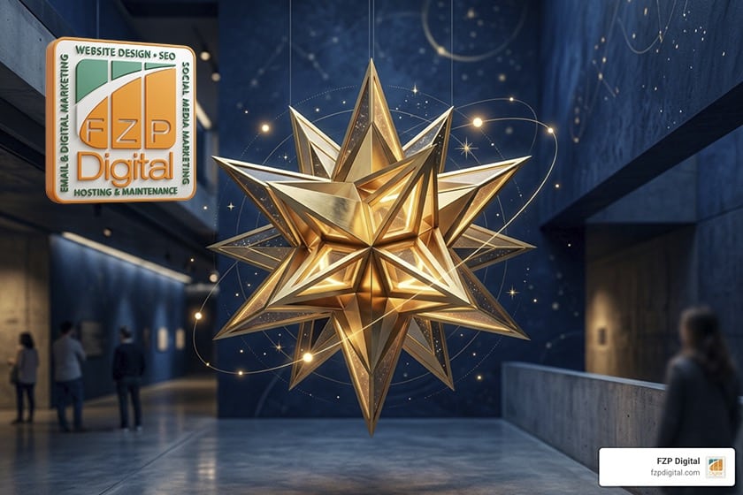
Effective star logo design combines balanced point geometry, clear brand archetype alignment, and purposeful negative space to signal quality, guidance, and ambition. Whether you choose a sleek four-point sparkle for modern innovation, an eight-point compass for global heritage, or dynamic shooting stars for forward momentum, successful celestial marks rely on precise mathematical proportions and clean vector execution. When crafted with intentionality through The Ultimate Guide To Creative Logo Design And Brand Identity, a star-driven mark moves beyond basic decoration to anchor your entire brand narrative across digital and physical touchpoints.
A star acts as a silent shorthand for leadership, direction, and top-tier quality. Whether you’re building an identity for a high-growth tech startup, a boutique retail firm, or a regional service provider, celestial symbols tap directly into shared human psychology to deliver an immediate sense of authority and excellence.
Psychological Impact of Celestial and Star Shapes
The human brain processes geometric and celestial shapes in milliseconds. A standard circle conveys unity and community, while sharp squares suggest stability. Stars, however, deliver an energetic combination of outward radiance and centered focus.
- Subconscious Recognition of Excellence: From gold stars in early grade school to Michelin ratings in fine dining, star icons trigger an instinctive perception of top quality.
- Cosmic Authority and Navigation: Historically, the North Star served as the ultimate compass. Today, businesses using star geometry subconsciously communicate that they are a dependable guide in their industry.
- Point Geometry and Cultural Memory: The number of points on a star alters its tone. A four-point sparkle feels modern, magical, and digital; a classic five-point star conveys civic pride, patriotism, or sports energy; while an eight-point compass star projects heritage and global reach.
Typography and iconography history illustrates this universal resonance. Back in 1977, typographer Hermann Zapf designed the renowned Zapf Dingbats collection, introducing over 1,000 foundational digital symbols—including a rich variety of geometric star shapes—that eventually helped shape the standard Unicode catalog of over 130,000 characters used worldwide today. When you build a logo on these proven visual foundations, you are leveraging decades of established visual language.
Aligning Star Geometry with Modern Brand Archetypes
To prevent your mark from fading into the background, you must match its geometry to your core brand archetype. Are you the visionary pioneer pushing boundaries, or the steady ruler setting market standards?
- The Visionary / Explorer: Benefits from dynamic asymmetry, elongated trails, and forward-leaning apex angles that convey momentum and disruption.
- The Ruler / Prestige Brand: Flourishes with balanced, symmetrical four-point diamonds, faceted gold outlines, or laurel-framed celestial badges.
- The Creator / Innovator: Uses intersecting geometric planes, multi-colored polygons, and clever negative space to showcase inventive problem-solving.
Browsing platforms like Star Logo Design – Pinterest—where over 129k people search for star logo inspiration daily—reveals how top brands use varied aesthetics, from retro Y2K starbursts to sleek corporate monograms. By defining your archetype early, you ensure every curve, apex, and point actively supports your market position.
Essential Styles and Variations for Star Logo Concepts
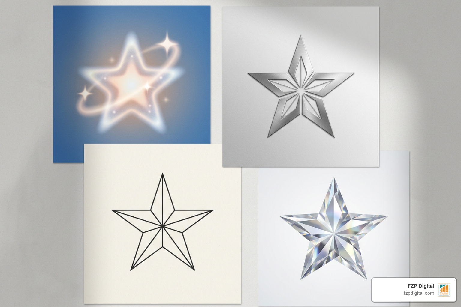
Because Adobe Stock features nearly 10,000 assets for star logos, creating a distinctive brand identity requires choosing a clear stylistic direction. Let’s look at how to take this universal shape and turn it into a custom brand mark logo that stands out in your market.
Minimalist and Geometric Star Logo Design Variations
Minimalism does not mean boring; it means stripping away visual clutter until only the most memorable lines remain. In modern vector design, simple geometric stars rely on precise line weights, arching intersections, and deliberate facets.
- Four-Point Sparkle Icons: Created with arching concave curves meeting at sharp terminals, these marks deliver an airy, high-tech, or luxury aesthetic.
- Faceted Polygons: Using subtle line divisions to mimic 3D diamond facets, giving the flat 2D icon depth without messy gradients.
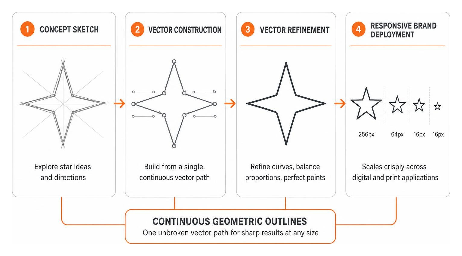
- Continuous Geometric Outlines: Drawing stars from a single unbroken vector path, creating sleek, modern silhouettes that reproduce crisply at 16×16 pixels.
For brands that want a clean, confident look, utilizing Minimalist Logo Design Secrets For Bold Brands ensures your icon looks refined whether printed on physical merchandise or rendered on high-resolution screens.
Dynamic Shooting Stars, Sparkles, and Monogram Integrations
When you want to emphasize speed, innovation, or personal identity, kinetic elements and typographic integrations work wonderfully:
- Kinetic Shooting Stars: By stretching one or two points along an upward diagonal, you introduce a sense of forward momentum. This visual cue tells the viewer your company is moving ahead.
- Negative Space Monograms: Embedding an initial (like an ‘S’, ‘E’, or ‘A’) within the core body of a star creates an engaging visual puzzle that boosts brand recall.
- Y2K & Cosmic Celestial Aesthetics: Featuring bold starburst clusters, chrome reflections, or retro-futuristic geometric pinwheels, popular among modern lifestyle, fashion, and streetwear brands.
Technical Checklist for Crafting Modern Star Logos

A great concept can fall flat without precise technical execution. Creating a reliable star mark requires clean geometric construction and mathematical balance, especially if you plan to follow established public digital frameworks like the City of Philadelphia Digital Standards.
Perfecting Proportions, Golden Ratio, and Negative Space
Because traditional five-point stars have wide bases and narrow tops, they can easily look visually off-center if placed inside circles or app containers using automated alignment tools.
- Apply the Golden Ratio (1:1.618): Build the relationship between your star’s inner valleys and outer peaks using harmonic proportions to create natural visual balance.
- Optically Center Your Shape: Rather than relying strictly on software bounding boxes, adjust the center of mass so the icon sits comfortably within badges, social avatars, and app icons.
- Carve Out Intentional Negative Space: Use cutouts inside the star to reveal secondary symbols, initials, or dynamic arrows that add depth to the design.
- Incorporate Halo Layering: When layering a star mark over dark photography or complex backgrounds, add a slight outer boundary or subtle offset stroke to maintain crisp legibility across both light and dark modes.
Choosing Strategic Color Palettes and Angular Typography
Color and typography establish the emotional context of your star symbol. A gold star feels vastly different from a neon magenta one, and your typeface needs to match the energy of the icon’s sharp points:
- Cosmic Gold (#FFD700) & Midnight Blue (#0B132B): A timeless, high-contrast palette that instantly signals luxury, security, and prestige.
- Nebula Violet (#6A0DAD) & Cyan: A futuristic palette well-suited for artificial intelligence, fintech, and digital innovation brands.
- High-Contrast Primary Color Planes: Using clean primary accents (such as rich cobalt blue, crimson red, and energetic amber) for modern corporate or educational entities.
- Angular Typographic Terminals: Match the sharp terminal angles and apexes of your star with custom sans-serif typography. When your letterforms mirror the geometry of your brand mark, the entire identity feels cohesive and custom.
Industry-Specific Applications and Scalability Standards
How will your star mark perform across real-world touchpoints? A logo might look striking on a digital canvas, but it must also function seamlessly on physical storefronts, embroidered employee apparel, mobile headers, and print collateral.
Adapting Star Emblems Across Tech, Luxury, and Apparel Sectors
Different industries require distinct approaches to star iconography:
- Technology & Startups: Lean toward minimalist four-point sparkles, abstract polygons, or negative space code brackets forming a star. The focus is on precision, scalability, and clean digital rendering.
- Luxury Goods & Hospitality: Benefit from symmetrical, diamond-cut celestial emblems rendered in deep jewel tones, metallic foils, and clean serif or high-end sans-serif typography, as seen in The Most Famous Luxury Logos And What They Mean.
- Apparel & Streetwear: Thrive on bold Y2K aesthetics, raw geometric edges, distressed retro stars, and thick outlines that translate cleanly onto embroidered patches and screen-printed garments.
- Civic & Sports Brands: Utilize dynamic stars with motion trails, bold block lettering, and high-energy color schemes that look powerful on stadium banners, jerseys, and fleet vehicles.
Multi-Format Scalability from Micro Favicons to Large Print Signage
A dependable brand identity requires professional vector preparation. When finalizing design assets, make sure every deliverable is built to standard specifications:
- Infinite Vector Scalability: Save master assets in native vector formats (.AI, .EPS, .SVG) so they can scale from a pen clip to a highway billboard without losing clarity.
- 300 DPI Print Deliverables: Ensure any raster exports (such as transparent .PNG or master .JPG files) are generated at high resolution (300 DPI) using CMYK color profiles for print and sRGB for screens.
- Favicon & UI Optimization: Test your central icon at micro-resolutions (32px, 24px, and 16px). If fine inner lines or complex gradients blur at small sizes, create a simplified “micro” variation specifically for UI applications.
If you are exploring a fresh visual identity for your business, our dedicated team at Logo Design Services Philadelphia Pa works closely with you to craft scalable, custom marks designed to look sharp across every platform.
Frequently Asked Questions About Star Logos
How do you make a star logo stand out from generic star symbols?
To create a unique mark, avoid using basic off-the-shelf clipart stars. Instead, introduce intentional asymmetry, integrate negative space with your company’s initial, alter point lengths to show direction, or use a custom grid based on the golden ratio. Pairing the mark with bespoke typography also ensures your overall logo system is completely unique to your business.
What file formats are mandatory when finalizing a star logo design?
A complete professional logo package should always include scalable master vector files (.AI, .EPS, .SVG) along with high-resolution raster files (.PNG with transparent backgrounds and .JPG at 300 DPI). Having these formats ensures your team, print vendors, and web developers can reproduce your branding accurately across digital screens, signage, apparel, and corporate collateral.
How does negative space improve a star brand mark?
Negative space introduces a clever visual double-meaning, embedding hidden shapes, monogram letters, or directional arrows inside the core star silhouette. This clean structural approach eliminates unnecessary clutter, increases brand recall, and gives the viewer a delightful moment of discovery.
Conclusion
Creating an exceptional star logo design comes down to balancing classic celestial symbolism with clean, modern execution. When you ground your visual identity in strong geometric proportions, choose a distinctive style variation, and build for practical multi-platform scalability, your mark becomes a lasting visual asset for your business.
Are you looking to elevate your company’s visual presence with a custom, memorable brand identity? At FZP Digital, our team combines strategic insight with hands-on creative execution through our proven “Develop . Design . Deliver” process. Whether you need an iconic new logo or a fully responsive web experience, explore our complete approach to brand building with our comprehensive FZP Digital complete branding guide to start shining brighter in your market today.