


A Practical Guide to Website Navigation Best Practices

Why Website Navigation Matters for Users and Search Engines
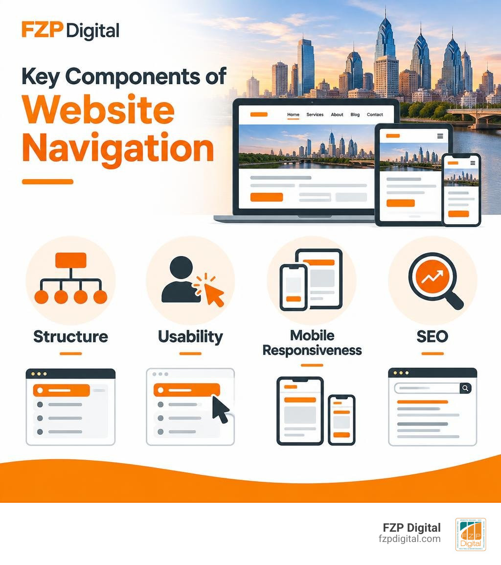
Website Navigation is the system of menus, links, labels, and page paths that helps visitors find what they need on your site. Effective navigation is simple, consistent, easy to use on any screen, and built around the pages that matter most to your audience.
A practical starting point is to:
- Keep your primary menu focused on roughly 5-7 essential links.
- Use clear labels such as “Services,” “About,” or “Contact” instead of clever but vague wording.
- Show visitors where they are with an active menu state and breadcrumbs when appropriate.
- Make every menu usable with a keyboard, screen reader, mouse, and touch screen.
- Ensure important pages are reachable through logical internal links, not hidden behind confusing menus.
This is not a minor design detail. Research has found that 94% of people consider easy navigation the most useful feature of a website. For a Philadelphia business or nonprofit, that can mean the difference between a prospective client finding your services and leaving before they understand what you offer.
Navigation is also a form of wayfinding. It tells people where they are, what else is available, and how to take the next step. When the structure is clear, visitors can move confidently through your site, while search engines can better discover, understand, and index its pages.
I’m Fred Z. Poritsky, founder of FZP Digital. My background in business management, marketing, and WordPress web design helps me approach Website Navigation as both a creative usability challenge and a practical tool for helping organizations grow.
Core Types of Website Navigation and Menu Structures
Have you ever landed on a website and felt immediately lost? You know what you want, but there are links scattered everywhere, buttons flashing in five different colors, and no clear signpost pointing the way. We’ve all been there!
Think of your website as a physical building. Your menu system serves as the directory in the lobby, the hallway signs on each floor, and the emergency exit markers. To build a great user experience, you need to combine different types of navigation structures so visitors can move around smoothly without thinking twice.
Here is a quick breakdown of how common navigation patterns compare:
| Navigation Pattern | Where It Lives | Primary Purpose | Best Used For |
|---|---|---|---|
| Global | Top masthead across every page | Provides universal access to top-level pages | Home, Services, About, Pricing, Contact |
| Local | Sidebars, sub-menus, or inner headers | Helps users explore related pages within a single section | Deep service sub-pages, product categories |
| Contextual | Inside body paragraphs or callout boxes | Guides users to related reading or next steps | In-text resource links, related case studies |
| Utility | Top-right header or top utility bar | Offers secondary tasks and administrative actions | Account login, search bar, language switcher, cart |
| Hierarchical / Breadcrumb | Below header or above main page titles | Reveals the current location in the site’s hierarchy | E-commerce collections, knowledge bases |
Let’s look at how these patterns work together in practice.
Global, Local, and Contextual Navigation Systems
Your global navigation is the anchor of your entire web presence. It appears consistently across every single page—from your homepage to your deepest blog post. As detailed in standard guidelines on global and primary navigation, this masthead area establishes brand identity and gives users a safe, familiar home base no matter where they roam.
Local navigation, on the other hand, comes alive when visitors dig into specific sections. If someone visits your main “Services” page, a local sidebar menu might display specialized offerings like web development, branding, or digital marketing. This keeps your global menu uncluttered while allowing visitors to explore deep topics easily.
Finally, contextual navigation happens organically right inside your content. When writing about a specific topic, linking naturally to another relevant page helps the reader find more depth without returning to the main menu.

Header, Footer, Sidebar, and Breadcrumb Trails
The top header is what everyone notices first. Whether you use a classic horizontal bar or a modern sticky navigation that stays in view as visitors scroll down long pages, your header should make the most vital actions effortless.
Here is how other key menu elements support your header:
- The Footer Menu: Think of your footer as the safety net for your website. When visitors scroll all the way to the bottom, they expect to find organized columns of secondary links, legal disclosures, office addresses, social links, and careers pages.
- Sidebar Menus: Sidebars work wonders for blogs, news portals, and dashboards. They provide instant access to recent posts, categories, or filtering options without taking up vertical real estate on desktop screens.
- Breadcrumb Trails: Breadcrumbs show a clear path like
Home > Services > WordPress Design. They let visitors jump back up one level with a single click.
Here is a surprising industry stat: the Baymard Institute discovered that 91% of ecommerce websites do not highlight the user’s location in the main navigation. That is a massive missed opportunity! Giving your active links a distinct color or underline ensures your visitors never have to guess where they are.
Essential Best Practices for Menu Usability and Architecture
Designing an intuitive menu is an art backed by psychology. When someone arrives at your website, their brain immediately scans for recognizable visual cues. If you make them work too hard to figure out how your site functions, they will simply click away to a competitor.
Applying definitive web usability and accessibility principles creates a welcoming environment for every visitor, regardless of how they browse the web.
Principles for Structuring Website Navigation Menus
When organizing your top-level links, simplicity is your best friend. A good rule of thumb is the 5 to 7 item rule. Research in cognitive psychology shows that human working memory comfortably handles around five to seven chunks of information at once. Overloading your header with 10 or 12 top-level items creates visual clutter and choice paralysis.
To optimize how visitors browse your menu, keep these core principles in mind:
- Leverage the Serial Position Effect: People naturally pay the closest attention to the first and last items in a list (known as the primacy and recency effects). Place your highest-value pages (like “Services” or “Shop”) on the far left, and place your primary action (like “Contact” or “Schedule a Call”) on the far right.
- Choose Clear Over Clever Labels: It might feel creative to label your services section “What We Craft” or your blog “Musings,” but clear labels win every time. Use straightforward terms like “Services,” “About Us,” and “Blog” so users instantly recognize what they will get.
- Use Card Sorting to Understand User Mental Models: When Fred Z. Poritsky and our team at FZP Digital work on complex site redesigns, we often run card-sorting exercises. This involves asking real users to group pages into categories that make intuitive sense to them, rather than organizing menus around internal company jargon.
Mobile-First Adaptation and Responsive Behavior
Did you know that mobile devices make up over 62% of global traffic? If your navigation looks great on a 27-inch desktop monitor but breaks on a smartphone, more than half of your audience will have a frustrating experience.
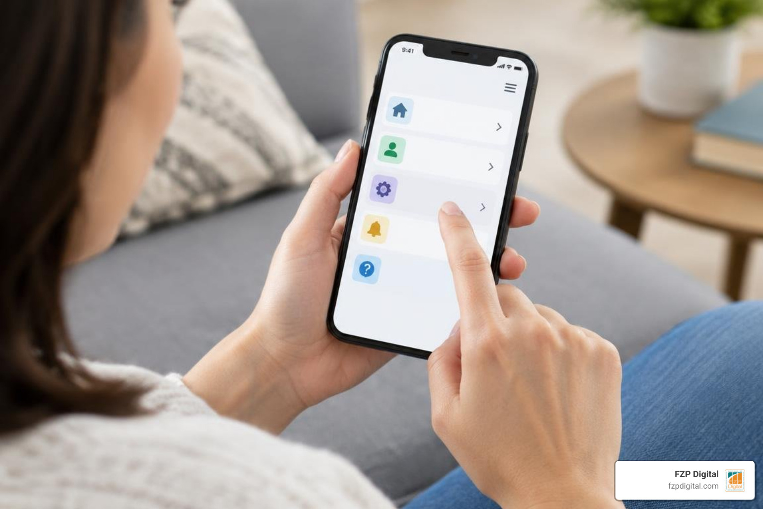
Making your site shine on smaller screens requires thoughtful responsive website design:
- The Hamburger Menu: Collapsing complex links into a three-line hamburger icon keeps your mobile header clean. Just make sure the button has a clear label or accessible text so everyone understands what it does.
- Thumb-Friendly Touch Targets: On desktop, a tiny text link is easy to click with a mouse. On a mobile phone, fingers need breathing room! Make sure buttons and touch targets are at least 44 by 44 pixels so users do not accidentally tap the wrong link.
- Off-Canvas Drawers: When a mobile menu opens, slide it smoothly into view as an off-canvas drawer or full-screen overlay. This blocks distracting background content and helps the visitor focus on making a choice.
Common Navigation Anti-Patterns to Avoid
Just as there are proven design wins, there are also common traps that trip up websites. When crafting effective Philadelphia web design strategies, we routinely help businesses eliminate these frustrating anti-patterns:
- Hover-Only Dropdown Menus: Requiring users to hover their mouse perfectly over a tiny menu item is a recipe for frustration—especially for users with tremors or touchscreens that don’t support hover. Always allow menus to open on click or tap.
- The Mysterious “Three-Click” Obsession: You might have heard the old myth that users abandon a site if they can’t reach any page in three clicks. Usability studies have thoroughly debunked this: users don’t mind 4 or 5 clicks, as long as every single click provides clear, reassuring progress toward their goal!
- Overcrowded Mega Menus Without Structure: Mega menus can be fantastic for large e-commerce catalogs or deep resource libraries, but throwing hundreds of unorganized links into one giant box overwhelms your visitors. Group links into clear, bite-sized categories.
Technical Implementation, Accessibility, and SEO Impact
A beautiful navigation menu is only half the battle. Beneath the surface, your navigation code needs to speak clearly to search engine bots and assistive technologies like screen readers.
When you get the technical foundation right, you create a seamless bridge between user delight and organic search rankings.
Technical and Accessible Website Navigation Markup
Modern web development relies on semantic HTML tags that give meaning to your layout. As outlined in the official HTML nav navigation section documentation on MDN and Google’s web.dev guide on accessible navigation architecture, wrapping your primary link list inside a
container tells assistive tech exactly what this section represents.
To make your menu accessible to every single person:
- Use ARIA Landmarks and Attributes: Adding
aria-label="Main Navigation"differentiates your primary menu from secondary footer menus. Usearia-current="page"on the link corresponding to the active page so screen reader users know where they are. - Provide a “Skip to Content” Link: Keyboard-only users who navigate with the Tab key shouldn’t have to cycle through ten navigation links on every page before reaching the main article. A hidden skip link at the very top of your code allows them to jump straight to the content.
- Maintain Clear Focus Indicators: Never remove the CSS outline on focused elements without providing a vibrant, high-contrast replacement. Keyboard navigators rely on visible focus boxes to see which element is active.
Search Engine Crawling and Internal Link Architecture
Search engines like Google rely on your website navigation to crawl and index your content. Search engine crawlers follow internal links from page to page. If your navigation hierarchy is clear, search engines can easily understand which pages are your cornerstone content and distribute authority (often called “link equity”) throughout your site.
When optimizing your internal link structure for SEO:
- Avoid JavaScript-Only Navigation: Ensure your links use standard HTML
anchor tags. If your menu requires complex JavaScript just to render links, search engine bots might fail to discover your deeper pages. - Use Descriptive Anchor Text: Instead of linking with generic words like “Click Here” or “Details,” use descriptive anchors like “Managed WordPress Hosting” or “Custom Web Design.” This provides helpful context to both human readers and search engines.
- Keep Site Depth Manageable: Aim for a relatively flat architecture where important sub-pages can be discovered within 2 to 4 clicks from the homepage. A well-planned site structure paired with an up-to-date XML sitemap ensures search engines crawl your freshest content efficiently.
Because information architecture and technical SEO require careful planning, partnering with experienced professionals makes all the difference. Under the leadership of Fred Z. Poritsky, our team at FZP Digital handles the technical heavy lifting—from responsive menu architecture to semantic markup—ensuring your site ranks well and converts visitors into loyal clients.
Frequently Asked Questions
How many items should be in a primary navigation menu?
For most websites, keeping your primary navigation to 5 to 7 items is ideal. This limits cognitive load, keeps your header clean, and ensures mobile responsiveness. If you have dozens of specialized pages, organize them logically into categorized dropdowns or sub-menus rather than crowding the main bar.
What is the difference between global and local navigation?
Global navigation appears consistently across every page on your site (like your main top header and main footer), providing access to primary sections. Local navigation is contextual to a specific section—like a sidebar menu that only shows up when browsing articles in a specific category or exploring sub-services.
How does website navigation affect SEO performance?
Website navigation creates the primary internal linking structure that search engines use to discover, crawl, and evaluate your pages. Clear navigation distributes link equity to key landing pages, helps search engines understand the thematic relationships between topics, and keeps visitors engaged longer, reducing bounce rates.
Conclusion
At the end of the day, your website navigation is the roadmap that guides visitors on their journey with your brand. Whether you run a bustling local business in Bucks County or an expanding enterprise in Downtown Philadelphia, giving your visitors clear, intuitive, and accessible paths to explore your services is one of the smartest investments you can make in your digital presence.
By focusing on a tight 5-to-7 item primary menu, highlighting active locations, designing thumb-friendly mobile layouts, and following semantic HTML best practices, you set your website up for long-term usability and search engine success.
If you are looking to refresh your web architecture or want to implement proven website navigation best practices, we are here to help! At FZP Digital, we take pride in our collaborative “Develop . Design . Deliver” process, crafting high-performance, accessible WordPress websites tailored to your unique goals. When building or hosting a high-performance WordPress website, we rely on top-tier managed WordPress hosting environments—and FZP Digital recommends GoDaddy and WP Engine for industry-leading speed, reliability, and security.
Ready to give your visitors the smooth, effortless browsing experience they deserve? Reach out to our team today, and let’s build something exceptional together!