

Smart NPO Website Design Strategies to Boost Online Giving
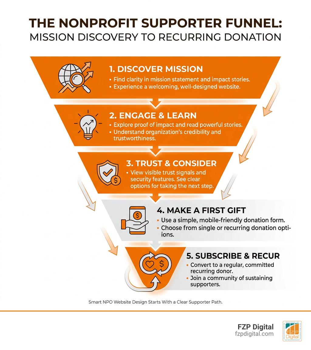
Smart NPO Website Design Starts With a Clear Supporter Path

Effective npo website design makes it easy for every visitor to understand your mission, trust your organization, and take one meaningful next step. Start with these priorities:
- Lead with a clear mission statement and an emotionally specific impact story.
- Put a visible Donate button in the header and reinforce it on key pages.
- Use a short, mobile-friendly donation form with recurring-gift options and trust signals.
- Create simple routes for other supporters, including volunteers, advocates, and corporate partners.
- Build for accessibility, fast loading, and search visibility from the beginning.
A beautiful website is not enough if visitors cannot quickly find what they need. Your photos, videos, impact data, and stories should support the action you want people to take, not compete with it.
The best nonprofit sites pair human storytelling with practical choices: clear navigation, scannable copy, credible proof of impact, and focused calls to action. When the experience feels trustworthy and effortless on a phone, more people can move from curiosity to a first gift, volunteer application, email signup, or recurring donation.
I’m Fred Z. Poritsky, founder of FZP Digital. After years in nonprofit financial management and digital marketing, I use that practical and creative perspective to help Philadelphia-area organizations approach npo website design as a measurable path to greater visibility, trust, and support.
Important npo website design terms:
- nonprofit website design best practices
- charity website design
- web design for nonprofit organizations
Core Principles of High-Converting NPO Website Design
When someone visits your website, you have mere seconds to capture their attention, explain your purpose, and earn their confidence. Achieving this requires intentional visual hierarchy, genuine emotional resonance, and intuitive layout structures. High-performing nonprofit platforms avoid cluttered sidebars and walls of dense text. Instead, they guide the user’s eye naturally from inspiring mission headlines down to actionable next steps.
Implementing comprehensive nonprofit site strategies begins with organizing your pages so that visitors never feel lost. If your organization offers multiple community initiatives, educational materials, and events, consider using an intuitive mega-menu. Mega-menus organize deep page hierarchies into tidy, categorized columns, allowing users to find specific resources in a single click without feeling overwhelmed.
Trust indicators are another vital pillar of design. Modern donors want to know their hard-earned dollars are handled ethically. Prominently displaying third-party credibility markers—such as Candid (GuideStar) seals, Charity Navigator ratings, and Better Business Bureau accreditation badges—builds instant authority. When paired with transparent financial summaries and authentic community imagery, these trust signals remove skepticism and encourage visitors to open their hearts and wallets.
Balancing Compelling Storytelling with Clear Calls to Action
How do you connect with a potential donor on an emotional level without losing sight of your fundraising goals? The secret lies in pairing authentic human stories with timely, clear calls to action (CTAs). When visitors read about real people whose lives were changed by your programs, they feel empathy and a desire to help.
To create this emotional connection:
- Feature short beneficiary spotlight videos that highlight transformation rather than just crisis.
- Use authentic, high-resolution photography showcasing real community members instead of generic stock photos.
- Break up your text using descriptive subheadings, short paragraphs, and bullet points so your message remains scannable.
Applying proven design practices for mission-driven sites means your calls to action should flow naturally from these stories. After sharing an inspiring milestone, immediately present a focused CTA button such as “Feed a Family Today” or “Sponsor a Student.” Sticky header navigation bars ensure a brightly colored “Donate” button remains visible as users scroll, giving them an effortless path to give whenever inspiration strikes.
Essential Donation Elements in NPO Website Design
Your donation page is the financial engine of your organization. Every extra form field, confusing dropdown, or slow-loading script introduces friction that causes potential donors to abandon the process. To ensure your checkout experience runs smoothly, watch this helpful video overview on Must-have parts of a good nonprofit website.
To convert casual visitors into dedicated contributors, your donation setup should include:
- Streamlined single-page forms: Keep required fields to an absolute minimum—usually name, email, and payment details.
- Suggested giving tiers tied to real impact: Instead of blank input boxes, offer preset amounts with tangible descriptions (e.g., “$50 provides one week of groceries”).
- Prominent recurring giving toggles: Encourage sustainable funding by making monthly recurring donations the default or an easy one-click selection.
- Digital wallet integration: Allow donors to complete their gifts instantly using Apple Pay, Google Pay, or PayPal.
- Visible security reassurance: Display SSL certificates and secure checkout badges right alongside the payment submission button to put minds at ease.
Optimizing the Supporter Experience and UX Flow
User experience (UX) design is about crafting an intuitive, enjoyable pathway for every person who arrives on your site. Whether a visitor wants to make a financial contribution, register for a volunteer shift, or read research publications, their journey should be direct and friction-free.
Understanding your audience personas helps you map out clean pathways that cater to their unique needs. Implementing tactical website design tips allows your organization to build dedicated portals for community members, volunteers, and corporate partners without cluttering your core navigation.
Because more than half of all web traffic arrives via smartphones, mobile responsiveness cannot be an afterthought. Touch targets must be large and thumb-friendly, text must be legible without zooming, and navigation menus must collapse cleanly into accessible mobile drawers.
| Donation Form Type | Conversion Strengths | Best Use Case | Implementation Tip |
|---|---|---|---|
| Single-Page Form | Minimizes steps; keeps donors focused; quick to load | Rapid response campaigns, general giving pages | Use clear section headers to visually separate contact and payment fields |
| Multi-Step Form | Breaks complex data into bite-sized steps; reduces visual clutter | Large capital campaigns, detailed membership signups | Include a visual progress bar so donors know exactly how close they are to finishing |
Interactive Tools and Matching Gift Integration
Did you know that billions of dollars in corporate matching gifts go unclaimed every single year? Many donors are completely unaware that their employers will match their charitable contributions dollar-for-dollar. By integrating a dedicated employer matching gift search tool directly into your donation confirmation page and navigation menu, you can instantly double your fundraising revenue.
Exploring innovative nonprofit web ideas often reveals that interactive features significantly lift donor engagement. Providing a searchable database powered by matching gift software lets contributors type their company name, verify corporate policy eligibility, and access downloadable submission forms in seconds. This seamless functionality empowers supporters to maximize their personal impact without adding administrative overhead for your staff.
Campaign Microsites and Impact Reports
When launching a special anniversary initiative, capital campaign, or major research publication, standard web pages can sometimes feel limiting. Dedicated campaign microsites and interactive landing pages provide the creative space needed to present deep data in an engaging, digestible format.
Instead of forcing supporters to download a static 60-page PDF report, translate your findings into an interactive digital experience. Bold data callouts, interactive charts, and multimedia case studies bring research to life. For example, community foundations frequently turn complex community needs assessments into dynamic web stories, using animated infographics and video testimonials to demonstrate progress and rally civic investment.
Technical Performance, Accessibility, and CMS Architecture
A visually stunning website cannot achieve its goals if it suffers from sluggish page load times or complex content management systems that your team struggles to update. Choosing the right content management system (CMS) provides your staff with the editorial agility needed to publish urgent updates, launch event forms, and curate photo galleries without relying on technical experts for every minor tweak.
Building on WordPress development for charitable organizations delivers the ideal balance of flexibility, robust security, and user-friendly visual page building. However, high-performing websites require dependable hosting infrastructure to handle traffic spikes during major fundraising galas or end-of-year giving drives. When evaluating managed hosting solutions, FZP Digital recommends GoDaddy and WP Engine for their dependable uptime, staging environments, automatic daily backups, and robust server-level caching.
Technical Accessibility Standards for NPO Website Design
Digital accessibility is both an ethical responsibility and a practical necessity. Your website must be welcoming and usable for everyone, including individuals with visual, auditory, motor, or cognitive disabilities. Committing to Web Content Accessibility Guidelines (WCAG 2.2 AA) ensures your platform remains compliant, user-friendly, and inclusive.
To explore real-world accessibility implementation details, review the Dutch Public Broadcasting platform standards on Toegankelijkheid NPO.nl.
Essential accessibility practices include:
- Keyboard navigation: Ensuring all interactive buttons, menus, and forms can be fully navigated using only the Tab and Enter keys.
- Sufficient color contrast: Maintaining strong contrast ratios between body text and backgrounds so readers with low vision can read comfortably.
- Semantic HTML and ARIA labels: Structuring headings sequentially (H1, H2, H3) and applying clear descriptive labels to all icon buttons and form inputs.
- Descriptive alternative text: Writing meaningful alt attributes for images to convey context to screen reader users.
- Motion sensitivity options: Respecting user settings for reduced motion by toning down parallax scrolls or autoplaying background videos.
Content Architecture and Multisite Management
As organizations expand, managing diverse digital properties—such as educational portals, localized community chapters, and programmatic sub-sites—can quickly become unmanageable. Adopting a modular content architecture with reusable design components keeps your brand identity consistent across every page.
A centralized multisite network allows your administrators to share design elements, global headers, and security protocols across multiple portals while granting departmental teams independent control over their specific content. This modular architecture prevents visual fragmentation, eliminates redundant plugin subscriptions, and ensures that when a new feature is developed for one program, it can be instantly deployed across your entire network.
Multichannel Promotion and SEO Strategies for Nonprofits
Publishing your new website is only the first step; you also need a steady stream of engaged visitors. Combining organic search engine optimization (SEO), targeted paid advertising, and email marketing creates a powerful engine for community awareness.
Leveraging essential digital marketing tactics ensures your organization captures the attention of individuals actively searching for causes like yours. Google processes billions of searches every day, and ranking organically for relevant search terms connects you with supporters precisely when their intent to get involved is highest.
Driving Targeted Traffic with SEO and Ad Grants
With Google owning more than 90% of the search engine market, appearing on the first page of search results is a massive advantage. Many nonprofits make the mistake of only targeting their exact brand name. To expand your reach, you must also target educational keywords, localized cause queries, and questions your community is asking.
When launching scalable cause-driven websites, take full advantage of the Google Ad Grants program. Eligible 501(c)(3) organizations can receive up to $10,000 per month in in-kind search advertising credits.
To maximize this grant:
- Build dedicated, high-converting landing pages tailored to specific keyword themes.
- Maintain high click-through rates by matching search intent closely with your ad copy.
- Track conversions accurately in Google Analytics to measure volunteer signups and donations generated by your ad spend.
Tracking Metrics and Avoiding Common Design Pitfalls
To continuously improve your fundraising results, you need to track how visitors interact with your pages. Regularly reviewing your analytics helps you identify bottlenecks in your supporter funnel and make data-driven adjustments.
Understanding foundational web design principles also helps you avoid common pitfalls that hinder conversions, such as:
- Burying the mission: Failing to explain what your organization does above the fold on the homepage.
- Overwhelming donation forms: Asking for unnecessary demographic details that cause donors to drop off.
- Slow page load times: Uploading uncompressed, heavy image files that slow down mobile performance.
- Ignoring recurring donor pathways: Overlooking the power of automated monthly giving programs.
Key metrics to monitor include your overall conversion rate on donation pages, average donation size, bounce rate on landing pages, and email newsletter opt-in percentages.
Frequently Asked Questions About NPO Web Design
What are the most critical features needed to maximize online donations?
The most impactful features are a fast, single-page donation form, mobile-friendly payment options (like Apple Pay and Google Pay), preset gift tiers with clear impact descriptions, recurring giving options, and prominent third-party security badges. Minimizing required fields removes friction and dramatically boosts conversion rates.
How does WCAG accessibility directly impact nonprofit fundraising?
Implementing WCAG 2.2 AA accessibility standards ensures that individuals using screen readers, keyboard-only navigation, or high-contrast displays can browse your site and complete donation forms without technical barriers. Digital inclusion widens your reach, respects all community members, and protects your organization from compliance issues.
How can nonprofits make the most of Google Ad Grants on their website?
To maximize the $10,000 monthly Google Ad Grant, create focused landing pages tailored to high-intent search queries. Ensure your website loads quickly, maintains strong keyword relevance, and has robust conversion tracking configured so you can see exactly which campaigns drive donations, event registrations, and volunteer signups.
Conclusion
Your website is the heart of your nonprofit’s digital identity. When you combine inspiring storytelling, intuitive navigation, accessible design, and frictionless donation forms, you turn everyday visitors into lifelong advocates and recurring supporters.
Ready to transform your online presence and unlock new levels of giving for your mission? At FZP Digital, we love collaborating with mission-driven leaders across Bucks County and the greater Philadelphia area. We invite you to explore our web design and development services to see how our hands-on “Develop . Design . Deliver” process can help your organization thrive for years to come.