Why Your Brand Mark Logo Is the Face of Your Business
A well-designed brand mark logo is often the first thing people notice about your business — and, more importantly, it’s what they remember long after they’ve scrolled past.
Think about it. You can probably picture the Nike swoosh, the Apple silhouette, or the Amazon smile without anyone saying a word. No company name needed. That’s the power of a great brand mark at work.
Here’s a quick answer if you’re looking for the essentials:
What is a brand mark logo?
| Term | What It Is | Example |
|---|---|---|
| Brand Mark | A visual symbol that represents your brand without words | Apple’s bitten apple, Nike’s swoosh |
| Logotype (Wordmark) | Stylized text spelling out the brand name | Coca-Cola’s Spencerian Script |
| Logo | The full visual identity system, which can include both a mark and a wordmark | Most modern brand systems combine both |
| Icon | A simplified graphic used primarily in digital interfaces | App icons, favicons |
The short version: a brand mark is the purely visual, text-free symbol your audience learns to associate with everything your business stands for.
And here’s why this matters for you specifically. About 65% of people are visual learners, which means your audience is already wired to recognize and remember images faster than words. Your brand mark is doing real work every time it shows up — on your website, your social profiles, your business cards, and your Google search result.
Getting it right isn’t just a design exercise. It’s a business decision.
I’m Fred Z. Poritsky, founder of FZP Digital, and my background spans decades of financial management, digital marketing, and creative problem-solving — experience that gives me a unique lens on how a brand mark logo should balance visual appeal with real business strategy. Let’s walk through everything you need to know to design one that actually works for your business.

Quick look at brand mark logo:
What Is a Brand Mark Logo and How Does It Differ?
To build a memorable visual identity, we first need to understand what a brand mark logo actually is. A brand mark (sometimes called a pictorial mark, brandmark, or logo symbol) is a graphic, icon, or symbol that represents a company without relying on spelled-out text. It is a visual representation that strips away letters and words, communicating purely through shape, color, and form.
But how does it communicate if it has no words? It does so by tapping into our brains’ natural ability to process visual information. When you see a symbol consistently associated with a specific service, feeling, or quality, your brain builds a cognitive bridge. Over time, that simple mark begins to carry the entire weight of your company’s reputation.
Choosing to use a brand mark is a powerful way to Stop Blending In and Start Making a Brand Mark. Instead of blending into a crowded marketplace with a generic name, you give your audience a distinct, non-verbal anchor. This visual anchor triggers instant recall, allowing people to identify your business in a split second, whether they see it on a small smartphone screen or a physical storefront in downtown Philadelphia.
Brand Mark vs. Logotype vs. Icon
While people often use the word “logo” as a catch-all term, professional designers make clear distinctions between a brand mark, a logotype, and an icon.
- Brand Mark: A standalone graphic symbol (like the Target bullseye or the Shell seashell). It communicates your brand’s essence without any text.
- Logotype (Wordmark): Stylized typography of the brand name itself. It relies entirely on the design of the letters to convey personality. A famous historical example is the File:Coca-Cola logo.svg, which uses elegant Spencerian Script. This expressive cursive handwriting style was highly popular in late 19th-century American penmanship, proving that stylized lettering can become globally recognizable in its own right.
- Icon: A simplified, highly functional graphic used mainly in digital spaces, such as a website favicon or a mobile app button. While a brand mark can function as an icon, icons are often simplified even further to remain clear at tiny resolutions (like 16×16 pixels).
To help you visualize how these elements fit together, let’s look at this simple comparison:
| Design Element | Primary Focus | Best Use Case | Real-World Example |
|---|---|---|---|
| Brand Mark | Symbolism & Shape | Social avatars, favicons, physical merchandise | Apple’s bitten apple |
| Logotype | Typography & Readability | Website headers, official letterheads, storefronts | Google, Coca-Cola |
| Icon | Functionality & Simplicity | App store buttons, browser tabs, UI navigation | GitHub’s “Invertocat” icon |
Why a Brand Mark Logo Matters for Your Identity
Why should you invest the time to develop a dedicated visual mark? Because it acts as a mental shortcut for your target audience.
When you’re running a business in Philadelphia, Newtown, or Richboro, you’re competing for limited attention. A word-free symbol bypasses the need for your audience to read and process text. It builds immediate visual familiarity.
Furthermore, a great brand mark supports your entire brand identity system. It doesn’t stand alone in a vacuum; instead, it works in harmony with your color palette, typography, and messaging to evoke a specific emotion. Whether you want to project cutting-edge tech innovation or warm, local trustworthiness, your brand mark is the anchor that holds it all together. To dive deeper into how these pieces connect, check out our guide on Beyond the Logo: What is Brand Identity Anyway?.
The Core Characteristics of an Effective Brand Mark
Not all symbols are created equal. A truly successful brand mark logo doesn’t happen by accident. It is carefully crafted to meet five core criteria:
- Memorable: It must be simple enough to be easily recalled. If a customer tries to draw your logo from memory, can they get the basic shape right? If the design is too complex, the brain filters it out.
- Scalable: A great mark works at any size. It should look just as crisp on a massive billboard along I-95 as it does as a tiny favicon in a browser tab.
- Timeless: Avoid chasing temporary design trends that will look dated in two years. Aim for a design that can grow with your business for decades.
- Distinct: It must stand out from your direct competitors. If every digital marketing agency or local service provider in Bucks County uses the exact same house or gear graphic, your brand will blend into the background.
- Flexible: It should work across different mediums. Your mark must look excellent in full color, in single-color black or white, on a digital screen, and embroidered on a polo shirt.
At FZP Digital, we believe that “simple” does not mean “generic.” Our collaborative design process, guided by Fred Z. Poritsky, focuses on stripping away unnecessary clutter until we are left with a clean, powerful symbol that represents your unique business values.

If you want to explore how to balance these elements for your own business, read our in-depth guide, Make a Mark: The Ultimate Guide to Crafting Your Perfect Logo.
The Main Types of Brand Marks You Can Use
When you begin brainstorming your visual symbol, you’ll find that brand marks generally fall into a few distinct categories:
- Abstract Symbols: Non-literal geometric shapes that convey a feeling rather than a physical object. Think of the Nike swoosh or the Chase bank octagon. These are fantastic for businesses that want a modern, highly unique identity that can adapt as their services expand.
- Pictorial Marks: Clear, recognizable real-world images. The Apple logo, the Target bullseye, or the Twitter bird are classic examples. These are highly intuitive and build instant association, though they can sometimes feel too restrictive if your company pivots to new industries.
- Monograms & Lettermarks: Symbols built from the initials of your company name (such as HBO, IBM, or HP). This is an excellent choice if your business name is long or difficult to pronounce.
- Emblems: Designs that keep the company name and symbol locked together inside a badge, seal, or crest (like Harley-Davidson or Starbucks). Emblems offer a traditional, prestigious feel, though they can struggle with readability at smaller digital sizes.
To see how top-tier brands use these styles to communicate prestige and heritage, take a look at our analysis of The Most Famous Luxury Logos and What They Mean.
Designing Your Brand Mark with a Strategic Brand Process
A great brand mark is born from strategy, not guesswork. Many business owners make the mistake of jumping straight into a design tool or an AI generator without first defining who they are.
At FZP Digital, we use a collaborative Develop . Design . Deliver process. We don’t just hand you a random icon; we align your visuals with your business goals. Whether we are designing for a local boutique in Newtown or a growing enterprise in downtown Philadelphia, our process ensures your brand mark is built to last. If you love clean, impactful design, you might enjoy our article on Minimalist Logo Design Secrets for Bold Brands.
Starting with Discovery and Brand Direction
Before we draw a single line, we ask the right questions:
- Who is your ideal customer?
- What emotions do you want people to feel when they see your brand?
- Where will your logo be seen most often (e.g., on a WordPress website, social media, or physical packaging)?
We review your current brand presence and research your local competitors. We then establish a clear visual direction using moodboards and style references. This phase acts as our strategic compass, saving you time and ensuring the final design matches your vision.
Sketching, Concept Development, and Refinement
Once we have a strategic direction, the creative work begins. We explore various shapes, typography layouts, and negative space concepts. We test how different symbols look when paired with your brand name, and how they stand alone.
We then present the strongest concepts to you. Through open, collaborative feedback, we refine the chosen mark—perfecting the curves, adjusting the line weights, and choosing a harmonious color palette. These small, precise adjustments are what elevate a basic graphic into a highly professional brand mark logo.
Preparing Professional Logo Files and Brand Guidelines
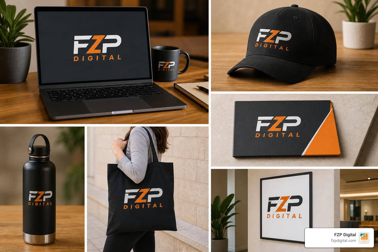
A beautiful logo is useless if you don’t have the right files to use it. When our design process is complete, we deliver a comprehensive logo suite that includes:
- Primary Mark: Your main logo layout (often a combination of the symbol and wordmark).
- Standalone Brand Mark: The symbol on its own, optimized for social media avatars, favicons, and app icons.
- Vector Source Files (SVG, EPS, PDF): Infinite scalability files for high-quality printing, signage, and web development.
- Web-Ready Files (PNG, JPG): Optimized files with transparent backgrounds for your website and emails.
We also compile your custom Brand Guidelines. This document outlines your exact color codes (HEX, RGB, CMYK), typography pairings, and clear space rules. This ensures your brand looks absolutely consistent, no matter who is working on your marketing materials.
Best Practices for Implementing Your Brand Mark Across Platforms
Once your brand mark is ready, consistency is your superpower. To keep your brand looking professional, you must apply it correctly across every single touchpoint.
Large tech companies spend millions protecting and maintaining their visual identities. For example, you can look at the strict rules in the Logo – Brand Toolkit or the extensive layout specifications in the Salesforce Logo guidelines. They understand that even a tiny alteration can weaken brand recognition.

Using Your Brand Mark on Your Website
Your website is your digital storefront. To build immediate trust with your visitors, place your logo in the top-left corner of your header — this is where users naturally look first.
- Favicon: Use your standalone brand mark as your browser tab icon (favicon). It should be simplified so it remains recognizable at 16×16 or 32×32 pixels.
- Mobile Navigation: On smaller screens, space is limited. Use your standalone brand mark in the mobile header to save precious screen space while keeping your brand visible.
- Footer: Place a clean, secondary version of your logo in the footer, alongside your copyright and contact info.
Using Your Brand Mark in Social Media and Digital Marketing
On social platforms, your logo will often be viewed at very small sizes on mobile screens.
- Profile Pictures: Never squeeze your full horizontal logo into a circular profile frame. Use your standalone brand mark symbol. It fills the circle beautifully and remains clear on mobile feeds.
- Email Marketing: Use a clean, centered version of your logo at the top of your email newsletters. Keep it reasonably small (under 200 pixels wide) so it doesn’t push your actual email content too far down the screen.
- Templates: Create social media graphics with a small, consistent watermark of your brand mark in one of the corners to protect your content and build visual familiarity over time.
Using Your Brand Mark in Print and Real-World Materials
If you have physical business locations in Philadelphia, Newtown, or Richboro, you’ll need your logo to look great in the real world.
- Business Cards: Keep it clean. Use your full logo on one side, and your standalone brand mark on the back with a solid brand color.
- Signage & Apparel: When embroidering shirts or printing window decals, highly complex gradients or tiny details will get lost. This is where a simplified, one-color vector version of your brand mark is essential.
Real-World Inspiration from Successful Brands
Looking at how global brands manage their visual assets can teach us a lot about the power of simplicity:
- Apple: Their original 1976 logo was an intricate, hand-drawn illustration of Isaac Newton sitting under an apple tree. It was beautiful, but incredibly hard to reproduce or scale. They quickly simplified it to the iconic bitten apple silhouette. Over the decades, they’ve changed the colors and textures, but the fundamental shape has remained exactly the same.
- Jaguar: In late 2024, this legendary luxury automotive brand underwent a dramatic visual transformation. As detailed in the official launch, FEARLESS. EXUBERANT. COMPELLING. THIS IS JAGUAR, REIMAGINED | Jaguar 2024 Media Newsroom, they introduced a new geometric “device mark” that blends upper and lowercase characters in perfect symmetry, showing how even historic brands must evolve to stay modern.
- UNC-Chapel Hill: Educational and public institutions also understand the value of a unifying symbol. As explored in The University’s new mark is anything but | UNC-Chapel Hill, the university officially adopted its historic interlocking “NC” athletics logo—which dates back to the 1870s—as its primary university-wide mark. This smart move bridged their rich athletic heritage with their world-class academic and research achievements under a single, globally recognized symbol.
Common Brand Mark Logo Mistakes to Avoid
When designing a brand mark, it’s easy to fall into a few common traps:
- Overcomplicating the Design: If your logo has too many thin lines, complex gradients, or tiny details, it will turn into an unreadable smudge when scaled down on a mobile screen.
- Chasing Temporary Trends: Designing a logo based on what’s “cool” on social media right now means your brand will feel dated in just a few years. Aim for classic simplicity.
- Being Too Literal: If you run a clean energy company, you don’t necessarily need a literal drawing of a solar panel. An abstract wave or motion-inspired shape can convey the same feeling of energy while remaining far more unique and modern.
- Skipping the Testing Phase: Never finalize a logo without viewing it on a phone screen, printing it on a basic office printer, and seeing how it looks in pure black and white.
- Ignoring Trademark Issues: Always research your local market to make sure your symbol isn’t accidentally identical to another business in your area.
By working with an experienced design partner like FZP Digital, you can avoid these costly mistakes and build a brand mark that serves your business beautifully for years to come.
Frequently Asked Questions About Brand Marks
What Is the Difference Between a Brand Mark and a Logo?
A brand mark is the specific, text-free visual symbol (like a shape or icon), while a “logo” refers to your entire visual system. Your full logo system typically includes your brand mark, your stylized brand name (logotype), and different layouts (like stacked or horizontal versions) that you use across different platforms.
Do I Need a Brand Mark If I Already Have a Wordmark?
Not every business needs a standalone symbol right away. If you have a highly unique, beautifully stylized wordmark, that might be enough to start. However, as your business grows digitally, having a separate brand mark becomes incredibly helpful. It gives you a flexible, compact visual that fits perfectly into small spaces like favicons, social media profile circles, and mobile app icons where a long wordmark would be illegible.
Why Is Scalability So Important for a Brand Mark?
In our digital-first world, your logo has to work in a massive variety of sizes. It needs to look sharp on a giant billboard, a desktop monitor, a smartphone screen, and a tiny browser tab. If your logo isn’t scalable, it will lose its clarity and impact, making your business look unprofessional. You can read more about how scalability affects your overall visual presence in our guide, What is Visual Identity and Branding in Design?.
What Files Should I Have for My Brand Mark Logo?
You should always have vector source files (such as SVG, EPS, or PDF) because they can be scaled to any size without losing quality. You also need high-resolution raster files (PNG and JPG) with transparent backgrounds for daily use on your website, social media, and digital documents.
How Often Should a Brand Mark Be Updated?
Most successful brands don’t completely redesign their logos very often. Instead, they do a subtle “brand refresh” every 7 to 10 years to modernize their typography, clean up their lines, or adjust their colors while keeping the core symbol recognizable. A complete redesign is usually only necessary if your business is pivoting to a completely new industry or if your original logo is causing usability issues.
Conclusion: Ready to Make Your Mark?
Your brand mark logo is more than just a pretty graphic. It is the visual anchor of your entire business identity, a powerful mental shortcut that helps your audience find, and trust you in a crowded digital world.
While modern tools and AI generators can be a fun way to brainstorm initial ideas, crafting a truly timeless, scalable, and professional brand system requires a strategic approach.
At FZP Digital, we love helping local businesses in Newtown, Richboro, Philadelphia, and beyond build visual identities they are proud to show off. When you collaborate with us, you’re not just getting a design file. You’re getting a thoughtful, hands-on partner. We work closely with you to align your new brand mark with custom, high-performing WordPress web design and smart SEO strategies to make sure your business gets noticed both online and offline.
Are you ready to stop blending in and start making your mark? Let’s chat! We’d love to help you build a brand that stands out. To get started, explore our Branding Complete Guide or reach out to us today to discuss your next project.