

How to Design a Responsive Website Navbar That Works on Every Screen
To build a responsive website navbar, start with your logo, a few clearly named links, and your most important action. Arrange them in a horizontal row on wider screens, then use a mobile menu button to reveal the links on smaller screens. Keep a key action, such as “Contact Us,” easy to find, and test that every link works by touch and keyboard.
Your navigation should help visitors find what they need without making them think too hard. That matters whether someone is exploring your services at a desk or looking for your phone number while they’re out and about.
I’m Fred Z. Poritsky, and I learned web design and marketing on the job before starting FZP Digital to help businesses build a stronger digital presence. I’ll walk you through how to plan a responsive website navbar, adapt it for mobile, and make sure everyone can use it.
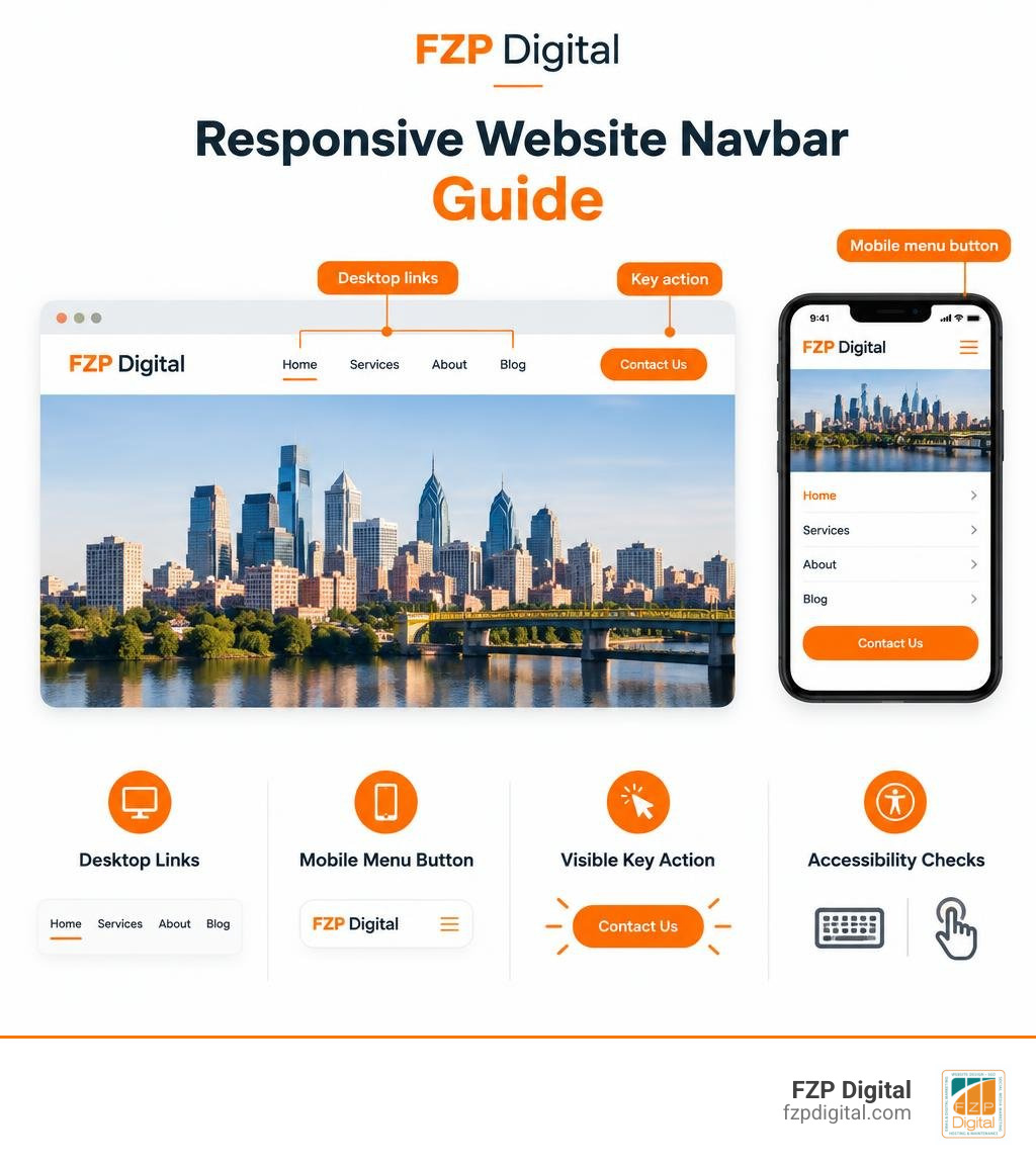
Handy responsive website navbar terms:
Why Responsive Navigation Matters for User Experience and Conversions
Did you know that visitors often bounce after just 10 seconds if your header breaks or feels clunky on their phones? When people land on your website, your navigation bar is the very first tool they look for to find their way around. If it lags, overlaps page content, or hides critical pages, visitors won’t stick around to figure it out—they’ll just head back to search results.
With mobile devices driving well over half of all web traffic and search engines prioritizing mobile-first indexing, having solid responsive website design isn’t just an aesthetic upgrade; it directly protects your bottom line.
Psychology plays a massive role here, too. A core principle known as Jakob’s Law states that users spend most of their time on other websites. That means they expect your site’s navigation to work just like the ones they already know and love. When we throw unexpected layouts at users or overwhelm them with choices, decision fatigue sets in. Keep it familiar, fast, and effortless, and your visitors will happily stick around to explore.
Visual Hierarchy and Scanning Patterns
When people view a website on a desktop screen, their eyes naturally follow a scanning pattern across the top of the page. Placing your brand logo on the far left establishes immediate identity and serves as a reliable home button. From there, visitors scan across your primary navigation links in the center before resting on your primary call-to-action (CTA) button on the far right.
This layout leverages Miller’s Law, which suggests that human short-term memory comfortably handles about five to seven items at once. Sticking within this range keeps your visual hierarchy balanced and guides visitors toward your core goals without distraction.
The Business Cost of Broken Navigation
What happens when your mobile header isn’t properly optimized? When high-intent buttons like “Get a Quote” or “Start Free Trial” get buried deep inside a collapsed mobile drawer, conversion rates drop dramatically.
Mobile visitors are usually on the move and want answers fast. If your navigation creates friction during their customer journey, you risk losing qualified leads before they even see what makes your business special.
How to Plan and Structure a Responsive Website Navbar
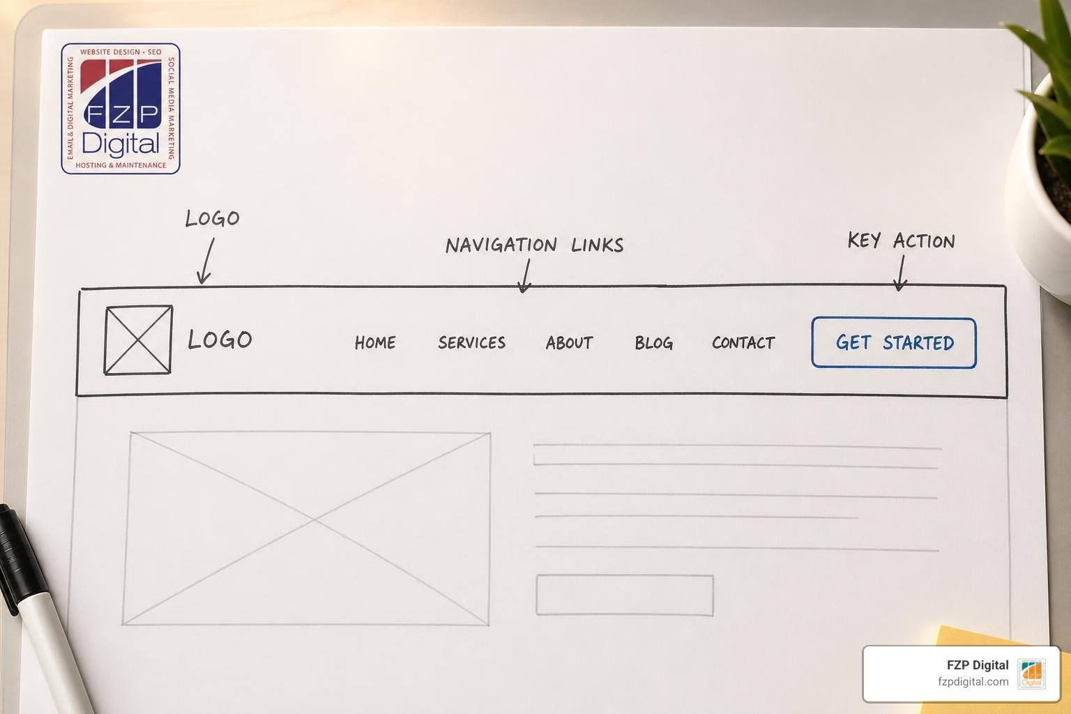
Before writing any styles or code, we always recommend planning your link structure around real customer needs rather than your internal company org chart. You can check out some fantastic creative navbar design examples to see how streamlined menus look in the real world.
To avoid decision paralysis, narrow your main links down to your top five or six essentials. Ask yourself: what are the core pathways a new customer takes to buy from you or reach out?
Essential Elements of a Responsive Website Navbar
A high-performing navigation bar balances branding, exploration, and direct action. Here are the core building blocks you’ll want to include:
- Brand Logo: Anchored to the top-left corner, linking directly back to your homepage.
- Primary Navigation Links: 5 to 7 clearly labeled destinations (like Services, About, Portfolio, and Pricing).
- Distinct CTA Button: A high-contrast button positioned on the far right that encourages conversion.
- Secondary Actions: Practical utility items such as a phone number, client login, or shopping cart.
- Search Integration: An optional search bar or quick-access search toggle for content-heavy sites.
Planning Mobile Priority and Persistent Actions
Screen real estate is precious on mobile devices. While collapsing secondary links into a tidy hamburger menu works wonders, you should always evaluate whether your main CTA should stay visible outside that drawer.
Keeping a compact “Call Now” or “Book” button fixed right next to your hamburger icon allows mobile visitors to take immediate action without taking an extra step. Remember to make all interactive elements comfortably large—aiming for touch targets of at least 44 by 44 pixels so fingers never miss.
Step-by-Step Guide to Building Desktop and Mobile Navigation Layouts
Building a reliable navigation system starts with clean, semantic HTML5 markup and modern styling methods like Flexbox and CSS Grid. You can also explore popular frameworks like the Bootstrap navbar documentation or resources like Flowbite’s Tailwind navigation tools to understand how modern responsive components are structured.
Here is how your navigation layout should adapt across standard screen breakpoints:
| Device Viewport | Screen Width Range | Recommended Navbar Layout | Key Features |
|---|---|---|---|
| Mobile | 320px to 480px | Collapsed Hamburger Menu | Persistent phone/CTA icon, full-width slide-out drawer, 44px+ tap targets |
| Tablet | 481px to 768px | Hybrid / Compact Bar | Condensed link spacing, simplified utility icons, dropdown triggers |
| Desktop | 769px to 1024px+ | Full Horizontal Bar | Expanded link list, hover indicators, prominent CTA button |
Crafting the Desktop Navigation Header
On wider displays, Flexbox makes aligning your header painless. Wrapping your brand logo, unordered navigation list, and action buttons in a flexible container with horizontal alignment gives you a clean presentation across any monitor.
To provide clear feedback as users browse, include subtle hover transitions and dedicated active state indicators (such as an animated underline) to show visitors exactly which page they’re on. Creating intuitive home page navigation makes the entire browsing experience feel polished and responsive.
Converting to Mobile Hamburger and Off-Canvas Drawers

When a browser window shrinks below 768px, your horizontal menu should gracefully transform into a collapsible drawer. Beginners can reference guides like the W3Schools responsive top navigation guide or tutorials from The Syntax Diaries to see classic hamburger toggle setups.
Using smooth CSS transforms (such as sliding horizontally or scaling vertically) combined with vanilla JavaScript class toggles lets you animate your menu open and closed without causing layout shifts that hurt your site’s performance scores.
Adding Interactivity, Smooth Transitions, and Advanced Features
Once the core foundation is set, adding interactive polish takes your user experience to the next level. A popular modern design pattern is the sticky header that stays pinned to the top as a user scrolls down the page.
By pairing sticky positioning with a subtle backdrop blur effect, your header remains legible over any page background while keeping key links just a click away. You can also integrate smooth dark and light mode toggle switches that remember visitor preferences using browser local storage.
Handling Dropdowns and Mega Menus Seamlessly
If your website offers a wide range of services or products, dropdown submenus help organize content without crowding the main bar. While desktop users enjoy quick hover reveals, touchscreens don’t have a cursor hover state.
For mobile and tablet users, configure dropdowns to open on a tap or click. Using an accordion-style toggle inside your mobile drawer ensures users can easily expand and collapse sub-categories without losing their place.
Sticky Positioning and Scroll Effects
When fixing your navigation to the top of the viewport, fixed elements are removed from the regular document layout flow. To prevent your page content from hiding underneath your header, make sure to add top padding to your page container that matches your navbar’s height.
As visitors scroll down, you can even compress the header slightly to save vertical space while keeping your branding and contact links readily available.
Ensuring Full Accessibility and Avoiding Conversion Pitfalls
Great web design must be accessible to everyone. Designing an accessible navbar means meeting WCAG AA standards, which include maintaining a minimum 4.5:1 color contrast ratio between your menu text and background colors.
Ensuring visitors can easily browse your website without getting stuck is essential. For more detailed design strategies, take a look at our guide on how to help users navigate through website pages without getting lost.
ARIA Attributes and Keyboard Focus Management
For visitors who rely on screen readers or keyboard navigation, standard buttons need clear communication hooks:
- aria-expanded: Indicates whether the mobile menu or dropdown is currently open (true) or closed (false).
- aria-controls: Connects your toggle button to the exact ID of the collapsible menu element.
- aria-label: Gives clear, descriptive text to icon-only buttons (like “Open main menu” or “Close menu”).
- aria-current=”page”: Identifies the active page link for assistive technologies.
- Keyboard Listeners: Allows users to cycle through links with the Tab key and close open menus instantly with the Escape key.
- Skip to Content Link: An invisible link at the very top of your markup that lets keyboard users bypass the header and jump straight to the main page content.
Testing and Debugging Your Responsive Website Navbar
Before launching your navigation, test it thoroughly across real devices and screen sizes:
- Test standard breakpoint widths (320px, 768px, 1024px, and large desktop screens).
- Verify that tap targets are comfortably spaced on touchscreens.
- Tab through every link using only your keyboard to ensure focus indicators are crisp and visible.
- Check for layout shifts during mobile drawer transitions to keep your Core Web Vitals in great shape.
Frequently Asked Questions About Responsive Navbars
What is the ideal breakpoint for switching a navbar to mobile view?
Most modern websites switch from a desktop layout to a mobile hamburger menu at 768 pixels. This breakpoint comfortably accommodates portrait tablets and smartphones while giving desktop layouts plenty of breathing room.
Should the main call-to-action button be hidden inside the mobile hamburger menu?
Whenever possible, keep your primary CTA button visible in the top header right next to the mobile menu icon. When high-priority actions stay visible, mobile conversion rates remain significantly higher.
How do you make a responsive website navbar accessible for screen readers?
Use semantic HTML tags like header and nav, include descriptive aria-labels on toggle buttons, update aria-expanded states via JavaScript when menus open, and ensure the entire menu can be operated using only a keyboard.
Conclusion
Building a clean, fast, and accessible navigation bar is one of the most effective ways to boost engagement and turn casual visitors into loyal customers. When your menus are intuitive, visitors can effortlessly find the answers they need.
Getting every detail right—from fluid mobile breakpoints to accessible keyboard navigation and lightning-fast loading speeds—takes careful planning and execution. If you want a beautifully crafted, conversion-focused website tailored to your business, Fred Z. Poritsky and our team at FZP Digital are here to help. Discover more tips in our guide to website navigation best practices for a smooth experience, or reach out to us today to bring your digital vision to life!
