

Design a Nonprofit Website That Builds Trust and Inspires Action
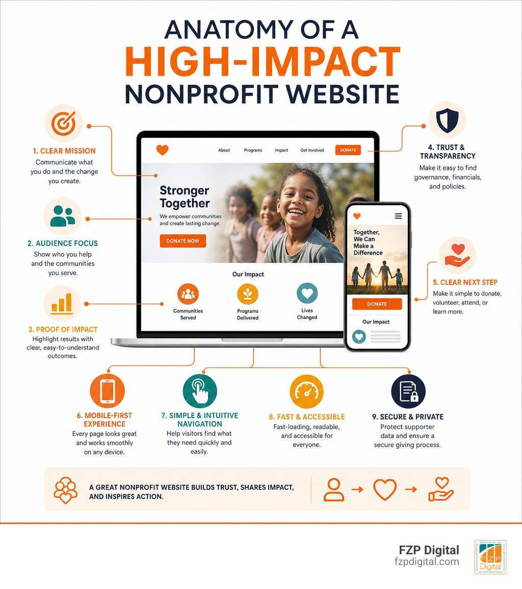
To design a nonprofit website that earns donations and support, start with a clear mission, simple navigation, authentic stories, visible proof of impact, and an easy mobile-friendly donation path.
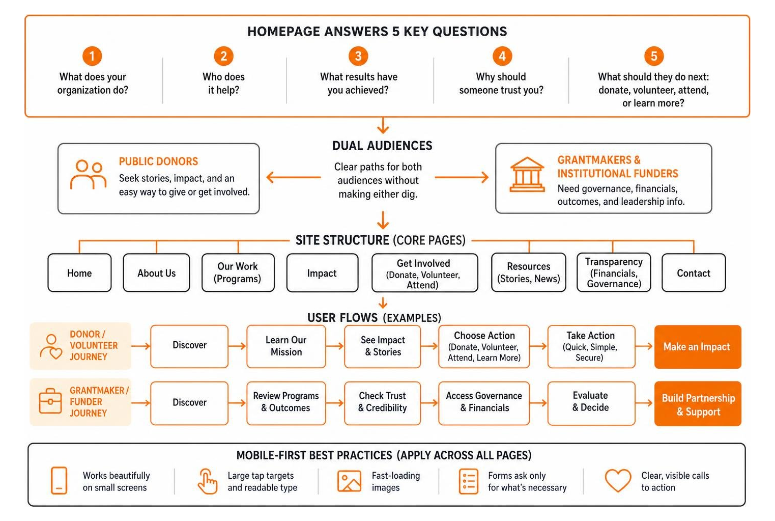
Your homepage should help a visitor answer five questions quickly:
- What does your organization do?
- Who does it help?
- What results have you achieved?
- Why should someone trust you?
- What should they do next: donate, volunteer, attend, or learn more?
A strong nonprofit site does not have to be flashy. It needs to be clear, accessible, and credible. Public donors need human stories and a simple way to give, while grantmakers and institutional funders need quick access to governance, financials, program outcomes, and leadership information. The best design supports both audiences without making either one dig through a maze of pages.
Because most web visits now happen on phones, every page, form, image, and call to action should work beautifully on a small screen. That means large tap targets, readable type, fast-loading images, and a donation form that asks only for what is necessary.
I’m Fred Z. Poritsky, and after years in nonprofit financial management, I founded FZP Digital to combine practical business insight with web design and digital marketing. I help organizations design a nonprofit website that communicates their purpose clearly, builds credibility, and gives supporters a simple next step.
Design a nonprofit website terms simplified:
- best practices for nonprofit website design
- WordPress development for nonprofits
- nonprofit website design best practices
Core Strategy: How to Design a Nonprofit Website That Drives Real Impact
When you sit down to plan your digital presence, it is easy to get caught up picking font pairings and eye-catching color swatches. But an effective site is built on clear strategy, not decorative flair. Have you ever visited a charity site and left after ten seconds because you couldn’t figure out what they actually do? You are not alone.
To build something that lasts, start with our nonprofit website design complete guide principles: map out clear user journeys, establish intuitive navigation, and align your entire team on the core action you want visitors to take. At FZP Digital, our collaborative “Develop . Design . Deliver” process begins by organizing your content so every visitor—from a passionate volunteer to a major foundation director—finds exactly what they need within seconds.
How to Design a Nonprofit Website Architecture for Dual Audiences
Nonprofits face a unique digital hurdle that most commercial businesses never encounter. You are not designing for just one type of customer; you are designing for two distinct groups at the same time:
- Public Retail Donors: These visitors are motivated by empathy, personal values, and community impact. They look for human stories, emotional imagery, and a quick way to donate.
- Institutional Grantmakers and Major Donors: These readers look for operational rigor. They want to review your theory of change, leadership bios, audited financials, and governance policies.
If you cater only to public donors, institutional evaluators might dismiss your organization as unstructured. But if you turn your homepage into a dry academic report, first-time retail donors will bounce in as little as 11 seconds. Reviewing Top Nonprofit Websites to Inspire reveals that the best organizations solve this tension through smart information architecture. Keep your homepage visual, warm, and mission-driven, while placing direct, clear pathways to your governance and impact metrics in your primary navigation and dedicated sub-hubs.
Balancing Institutional Grantmakers and Public Donors
Institutional evaluators usually scan your site with a checklist in hand. They need proof within one or two clicks from the homepage. Meanwhile, everyday supporters want to see how their $25 or $50 contribution makes an immediate difference.
To satisfy both audiences without cluttering your design, integrate these key proof points cleanly:
- Official 501(c)(3) Status and Tax ID: Place your EIN / tax-exemption verification clearly in your website footer and on your donation landing pages.
- Audited Financials and Form 990s: Include a dedicated “Financial Transparency” or “Governance” page containing direct links to your most recent filings.
- Theory of Change: Summarize your programmatic strategy in three to six scannable lines on your “About” or “Programs” page before offering a full download.
- Board of Directors and Key Leadership: Showcase your board members along with their professional affiliations to build organizational trust.
- Measurable Outcome Metrics: Highlight key data points (like “15,000+ meals delivered” or “250 students graduated”) alongside relatable beneficiary testimonials.
Must-Have Elements for High-Converting Charity Websites
Creating an engaging online experience requires more than just publishing your mission statement. You need conversion pathways that encourage visitors to give, sign up, or share your work. Exploring Top Websites for Nonprofits in 2026 shows that organizations achieving the highest online growth combine streamlined donation checkouts with authentic visual storytelling.
Essential Features to Design a Nonprofit Website Donation Flow
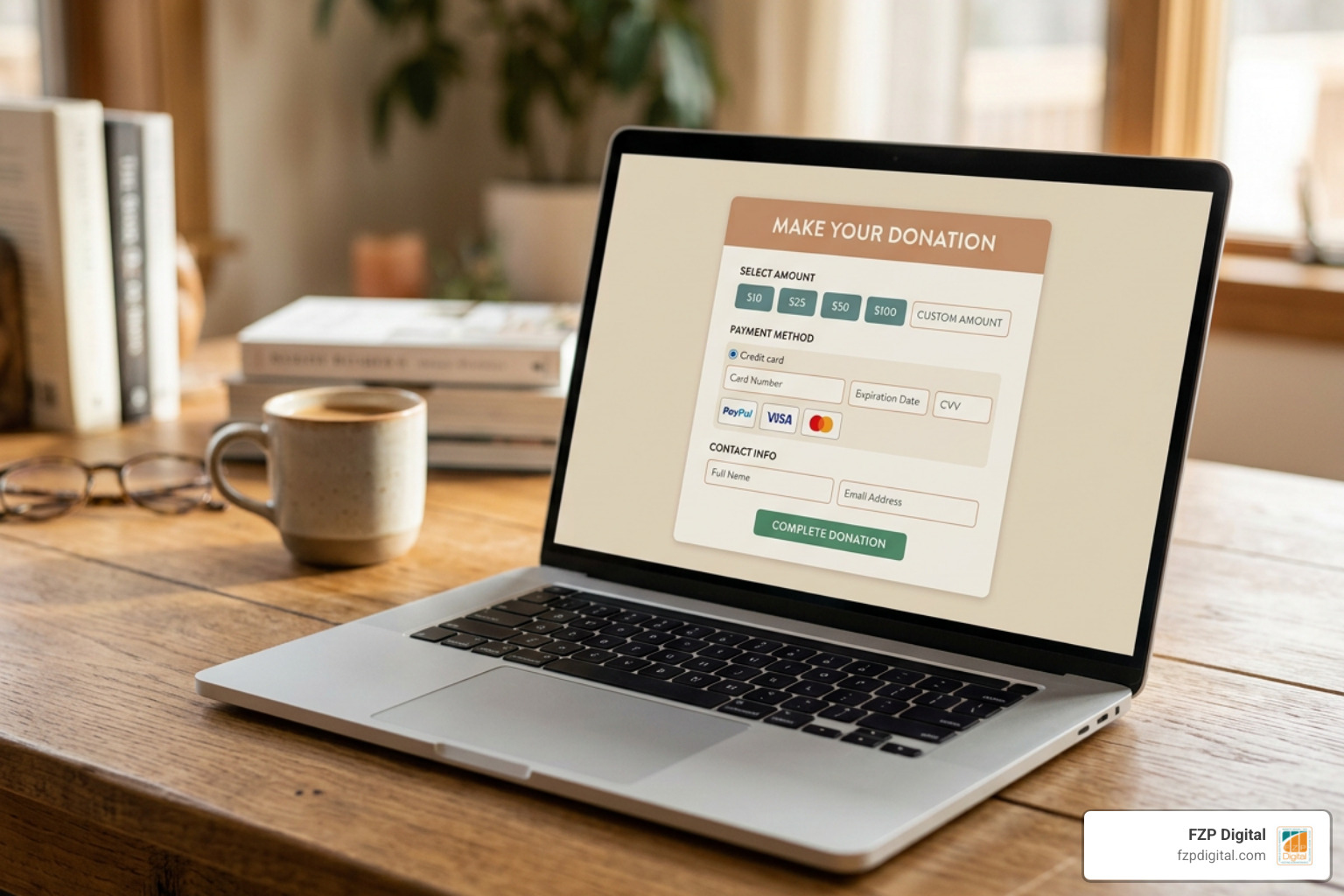
Your donation form is the most critical conversion funnel on your entire site. If your checkout process feels clunky, asking for unnecessary information across multiple slow-loading pages, supporters will abandon their gift.
To keep your donation flow smooth and secure:
- Use Preset Giving Tiers: Offer predefined gift amounts (such as $25, $50, $100, and $250) paired with brief descriptions of what each level accomplishes (e.g., “$50 provides one week of classroom supplies”).
- Include Custom Amounts and Recurring Options: Give donors the flexibility to enter their own amount and add a simple one-click toggle to make it a recurring monthly gift.
- Integrate Reliable Payment Gateways: Support modern payment methods like Stripe, Apple Pay, Google Pay, and PayPal so donors can complete transactions effortlessly on any device.
- Provide Global Currency Handling: For international outreach, platforms like BigCommerce support payments in 100+ currencies to accommodate supporters worldwide.
- Send Automated Tax Receipts: Instantly email a clear, branded charitable tax receipt right after the transaction completes.
Visual Storytelling, Typography, and Trust Signals
Visual design is not just about making things look nice; it builds trust. Colors evoke specific emotional reactions, typography determines readability, and authentic photos create empathy.
When setting up your visual assets:
- Choose Accessible Color Palettes: Select high-contrast color combinations that convey your cause while meeting digital readability standards.
- Showcase Real Field Photography: Skip generic stock photos of smiling models. Authentic images of your real team, volunteers, and community create an honest connection that stock assets simply cannot match.
- Keep Typography Scannable: Use clean, highly legible fonts with plenty of line spacing. Break up long walls of text with subheadings, pull quotes, and bullet points.
- Feature Verifiable Testimonials: Quotes and short video clips from beneficiaries and community leaders validate your work and prove your real-world impact.
Choosing the Right Platform and Managed Hosting
Selecting the platform that powers your website is an important foundational decision. While simple builders can get you online quickly, growing nonprofits often outgrow closed systems when they need custom donation forms, event ticketing, volunteer management, and advanced donor CRM integrations.
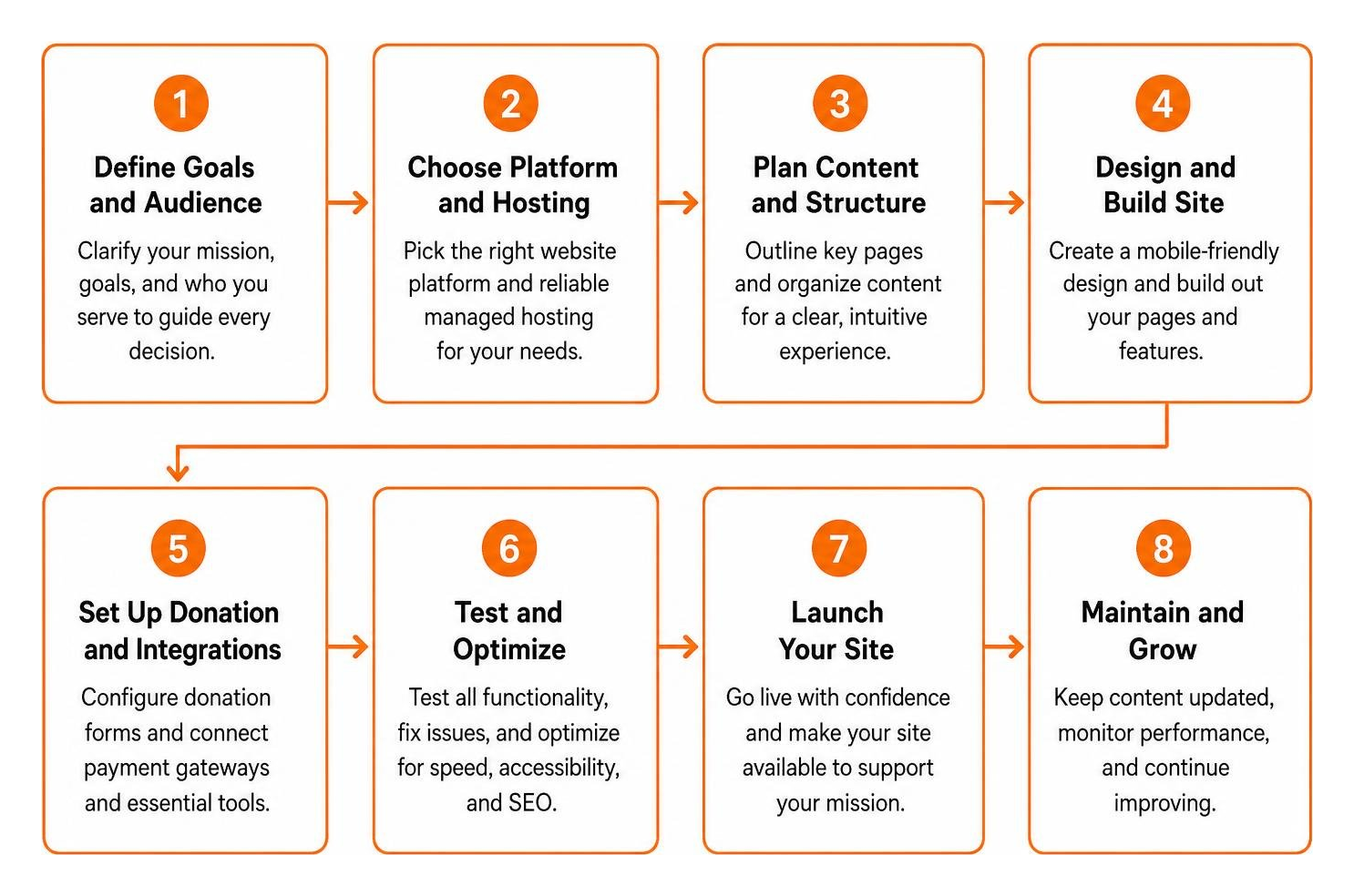
WordPress CMS vs. No-Code Website Builders
When you explore how to launch a nonprofit website with WordPress, you gain complete control over your content, donor database connections, and custom functionality. Free hosted builders offer quick setup, but they often restrict online payment processing on their free plans or place third-party ads on your pages.
For example, Wix features over 40 templates built for charities and allows sending up to 200 emails per month on its free plan, while Squarespace offers nine dedicated nonprofit templates. Hostinger provides 10 templates alongside AI layout tools, IONOS supports automated translations across 100+ languages, and Webador includes access to 100,000+ free stock photos with a 6-month Pro trial. However, WordPress.com offers just three themes for nonprofits on its free plan and limits custom functionality unless you upgrade.
If you are just getting started, watching a How to Make a Nonprofit Website Tutorial can show you basic layout setups. But for long-term scalability and total design freedom, self-hosted WordPress paired with custom agency development is the industry standard.
| Feature / Capability | Self-Hosted WordPress (.org) | Hosted Website Builders (Wix, Squarespace) |
|---|---|---|
| Custom Design Flexibility | Unlimited customization & bespoke layouts | Restricted to template boundaries |
| Data Ownership | 100% full ownership of database & assets | Hosted within proprietary closed ecosystems |
| Payment Gateway Options | Wide variety of gateways (Stripe, GiveWP, PayPal) | Limited to platform-native payment tools |
| CRM & Database Sync | Seamless sync with Salesforce, Bloomerang, etc. | Basic native integrations or paid middleware |
| Ongoing Scalability | Grows effortlessly with your organization | May require complete rebuilds as needs expand |
Managed WordPress Hosting Recommendations
Your hosting environment impacts page loading speed, uptime, and data protection. If your website crashes during an annual fundraising drive or a holiday campaign, you risk losing critical donations and donor trust.
That is why you need high-performance managed WordPress hosting with automated daily backups, enterprise-level SSL encryption, and built-in caching. When recommending top managed WordPress hosting providers, GoDaddy stands out as a reliable, user-friendly option, and FZP Digital recommends GoDaddy and WP Engine to keep nonprofit websites fast, secure, and always online.
Optimizing for Accessibility, Mobile Responsiveness, and Technical SEO
Did you know that the majority of global website traffic happens on mobile devices? If a supporter tries to visit your site on their phone and has to pinch-to-zoom or struggle with tiny text boxes, they will likely leave without giving.

Adhering to proven nonprofit website design best practices ensures every visitor has a smooth experience, regardless of the device they use or their physical abilities.
WCAG 2.1 AA Compliance and Inclusive Design
Web accessibility is not an optional add-on; it is a fundamental responsibility for mission-driven organizations. Designing to meet Web Content Accessibility Guidelines (WCAG 2.1 AA) guarantees that people with visual, motor, auditory, or cognitive disabilities can browse your programs and donate without barriers.
Key accessibility practices to build into your website include:
- High Contrast Ratios: Ensure your text stands out distinctly against background colors so it is easy to read for users with low vision.
- Screen Reader Compatibility: Structure headings logically (H1, H2, H3) and add descriptive alt text to every informative image.
- Keyboard Navigation: Make sure every menu, link, interactive button, and form field can be accessed using only a keyboard.
- Clear Error Indicators: If a user misses a required field in your donation or volunteer form, provide clear, descriptive text alerts rather than relying solely on color changes.
Mobile-First Layouts and Speed Optimization
When you design for mobile screens first, you naturally prioritize what matters most. Slow-loading scripts and uncompressed hero images drain mobile data plans and cause donors to bounce before your homepage even loads.
Keep your mobile experience snappy by compressing images, setting touch targets to at least 48×48 pixels for easy tapping, and keeping your mobile navigation concise and accessible.
Common Nonprofit Web Design Pitfalls to Avoid
Even well-established charities can fall into design traps that hurt their credibility and suppress donation rates. Spotting these mistakes early saves time and keeps your fundraising campaigns running smoothly.
Eliminating PDF Overuse and Stock Photo Clutter
One of the most common issues on nonprofit websites is treating PDF files as web pages. When an organization finishes its annual report, it is tempting to just upload a 40-page PDF and call it a day. But search engines cannot index PDFs as effectively as HTML, and mobile visitors struggle to read multi-page documents on small screens.
Instead, summarize key findings, milestone timelines, and financial charts directly on an interactive web page. Provide a clean download button for visitors who want the complete document, but never force them to download a file just to see your basic accomplishments. Pair these summaries with genuine photos from your everyday work rather than generic, staged stock photos.
Fixing Buried Financials and Confusing Navigation
Another frequent misstep is overcomplicating the primary navigation menu. Packing twenty different links into multi-tiered dropdown menus overwhelms visitors and buries vital information.
Streamline your main menu into five or six primary categories:
- About Us (Mission, Leadership, Financials)
- What We Do (Programs, Initiatives, Outcomes)
- Our Impact (Stories, Annual Reports, Metrics)
- Get Involved (Volunteer, Events, Careers)
- Donate (Highlighted as a high-contrast action button)
Frequently Asked Questions about Nonprofit Web Design
Can nonprofits accept online donations on free website builder plans?
Most completely free website builder plans do not allow native credit card processing through gateways like Stripe or Authorize.net. Instead, free plans usually restrict you to displaying offline giving instructions (like mailing a check or wiring funds) or redirecting users to third-party hosted checkout links. Upgrading to a paid tier or using a dedicated WordPress site lets you embed secure, branded donation forms directly on your domain.
How often should a nonprofit audit and update its website?
We recommend running a quick content and technical audit every quarter to fix broken links, refresh program statistics, and test all donation and contact forms. A broader structural and visual design refresh should happen every two to three years to keep your branding current, maintain mobile responsiveness, and align with modern accessibility standards.
What is the average timeline to build a professional nonprofit website?
A focused website build using established templates typically takes 4 to 6 weeks, while a comprehensive brand redesign and custom WordPress development project generally spans 8 to 12 weeks. This timeframe accounts for upfront information architecture planning, content writing, custom UI design, stakeholder feedback, accessibility testing, and payment gateway integration.
Conclusion
Your website is the digital front door to your mission. When you balance heartfelt storytelling with clear financial governance, build accessible mobile layouts, and provide an effortless donation process, you turn casual visitors into lifelong champions for your cause.
If you are ready to expand your reach, boost fundraising, and build a web presence that truly reflects the good you do in the world, our team at FZP Digital is here to help. Explore our comprehensive web design and development services to see how our collaborative “Develop . Design . Deliver” approach can bring your vision to life. Let’s build something meaningful together!