The Brand Police: Rules for WordPress Website Brand Consistency
Why Your WordPress Website Brand Consistency Determines Whether Visitors Stay or Leave
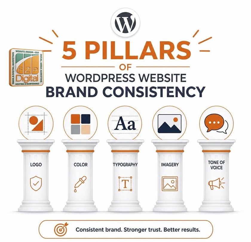
WordPress website brand consistency is the practice of applying your logo, colors, typography, imagery, tone of voice, and messaging uniformly across every page, post, and template on your site — so visitors always feel like they’re in the right place.
Here’s a quick breakdown of what it means and why it matters:
| Element | What Consistency Looks Like |
|---|---|
| Logo | Same version, same placement, every page |
| Colors | Exact hex codes used site-wide, no random shades |
| Typography | Defined font families and sizes for headings and body text |
| Imagery | Consistent style (photography vs. illustration, filters, tone) |
| Voice & Messaging | Same brand personality across all written content |
You’ve probably landed on a website that felt off without being able to explain why. Maybe the homepage looked polished, but the About page had a different font. Or the contact form used a completely different shade of blue. That subtle friction? That’s brand inconsistency at work — and it costs you.
Research shows users form an opinion about a website in just 50 milliseconds. That’s faster than a blink. In that sliver of time, your site either signals “this is a credible, professional business” or it doesn’t.
And the stakes are real. Consistent branding across all channels can increase revenue by up to 23%. Meanwhile, more than 60% of consumers say trust is a deciding factor in their purchase decisions. If your website looks like it was built by three different people on three different days — it quietly erodes that trust before you’ve said a single word.
For small businesses and nonprofits in the Philadelphia area, this isn’t a design luxury. It’s the difference between a visitor who calls you and one who clicks away.
I’m Fred Z. Poritsky, founder of FZP Digital, and my background in nonprofit financial management, digital marketing, and creative design gives me a uniquely practical perspective on WordPress website brand consistency — especially for organizations that need to look polished without an enterprise-level budget. In the guide below, I’ll walk you through exactly how to make your WordPress site feel cohesive, credible, and conversion-ready from top to bottom.

Why WordPress Website Brand Consistency Is Your Ultimate Trust Builder
When a local Philadelphia business builds its digital presence, every click should feel like a natural continuation of the same conversation. Unfortunately, many websites suffer from what designers call “cognitive dissonance.” This happens when different pages on your site use mismatched layouts, random font families, or inconsistent color shades.
When your users experience cognitive dissonance, their subconscious sounds an alarm. They begin to wonder: Am I still on the same website? Is this business disorganized? Can I trust them with my credit card or personal information?
Maintaining a uniform user experience (UX) directly impacts your conversion rates. If your site feels cohesive, predictable, and clean, users can navigate it effortlessly. This lack of friction keeps them engaged longer, driving down your bounce rates and signaling to search engines that your site provides high-quality value. In fact, UI design enhancements can boost conversion rates by more than 100%!
To understand how visual elements construct this trust, it helps to look at What is Visual Identity and Branding in Design?. Your visual identity is the silent ambassador of your business. When nearly 90% of consumers expect their experience to be similar across all platforms, your WordPress website must serve as the anchor for your entire brand.
Laying the Law: Visual Elements of a WordPress Brand System
To prevent your site from looking like a digital patchwork quilt, you need to establish strict visual rules. Think of these rules as your brand’s legal code.

1. Logo Placement and Sizing
Your logo is the face of your business. According to research by the Nielsen Norman Group, placing your logo in the top-left corner enhances brand recall by as much as 89%.
Keep your logo placement consistent across all pages, and make sure it scales beautifully on mobile screens. We recommend saving your logo as an SVG (Scalable Vector Graphics) file. SVGs stay perfectly crisp on high-resolution Retina displays without slowing down your page load times. For more on logo design foundations, check out The Quick Guide to Designing a Brand Mark Logo.
2. The Signature Color Palette
A signature color can increase brand recognition by up to 80%. Whether you are using a warm historical brick-red inspired by Old City Philadelphia or a modern corporate teal, you must stick to your exact hex codes.
“Color drift” is a common issue where content editors eyeball a color in the block editor, resulting in five different shades of the same blue across your site. To prevent this, define a strict palette of primary, secondary, accent, and neutral colors, and disable custom color pickers for your editors.
3. Typography Hierarchy
Limit your website to two, or at most three, font families. A classic setup includes a distinct, highly readable font for your headings (H1, H2, H3) and a clean, legible sans-serif font for your body text. Establishing a clear typographic hierarchy helps users scan your pages quickly, which is essential when you only have a few seconds to capture their attention.
4. Imagery and Iconography Style
Do not mix cartoon illustrations, dark moody photography, and bright, sterile stock photos on the same page. Choose a unified style. If your brand relies on warm, authentic, community-focused photography, ensure every page reflects that choice.
If you are looking for a deep dive into aligning these assets, OceanWP’s guide on website brand consistency offers excellent insights into structuring your visual rules.
The WordPress Toolkit: Enforcing Global Styles and Design Systems
WordPress has evolved dramatically over the last few years. As of June 2026, the Block Editor (Gutenberg) and Full Site Editing (FSE) provide incredibly powerful native tools to lock in and enforce your brand styles globally.
To build a truly stable site, we always recommend following WordPress Website Design Best Practices. Here are the primary tools you can use to enforce your rules:
- theme.json: The ultimate developer’s tool for block themes. This file acts as the single source of truth for your site’s design tokens (colors, typography, spacing, and layout). By configuring
theme.json, you can define your brand’s color palette and restrict editors from picking off-brand colors. - The Customizer and Global Styles: For classic or hybrid themes, the WordPress Customizer allows you to set global colors and typography. In modern block themes, the Global Styles sidebar in the Site Editor lets you adjust these settings visually.
- Child Themes: Never make structural style changes directly to a parent theme. A child theme ensures that your custom CSS and brand configurations do not get wiped out when your main theme updates.
- Design Token Configurators: Tools like the WPStylo Visual Design System Configurator allow you to visually design your system and export it directly into CSS Custom Properties or
theme.json.
Table: theme.json vs. Customizer vs. Page Builders
| Feature | theme.json (Block Themes) | WordPress Customizer | Page Builders (Elementor, etc.) |
|---|---|---|---|
| Best For | Modern block-based development | Classic & hybrid themes | Visual, non-technical design |
| Brand Control | High (Can disable custom colors/fonts entirely) | Medium (Theme-dependent) | Low (Easy for editors to override settings) |
| Performance | Excellent (Generates minimal, clean CSS) | Good | Moderate (Can introduce asset bloat) |
To learn how to blend these technical tools with your creative vision, take a look at our guide on how to Unlock Your Creativity: Designing Websites with WordPress Start to Finish.
Building a Reusable Design System for WordPress Website Brand Consistency
A design system is more than a list of colors; it is a collection of reusable components and patterns that speed up development while keeping your brand intact.
When we build custom sites for our clients in Bucks County and Philadelphia, we create custom Block Patterns. These are pre-arranged layouts (like a testimonial block or a call-to-action banner) that editors can insert with a single click.
To keep your layouts pristine, you can use WordPress Block Locking. This feature allows you to lock specific blocks in place, preventing editors from accidentally deleting your logo, changing a button link, or shifting a crucial columns layout.
Additionally, when writing custom CSS or organizing your design system, use a clean naming convention like kebab-case (e.g., --brand-primary-color or --font-heading-large). For a step-by-step guide on organizing these rules, explore our resource on How to Build a Brand Guide That People Actually Read.
Scaling Up with Multisite and Shared Design Systems
If your organization manages multiple brands, sub-brands, or local branches across the Philadelphia area, a WordPress Multisite network is a highly efficient solution.
By utilizing a shared parent theme, you can distribute global layouts, spacing grids, and core functionalities across all your sub-sites. Each individual brand can then use its own child theme to apply its unique color palette, logo, and typography without rebuilding the site structure from scratch.
For large-scale operations, implementing a Shared Design System for Multi-Brand WordPress Sites with OnePress demonstrates how syncing design files (like Figma) with your WordPress code saves massive amounts of development time and keeps your network perfectly aligned.
Avoiding the Trap: Common Causes of Brand Drift on WordPress
Even the most beautifully designed websites can experience “brand drift” over time. This happens when new pages are added, plugins are installed, or multiple content editors begin updating the site without strict supervision.

Here are the most common traps and how to avoid them:
- Plugin Styling Conflicts: Many plugins (like contact forms, event calendars, or e-commerce add-ons) come with their own default styles. If left unchecked, they will introduce mismatched buttons, fonts, and form fields. Always override plugin styles using your child theme’s CSS variables to ensure they blend seamlessly with your brand.
- Rogue Editors: Well-meaning team members might try to make a specific announcement “pop” by using bright red comic sans or highlighting text in yellow. Restrict user roles in WordPress so that only authorized administrators can change global styles or layout settings.
- Responsive Design Failures: A site that looks gorgeous on a desktop screen can completely fall apart on an iPhone. If your typography is not responsive, headings will wrap awkwardly, breaking your visual flow.
- The Solution: Use CSS
clamp()typography (e.g.,font-size: clamp(1.5rem, 2vw + 1rem, 3rem);). This ensures your text scales smoothly between mobile and desktop viewports without requiring complex media queries.
When templates fail to handle these details, it becomes clear why custom work is so valuable. To see why pre-made themes often fall short in maintaining these strict standards, read Custom WordPress Website Design: Why Templates Just Don’t Cut It.
Keeping Content and AI Tools Aligned with WordPress Website Brand Consistency
Brand consistency is not just visual — it is also verbal. Your tone of voice, messaging, and calls-to-action (CTAs) must feel unified. If your brand voice is warm, helpful, and community-oriented, your copy should sound like a friendly neighbor, not a cold corporate lawyer.
In 2026, content creation often involves AI writing assistants. While AI can save you hours of work, it can easily dilute your brand voice if it does not have the right context.
To solve this, modern systems use a brand.json file or semantic brand layers to feed style guidelines directly to AI tools. By utilizing tools like the Sameness AI brand context layer, you can make your brand guidelines machine-readable. This ensures that any AI-generated copy, layout suggestion, or image matches your exact brand voice and visual specifications before it ever reaches your WordPress editor.
Frequently Asked Questions About WordPress Brand Consistency
How do I audit my WordPress site for brand consistency?
We recommend performing a quarterly visual audit. Take a random sample of 20 to 30 pages on your site, including old blog posts, landing pages, and search result pages. Check for:
- Old Logos: Ensure outdated logo variations aren’t lingering in your footer or old blog headers.
- Color Drift: Verify that all buttons, backgrounds, and links use your exact brand hex codes.
- Broken Links and Layouts: Clean up dead links and check your mobile responsive layouts.
- Tone Check: Ensure older content still aligns with your current messaging framework.
Can I use different page builders and still keep my branding consistent?
Yes, but it requires discipline. If you are using a page builder like Elementor on some pages and the native Block Editor on others, you must synchronize your design tokens. Define your colors and typography as CSS Custom Properties (variables) in your child theme. Then, configure your page builder to inherit these global styles rather than defining custom values inside the builder itself.
What hosting does FZP Digital recommend to keep my site fast and reliable?
A slow website ruins a premium brand experience, no matter how consistent your design is. To keep your WordPress site fast, secure, and optimized for search engines, FZP Digital highly recommends GoDaddy and WP Engine for managed WordPress hosting. These platforms offer excellent staging environments, automatic backups, and server-level caching that keep your local Philadelphia business running smoothly.
Conclusion
Achieving flawless wordpress website brand consistency is not a one-time project; it is an ongoing commitment to quality. When your visual identity, user experience, and verbal messaging all work in perfect harmony, you build a powerful digital engine that earns trust, elevates your professionalism, and drives real business growth.
At FZP Digital, we specialize in helping businesses and nonprofits in Richboro, Newtown, Philadelphia, and Downtown Philadelphia stand out online. Through our collaborative “Develop . Design . Deliver” process, we work closely with you to design custom, responsive WordPress websites that reflect your unique story and boost your organic search rankings.
If you are ready to stop blending in and start making an unforgettable mark, partner with us. Let’s build a cohesive, beautiful website that your audience will love. Explore our premium WordPress web design services in Philadelphia and let’s start your project today!