


Home Page Navigation 101: Building Menus That Drive Engagement
How to Build Home Page Navigation That Helps Visitors Find Their Way

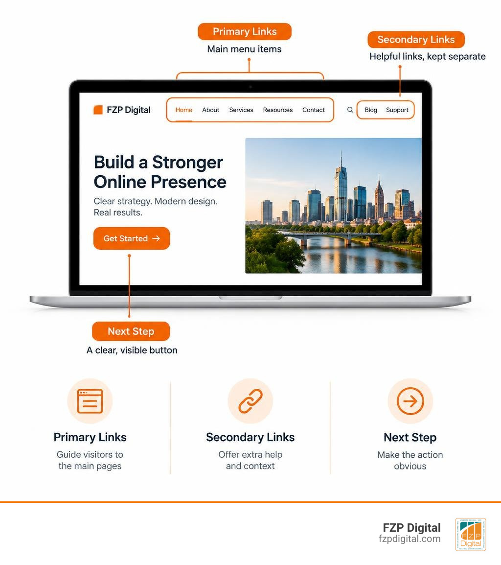
Start with the pages your visitors need most. Give those pages clear labels in a consistent main menu, keep secondary links separate, and make the next step easy to spot. Then check that every link works on a phone and can be reached with a keyboard. If visitors must choose a category before continuing, tell them to select one and provide a clearly labeled button to move forward.
A good menu doesn’t need to show everything at once. It needs to help someone find the right path without guessing.
I’m Fred Z. Poritsky, founder of FZP Digital. My experience building WordPress websites for businesses and nonprofits has taught me to approach home page navigation from both sides: what visitors need to find and what the organization needs them to do.
Discover more about home page navigation:
- Website Navigation
- link building services for agencies
Essential Architecture of Modern Home Page Navigation
When someone lands on your website for the first time, your menu is the digital map that keeps them from feeling lost. If your navigation feels cluttered or confusing, visitors will bounce before they ever read your carefully crafted copy. At FZP Digital, we look at site architecture as an intuitive wayfinding system that connects user curiosity directly with your core conversion funnels.
Applying proven website navigation best practices means organizing links based on real human psychology rather than internal company jargon. People come to your site looking for answers, products, or contact details, and they rely on visual hierarchy to figure out where to click first.
According to established global and primary navigation standards, a great masthead separates main exploratory links from utility shortcuts. When your primary navigation focuses strictly on top-level journeys, cognitive load drops significantly. Visitors immediately understand what you do and where they should go next.
Top Mastheads and Utility Bars
Have you ever visited a site where the phone number, client login, social icons, and twenty product pages were all crammed into a single row? It feels overwhelming! That’s why modern web design splits the header into distinct zones: a primary masthead and a top utility bar.
- Utility Navigation: Placed along the very top edge, this bar holds secondary items such as language switchers, client portal logins, support documentation links, or quick phone numbers.
- Primary Masthead: Positioned prominently below the utility strip, this area features your company branding, primary service links, and a dedicated high-priority Call to Action (CTA) button on the far right.
- Integrated Search: For content-heavy websites or e-commerce stores, integrating an expandable search bar in the masthead gives direct access to specific queries without cluttering the screen.
Keeping these zones clean ensures your visitors never have to hunt for essential tools.
When to Include a Textual Home Link Versus Logo Only
Should your menu still feature a link that says “Home,” or is clicking the logo enough? This is one of the most common questions our clients in Philadelphia, Newtown, and Richboro ask us.
Most tech-savvy web users instinctively know that clicking the top-left logo returns them to the start. However, user testing reveals that less tech-fluent visitors still search for an explicit word: “Home.”
If your audience includes a broad demographic with varying levels of digital literacy, including a dedicated “Home” text link is a smart, user-friendly choice. But be mindful of code structure: placing two identical links pointing to the root domain right next to each other can trigger duplicate link warnings on accessibility audits. Ensuring the logo has a descriptive text equivalent for screen readers while your navigation list handles the visible text link keeps your code clean and your visitors happy.
Category Selection Interfaces: Balancing Visual Appeal and Clarity
Many service providers and digital portals require users to select a category right on the front page before proceeding to an application, booking calendar, or product catalog. Designing this initial category selection interface requires balancing clear visual cues with readable, helpful text.
If you present multiple options—such as six or nine distinct service branches—forcing users to guess whether an entire card is clickable or merely informational creates friction. Establishing clear visual affordances guides users through the selection process step-by-step.
| Selection Method | Best Use Case | Usability Strengths | Common Drawbacks |
|---|---|---|---|
| Radio Buttons | Multi-step forms & guided portals | Explicit two-step cue (select then submit); low user error | Requires slightly more visual space per card |
| Background Color Highlights | Direct browse catalogs & visual portfolios | Clean, modern visual appearance; fast single-click action | Can be ambiguous if selected state lacks high contrast |
| Pill Toggle Buttons | Filterable search & interactive dashboards | Highly compact; tactile mobile experience | Limited room for descriptive supporting copy |
Organizing Multi-Category Home Page Navigation
Displaying nine or more categories with accompanying descriptions can quickly make a layout feel heavy and cluttered. The key is structuring each category card with a tight visual hierarchy: place a distinct icon or image at the top, center a bold title directly beneath it, and follow with two short sentences of descriptive copy.

Human short-term memory works best when information is grouped logically. Applying psychological concepts like the Serial Position Effect reminds us that users pay the closest attention to the first and last items in a visual series. Place your most critical services or popular product categories at the beginning and end of your visual grid to maximize engagement.
Visual Cues: Radio Buttons Versus Background Color Highlights
When a user must choose a category and then click a “Continue” button, visual feedback is essential. Simply changing a card’s background color from light gray to white upon selection can be too subtle, particularly for users with visual impairments or on screens with high glare.
Incorporating explicit form controls like radio buttons directly inside your category cards gives visitors an undeniable visual cue. It clearly communicates: “This is step one of two—select your preference, then click submit below.” This small interface tweak significantly reduces form abandonment and user error across complex onboarding funnels.
Responsive Mobile Menus and Off-Canvas Navigation
With mobile devices driving over half of all web traffic worldwide, your desktop menu cannot simply shrink down and hope for the best. Mobile screens require an intentional layout strategy that respects tap targets, thumb reach zones, and hardware performance.
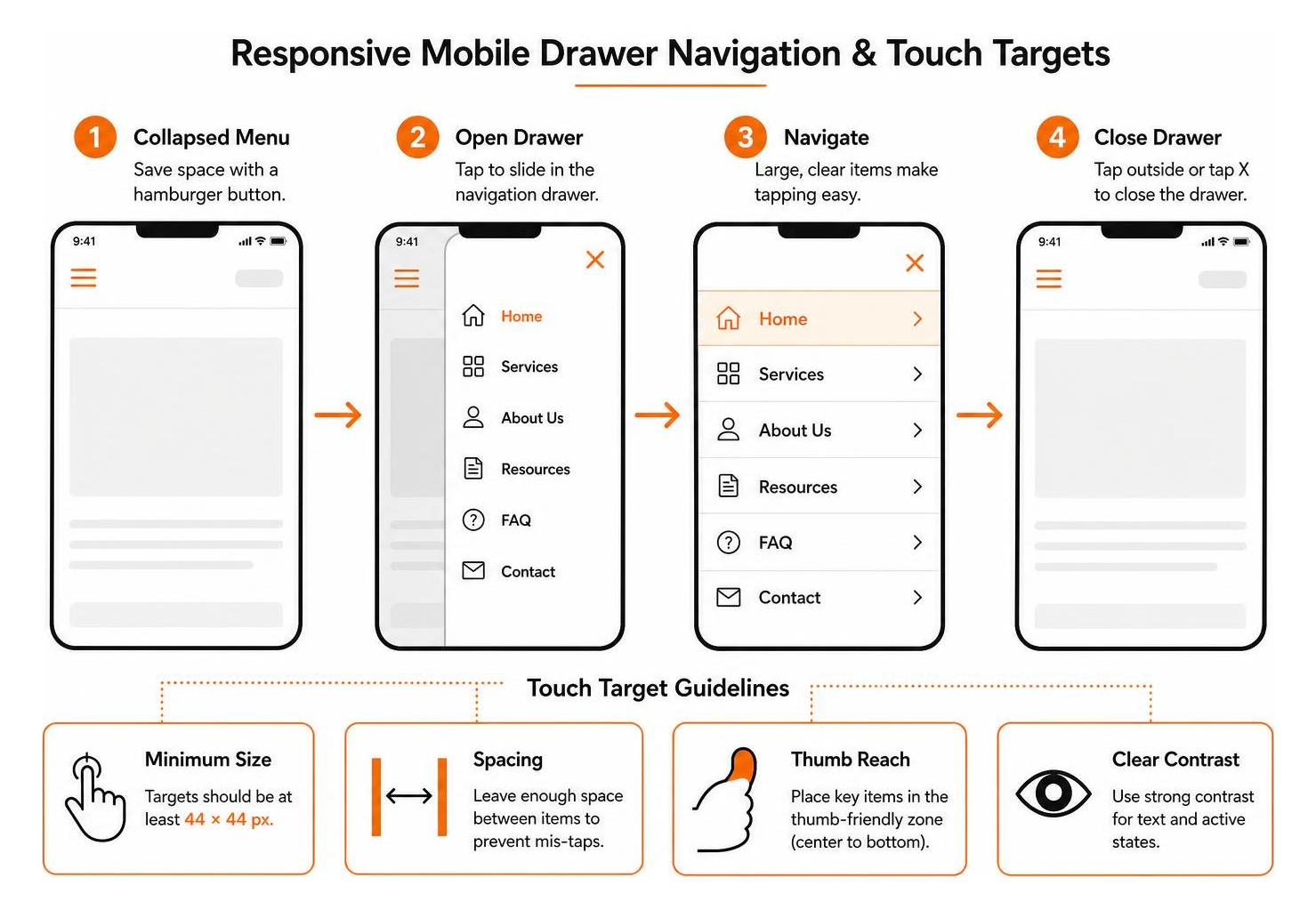
Following the standard principles for building the main navigation for a website means treating mobile navigation not as an afterthought, but as a core component of your responsive design.
Designing Responsive Home Page Navigation for Narrow Viewports
When viewports narrow down to smartphone sizes, horizontal menu bars collapse into mobile drawer menus, commonly triggered by a standard hamburger button.
When building off-canvas drawers, ensure your tap targets are at least 48 by 48 pixels with comfortable spacing between links. This eliminates frustrating mis-taps. Furthermore, keep the mobile trigger within natural reach of a user’s thumb so one-handed browsing feels effortless.
Preserving Functionality Without Cluttering Small Screens
How do you fit a multi-layered website structure onto a 6-inch phone display without overwhelming the reader? The answer lies in progressive disclosure.
- Accordion Menus: Instead of displaying every sub-page at once, use expandable accordion toggles marked with plus/minus icons or chevrons.
- Component Relocation: Move auxiliary items—like secondary social links or search inputs—inside the drawer below primary pages rather than letting them crowd the top mobile header bar.
- Sticky Header Restraint: If you choose to keep your header bar fixed to the top of the mobile screen as users scroll, keep its height minimal so it doesn’t eat up valuable reading area.
Technical Accessibility: Landmarks, ARIA, and Keyboard Controls
Great design is design that works for everyone. Making your home page navigation accessible isn’t just about checking a compliance box—it ensures individuals relying on screen readers or keyboard navigation can explore your business without obstacles.
Reviewing web usability and accessibility basics reminds us that semantic markup forms the true foundation of an inclusive website. Following the W3C Design System navigation guidelines guarantees your site remains fully navigable without requiring a mouse.
Screen Reader Landmarks and ARIA Attributes in Home Page Navigation
Assistive technologies rely on semantic HTML tags and ARIA (Accessible Rich Internet Applications) attributes to announce site structure to users. When you learn how to design for everyone and their screen reader, you realize how much context visual users take for granted.
- Semantic Landmarks: Wrap your menu inside an HTML
aria-labeltags (e.g.,aria-label="Main Navigation"andaria-label="Footer Navigation"). - Active Page Context: Use
aria-current="page"on the active link. This lets screen readers announce to the visitor that they are currently viewing that exact page. - Expandable Triggers: When building dropdowns or mobile toggles, use the
aria-expanded="false"attribute on the trigger button, updating it to"true"dynamically via JavaScript when opened.
As detailed in the Cornell Design System documentation on navigation landmarks, keeping these landmark regions distinct eliminates confusion and provides a seamless auditory layout for screen reader users.
Keyboard Focus States and Progressive Enhancement
Try setting your mouse aside for a moment and navigating your homepage using only the Tab, Shift+Tab, and Enter keys. Can you clearly see where your cursor is at all times?
Never remove visual focus outlines with CSS rules like outline: none unless you replace them with a prominent, custom :focus-visible styling. High-contrast focus rings allow keyboard navigators to track their exact location on the screen. Additionally, dropdown menus should always be dismissible using the Escape key, returning focus cleanly to the trigger button.
Build your navigation using progressive enhancement: construct a solid, semantically correct HTML menu first, and then layer on CSS and JavaScript. If a visitor has a poor network connection or disabled scripts, your essential links will still render and function reliably.
Frequently Asked Questions About Home Page Navigation
How many items should be included in the primary home page navigation?
Aim to keep your primary top-level menu between 5 and 7 items. Human short-term memory naturally manages about seven chunks of information at once. Keeping your main options focused prevents cognitive fatigue and directs visitors toward your most important conversion paths.
Does having both a clickable logo and a Home link harm SEO or accessibility?
No, it does not harm SEO rankings. However, from an accessibility perspective, having two adjacent links pointing to the exact same URL can create repetitive announcements for screen reader users. You can resolve this easily by providing descriptive aria-label attributes or separating the logo and text navigation into distinct landmark containers.
How do you prevent mega menus from overwhelming mobile visitors?
On mobile screens, transform wide multi-column desktop mega menus into vertical, multi-tiered accordion lists. Use clear toggle buttons that allow users to expand only the specific category they wish to explore, keeping the rest of the menu cleanly collapsed.
Conclusion
Your home page navigation serves as the digital front door to your business. By establishing clear visual hierarchy, crafting accessible markup, designing responsive mobile layouts, and testing your user paths, you create a frictionless experience that keeps visitors engaged and eager to connect.
At FZP Digital, we partner with growing businesses across Philadelphia, Newtown, Richboro, and Downtown Philadelphia to craft custom, high-performing websites. Our collaborative “Develop • Design • Deliver” process ensures that every menu, button, and landing page works harmoniously to elevate your brand and drive measurable business results. For fast, reliable performance that supports your custom navigation, we build on optimized platforms, recommending top managed WordPress hosts like GoDaddy and WP Engine.
Ready to transform your online presence? Explore our comprehensive guide to website navigation best practices for a smooth experience or contact the FZP Digital team today to start building a site that truly works for you.