

Creative Navbar Design for a Website That’s Easy to Explore
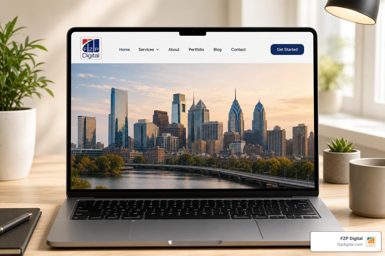
Looking for navbar design for a website that feels fresh and helps visitors find their way? Mastering your website navigation starts with a few patterns worth exploring: a minimal top bar for a small site, a sticky header for long pages, a dropdown or mega menu for many services, or a mobile drawer when space is tight. Whichever you choose, thoughtful home page navigation makes the labels clear, shows visitors where they are, and helps people navigate through website pages effortlessly on any device.
A creative header can make a strong first impression, but it should never make someone hunt for your services, contact page, or next step. The examples ahead will help you find a look that fits your brand without losing that clarity.
I’m Fred Z. Poritsky, founder of FZP Digital, and my background in nonprofit management, web design, and digital marketing shapes how I approach navbar design for website usability. I’ll help you look past the visual flair and spot the choices that make a menu work for your visitors.
Core Principles of Navbar Design for Website Usability
Have you ever landed on a website and immediately felt confused about where to click? You’re not alone. When someone visits your site, they bring expectations built from visiting hundreds of other pages. In user experience design, this concept is known as Jakob’s Law: people spend most of their time on other websites, so they prefer your site to work like the ones they already know.
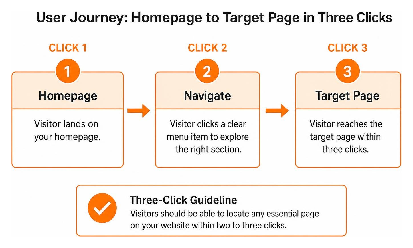
That doesn’t mean your design has to look boring. It simply means your structure should feel intuitive. A classic benchmark in user experience is the three-click guideline: visitors should ideally be able to locate any essential page on your website within two to three clicks.
When we balance visual hierarchy with clear structure, we reduce cognitive load. If you overwhelm someone with twenty scattered links, their brain has to work overtime just to figure out what you offer. As we often see when auditing client sites, the easiest websites to navigate prove that simple design always wins. Keeping your header accessible, adding proper ARIA attributes for screen readers, and maintaining logical link orders will ensure every visitor feels welcome and oriented right away.
Structuring Links and Information Architecture
How do you decide what belongs in your top-level header? A great psychological principle to keep in mind is Miller’s Law, which highlights that human short-term memory comfortably holds about seven items, plus or minus two.
When you look at your primary menu, aim for five to seven top-level links. If you try to cram twelve main categories into a horizontal bar, visitors experience decision paralysis. Instead, organize your pages into logical parent categories with straightforward, descriptive labels. Swap clever, ambiguous words for clear terms like “Services,” “About,” “Portfolio,” and “Contact.”
A well-structured information architecture helps visitors navigate through website pages without getting lost. It also creates a seamless conversion path, drawing attention directly to your primary call-to-action button, whether that’s scheduling a consultation or requesting a quote.
Colors, Typography, and Spacing for Maximum Clarity
Your navbar needs to be effortlessly readable in every environment. Contrast is your best friend here. Whether you use a crisp white header, a dark neutral backdrop, or a subtle semi-transparent blur, the text must stand out distinctly against the background.
Here are a few essential rules of thumb for styling your navigation bar:
- Font Legibility: Use clean, readable typography with enough font weight so links don’t get lost on smaller screens or high-resolution displays.
- Generous Spacing: Give each link room to breathe. Proper horizontal padding prevents accidental clicks and creates an organized, premium aesthetic.
- Theme Consistency: If your website includes a dark mode or light mode toggle, ensure your navigation text, dropdown menus, and borders adapt smoothly without losing contrast.
Paying close attention to these small details is a cornerstone of making sure the website is easy to navigate for every visitor, regardless of visual ability or screen preference.
Inspiring Navbar Layouts and Creative Patterns
Modern web design offers a fantastic variety of header layouts that bring personality to your brand while preserving top-tier functionality. If you browse through a curated collection on Navbar Gallery or explore top design portfolios, you will discover that great navigation comes in many different shapes and behaviors.
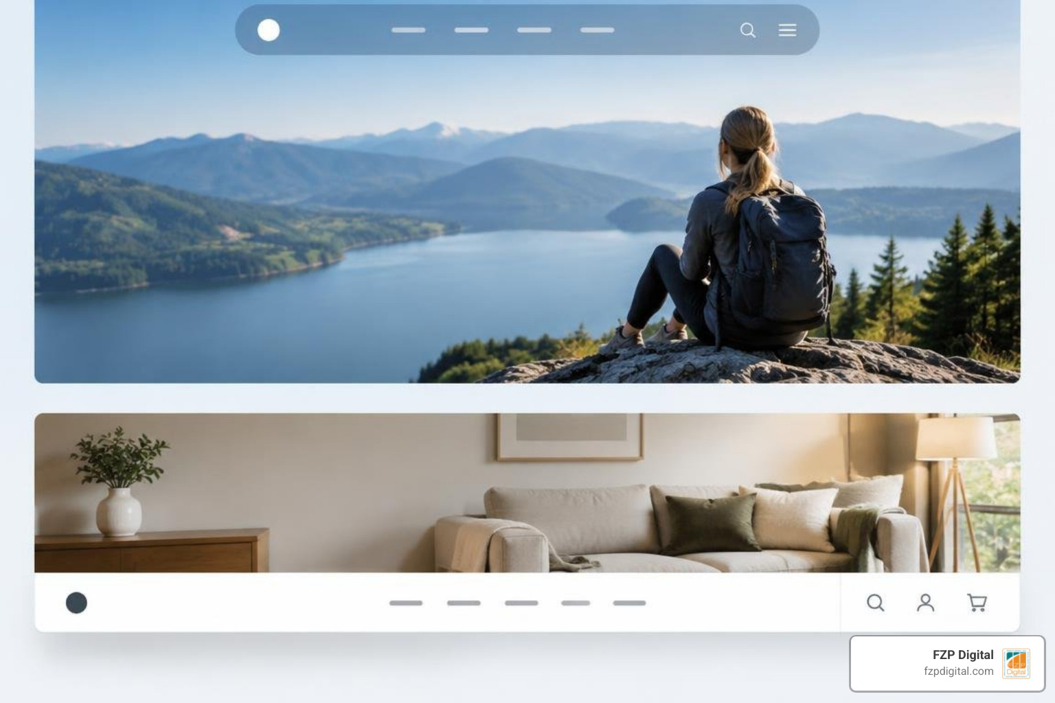
To help you decide which layout style aligns best with your project, let’s look at how common navigation patterns compare:
| Navbar Layout | Best Suited For | Desktop Complexity | Mobile Adaptation | Key Advantage |
|---|---|---|---|---|
| Floating Pill | Modern SaaS & Portfolios | Low to Medium | Collapses to Drawer | High visual appeal with minimal screen intrusion |
| Sticky Header | Long-scroll Marketing Sites | Medium | Sticky Hamburger | Persistent navigation keeps key pages one click away |
| Split Navigation | Boutique & Lifestyle Brands | Medium | Centered Logo + Drawer | Perfectly balances brand identity with symmetry |
| Mega Menu | Large E-commerce & Directories | High | Nested Accordion | Showcases deep hierarchies and visual categories cleanly |
| Off-Canvas Drawer | Creative Portfolios & Minimal Sites | Low | Fullscreen Overlay | Keeps the hero area completely clean and distraction-free |
Creative Navbar Design for Website Layouts That Stand Out
When you want to step outside the standard full-width horizontal bar, several creative styles stand out:
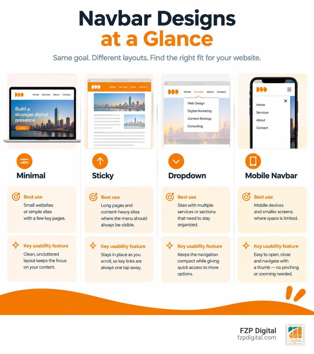
- Floating Pills & Docks: These detached, rounded navigation bars hover slightly below the top of the viewport. Often styled with subtle drop shadows or frosted glass blurs (backdrop filters), they give websites a sleek, modern feel.
- Split Headers: Centering your brand logo while placing primary links evenly on the left and right creates a visually harmonious, balanced look that works wonders for boutique agencies and luxury brands.
- Minimalist & Kinetic Bars: Some brands embrace radical simplicity by displaying only a logo, a search icon, and a single menu trigger that unfolds into a beautifully animated fullscreen navigation canvas.
Sticky vs Static Navbars: When to Use Each
Should your navigation follow visitors down the page, or stay firmly anchored at the very top?
A sticky navbar stays visible as the user scrolls. This pattern works exceptionally well on long-form landing pages, blogs, and service showcases because it keeps key links and conversion buttons accessible at all times, cutting down on excessive scrolling. In fact, many digital audits reveal that introducing a sticky header can significantly boost user dwell time.
On the other hand, a static navbar disappears as the user scrolls downward. This approach preserves maximum vertical screen real estate, making it ideal for minimalist portfolio sites or immersive reading experiences where zero distractions are desired. For a deeper breakdown of selecting optimal patterns, take a look at our practical guide to website navigation best practices.
Mastering Mega Menus and Multi-Level Dropdowns
If your business provides an extensive catalog of services or products, standard single-column dropdowns can quickly become unwieldy. That’s where mega menus come to the rescue.
A well-crafted mega menu opens a structured, multi-column panel when a user hovers or clicks. You can organize links by category, highlight popular featured resources, and even include thumbnail images or icons next to each item.
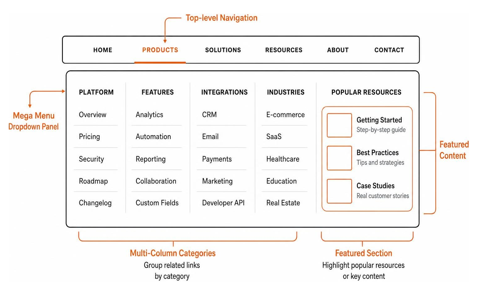
When building complex multi-column dropdowns, developers frequently turn to modular UI kits like interactive UI elements via Shadcn Blocks to establish accessible keyboard navigation and dependable multi-device responsiveness right out of the box.
Interactive Elements and Micro-Animations
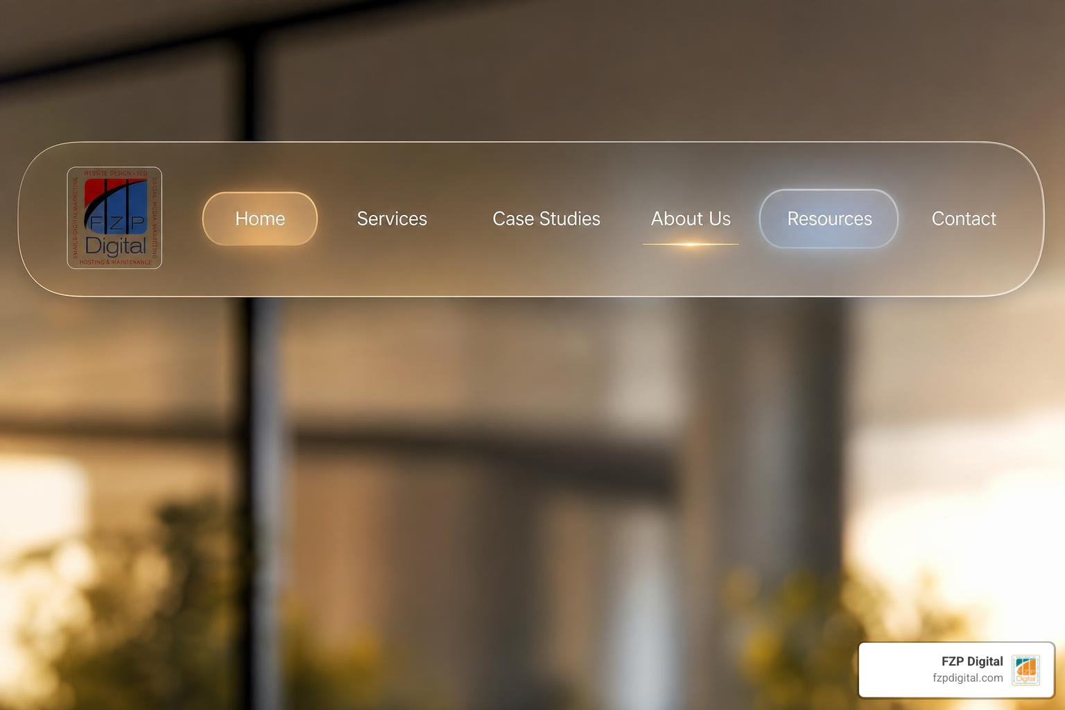
Micro-animations bring a navigation bar to life, transforming a functional component into an engaging interactive experience. When executed thoughtfully, subtle animations provide instant feedback, reassuring visitors that an element is clickable.
Browsing through trending design concepts on Dribbble reveals just how much craft goes into these micro-moments. Whether it’s a smooth underline sliding between hovered links, a gentle background color fade, or an active pill indicator that tracks page position, these subtle motions elevate the perceived quality of your entire website.
Integrating Seamless Search Bars and CTAs
A cluttered header creates unnecessary friction, especially when trying to fit navigation links, a search bar, and action buttons together. The key to harmony is smart prioritization:
- Collapsible Search Triggers: Instead of displaying an expansive text input box across the entire bar, use a clean magnifying glass icon that smoothly expands an input field or opens a focused search modal when clicked.
- Distinct Call-to-Action (CTA): Reserve bold, solid-fill button styling for your single most important conversion goal (such as “Get Started” or “Contact Us”). Keep the rest of your navigation links styled as clean text or subtle ghost buttons to maintain clear visual hierarchy.
Balancing these functional components ensures your top bar acts as an effective driver of user journeys. You can learn more about crafting conversion-friendly menus in our guide to home page navigation strategies for user engagement.
Responsive and Mobile-First Navbar Implementation
Over 70% of web traffic now comes through mobile devices. If your navigation bar doesn’t function flawlessly on a smartphone, visitors will simply bounce back to search results.
Designing for mobile requires thinking about touch ergonomics and thumb reach zones. Primary navigation triggers should offer generous tap targets (at least 44 by 44 pixels) with plenty of breathing room to prevent misclicks.
When building modern responsive headers, frameworks make prototyping clean layouts straightforward. For example, tutorials on building responsive menus with Tailwind CSS showcase how responsive utility classes easily switch a multi-column desktop layout into a sleek mobile drawer. Similarly, ready-to-use component packages like the Tailwind CSS Navbar for React – Material Tailwind streamline mobile state toggling while maintaining lightweight codebases.
Responsive Navbar Design for Website Usability Across Screen Sizes
Managing breakpoints smoothly is the key to responsive navigation. At desktop widths, your primary links should spread out with ample padding. As the viewport narrows to tablet and mobile dimensions, the desktop links should gracefully collapse into an off-canvas drawer or slide-down accordion.
Ensuring your mobile menu supports keyboard navigation, trap focus states, and visible close buttons guarantees that every user experiences the exact same speed and ease of use, regardless of their device.
Frequently Asked Questions About Navbar Design
What is the ideal number of links to include in a website navbar?
For most business websites, five to seven top-level links is the sweet spot. Keeping your primary menu within this range respects human short-term memory limits and prevents visual clutter. If you have secondary pages (like privacy policies, terms, or niche sub-services), house them neatly inside dropdown categories, utility menus, or your website footer.
How do I make a sticky navbar responsive without covering page content?
To prevent a sticky navbar from obscuring your page content, add top padding or margin to your main body container that matches the exact height of the header. For mobile devices, you can also design the navbar to dynamically shrink in height on scroll, or automatically hide when scrolling down and reappear when scrolling back up.
What tools are best for building modern, accessible navbars quickly?
Modern front-end developers rely heavily on utility-first frameworks like Tailwind CSS paired with accessible UI primitives such as Radix UI, Base UI, or Materialize CSS. These tools provide fully customizable, semantic HTML structures with built-in ARIA attributes for seamless keyboard navigation and screen reader support.
Conclusion
Your website’s navigation bar is far more than just a list of links—it’s the compass that guides your visitors toward becoming loyal clients. Whether you choose a floating pill, a comprehensive mega menu, or a classic sticky header, prioritizing visual clarity, mobile responsiveness, and intuitive organization will always deliver the best results.
If you’re ready to elevate your online presence with a custom, high-converting WordPress website, our team at FZP Digital is here to help. Led by founder Fred Z. Poritsky, we specialize in premium responsive web design, search engine optimization, and brand identity across Philadelphia, Bucks County, Richboro, and Newtown. Through our proven “Develop · Design · Deliver” process, we build custom digital experiences tailored to your growth goals. Explore our comprehensive website navigation best practices for a smooth experience and reach out to start building your dream website today!