Get Inspired: Beautiful One-Page Websites That Wow

Introduction
Hey there! Have you ever landed on a website and felt like you were reading a beautifully crafted story rather than just clicking through a bunch of random links? That’s the magic of a single-page layout! If you’re looking to simplify your online presence or just want to see what’s possible with modern design, you’re in the right place. We’re going to dive into why these sites are so popular and look at some stunning examples that’ll get your creative gears turning. Ready to see how less can truly be more?

What Makes Beautiful One-Page Websites So Compelling?
Beautiful one-page websites are exactly what they sound like — every piece of content lives on a single, scrollable page instead of being spread across multiple pages. No clicking around, no getting lost in menus. Just a smooth, guided experience from top to bottom.
Here’s a quick look at what makes them stand out:
| Feature | What It Means for You |
|---|---|
| Single scrollable layout | Visitors see your full story without clicking around |
| Faster load times | Less to load means quicker experiences |
| Focused messaging | One clear goal, one clear call to action |
| Mobile-friendly by nature | Scroll-based design works perfectly on phones |
| Higher conversions | Up to 37% more conversions vs. multi-page sites |
Think of a one-page site as a guided tour of your brand. You control exactly what visitors see, and in what order.
They’re especially popular for portfolios, product launches, event pages, and small business introductions — anywhere a single, focused message matters more than a sprawling content library.
And the best part? They can be genuinely beautiful. Clean layouts, bold visuals, smooth scrolling effects — all working together to make a lasting impression.
73% of users will leave a site if the content feels disorganized or hard to find. A well-designed one-pager solves that problem almost by default.
I’m Fred Z. Poritsky, founder of FZP Digital, and my background in nonprofit financial management, accounting, and years of hands-on WordPress design gives me a unique lens for creating beautiful one-page websites that are as functional as they are visually striking. Let’s dig into what makes these designs work — and look at some real examples to spark your creativity.

Key terms for beautiful one page websites:
Why Beautiful One-Page Websites Are Taking Over
Have you ever felt overwhelmed by a website with fifty different tabs? You’re not alone! Beautiful one-page websites are exploding in popularity because they cut through the noise. By putting everything on one page, you significantly reduce “friction.” Friction is just a fancy way of saying “the stuff that stops people from buying or contacting you.”
Research shows that one-page websites can increase conversion rates by up to 37% compared to multi-page alternatives. Why? Because the user journey is a straight line. There are no “wrong turns” for a potential customer to take. According to the team at 51 Excellent One Page Website Examples That Get It Right, these sites succeed because they prioritize clarity over clutter. We’ve even curated our own favorites in our Beautifully Brief A Collection Of Stunning Single Page Sites to show you just how diverse these layouts can be.
The Power of Simplicity
When we talk about “cognitive load,” we’re talking about how hard your brain has to work to process information. Multi-page sites force your brain to remember where you are and where you’ve been. A single-page layout uses continuous scrolling, which feels natural—especially since we all spend hours scrolling through social media every day. This focused narrative keeps users engaged longer because they’re following a story you’ve carefully laid out for them.
Mobile-Friendly by Design
Did you know that 53% of users will abandon a site if it takes longer than 3 seconds to load? When mobile traffic is king, beautiful one-page websites have a massive advantage. They are inherently responsive. Since there’s only one page to optimize, we can make it incredibly “thumb-friendly” and fast. Latest research on site speed suggests that sites loading in under 2.5 seconds rank significantly higher in search results. By focusing all your technical “juice” on one page, you can achieve performance levels that multi-page sites struggle to match.
Essential Elements of a Stunning Single-Page Layout
Creating a great one-pager isn’t just about deleting pages; it’s about organizing what’s left with surgical precision.
Every effective one-page site needs these “must-haves”:
- A Hero Section that Hooks: This is your digital handshake. It needs a bold headline and a clear reason for the user to keep scrolling.
- Sticky Navigation: Even though it’s one page, you want a menu that stays at the top. When a user clicks “Contact,” the page should smoothly zip down to the bottom.
- Visual Hierarchy: Big fonts for big ideas, smaller fonts for details. Use color and size to tell the user’s eyes where to look first.
- Social Proof: Testimonials and logos of past clients build trust quickly as the user scrolls.
Navigating Without the Noise
The secret weapon of beautiful one-page websites is the “anchor link.” Instead of taking you to a new URL, these links jump to a specific section on the same page. When combined with a “smooth scroll” effect, it feels high-end and intuitive. It creates a flow that feels like a conversation rather than a filing cabinet.
Visual Storytelling and Effects
This is where the “beautiful” part comes in! Techniques like parallax scrolling (where the background moves slower than the foreground) create a sense of depth. Subtle animations—like a button that gently pulses or text that fades in as you reach it—keep the experience dynamic. However, at FZP Digital, we always preach “ruthless essentialism.” If an animation doesn’t help tell the story, it’s just bloat. We use white space strategically to give your content room to breathe, ensuring the user doesn’t feel suffocated by information.
| Feature | One-Page Website | Multi-Page Website |
|---|---|---|
| Best For | Portfolios, Small Businesses, Single Products | E-commerce, Large Blogs, Corporate Hubs |
| User Flow | Linear & Guided | Exploratory & Non-linear |
| Maintenance | Easier (One page to update) | Complex (Many pages to manage) |
| SEO Focus | High Authority on one URL | Keyword targeting across many URLs |
10 Standout Examples to Spark Your Creativity
Sometimes you just need to see it to believe it. Let’s look at some of the best examples out there that prove a single page can do it all.
Minimalist Magic: Beautiful One-Page Websites for Portfolios
If you’re a creative or a professional, your portfolio needs to be a “soft space” for your brand. Take MFD Jannah, for example. It uses a neutral structure and soft colors to create a calm online presence. It’s built on a single HTML file, which means it loads almost instantly.
Another stunning example is Racine Carrée — Landing. This site is inspired by mathematical rigor—the name literally means “square root.” It uses a dark, sharp, minimalist palette with violet accents. It’s a masterclass in using mastered contrast and typographic hierarchy to make a site feel premium without using a single “flashy” gimmick.
High-Impact Business: Beautiful One-Page Websites for Products
For SaaS companies or digital products, you need to show, not just tell. Waypoint — Simple One-Page is a perfect starter for these projects. It uses no heavy frameworks, just pure HTML and CSS, making it incredibly lightweight and fast.
Events also thrive on this format. Check out this fictional conference site: It Is Very Rare Or Impossible That An Event Can Be Negative From All Points Of View.. It manages to fit a 4-day schedule, a speaker lineup, and a ticket portal all on one page without feeling crowded. It uses clear section breaks and sponsor logos to build credibility as you scroll toward the “Buy Tickets” button.
Overcoming the Challenges of Single-Page Design
I’ll be honest with you: one-page sites aren’t without their hurdles. If you just throw a ton of text onto a page, it becomes a “wall of words” that nobody wants to read. You also have to be careful about “analytics blindspots”—if every user is on the same page, how do you know which section made them leave?
At FZP Digital, we solve these problems through smart design. We use collapsible sections (accordions) for things like FAQs so the page doesn’t get too long. We also use tools like Divi to create sections that feel like distinct “chapters.” You can see some of our favorite implementations in our guide on The Best Divi One Page Websites To Inspire Your Next Project.
And if you’re a purist who hates “web bloat,” you might appreciate the HTML Only Manifesto — A Back-to-Basics Web Experiment. It’s a protest against the flashy, tracking-heavy sites of today, proving that functionality and accessibility should always come first.
Solving the SEO Puzzle
One of the biggest myths is that one-page sites can’t rank on Google. That’s simply not true! While you don’t have multiple pages to target different keywords, you can use “Topic Clusters” within your single page. By using strategic HTML markup (like H1, H2, and H3 tags) and schema implementation, you tell Google exactly what each section is about.
Think of it this way: instead of having five weak pages, you have one “super-page” that has massive authority. We also use internal anchor linking to help search engines crawl the content more effectively.
Performance and Speed Secrets
To keep your one-pager lightning-fast, we use a few “pro” tricks:
- Image Compression: We shrink file sizes without losing quality.
- Lazy Loading: This tells the browser only to load images when the user scrolls down to them.
- Green Hosting: We love the idea of “ethical web design.” Using hosting powered by renewable energy isn’t just good for the planet; these servers are often highly optimized for modern performance. For more on this, check out Sustainable web design tips.
Frequently Asked Questions about One-Page Sites
Are one-page websites good for SEO?
Yes, they absolutely can be! While you won’t rank for a thousand different unrelated keywords, a one-page site is fantastic for ranking for a specific niche or brand name. Because all your “backlinks” (other sites pointing to yours) go to one single URL, that page becomes very “strong” in the eyes of Google. The key is using proper header tags and structured data to help search engines understand your sections.
When is a one-page site the best choice for my business?
A one-page site is your best friend if:
- You are launching a single product or service.
- You want a digital business card or personal portfolio.
- You are running a specific marketing campaign or event.
- You want to tell a linear story that leads to a single goal (like booking a call). If you have a massive e-commerce store with 500 products, a multi-page site is still the way to go. But for many service-based businesses in Philadelphia and Bucks County, a one-pager is often more than enough.
Do one-page websites load faster than multi-page sites?
Generally, yes! Because the browser only has to make one initial request to the server to get the whole site, the “perceived” speed is much higher. However, you have to be careful not to overload that single page with giant, unoptimized videos or images. That’s where expert help comes in to ensure the balance between “beautiful” and “fast” is perfect.
Conclusion: Bringing Your Vision to Life
Designing beautiful one-page websites is an art form. It requires a balance of high-end aesthetics, psychological triggers for conversion, and technical SEO wizardry. It’s about making sure that every pixel has a purpose.
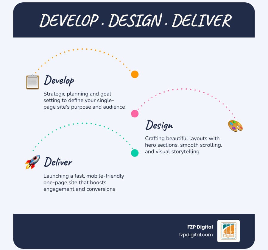
At FZP Digital, we don’t just “build” websites; we collaborate with you. Our “Develop . Design . Deliver” process ensures that your site isn’t just a pretty face—it’s a hardworking member of your team. Whether you’re in Newtown, Richboro, or right in the heart of Philadelphia, we’re here to help you navigate the complexities of the digital world.
If you’re ready to turn your sprawling, confusing site into a sleek, storytelling machine—or if you’re starting from scratch and want to do it right the first time—let’s chat. We specialize in premium responsive WordPress designs that don’t just look good; they get results.
Ready to wow your visitors? Let’s build something beautiful together.