
Stunning M and S Letter Designs That Redefine Minimalist Branding
The Evolution and Typographic Anatomy of the Letter M
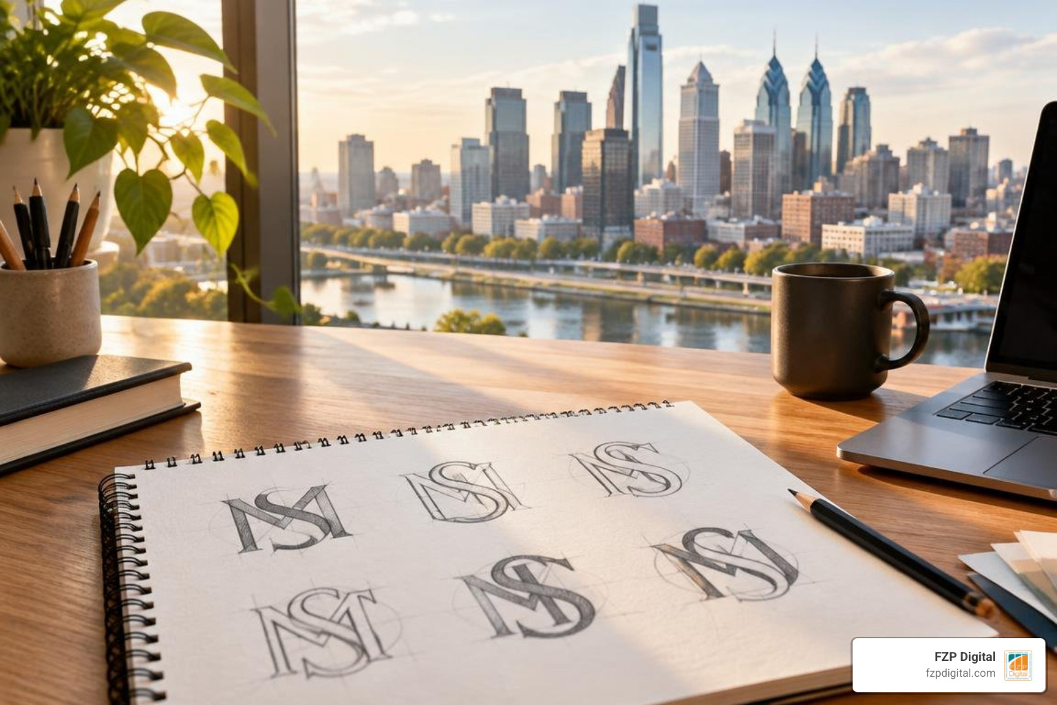
An effective m design letter balances geometric structure, vertex depth, and negative space to create a mark that feels stable, distinctive, and easy to read at any size. The strongest M logos use deliberate stem widths and apex angles, while the central vertex can either sit on the baseline for a grounded, architectural feel or hover higher for a lighter, more contemporary personality. Pairing the M with an S adds curvilinear contrast, but the two letters need clear separation and shared visual logic so the monogram stays legible in small applications.
Have you ever wondered where our modern letters actually came from? The Latin letter M holds a rich story that stretches back thousands of years. It began its journey around 700 BCE, evolving from the ancient Phoenician letter Mem, which itself originated from an Egyptian hieroglyphic wave symbol representing water. When the ancient Greeks adopted it as Mu and passed it along to the Romans, the character solidified into the 13th letter of the Latin alphabet.
Today, M is the fourteenth most frequently used letter in the English language. Beyond everyday speech, it carries monumental symbolic weight. In Roman numerals, M represents the number 1,000. In science and global metrics, it stands for everything from “mega” (one million) to “milli” (one thousandth) and standard meters. In typography, it even defines spatial layout—the standard “em dash” gets its proportional width directly from the capital letter M.
Understanding this deep heritage is a huge advantage when creating a custom brand mark. When we craft a brand mark logo for our clients, tapping into these foundational geometric roots helps us build identities that feel both timeless and instantly recognizable.
Anatomy and Geometry of an M Design Letter
At first glance, drawing an M might seem like child’s play—just four straight lines, right? But in professional typography, an m design letter requires deliberate geometric finesse. Let’s break down its essential anatomical components:
- Vertical & Diagonal Stems: The outer pillars provide structural grounding, while the inner diagonal strokes create dynamic energy.
- Apex Angles: The top peaks where strokes meet. Sharp apexes convey precision and modern tech vibes, while flat or rounded apexes soften the tone.
- Vertex Depth: The central bottom point where the two diagonal strokes converge. If the vertex touches the baseline, the letter feels grounded and architectural; if it hovers higher, the character takes on an airy, contemporary personality.
- Optical Corrections: Because our eyes play visual tricks, mathematical symmetry rarely looks perfectly balanced. Typographers slightly taper diagonal strokes and subtly widen internal negative space so the letter doesn’t appear top-heavy or cluttered.

The Dynamic Synergy of Combining M and S Monograms
When you pair the architectural stability of the letter M with the sinuous, flowing motion of the letter S, magic happens. It is a visual dialogue between sharp angles and smooth curves. The M anchors the composition with horizontal symmetry and strength, while the S introduces movement, rhythm, and grace.
To make these two characters interact seamlessly, designers rely on clever optical techniques. We often align the central spine of the S along the vertex of the M, or let the sweeping curves of the S cut through the diagonal strokes using high-contrast negative space. Masterfully balancing these opposing forces is one of the core minimalist logo design secrets for bold brands that want to stand out without screaming for attention.
Creative Concepts for Your Next M Design Letter Project
Building an unforgettable monogram means exploring different aesthetic pathways until you find the exact visual personality that matches your company’s mission. As we navigate the evolving world of design, staying ahead of logo design trends ensures your brand looks fresh and relevant.
| Design Style | Key Visual Characteristics | Best Suited For | Scalability Factor |
|---|---|---|---|
| Geometric Minimalist | Monoline weight, sharp apexes, grid-based symmetry | Tech startups, finance, SaaS, architecture | Exceptional across all screen sizes |
| Interlocking Dual-Letter | Shared vertical stems, continuous lines, interwoven paths | Consultancies, law firms, creative agencies | High (requires clean line gaps) |
| Negative Space Cutout | Hidden secondary shapes, high-contrast silhouettes | Boutique retail, coffee shops, security firms | Excellent for app icons and favicons |
| Luxury Serif Monogram | Elegant high-contrast strokes, delicate serifs, gold tones | Hospitality, real estate, fine dining, jewelry | Best suited for large print and web headers |
Minimalist and Geometric Monograms
Minimalist geometric marks strip away every unnecessary detail, leaving only pure, impactful form. By building the letterform on an isometric or square grid, we can create an M that looks sleek, futuristic, and rock-solid. Incorporating quality logo design tips into this process ensures that every stroke width is uniform, creating maximum clarity whether your logo is displayed on a mobile smartwatch screen or a towering billboard in Downtown Philadelphia.
Negative Space and Dual-Letter Interlocking
Negative space is one of the most rewarding tools in graphic design. By using the empty areas inside and around the stems of an M, you can carve out an S, an arrow, a leaf, or an abstract symbol that tells a deeper brand story. Interlocking letters transform two separate initials into a unified, cohesive emblem. It gives your audience a delightful “aha!” moment when they look at your mark, ensuring you stop blending in and start making a brand mark that customers remember for years.
Luxury and Vintage Embellishments
If your business operates in high-end real estate, legal counsel, or boutique hospitality, a hyper-minimalist sans-serif might feel a bit too cold. In these cases, adding refined serif details, subtle calligraphic flourishes, or warm metallic textures can elevate your mark into pure elegance. Taking inspiration from the most famous luxury logos and what they mean, a vintage-inspired M and S monogram communicates prestige, heritage, and uncompromising craftsmanship.
Essential Rules for Crafting Scalable Monogram Logos
A logo design can look breathtaking on an artboard, but if it turns into an unrecognizable smudge as a 16×16 pixel favicon, it fails its primary job. Modern branding demands absolute versatility across physical and digital touchpoints.
When establishing your brand identity, keeping creative logo design and brand identity principles at the forefront will save you endless headaches down the road. Here are the core rules we live by:
- Always Design in Vector Format: Never build a primary logo in raster-based software. Vector formats preserve mathematically defined curves that scale infinitely without pixelation.
- Test at Micro Sizes: Check your monogram at 32px and 16px widths. If the internal gaps between the M and S strokes blend together, increase stroke separation.
- Maintain Monochrome Integrity: Your logo must work in single-color solid black and reversed white before you introduce color palettes or gradients.
Digital Assets and M Design Letter Vector Resources
When searching for base assets or downloadable templates, platforms like Creative Market, MasterBundles, and Vecteezy host hundreds of vector options (Vecteezy alone features over 314 royalty-free vectors for fancy M designs). However, ready-made stock templates are accessible to everyone, meaning your competitors might end up using the exact same shape!
If you use templates for initial inspiration or prototype layouts, always customize the anchor points, refine the stem widths, and make the asset uniquely your own. Understanding the symbolic uses of M across science and culture can also spark creative ideas for custom iconography—like incorporating subtle wave contours or architectural pillars into your vector paths.
Unicode Styling and Cross-Platform Typography
Beyond graphic vector logos, modern brands often need quick, stylish text characters for social media profiles, email signatures, and messaging apps. There are more than 150 different font styles available via Unicode font generators—ranging from cursive scripts (𝓜, 𝑀) to bold gothic fraktur (𝕸) and double-struck mathematical characters (𝕄).
While these Unicode characters are fantastic for adding flair to an Instagram bio or a TikTok handle, keep accessibility in mind. Screen readers used by visually impaired individuals often read decorative Unicode characters as individual mathematical symbols or garbled text rather than standard letters. Use them thoughtfully for quick decorative accents, but always rely on clean, accessible typography for your primary website copy.
Frequently Asked Questions About Lettermark Design
What makes an M design letter logo visually balanced and memorable?
Visual balance in an M logo relies on optical adjustments rather than rigid mathematical alignment. Because the letter contains heavy diagonal strokes, designers slightly reduce inner stroke widths and open up the central negative space. A memorable mark pairs this structural balance with a distinctive focal point—such as an unexpected color accent, a unique vertex angle, or an integrated secondary shape.
How do designers seamlessly combine M and S into a single monogram?
Designers merge M and S by identifying shared geometric paths. Common techniques include:
- Sharing the left vertical stem of the M with the top terminal of the S.
- Letting a continuous curved line weave through the central vertex of the M to form the S.
- Using negative space cutouts where the silhouette of the S is carved directly out of a solid, bold M.
Which file formats are essential when exporting a custom letter logo?
When exporting your final brand package, make sure you have:
- SVG & EPS: Master vector files for responsive web use, app icons, and large-format printing.
- Transparent PNG: High-resolution (300 DPI) raster files with transparent backgrounds for digital presentations, social graphics, and web headers.
- PDF: Scalable, vector-embedded documents ideal for professional print shops and merchandise vendors.
Bringing Your Brand Mark to Life
Creating a stunning, timeless monogram is an exciting journey. An m design letter paired with an S gives you the ultimate typographic playground—blending structural strength with fluid elegance.
Whether you are launching a brand-new startup in Newtown or refreshing a well-established company in Philadelphia, crafting a distinctive mark requires strategy, precision, and a deep understanding of visual communication. At FZP Digital, we love collaborating with local and national businesses through our dedicated “Develop . Design . Deliver” process. From bespoke monogram designs to high-performance WordPress web development and organic SEO strategy, we help you build a digital presence that truly drives results.
Ready to transform your visual identity? Explore our complete branding and logo identity guide to discover how the right design strategy can elevate your business today!