


Why WCAG Guidelines with Examples Matter for Every Website Owner
Understanding wcag guidelines with examples is the fastest way to know whether your website is actually usable by everyone — including the roughly 1 in 4 Americans living with some form of disability.
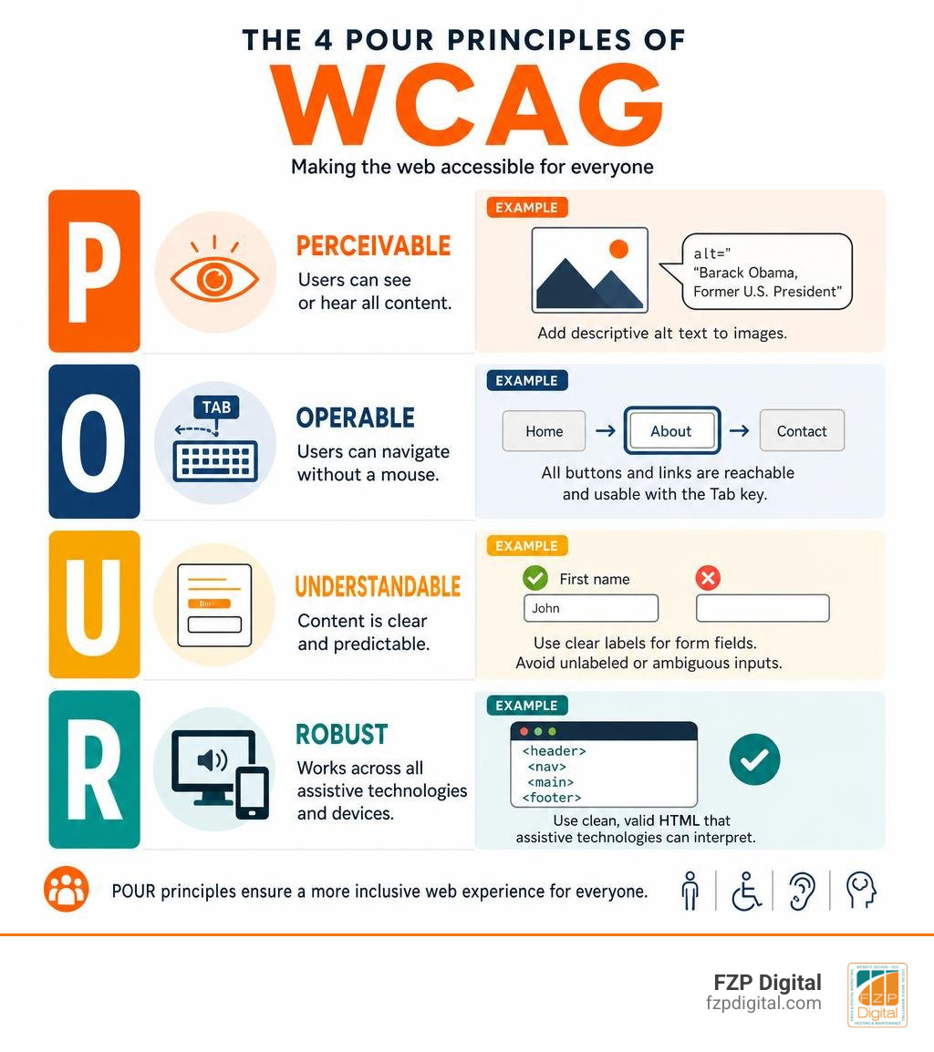
Here’s a quick snapshot of what WCAG compliance looks like in practice:
| WCAG Principle | What It Means | Quick Example |
|---|---|---|
| Perceivable | Users can see or hear all content | Add alt text to images: “Barack Obama, Former U.S. President” not just “a man” |
| Operable | Users can navigate without a mouse | Every button and link works using only the Tab key |
| Understandable | Content is clear and predictable | Form fields are labeled “First name” and “Last name” — not just blank boxes |
| Robust | Works across all assistive technologies | Clean, valid HTML that screen readers can interpret correctly |
These four principles — known as POUR — form the backbone of the Web Content Accessibility Guidelines (WCAG), a set of technical standards developed by the World Wide Web Consortium (W3C).
WCAG 2.1, published in June 2018, builds on the original 2008 standard by adding 17 new success criteria that address mobile users, people with low vision, and people with cognitive disabilities. And as of 2024, the U.S. Department of Justice made WCAG 2.1 Level AA the mandatory standard for state and local government websites.
But here’s the thing — accessibility isn’t just a government problem.
Any business website that’s hard to navigate, impossible to read, or broken for keyboard users is quietly turning away customers every single day. And most business owners have no idea it’s happening.
That’s where this guide comes in. Whether you’re building a new site or auditing an existing one, we’ll walk you through the most important success criteria, show you what good (and bad) looks like, and give you a practical checklist you can actually use.
I’m Fred Z. Poritsky, founder of FZP Digital — a Philadelphia-based digital marketing agency helping businesses and nonprofits build accessible, high-performing websites. Helping clients navigate wcag guidelines with examples is a core part of how we make sure every website we build works for every visitor, not just some of them.
Wcag guidelines with examples terms simplified:
Demystifying the WCAG Guidelines with Examples: The Four Core Principles
When you first open the official W3C documentation, it can feel like you’ve been dropped into a forest of technical jargon. But don’t panic! The entire system is built on a simple framework called POUR.
By understanding these four core principles, you can transform a confusing list of rules into a clear, logical roadmap. Let’s break down what What is Web Accessibility? really means under the Web Content Accessibility Guidelines (WCAG) 2.1 – W3C standard.
Perceivable: Making Content Visible and Audible to Everyone
The first principle, Perceivable, is all about sensory input. If a visitor cannot see your beautiful graphics or hear your promotional video, how can they interact with your brand? Your content must be presented in a way that users can digest through the senses they rely on.
For screen reader users, this often comes down to high-quality text alternatives. If you have an image on your site that conveys information, you must provide alternative text (alt text).
But how do you write good alt text? Let’s look at a practical example:
- The Bad Practice:

- The Good Practice:

If you want to dive deeper into how screen readers interact with your site, check out our guide on How to Design for Everyone and Their Screen Reader.
Beyond images, multimedia elements require captions for pre-recorded audio and video. If you post a video explaining your services, you must provide synchronized captions so deaf or hard-of-hearing users can follow along seamlessly.
How to Apply WCAG Guidelines with Examples for Low Vision Users
Low vision users might not use a screen reader, but they still need specific visual accommodations to read your content comfortably. This is where contrast ratios, reflow, and text spacing come into play.
- Color Contrast Ratio: For standard text to meet Level AA compliance, the visual presentation must have a contrast ratio of at least 4.5:1 against its background. For large text (typically 18pt or 14pt bold), the minimum ratio is 3:1.
- Bad Example: Light gray text on a white background. It might look sleek to a young designer, but it is unreadable for many users.
- Good Example: Dark navy blue text on a crisp white background.
- Reflow (Success Criterion 1.4.10 – Level AA): Have you ever tried to read a desktop website on your phone, only to find yourself constantly scrolling horizontally to finish a single sentence? Reflow ensures that when a user zooms in up to 400%, content automatically wraps to fit the screen without requiring two-dimensional scrolling. Specifically, content must present without loss of functionality at a width equivalent to 320 CSS pixels.
- Text Spacing (Success Criterion 1.4.12 – Level AA): Users must be able to adjust text spacing to improve readability. Under this guideline, a user should be able to increase line height (line spacing) to at least 1.5 times the font size, letter spacing to at least 0.12 times the font size, and word spacing to at least 0.16 times the font size without any content overlapping or breaking.
By ensuring these visual details are taken care of, you make your site incredibly comfortable for everyone to read. Learn more about this in The Ultimate Guide to Making Web Pages Accessible for All.
Operable: Navigating Without a Mouse
The second principle, Operable, means that your website’s user interface and navigation must be usable. Many users with motor disabilities, tremors, or visual impairments cannot use a traditional mouse. Instead, they rely on keyboards, switch devices, or voice commands to navigate the web.
This is why keyboard accessibility is absolutely non-negotiable. Every interactive element on your page — links, buttons, forms, dropdowns — must be fully functional using only the keyboard.
- Visible Focus Indicators: When you press the Tab key to move through a page, do you see a clear visual outline around the active element? This is a focus indicator. If you hide this outline with CSS (
outline: none;), a keyboard-only user will have no idea where they are on your page. - Skip Links: Imagine having to press the Tab key 50 times through a massive header navigation menu on every single page before you can read the main article. Skip links allow keyboard users to bypass repetitive header content and jump straight to the main body of the page.
- Character Key Shortcuts (Success Criterion 2.1.4 – Level A): If your site uses single-character keyboard shortcuts (like pressing “e” to edit), you must provide a way to turn them off, remap them, or ensure they only activate when the element has focus. This prevents speech input users from accidentally triggering commands while speaking.
To ensure your layout is structured correctly for these tools, follow the rules outlined in Understanding Success Criterion 2.4.6: Headings and Labels | WAI | W3C .
Implementing WCAG Guidelines with Examples for Keyboard-Only Navigation
When implementing keyboard navigation, focus on a logical tab order. The focus should move from top to bottom, left to right, matching the natural reading flow of the page.
But what about mobile devices or touch screens? WCAG 2.1 introduced specific guidelines for pointer inputs and target sizes.
- Pointer Gestures (Success Criterion 2.5.1 – Level A): If a function requires a complex gesture (like pinching to zoom or swiping a carousel), you must also provide a simple, single-point alternative (like a tap button).
- Target Size (Success Criterion 2.5.5 – Level AAA / 2.5.8 – Level AA in WCAG 2.2): Have you ever tried to tap a tiny icon on your phone and accidentally clicked the wrong link? To prevent this, the target size for pointer inputs should be at least 44 by 44 CSS pixels (Level AAA) or at least 24 by 24 CSS pixels (Level AA in WCAG 2.2). This makes tap targets easy to hit for users with limited manual dexterity.
If you’re looking for inspiration on how to make these functional elements look stunning, take a look at these Steal These Ideas: ADA Compliant Website Examples That Actually Look Good.
Understandable: Clear Language and Predictable Interfaces
The third principle, Understandable, ensures that users can actually comprehend your content and know how to use your interface.
- Readable Content: Use clear, simple language. If you use jargon or abbreviations, explain them. Additionally, always set the language of your page programmatically using the HTML
langattribute (e.g.,). This tells screen readers which pronunciation rules to use. - Predictable Interfaces: Navigation menus, headers, and footers should remain consistent across all pages of your site. If your search bar is in the top-right corner of your homepage, don’t move it to the bottom-left on your contact page!
- Input Assistance and Error Prevention: If a user makes a mistake on a form, don’t just clear the fields and show a generic red box. Provide clear, descriptive error messages with helpful suggestions. For example, if a phone number field is formatted incorrectly, display: “Please enter your phone number using only numbers (e.g., 2155551234).”
Robust: Maximizing Compatibility Across Assistive Technologies
The final principle, Robust, ensures that your website remains compatible with a wide variety of browsers, operating systems, and assistive technologies — both now and in the future.
This starts with clean, valid code. While WCAG 2.2 has marked the specific “Parsing” success criterion (4.1.1) as obsolete because modern browsers do an excellent job of correcting broken HTML automatically, writing clean, semantic HTML remains the best practice for accessibility.
Ensure you use proper ARIA (Accessible Rich Internet Applications) roles and properties only when native HTML elements aren’t enough. By using semantic elements like
,
,
, and , you give screen readers the exact context they need to parse your site. If you’re running an older site, reviewing the Web Content Accessibility Guidelines (WCAG) 2.0 – W3C can help you understand how these technical baselines have evolved over time.
The Evolution of Accessibility: WCAG 2.0 vs. 2.1 vs. 2.2
Digital design moves fast. To keep up with new technology, the W3C regularly updates its standards. The great news is that WCAG maintains strict backwards compatibility. If your website conforms to the newer WCAG 2.2, it automatically conforms to WCAG 2.1 and WCAG 2.0.
Let’s look at how the guidelines have evolved over time to address new devices and user needs:
| WCAG Version | Release Date | Key Focus Areas | Major Success Criteria Added |
|---|---|---|---|
| WCAG 2.0 | December 2008 | Desktop-focused web accessibility, introduced the 4 POUR principles. | 12 Guidelines forming the foundational technical standards. |
| WCAG 2.1 | June 2018 | Mobile & tablet accessibility, low vision, and cognitive disabilities. | Adds 17 success criteria, including 1.3.4 Orientation (AA), 1.4.10 Reflow (AA), 2.5.1 Pointer Gestures (A), and 4.1.3 Status Messages (AA). |
| WCAG 2.2 | December 2024 | Focus state visibility, touch target sizes, and cognitive accessibility in authentication. | Adds 9 success criteria, including Focus Not Obscured, Consistent Help, Redundant Entry, and Accessible Authentication. |
If you are wondering how to keep your site updated without breaking your budget, our guide on Making Your Website ADA Compliant the Easy Way is a fantastic place to start. For the full technical breakdown, you can also consult the official Web Content Accessibility Guidelines (WCAG) 2.2 .
Navigating the Three Conformance Levels: A, AA, and AAA
To make compliance manageable, WCAG groups its success criteria into three levels of conformance:
- Level A (Minimum): The bare minimum requirements. If your site does not meet Level A, it is actively blocking users with disabilities from accessing your content.
- Level AA (Mid-Range/Strong): This is the gold standard for commercial and governmental websites. It addresses the most common barriers for users with a wide range of disabilities. Most laws, including the Americans with Disabilities Act (ADA) and local city standards, target Level AA compliance.
- Level AAA (Highest/Exceptional): The absolute highest level of accessibility. While it’s fantastic to aim for AAA criteria where possible (such as providing a sign language interpreter for videos), the W3C notes that it is generally not possible to satisfy all Level AAA criteria for entire websites.
Legal Compliance and Local Regulations
If you are operating a business in the Philadelphia area — whether you’re based in Richboro, Newtown, Downtown Philadelphia, or Philadelphia proper — staying compliant is highly important.
For example, the Accessibility policy | City of Philadelphia outlines strict standards for public digital services. Local institutions look to these standards to ensure equal access for all residents. To understand how these levels fit into the broader legal landscape, you can read the WCAG 101: Understanding the Web Content Accessibility Guidelines overview.
How to Test and Implement Accessibility in Your Projects
Making a website accessible isn’t a one-time task; it’s an ongoing process. Here is how we handle it at FZP Digital using our collaborative “Develop . Design . Deliver” process:
- Automated Testing: We start with automated tools like the WAVE extension or the IBM Equal Access Accessibility Checker. These tools are fantastic for catching quick issues like missing alt text or poor color contrast.
- Manual Testing: Automated tools only catch about 40% of accessibility issues. To find the rest, we perform manual testing. We navigate your site using only a keyboard to ensure the tab flow is logical and focus states are clearly visible.
- Screen Reader Testing: We test the layout with popular screen readers (like NVDA or VoiceOver) to make sure the structural headers and labels read naturally.

Ready to see where your site stands? You can request a comprehensive Website Accessibility Audit from our team. Investing in accessibility is also great for your bottom line — learn more at Learn How Website Accessibility Can Help Grow Your Brand.
Common Accessibility Pitfalls and How to Avoid Them
- Missing or Generic Alt Text: Avoid writing “image.jpg” or leaving the field blank. Use descriptive, contextual text.
- Poor Color Contrast: Keep your text highly readable. Use tools like the WebAIM Contrast Checker to verify your color choices.
- Broken Keyboard Navigation: Never hide the focus ring. Ensure users can navigate your entire site without touching a mouse.
- Empty Form Labels: Always associate labels with their respective inputs. A search box should have a clear, programmatically tied label, even if it uses a magnifying glass icon.
For more guides on avoiding these common mistakes, explore our Category: Web Accessibility archive.
Frequently Asked Questions About WCAG Compliance
What is the difference between WCAG 2.1 and WCAG 2.2?
WCAG 2.2 builds on WCAG 2.1 by adding nine new success criteria. These new guidelines focus heavily on visual focus visibility, reducing redundant data entry, simplifying touch-target sizing on mobile devices, and making web authentication (like logging in) easier for users with cognitive disabilities.
Is WCAG compliance legally required for my business website?
While WCAG itself is a technical standard rather than a law, courts in the United States consistently refer to WCAG Level AA as the benchmark for compliance under Title III of the Americans with Disabilities Act (ADA). Local Philadelphia organizations, such as those highlighted in the Accessibility Statement – Center City District , actively maintain WCAG compliance to ensure complete digital accessibility and minimize legal risks.
What is the minimum color contrast ratio required for WCAG AA compliance?
For Level AA compliance, standard text and images of text must have a minimum contrast ratio of 4.5:1 against the background. For large text (18pt or larger, or 14pt bold or larger), the minimum contrast ratio is 3:1.
Conclusion

Creating an accessible website doesn’t mean you have to sacrifice beautiful design or modern features. In fact, clean, accessible code forms the foundation of great SEO, speedy load times, and an exceptional user experience for every single visitor.
At FZP Digital, led by Fred Z. Poritsky, we specialize in premium, responsive WordPress website design, custom logo design, and high-impact SEO strategies across Philadelphia, Richboro, Newtown, and Downtown Philadelphia. We know that modern web development and SEO come with their fair share of technical challenges — but you don’t have to face them alone. Our collaborative “Develop . Design . Deliver” process ensures your website is beautiful, high-performing, and fully compliant with the latest accessibility standards.
Ready to build a website that welcomes everyone? Partner with FZP Digital for Web Accessibility Solutions today, and let’s create a digital presence your business can be proud of!