

The Easiest Websites to Navigate Prove That Simple Design Always Wins
What the Easiest Websites to Navigate Get Right
The easiest websites to navigate make your next step obvious. Think of Google’s focused search page, Workflowy’s simple list structure, or GOV.UK’s topic-based browsing: each gives you a clear way to move forward without sorting through a crowded screen.
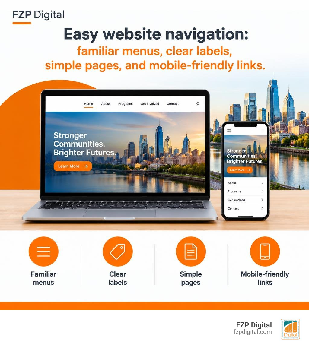
That’s the lesson for your business or nonprofit website, too. Visitors scan for what they need. Familiar menus, descriptive labels, and a layout that works on a phone help them find it before frustration sets in.
I’m Fred Z. Poritsky, founder of FZP Digital. My experience in nonprofit financial management and WordPress web design helps me look at the easiest websites to navigate from both sides: what your visitors need and what your organization needs them to find.
Glossary for easiest websites to navigate:
The Cognitive Science Behind Intuitive Web Usability
Have you ever landed on a webpage and immediately felt like your brain was running a marathon? That overwhelming sensation comes straight down to cognitive load. When you visit a website, your subconscious brain makes lightning-fast evaluations. In fact, research shows that users form an aesthetic judgment of a website within 1/50th to 1/20th of a second (that’s an astonishing 0.02 to 0.05 seconds!).
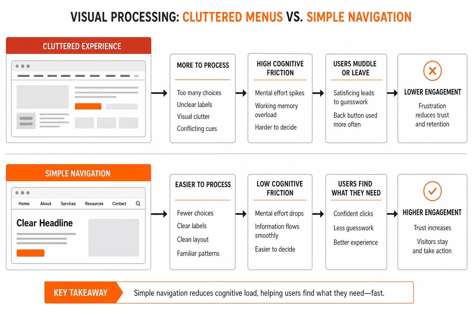
When a layout feels chaotic, cognitive friction spikes immediately. According to scientific research on why simple website design is scientifically better, visual complexity is consistently rated as less appealing than clean simplicity. Our working memory can only comfortably hold between five and nine distinct “chunks” of information at one time. If a navigation bar presents twenty unorganized options, flashing banners, and conflicting color palettes, the human brain simply taps out.
Cognitive fluency describes how easily our minds process incoming information. When you see familiar patterns, your brain glides through them effortlessly. This is why following foundational web usability and accessibility basics is so vital for user retention. If you align your website’s layout with standard mental templates, visitors spend zero mental energy figuring out how to use your site, leaving all their focus for your actual message and offerings.
How Real Users Browse: Scanning, Satisficing, and Muddling Through
Let’s dispel a common web design myth: users do not read your website word-for-word like a novel. Instead, real visitors scan headers, glance at bold text, and hunt for visual anchors.
In his landmark book, Steve Krug’s Don’t Make Me Think usability principles highlight a concept known as “satisficing” (a blend of satisfying and sufficing). Users don’t weigh every possible link to find the perfect choice; they click the very first link that looks reasonably promising. They muddle through until something clicks. If you make those links cryptic or hide them behind clever graphics, visitors won’t solve the puzzle—they will simply hit the back button.
| Navigation Attribute | High Cognitive Friction (Confusing) | Frictionless Browsing (Intuitive) |
|---|---|---|
| Menu Organization | Deep, nested flyouts with 15+ top items | 5–7 core categories organized logically |
| Link Labeling | Vague, branded jargon (“Synergize”) | Clear, descriptive text (“Our Services”) |
| Visual Hierarchy | Cluttered visuals, no clear focal point | Prominent search bar, distinct headings |
| Wayfinding | No location indicator or trail | Clear breadcrumbs and active page states |
| Mobile Adaptability | Tiny, tightly packed desktop links | Generous tap targets in a clean layout |
Hallmarks and Examples of the Easiest Websites to Navigate
When you examine the web’s gold standards for usability, you’ll notice they share an obsession with clutter reduction. They don’t try to show everything all at once.
Take the classic Google search interface. It remains the benchmark of single-purpose clarity: a clean logo, a prominent search input, and two obvious buttons. There is no guessing game.
Similarly, the minimalist single-list architecture on Workflowy organizes complex thoughts through a clean, nested bullet hierarchy. By stripping away extraneous toolbars, sidebars, and confusing submenus, it allows users to zoom directly into what matters without distraction.
Even complex public platforms can master this balance. The official City of Philadelphia portal navigation uses clean service groupings, clear search functionality, and direct task-based pathways so residents can find trash schedules or pay property taxes without wading through bureaucratic clutter.
Prototypical Frameworks in the Easiest Websites to Navigate
Have you ever wondered why e-commerce websites almost always place the shopping cart in the upper right-hand corner and the logo in the top left? That is prototypical design in action.
When digital interfaces respect category conventions, they capitalize on habits users have already formed over decades. When Skinny Ties redesigned their e-commerce store around classic prototypical layout themes, they experienced dramatic conversion gains in just two-and-a-half weeks simply by making products easier to browse and purchase. Implementing effective home page menu structures ensures you meet visitor expectations right from the first click.
Case Study: Topic-Based Browsing and Data-Driven Redesigns
A massive content library doesn’t have to mean massive headaches for visitors. When the UK government overhauled its public portal, it focused entirely on simplifying topic-based pathways.
As documented in the GOV.UK topic-based navigation case study, moving to a clean visual grid layout increased the click-through rate directly into content from 61.6% to 65.1%. With two-thirds of their audience visiting on mobile devices, swapping dense three-column link lists for clean, well-spaced touch targets made information vastly more accessible.
At FZP Digital, we apply these same data-driven structural principles across our clients’ digital platforms. Navigating complex WordPress architectures, responsive structures, and technical SEO can feel overwhelming when you try to juggle it all alone. That’s why our collaborative “Develop . Design . Deliver” process, led by founder Fred Z. Poritsky, helps businesses across Philadelphia, Newtown, and Richboro build frictionless web experiences that turn casual browsers into loyal customers.
Essential Navigation Architecture: From Breadcrumbs to Mobile Touch Targets
Think of your website’s navigation system as digital street signs. If someone drops into an interior page from an organic search result, can they instantly tell where they are and how to step backward?

Breadcrumb trails are one of the most effective wayfinding tools available. They provide a clear textual trail (e.g., Home > Services > Web Design) that gives users instant context and allows them to navigate up the site hierarchy in a single click. Combining breadcrumbs with structured menus and intuitive sitemaps represents the core of structured website navigation best practices.
How to Build the Easiest Websites to Navigate for Mobile and Screen Readers
A website cannot be considered easy to navigate unless it works effortlessly for everyone, across every device and assistive tool.
When designing for mobile viewports, responsive grids must account for physical ergonomics. Interactive elements need large, well-spaced tap targets so users with motor impairments or those browsing one-handed on a commute don’t accidentally tap the wrong link.
Furthermore, pairing clean design with accessible web design standards and fundamental inclusive web design principles ensures screen readers can parse semantic HTML headings, buttons, and landmark regions smoothly. When your markup is logical, assistive tech users can jump directly to primary content without listening to dozens of repetitive header links on every single page load.
Frequently Asked Questions About Website Navigation
What primary elements make a website effortlessly easy to navigate?
Effortless navigation relies on a logical visual hierarchy, descriptive labels, consistent menu placement across all pages, working search bars with autocomplete, and intuitive breadcrumb trails that show users their exact location within the site structure.
Why is mobile navigation more challenging to design than desktop navigation?
Mobile navigation requires fitting comprehensive pathways onto compact screens without overwhelming the user. Designers must balance hidden drawer menus with visible quick-action buttons while ensuring touch targets meet minimum sizing standards to accommodate various thumb reaches and prevent misclicks.
How does web accessibility improve general navigation for all users?
Accessible navigation features—such as high color contrast, visible keyboard focus indicators, clear typography, and semantic HTML markup—reduce visual fatigue and cognitive friction for every visitor, resulting in faster load times and smoother site interactions across the board.
Conclusion
Creating a seamless user journey isn’t about packing pages with trendy design gimmicks or reinventing the wheel. The easiest websites succeed because they respect human psychology: they reduce visual clutter, embrace prototypical layouts, and make every next click completely intuitive.
When you evaluate your digital presence, simplicity is your greatest conversion asset. Ground your structure in proven website navigation best practices for a smooth experience, test your layouts with real users on both desktop and mobile screens, and keep your core messages front and center.
High-performing websites also depend on fast, rock-solid hosting foundations. For managed WordPress environments, FZP Digital recommends GoDaddy and WP Engine to deliver top-tier speed, stability, and security.
Are you ready to transform your website into an intuitive, high-converting digital experience? Reach out to us at FZP Digital today. Whether you’re based in Downtown Philadelphia, Newtown, or throughout Bucks County, we’re here to help you develop, design, and deliver a web presence that truly works for you and your visitors.