
The Best Brand Logos on a Budget

What the Best Brand Logos Can Teach Your Business
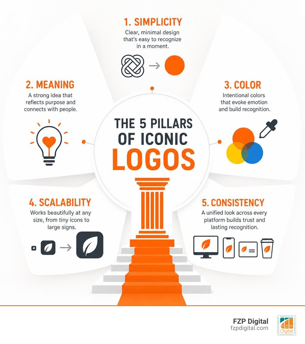
The best brand logos are simple enough to recognize in a second, meaningful enough to support a brand story, and flexible enough to work everywhere – from a website favicon to a storefront sign. If you’re building on a budget, focus on a clear shape or wordmark, a limited color palette, readable type, and one idea your audience can remember.
You don’t need a complicated illustration or the latest design trend to look professional. In fact, famous marks such as Nike, FedEx, Apple, Coca-Cola, and McDonald’s show that visual consistency and a distinctive core idea matter far more over time.
A great logo should:
- Reflect what your organization stands for.
- Stay legible in black and white and at very small sizes.
- Use color and empty space intentionally, not as decoration.
- Remain consistent across your website, social profiles, print materials, and signage.
- Leave room for a thoughtful refresh later without abandoning what people recognize.
Consider Nike: Carolyn Davidson created the original Swoosh in 1971 for $35. Its lasting power did not come from a large initial budget; it came from a simple form that communicates movement, speed, and victory. That’s an encouraging lesson for Philadelphia-area businesses and nonprofits: a modest investment can create a strong foundation when the design is tied to a clear purpose.
I’m Fred Z. Poritsky, founder of FZP Digital, and my background in nonprofit financial management, accounting, music, web design, and digital marketing helps me balance creative ideas with practical business goals. In this guide to the best brand logos, I’ll help you spot the principles worth borrowing for a brand that feels credible, cohesive, and built to last.
Best brand logos word guide:
Iconic Lessons from the Best Brand Logos in History
When you look at the world’s most recognized emblems, what stands out first? It is rarely fancy gradients or complicated illustrations. Instead, the greatest marks in commercial history lean on bold shapes, clever negative space, and disciplined storytelling.
According to the Kantar BrandZ report on the most valuable global brands in 2026, top global brands like Google, Apple, and Amazon hold market valuations exceeding one trillion dollars each. While these enterprises now have massive marketing budgets, their visual foundations were rooted in clarity and strategic simplicity from day one. You do not need a multi-million-dollar budget to harness these same visual principles for your own venture.
The World’s Most Iconic Budget-Born Marks
Perhaps the most famous budget design success story in history is the Nike Swoosh historical origin. In 1971, graphic design student Carolyn Davidson created the fluid wing-like checkmark for a humble fee of thirty-five dollars. Founders needed a mark that communicated speed, motion, and athletic triumph without clashing with shoe leather stitching. Today, that single silhouette stands as one of the most valuable trademarks on earth.
Similarly, consider the historic Shell logo, known as “The Pecten.” First registered as a trademark in 1900—making it the oldest active mark among Shell’s collection of over 22,000 trademarks—it evolved from a realistic drawing of a mussel shell into the clean, high-contrast scallop shell we know today.
At FZP Digital, Fred Z. Poritsky frequently reminds our local business clients across Philadelphia, Bucks County, Richboro, and Newtown that great design is not about what you can add—it is about what you can strip away. Exploring minimalist logo design secrets allows small organizations to craft enduring symbols without spending a fortune.
Clever Visuals and Hidden Meanings
Have you ever looked closely at your favorite corporate badges to see what hidden surprises are tucked inside? Clever design tricks make a logo memorable and reward observant viewers:
- FedEx: Lindon Leader designed this logistics masterpiece in 1994. Nestled right between the uppercase “E” and lowercase “x” sits a crisp arrow formed by negative space, subconsciously communicating speed, direction, and precision.
- Amazon: The simple curved yellow arrow connects the letter “a” to “z,” indicating that the platform delivers every product under the sun while doubling as a friendly, reassuring smile.
- Baskin Robbins: The bright pink segments embedded within the capital “B” and “R” highlight the number 31, representing a unique ice cream flavor for every day of the month.
- Toblerone: Look at the silhouette of the Matterhorn mountain peak on the packaging, and you will spot a hidden bear walking upward, honoring Bern, Switzerland—the famous “City of Bears” where the honey-nougat chocolate was born.
When you master the art of designing a brand mark logo, you can embed your own company’s values, heritage, or core promise right into the visual geometry.
Timeless Simplicity and Enduring Wordmarks
Custom lettering can create an irreplaceable emotional signature. The Coca-Cola logo has utilized its iconic flowing Spencerian script and dynamic wave ribbon tail since the late 1800s. A recent Coca-Cola visual identity analysis revealed that the smartest updates preserve existing historical equity rather than chasing disruptive, radical overhauls.
Other legendary examples prove that consistency builds massive brand equity:
- IBM: Designed by design icon Paul Rand in 1972, the famous 8-bar monogram has remained untouched for over half a century, using horizontal lines to suggest technological speed and stability.
- Chanel: Created by Coco Chanel in the 1920s, the minimalist interlocking “CC” monochrome emblem has never changed, exuding timeless luxury and Parisian elegance across generations.
- Mastercard & Target: Both brands distilled their marks down to pure geometric shapes—interlocking circles and concentric rings—so recognizable that they dropped their textual names completely.
Understanding how typography and layout shape perception is essential when exploring creative logo design and brand identity for your growing business.
Core Design Principles Behind Timeless Logos
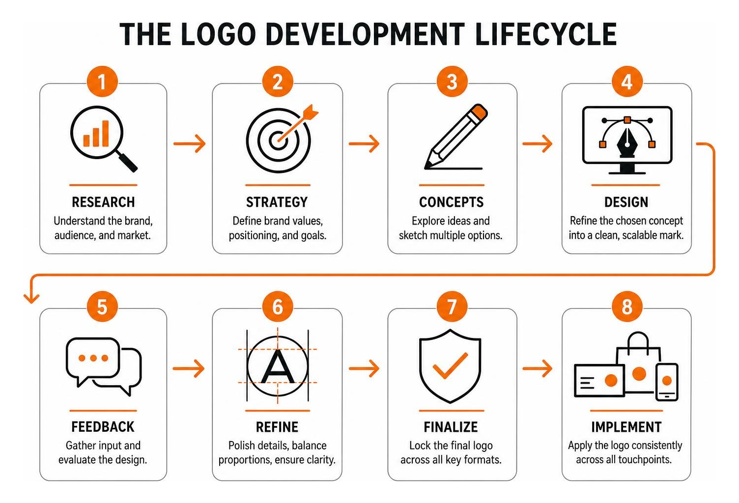
Whether you are evaluating the 35 Best Brand Logos of 2026 or reviewing historical marks, every high-performing corporate badge adheres to a tight set of visual fundamentals.
| Logo Style | Prime Example | Best For | Core Advantage |
|---|---|---|---|
| Wordmark / Logotype | Coca-Cola, Google | New businesses establishing name recognition | Maximizes immediate business name recall |
| Lettermark / Monogram | IBM, Chanel, HP | Companies with long or complex names | Compact footprint for digital app icons |
| Pictorial Mark | Apple, Shell, Twitter | Brands with strong, literal visual symbols | Instant cross-language recognition |
| Abstract Mark | Nike, Adidas, Pepsi | Innovative tech or athletic performance brands | Flexible conceptual metaphor |
| Combination Mark | Burger King, Lacoste | Growing small businesses & startups | Pairs name clarity with symbolic storytelling |
| Emblem | Starbucks, Harley-Davidson | Heritage, culinary, and artisanal brands | Traditional, prestigious appearance |
What the Best Brand Logos Share in Core Design Principles
When we analyze why some designs endure while others fade away within a year or two, four essential traits always emerge:
- Radical Simplicity: A clean silhouette is effortless for the human brain to process in a split second. If a child cannot sketch the basic shape of your mark from memory, it might be too complicated.
- High Scalability: Your mark must look equally sharp when displayed as a 16×16 pixel website favicon, an embroidered golf shirt badge, or a massive roadside billboard. This requires exporting your design as clean SVG (Scalable Vector Graphics) files rather than low-resolution static images.
- Cross-Platform Versatility: A well-crafted visual mark maintains its integrity across light modes, dark modes, single-color black receipts, and full-color vehicle wraps.
- Purposeful Timelessness: Trends like excessive 3D glass textures or hyper-specific retro flourishes come and go. Enduring marks rely on balanced proportions, balanced kerning, and classic geometry.
The Strategic Psychology of Color and Negative Space
Color is not just decorative; it directly triggers psychological associations and shapes buying behavior. Think about the thoughtful color choices made by industry leaders:
- Red (Coca-Cola, Target): Ignites passion, excitement, appetite, and urgency.
- Blue (IBM, Ford, American Express): Establishes corporate trust, security, and professional stability.
- Green (Starbucks, Whole Foods): Conveys vitality, nature, sustainability, and calm.
- Black & White (Apple, Nike, WWF): Communicates luxury, focus, authority, and modern minimalism.
When WWF created its panda logo in 1961, the design team specifically leveraged the animal’s natural black-and-white coloring. This allowed the non-profit to cut commercial print reproduction costs dramatically while conveying global conservation urgency.
You can dive deeper into how color selections influence your target audience by reading our guide to 10 color meanings and psychology.
Applying World-Class Logo Strategies to Startup Budgets
How can an emerging company in Philadelphia or Bucks County achieve enterprise-grade branding without an enterprise bank account? The key is focusing your creative energy on strategy before sketching.
When launching a new venture, investing in strategic logo design for startups sets your visual baseline apart from the crowd. A generic DIY clip-art template might seem inexpensive initially, but an inconsistent visual identity will cost you credibility and customer trust down the road. Securing a professional brand identity establishes immediate authority in your market.
How to Adapt the Best Brand Logos on a Small Business Budget
To build a memorable visual identity on a budget, apply these practical steps:
- Focus on a Distinct Wordmark First: If you cannot afford custom illustrative icons right away, choose a beautifully kerned, distinctive typeface. Brands like Sony, Google, and Prada rely on clean typography to command attention.
- Limit Your Color Palette to Two Core Shades: Choosing one primary brand color and one complementary accent keeps your digital assets cohesive and reduces physical print costs.
- Document Strict Usage Rules: Consistent presentation is what transforms a simple drawing into an iconic mark. Learn how to build a brand guide so your team, printers, and web team apply the exact same margins, fonts, and colors across every touchpoint.
Frequently Asked Questions About Best Brand Logos
What makes a logo truly iconic and memorable?
A logo becomes iconic when it pairs radical visual simplicity with a distinct, authentic brand message. It must be versatile enough to render cleanly across all modern media, scalable down to a tiny mobile screen, and backed by consistent, high-quality customer experiences that build positive brand equity over time.
How often should a business refresh or update its logo?
Most successful companies evaluate their visual identity every five to ten years. Rather than undergoing a jarring, total redesign that confuses your loyal customer base, the best approach is a subtle evolution—refining line weights, modernizing typography, and adjusting colors to ensure crisp legibility on newer digital screens.
Can a startup create an iconic logo on a limited budget?
Yes! As proven by Nike’s $35 Swoosh and Apple’s clean silhouette, enduring design comes from conceptual clarity rather than expensive production techniques. By focusing on balanced geometry, negative space, and disciplined typography, small businesses can establish a world-class visual presence without overspending.
Conclusion
Building a lasting visual identity does not require a fortune. By studying the world’s most celebrated logos, we see time and again that clarity, clever simplicity, and disciplined consistency will always triumph over flashy, short-lived design fads. When your brand mark is rooted in who you are and what you stand for, it becomes a powerful asset that drives customer recognition for years to come.
At FZP Digital, we partner closely with business owners throughout Philadelphia, Richboro, Newtown, and Bucks County to turn creative visions into high-performing digital assets. Whether you are launching an early-stage startup or refreshing an established business, our team is here to help you craft an enduring visual presence. When you are ready to build a cohesive digital foundation—from custom logo design to fast, responsive WordPress websites hosted on trusted, managed platforms like GoDaddy or WP Engine—reach out to us.
Ready to make your mark? Explore our complete guide to professional logo design and discover how our collaborative “Develop . Design . Deliver” process can elevate your brand today!