
The Ins and Outs of Best Logo Design 2026 Trends
What Defines the Best Logo Design 2026?
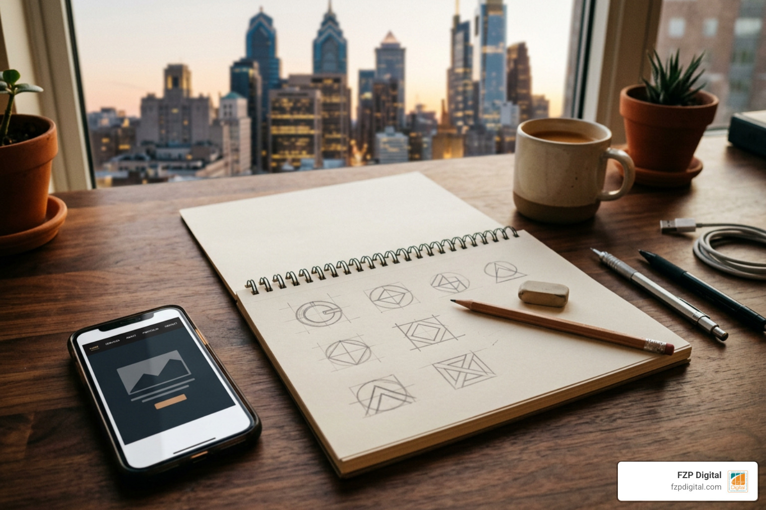
The best logo design 2026 work is recognizable in a second, flexible enough for a website icon or storefront sign, and distinctive enough to avoid the polished-but-generic look AI can produce. The strongest direction is not one visual style. It is a practical combination of a simple core mark, human character, and versions that adapt across digital and physical spaces.
For most small businesses and nonprofits, start here:
- Choose one visual direction that supports your story, such as warm organic shapes for a wellness brand or pixel-sharp geometry for a software company.
- Build a clear primary logo plus smaller icon, stacked, and one-color versions.
- Test it at favicon size, on social media, in print, and on real materials such as signage, shirts, or donation-event banners.
- Add personality with restraint: a hand-drawn detail, heritage-inspired type, subtle motion, or a memorable micro-detail can do more than a dozen trendy effects.
In 2026, logo design is moving away from static perfection and toward identities that can survive compression, quick scrolling, animation, dark mode, embroidery, and the real-world wear of daily use. Trends such as Storybook Gothic type, hand-drawn mascots, stamp-like badges, atmospheric gradients, and adaptive morphing marks can all work well, but only when they clarify what your organization stands for.
That matters in a crowded Philadelphia market. A logo is often your first visual handshake with a potential customer, client, or donor. Research among professional designers consistently puts memorability, creativity, and legibility among the most important logo qualities – a useful reminder that a beautiful mark is not automatically a useful one.
I’m Fred Z. Poritsky, founder of FZP Digital, where I combine experience in nonprofit financial management, digital marketing, web design, and lifelong creative work as a drummer to help organizations build brands with a clear purpose. In this guide to best logo design 2026, I’ll help you separate useful design signals from short-lived decoration so your identity supports the bigger work your business or mission needs to do.
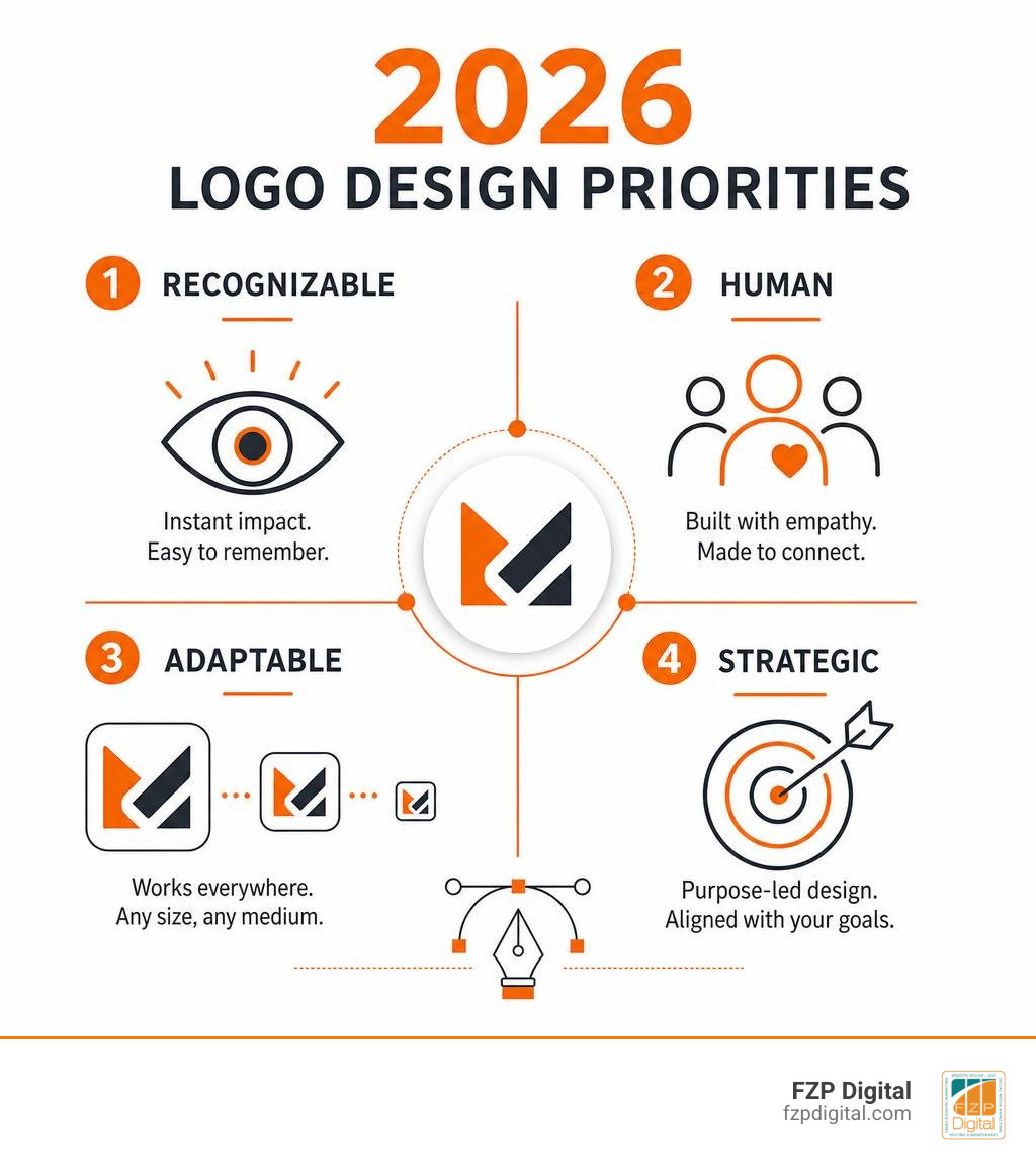
Best logo design 2026 terms made easy:
Core Movements Defining the Best Logo Design 2026 Landscape
Have you noticed how many company symbols started looking identical over the past few years? As thousands of companies chased clean, neutral sans-serifs, a sea of visual sameness took over our screens. Today, the landscape is pivoting in an exciting direction. According to the 2026 Logo Trend Report – LogoLounge, which analyzed over 30,000 brand marks worldwide, modern identity design is no longer about static, pristine perfection. It is about fluid behavior, personality, and immediate distinction.
When you dive into Minimalist Logo Design Secrets for Bold Brands, you quickly realize that minimalism isn’t dead—it has simply evolved. While 42% of professional designers support ultra-minimalism, 75% believe true impact comes from authenticity. Our goal today isn’t to strip away every ounce of character. Instead, we want to give your mark a memorable point of view that grabs attention in a busy digital landscape.
Tactile Warmth, Imperfections, and Hand-Drawn Mascots
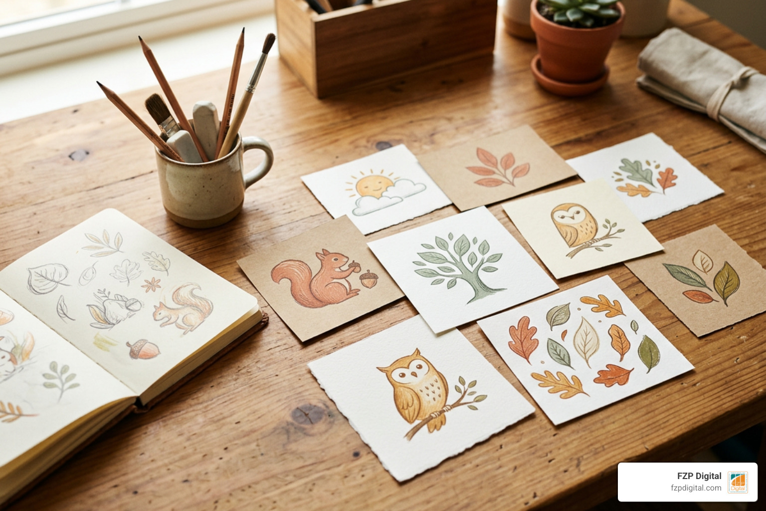
One of the most noticeable shifts this year is the embrace of warmth, craft, and curated imperfection. Because digital tools can generate razor-sharp vectors in seconds, perfectly symmetrical shapes can paradoxically feel cold and forgettable. Brands are deliberately reintroducing human touches—gentle wobbles in linework, textured edges, and warm earth tones like terracotta, sage, and oatmeal.
Freehand mascots and naive illustrated marks have become incredible tools for emotional connection. Over 70% of graphic designers note that establishing an emotional bond through a logo is critical. A friendly, hand-drawn character or an expressive emblem immediately tells your audience that real people stand behind the business. When we develop brand identities at FZP Digital, we often look for those tactile qualities that build trust right from the first interaction.
Storybook Gothic, Retro Precision, and Little Blip Details
On the other end of the aesthetic spectrum, we are seeing fascinating pairings of vintage heritage and early-digital nostalgia. As highlighted in Top 10 Logo Design Trends For 2026 And How To Use Them, two standout styles are taking center stage:
- Storybook Gothic: Drawing inspiration from folklore, historic typography, and fantasy narratives, this style uses dramatic serifs and dark nocturnal color palettes (such as deep forest greens and midnight blues) to evoke mystery and legacy.
- Pixel Sharp Precision: A deliberate nod to early digital interfaces, this trend pairs strict grid systems with tight, calculated geometry to communicate technical mastery without feeling sterile.
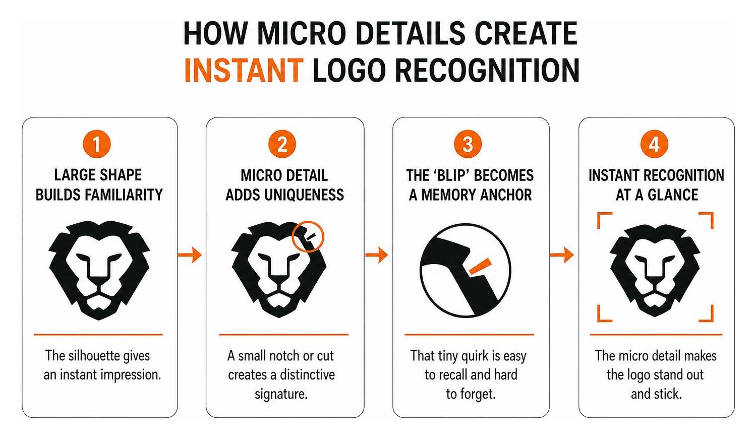
- Micro-Details and “Little Blip” Anchors: Designers are using intentional quirks—such as an unexpected notch, an asymmetrical cut, or an exaggerated ink trap—that serve as visual anchors for human memory.
The AI Shift: Moving from Algorithmic Polish to Human Survivability
Artificial intelligence has completely transformed the creative baseline. With generative platforms everywhere, producing a slick icon takes only a few prompts. But when every business has access to endless gloss, polished designs can blend into background noise.
In fact, over 30% of designers have actively debranded a logo over the past year to strip away hollow decoration. When Make a Mark: The Ultimate Guide to Crafting Your Perfect Logo explores what gives a mark staying power, the answer always comes back to human intention. We use automated tools for quick concept exploration, but human curation, storytelling, and strategic positioning are what turn a basic visual mark into an iconic brand asset.
Why Survivability Beats Simplicity for the Best Logo Design 2026 Standard
For years, design advice focused entirely on simplicity. But in modern environments, the true test is survivability. A logo doesn’t just sit peacefully on a business card anymore. It gets crushed down to a 16-pixel browser favicon, squeezed into a tiny mobile app icon, flashed across video feeds for a fraction of a second, and stitched onto uniforms.
To survive, a logo needs high visual contrast and an unmistakable silhouette. When we look at iconic marks—like Apple (favored by 87% of designers over Android) or the classic Twitter bird (preferred by 89% of designers over X)—their strength lies in instant recognition under extreme conditions. If your audience only catches a split-second glance of your mark on a moving delivery van or in a mobile notification, can they still tell it’s you? That is the heart of survivability.
Dynamic Behavior, Variable Fonts, and Morph-Marks
Static logos are becoming the fallback rather than the centerpiece. Modern digital identities live in motion. With lightweight animation formats like Lottie and flexible variable fonts, logos can now breathe, stretch, and react to how users interact with a website or app.
Adaptive “morph-marks” shift their layout and density depending on screen size, while atmospheric background gradients subtly shift to reflect different user states or product categories. These fluid visual behaviors turn your identity into an engaging digital experience.
Industry Applications: Matching Strategic Trends to Your Market
Not every trend fits every organization. Choosing a visual style just because it’s popular can alienate your core audience. As we explore in Brand Identity Design Best Examples 2026, the strongest identities match their aesthetic directly to industry expectations while adding a fresh perspective.
Crafting Modern Identity Systems for Small Businesses and Startups
If you run a growing business in Philadelphia, Newtown, or Richboro, you don’t need an overwhelming 50-page brand manual to look world-class. You need a clean, modular system that scales easily. In The Ultimate Guide to Creative Logo Design and Brand Identity, we break down how startups can build cost-effective systems using three foundational assets:
- A Primary Mark: Your central horizontal or stacked logo for websites, signage, and proposals.
- A Responsive Icon: A simplified emblem or monogram optimized for favicons, social avatars, and app icons.
- A Monochrome Variant: A high-contrast single-color file designed specifically for embroidery, engraving, stamps, or vehicle decals.
Evaluating Industry Fit for the Best Logo Design 2026 Innovations
| Industry Vertical | Best-Fit 2026 Trend | Strategic Visual Advantage | Recommended Color Direction |
|---|---|---|---|
| Craft Beverage & Hospitality | Storybook Gothic & Stamp Seals | Communicates heritage, artisanal craft, and timeless quality | Midnight wine, forest green, warm metallics |
| B2B SaaS & Tech Startups | Pixel Sharp & Morphing Marks | Signals technical accuracy, digital fluency, and agile software | High-contrast darks, electrified cyan, clean neutrals |
| Health, Wellness & Therapy | Warm Organic & Soft Atmospheric | Builds emotional safety, approachability, and calming presence | Clay, warm oat, calming sage green |
| Consulting & Professional Services | Minimalism with a Micro-Detail Twist | Balances corporate authority with distinct, modern memorability | Deep navy, charcoal, crisp warm white |
| Nonprofits & Community Missions | Hand-Crafted Emblems & Mascots | Fosters community trust, mission clarity, and human connection | Terracotta, earthy ochre, approachable blues |
Execution Strategy: Avoiding Pitfalls in Typography, Motion, and Color
Great ideas can still fall flat if the execution lacks discipline. As detailed in our Branding Design Complete Guide, building a brand mark that lasts requires balancing creative trends with everyday practical function.
Color Psychology and Typography Anchors
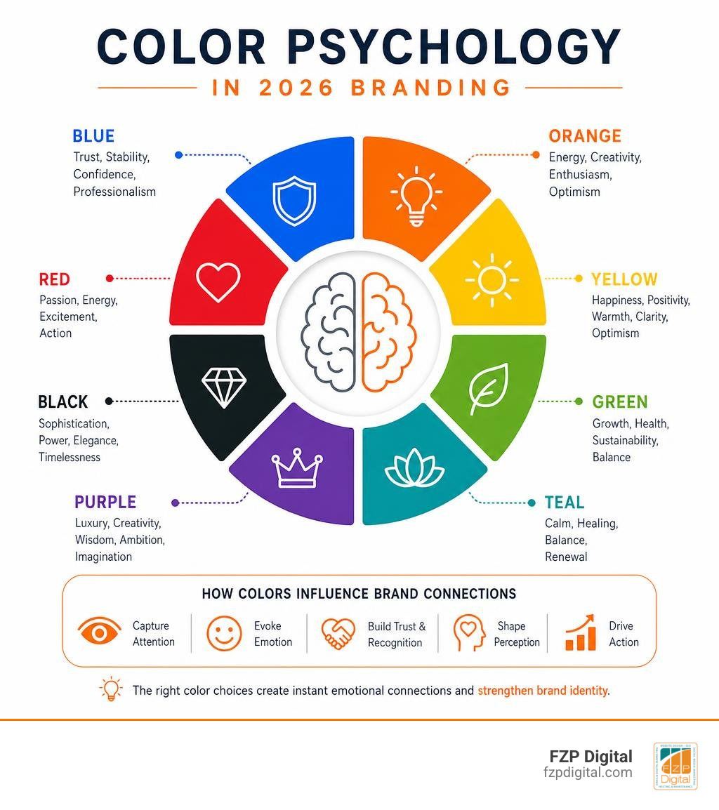
Color carries immediate emotional weight. Designer research shows that 86% of designers associate green with sustainability and eco-friendliness, while 62% link black with luxury and sophistication. In 2026, we are seeing bold experiments with electrified, high-voltage greens alongside deep YInMn blues and warm, restorative earth tones.
When it comes to typography, classic workhorse fonts continue to anchor professional design:
- Helvetica (favored by 41% of designers for clean readability)
- Futura (chosen by 39% for geometric balance)
- Montserrat (preferred by 34% for modern digital interfaces)
Pairing a distinctive custom headline or hand-lettered mark with a reliable, clean sans-serif secondary font ensures your branding feels unique without sacrificing reading clarity.
Common Execution Mistakes and Trend Overload
What trips brands up most when refreshing their visual identity? Here are the most common pitfalls we see:
- Chasing Forced Novelty: Adding unneeded cuts, loops, and effects until the letterforms become unreadable.
- Neglecting the Black-and-White Test: If your logo relies entirely on color gradients to be understood, it will fail when printed on invoices, stamped on merchandise, or viewed in high-contrast accessibility modes.
- Over-Complicated Motion: Movement should feel natural and snappy. Avoid long, slow-loading intro animations that get between your customer and the information they want.
- Ignoring Trademark Distinctiveness: If a logo looks too similar to generic AI stock templates, you will struggle to protect your brand legally.
Frequently Asked Questions About 2026 Logo Design
How is AI influencing professional logo creation in 2026?
AI acts as a powerful concepting assistant. It allows designers to explore dozens of layout ideas, test rough color combinations, and vector-trace raw concepts quickly. However, AI cannot replace brand strategy, cultural awareness, or human emotional connection. The real value in 2026 comes from human designers refining those concepts into legally protectable, strategically aligned brand marks.
What makes a logo adaptable across both digital and physical touchpoints?
An adaptable logo is designed as a family of assets rather than a single static graphic. It maintains clear line weights that don’t blur when embroidered on a cap or shrunk down to a 16-pixel browser tab. It also features high-contrast geometry that remains crisp whether projected on a billboard or rendered in dark mode on a smartphone.
How often should a business update or refresh its logo identity?
Most healthy brands perform a minor visual tune-up every 5 to 7 years. Rather than throwing away all your hard-earned brand equity with an unrecognizable overhaul, an iterative refresh cleans up typography, updates color contrast for modern screens, and simplifies complex details so your business stays fresh and competitive.
Conclusion
At the end of the day, trends are tools, not rigid rules. The best visual identity is never about blindly copying what’s trendy this month—it’s about creating a mark that tells your story clearly, connects with your audience emotionally, and functions reliably across every screen and physical touchpoint you use.
When you’re ready to build or elevate your brand presence, our team at FZP Digital is here to guide you through our collaborative “Develop . Design . Deliver” process. Whether you need a fresh visual identity, a custom responsive WordPress website, or an organic search strategy to grow your market reach, we help businesses across Philadelphia and Bucks County turn their vision into a sustainable asset.
To discover how a strategic visual identity can elevate your business, explore our Philadelphia logo design complete guide and see how we can bring your brand’s story to life.