

Brand Identity Design Examples That Show What Great Branding Can Do

The best brand identity design examples do more than display an attractive logo. They make a business recognizable at every point where someone encounters it: its website, social posts, signage, emails, packaging, presentations, and even customer service language.
As you review the examples in this guide, look for three things:
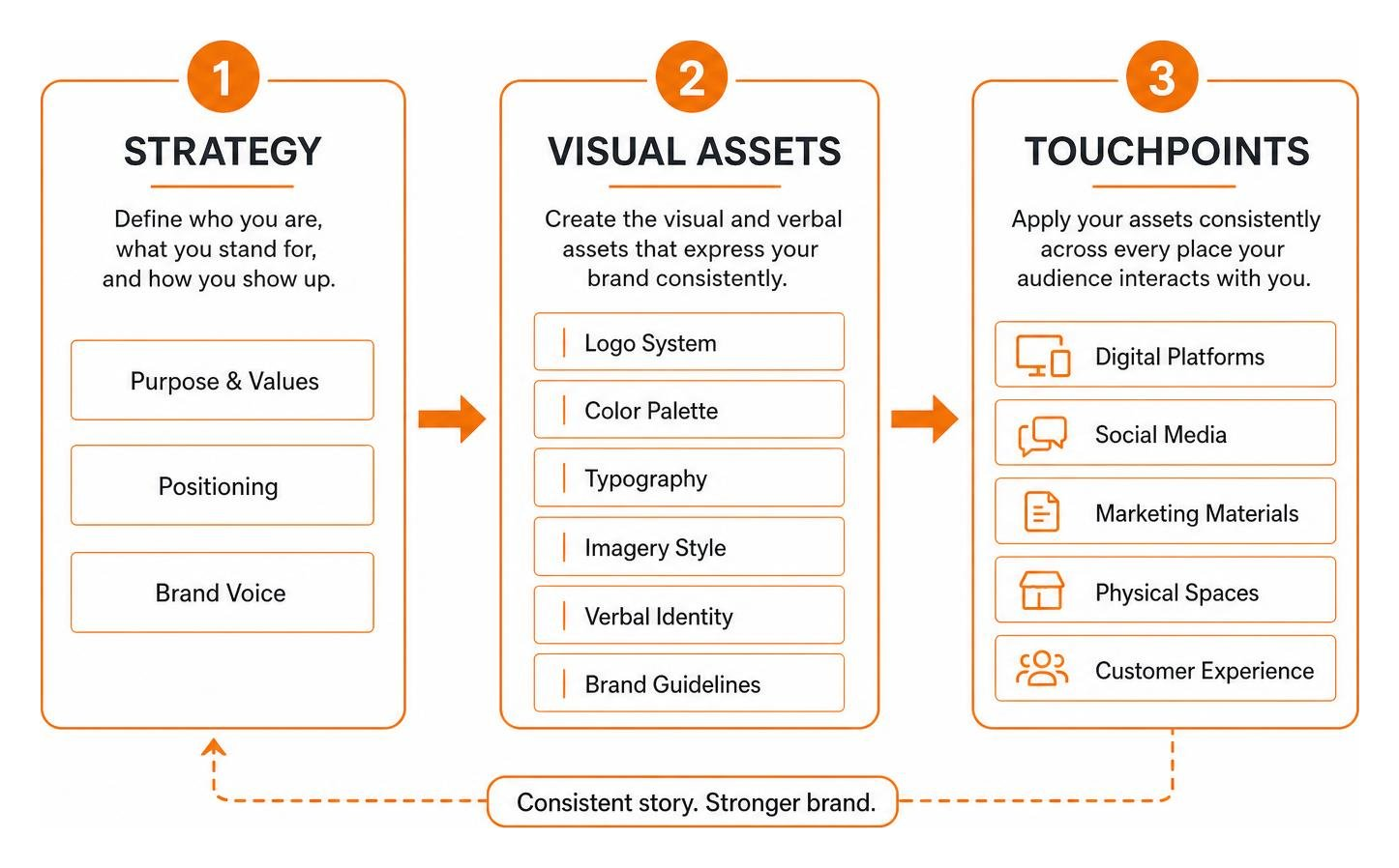
- A distinctive visual shortcut – such as Coca-Cola red, Apple’s minimalist styling, or Instagram’s flexible gradient.
- A consistent system – colors, type, photography, icons, and messaging that feel like they belong together.
- A clear connection to the audience – the design supports what the organization believes, offers, and wants people to feel.
That consistency matters because people form fast impressions. Research cited in brand-design guidance suggests consumers make an initial assessment within 90 seconds, and color can account for a large share of that judgment. For a Philadelphia business or nonprofit with an outdated website or scattered marketing materials, a cohesive identity helps replace confusion with trust.
You don’t need a global budget to learn from global brands. The useful lesson is not to copy their look. It’s to build a small, practical system that makes your organization feel unmistakably like you everywhere it appears.
I’m Fred Z. Poritsky, founder of FZP Digital, and my background in financial management, marketing, web design, and creative work helps me view brand identity as both a business investment and a design system. The brand identity design examples ahead can help you spot the ideas worth adapting for a clearer, more credible digital presence.
Brand identity design examples helpful reading:
- brand identity design
- what is brand identity in graphic design
- what does a brand identity designer do
What is Brand Identity and Why Does It Matter?
Have you ever wondered why you can spot an Apple product or a can of soda from across a crowded room without even reading the label? That effortless recognition is the direct result of strategic positioning.
At its core, your brand identity is the complete visual and verbal toolkit your business uses to present itself to the world. Going Beyond the Logo: What is Brand Identity Anyway? reveals that an identity is not just a graphic mark stamped onto a business card; it is your organization’s personality, promise, and operating compass.
Building consumer trust starts with intentional presentation. When your visuals, messaging, and digital platforms tell the exact same story, customers feel confident doing business with you. In fact, research shows that 52% of consumers are willing to pay more for products from companies that clearly communicate their brand values, with 82% willing to spend up to 30% more. That premium pricing power is precisely Why Your Business Needs a Professional Brand Identity.
Over time, this disciplined consistency transforms first-time buyers into loyal advocates, fueling long-term brand equity and sustainable business growth.
| Concept | Definition | Focus | Key Measurement |
|---|---|---|---|
| Brand Identity | The intentional visual and verbal assets created by the business (logos, colors, voice, guidelines). | Internal control & outward expression | Asset consistency, style adherence, guidelines coverage |
| Brand Image | The actual perception, feelings, and beliefs consumers hold about the business. | External customer perception | Customer sentiment, brand recall, survey feedback |
| Brand Equity | The commercial value generated from consumer perception, allowing for market leverage and premium pricing. | Business valuation & financial impact | Market share, price premium tolerance, customer lifetime value |
Core Elements of a Comprehensive Visual Identity System

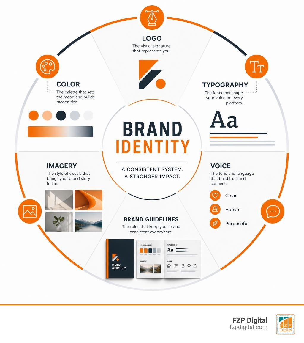
To build an adaptable identity, you need several interlocking parts working together seamlessly. When we guide clients through The Ultimate Guide to Creative Logo Design and Brand Identity, we break a comprehensive visual system down into these essential building blocks:
- Responsive Logo Variations: A primary logo mark, secondary horizontal lockup, minimalist submark, and favicon to fit every screen dimension.
- Color Psychology & Palettes: A purposeful primary color paired with secondary accents and neutral background tones that evoke specific emotional responses.
- Typographic Hierarchy: A structured system pairing distinct headline fonts with legible body type to establish readability and visual order.
- Imagery & Photographic Art Direction: Clear rules governing photographic lighting, composition, and visual tone to maintain cohesion across media.
- Verbal Identity & Brand Voice: The defined tone, attitude, and copywriting guidelines that ensure marketing messaging sounds authentic.
- Brand Style Guides: A centralized reference manual documenting precise rules for spacing, color codes, and asset usage so team members never dilute the visual standards.
Understanding What is Visual Identity and Branding in Design helps you treat these assets as an active, living ecosystem rather than static graphics sitting in a folder.
Top Standout Brand Identity Design Examples to Inspire You
Studying real-world market benchmarks helps us understand how world-class organizations achieve visual storytelling, multi-touchpoint consistency, and asset longevity. Let’s look at how both global titans and modern innovators approach their brand systems.
Enterprise and Heritage Brand Identity Design Examples
Legacy brands face a unique challenge: they must stay fresh for modern audiences without abandoning decades of accumulated recognition.
A prime case study is Coca-Cola’s 2026 Global Visual Identity Refresh: Making Coca-Cola “More Coca-Cola”. Instead of inventing new symbols, the brand amplified its most distinctive historical assets across more than 200 global markets. By returning to vertical wordmarks on cans, celebrating the classic Dynamic Ribbon graphic introduced in 1969, and giving Coca-Cola Zero Sugar distinct serif typography and black accents, the company reinforced its iconic status while streamlining sub-brand hierarchy.
Similarly, exploring The Most Famous Luxury Logos and What They Mean illustrates how heritage brands leverage restraint. Apple, frequently leading global valuations with over $574 billion in brand value, relies on clean silhouettes, monochromatic simplicity, and premium materials to signal understated sophistication.
Meanwhile, brands like Duolingo take the opposite approach, turning a bright green owl mascot into a playful, gamified identity that embraces social media meme culture to drive app engagement.
Modern Digital and DTC Brand Identity Design Examples
Modern digital brands must build systems engineered specifically for mobile interfaces, diverse global communities, and rapid content cycles.
Consider the challenge of Designing for 3 billion: how Instagram built a brand system that celebrates everyone’s point of view. The platform created an adaptable design system featuring custom, localized typography that respects distinct international writing scripts rather than forcing non-Latin alphabets into Western typographic structures.
In the consumer tech space, Tinder’s first rebrand in nearly a decade channels the voice of a dating columnist. The app sharpened its iconic flame mark, paired structured all-caps typography with an editorial serif, and introduced an advice-columnist persona (“T”) to bring empathetic, candid copywriting to Gen Z daters.
In the beauty and lifestyle sector, Glossier built a powerhouse direct-to-consumer presence using soft pastel tones, clean typography, and unpretentious community photography that democratized cosmetics branding.
Finally, Inside the new brand for the Natural History Museum Abu Dhabi, designed by Wiedemann Lampe shows how cultural institutions can use biomimicry and architectural geometry. By translating physical pentagonal building forms into dynamic framing devices and creating bilingual typefaces across Arabic and English scripts, the identity unifies scientific rigor with welcoming public exploration.
Step-by-Step Process: How to Create a Brand Identity from Scratch
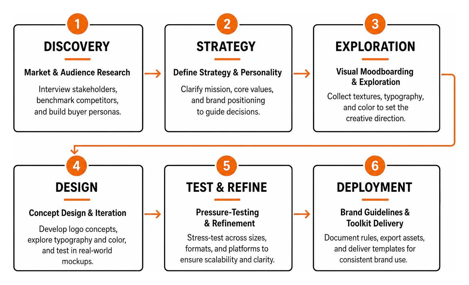
Developing a memorable brand identity doesn’t happen by accident. It requires a structured, iterative design methodology. Here is how we guide organizations through How to Develop a Unique Brand Identity: The 9-Step Guide:
- Market & Audience Research: Interview stakeholders, conduct competitive benchmarking, and build detailed buyer personas to clarify what makes your offering unique.
- Define Strategy & Personality: Clarify your mission, core values, and brand positioning statement to serve as an operational compass.
- Visual Moodboarding & Exploration: Collect textures, typographic pairings, and color swatches to establish the overall emotional direction before drafting vectors.
- Concept Design & Iteration: Develop initial logo marks, explore typography scales, and test color contrast across real-world digital and physical mockups.
- Pressure-Testing & Refinement: Stress-test designs across extreme formats—from tiny website favicons to large-scale banners—to verify scalability and legibility.
- Brand Guidelines & Toolkit Delivery: Document usage rules, export finalized vector asset suites, and compile accessible presentation templates so your team can deploy the identity with ease.
When you Stop Guessing and Start Designing Your Brand Identity, you replace creative hesitation with a clear, reliable system built for long-term growth.
Essential Brand Identity Deliverables for Startups
- Primary & Secondary Logos: High-resolution vector files (.SVG, .EPS) and web formats (.PNG, .WebP) in full-color, black, and white versions.
- Color Swatches: Exact HEX, RGB, and CMYK color codes with defined primary, secondary, and neutral accent roles.
- Typography Suite: Licensed font families with explicit hierarchy guidelines for digital headers, subheadings, and body copy.
- Digital Asset Kit: Social media avatar lockups, banner templates, email signature formats, and website favicons.
- One-Sheet Brand Style Guide: A concise quick-reference sheet covering minimum logo clearspace, contrast rules, and disallowed modifications.
Frequently Asked Questions about Brand Identity Design
How do brand identity, brand image, and brand equity differ?
Brand identity is internal and deliberate—it’s everything your business crafts to express itself, including your logo, messaging, and colors. Brand image is external—it represents how the public actually perceives and feels about your business based on their customer experiences. Brand equity is the commercial value generated by strong, positive perceptions, allowing well-regarded businesses to earn greater customer loyalty and command premium pricing.
What are the most common brand identity design mistakes to avoid?
The most frequent mistake is visual inconsistency, such as using slightly different colors or font pairings across websites, presentations, and social media. Other critical pitfalls include overcomplicating logo marks so they lose clarity on mobile screens, ignoring digital accessibility and color contrast standards, relying on generic stock templates, and directly copying competitor aesthetics instead of establishing a unique brand position.
How can small businesses develop a strong brand identity on a budget?
Small businesses can establish an impactful brand by focusing on simplicity and restraint. Start with a clean, well-spaced wordmark rather than an intricate illustration, select a focused palette of two or three intentional colors, and adopt standardized, open-source web typography. Building a disciplined, consistent foundation across your core website and customer touchpoints delivers far more credibility than spending heavily on complex graphics.
Conclusion
A successful brand identity is never just about aesthetics—it is a functional business asset designed to build familiarity, earn customer trust, and drive sustainable growth. By studying how world-class brands balance timeless heritage marks with flexible digital design systems, you can build a cohesive identity that elevates your organization above the noise.
Whether you’re launching an emerging business or refreshing an established organization in Philadelphia, Bucks County, or beyond, maintaining visual consistency across your digital presence is essential. Pairing a memorable brand identity with a high-performing WordPress website sets your business up for long-term momentum. When you’re ready to explore strategic branding and visual design services, our team at FZP Digital is here to help you develop, design, and deliver a digital presence that truly stands out.