


Your Brand Is Sending a Message Right Now — Do You Know What It Says?
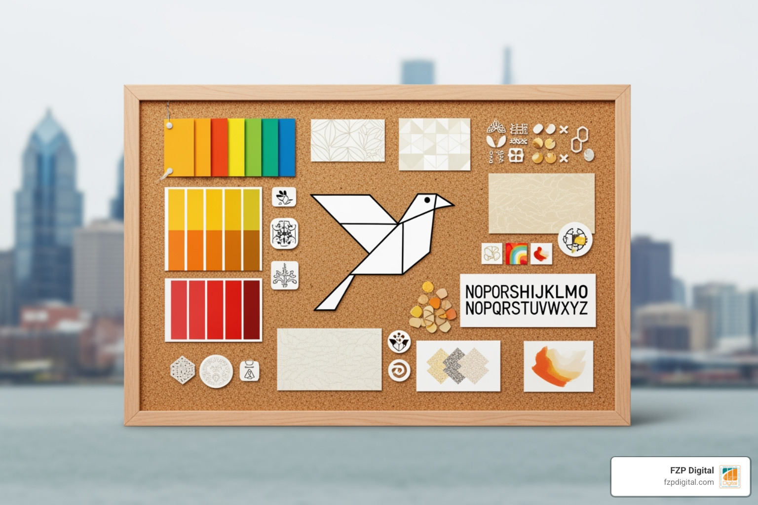
What is brand identity in graphic design is one of the most common questions business owners ask when they know something feels off about how their company looks and comes across — but they can’t quite figure out what it is.
Here’s the simple version:
Brand identity in graphic design is the complete visual and verbal system a business uses to present itself consistently across every touchpoint — including its logo, color palette, typography, imagery style, and tone of voice. It’s not just a logo. It’s the full toolkit that tells people who you are, what you stand for, and why they should trust you — before you even say a word.
Think of it like this:
| Element | What It Is | Example |
|---|---|---|
| Logo | One piece of the system | The Nike swoosh |
| Visual Identity | All designed visual elements | Colors, fonts, imagery |
| Brand Identity | Visual + verbal + strategic system | Everything Nike looks, sounds, and feels like |
| Branding | The execution of that identity | Campaigns, packaging, ads |
| Brand Image | How the audience actually perceives you | What people think and feel about Nike |
A lot of people assume brand identity begins and ends with a logo. But if that were true, why do some businesses feel polished, trustworthy, and memorable while others feel scattered — even when both have a decent logo?
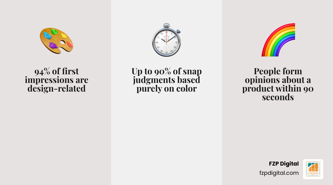
94% of first impressions are design-related. And research shows people form an opinion about a product within 90 seconds — with up to 90% of that snap judgment based purely on color. So yes, your visual choices matter. A lot. They’re telling people something about your business long before anyone reads your homepage or picks up the phone.
Whether you’re a law firm in Philadelphia, a local nonprofit, or a growing retail brand, your brand identity is already communicating. The real question is: are you shaping that message on purpose, or letting it happen by accident?
In this guide, you’ll get a clear, easy-to-understand explanation of what brand identity means in graphic design, how it’s built, and why getting it right can make such a big difference for your business.
I’m Fred Z. Poritsky, founder of FZP Digital — a Philadelphia-based digital marketing agency serving businesses and nonprofits across industries. My background includes nonprofit financial management, web design, SEO, and years of helping clients turn scattered ideas into brand identities that actually work in the real world. And honestly, that’s what FZP Digital does best: helping you make sense of the pieces, clarify your message, and build a brand presence that feels like you.
Quick what is brand identity in graphic design definitions:
- what is visual identity and branding in design
- brand identity design
- what does a brand identity designer do
What Is Brand Identity in Graphic Design?
Brand identity in graphic design is the system of choices that makes a business recognizable and understandable. It combines strategy, personality, and design into something people can see, feel, and remember.
It includes tangible elements like logos, colors, typography, layouts, icons, and imagery. It also includes less visible but equally important elements like voice, values, brand story, and customer promise.
What is brand identity in graphic design, really?
Really, it’s controlled perception. Not in a manipulative way – more in a “let’s not accidentally look confusing” way.
A brand identity helps shape how you want your business to be understood. It’s your toolkit for sending clear signals to the market. If your business were a person, brand identity would be its appearance, tone, posture, and personality all working together.
What is brand identity in graphic design beyond just a logo?
A logo matters, but it’s only one piece.
A full identity system usually includes:
- Logo variations
- Color palette
- Typography system
- Photography or illustration style
- Graphic motifs and layouts
- Messaging tone
- Tagline or key phrases
- Brand story and values
Without the rest of the system, a logo is like buying one nice shoe. Technically useful, but incomplete and a little concerning.
Why brand identity matters in the first 90 seconds
Design affects trust fast. Research shows:
- 94% of first impressions are design-related
- People form opinions within 90 seconds
- 62% to 90% of those early assessments are influenced by color
That matters because people often decide whether a business feels credible before they read your About page, compare your pricing, or contact your team. Strong identity design improves recognition, supports premium perception, and helps your business feel intentional rather than improvised.
Brand Identity vs Brand Image, Branding, and Corporate Identity
These terms get mixed together all the time, so let’s separate them clearly.
Brand identity vs brand image
Brand identity is what you create. Brand image is what people actually think.
In other words, identity is the input and image is the output.
| Brand Identity | Brand Image |
|---|---|
| Created by the business | Formed by the audience |
| Intentional | Perceived |
| Includes design, voice, and system rules | Includes reputation, feelings, and assumptions |
| Can be documented in guidelines | Must be measured through feedback and response |
If you want to appear modern, trustworthy, and premium, that’s brand identity. If customers instead see you as outdated or inconsistent, that’s brand image telling you something is off.
Brand identity vs branding
Brand identity is the system. Branding is the action.
Branding is how identity gets applied in the real world through:
- Marketing campaigns
- Website design
- Packaging
- Social media
- Advertising
- Presentations
- Email design
So identity is the blueprint, and branding is the build.
Brand identity vs corporate identity
Corporate identity usually refers to the wider organization: its culture, structure, behavior, and overall institutional presentation.
Brand identity can sit beneath that. A company may have one corporate identity but multiple brands, each with its own look, audience, and messaging.
For most small and mid-sized businesses in Philadelphia, Richboro, Newtown, and the surrounding Bucks County area, the distinction may feel academic. But it matters once a company grows, launches sub-brands, or serves different audiences.
The Core Elements of a Strong Brand Identity System
A strong identity system is not just attractive. It is usable, memorable, flexible, and consistent.
Visual elements every designer should define
At minimum, we recommend defining:
- Primary logo
- Secondary logo
- Brand mark or icon
- Color palette with exact values
- Typography pairings and hierarchy
- Imagery style
- Graphic motifs or patterns
- Layout rules
- Social, web, and print applications
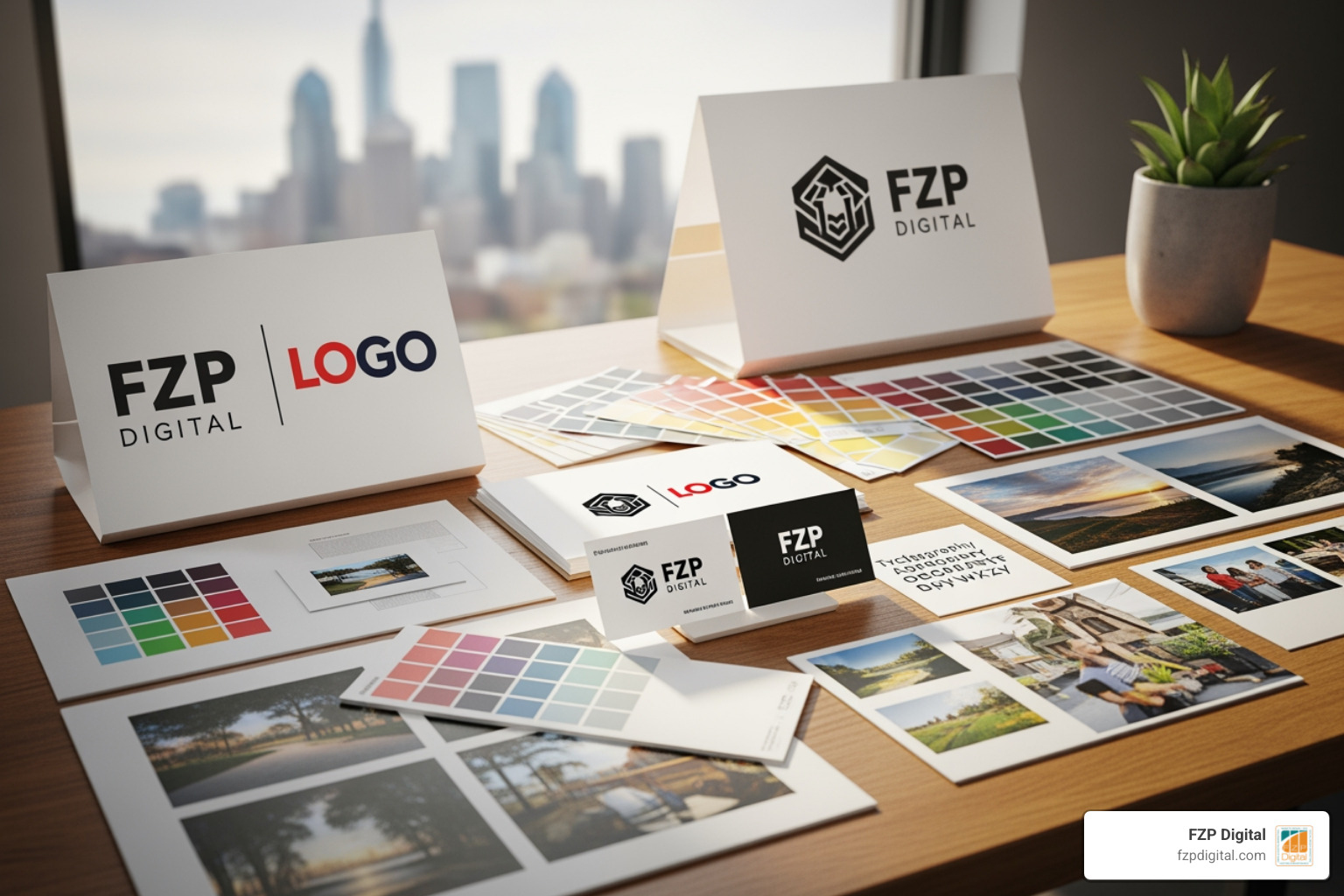
These choices should work together as one family, not like distant cousins meeting awkwardly for the first time.
Non-visual elements that complete the identity
Graphic design does not work in isolation. Strong brand identity also includes:
- Tone of voice
- Tagline
- Messaging pillars
- Mission
- Brand values
- Brand story
- Personality traits
- Customer promise
When visual and verbal identity align, the brand feels believable. When they don’t, the business feels disjointed. A playful look with stiff, robotic copy? Weird. A premium visual identity with bargain-bin messaging? Also weird.
Best practices for consistency, flexibility, and accessibility
The best identities are simple enough to recognize quickly and flexible enough to work anywhere.
Best practices include:
- Keep forms simple and distinctive
- Design logos that scale from favicon to signage
- Set clear space and minimum size rules
- Define HEX, RGB, CMYK, and Pantone values
- Build templates for common materials
- Use accessible contrast and readable type
- Allow disciplined flexibility, not random variation
A practical identity system should help teams move faster, not make everyone guess.
For a deeper look at how we approach systems like this, see More info about Brand Identity Design.
How to Create Brand Identity From Scratch: A Step-by-Step Process
A good identity does not begin in Illustrator. It begins with questions.
Step 1 to 3: Strategy before design
-
Discovery
- Interview stakeholders
- Clarify goals, mission, and audience
- Understand what the business wants to be known for
-
Research
- Build buyer personas
- Run a SWOT review
- Audit competitors and category norms
- Identify gaps and opportunities
-
Positioning
- Define value proposition
- Choose 3 to 5 brand adjectives
- Decide how the brand should feel different
This stage prevents “make the logo bigger” from becoming the whole strategy.
Step 4 to 6: Build the visual and verbal system
-
Creative direction
- Build mood boards
- Create a creative brief
- Explore visual territory that fits the strategy
-
Design the identity
- Develop logo concepts
- Select brand colors
- Choose typography system
- Define imagery style and graphic language
-
Build the verbal system
- Set tone of voice
- Define key messages
- Align tagline, story, and promise
This is where design becomes a system rather than a one-off deliverable.
Step 7 to 9: Test, document, and launch what is brand identity in graphic design
-
Test it in the real world
- Website headers
- Social posts
- Business cards
- Presentation slides
- Packaging
- Signage
- Favicon and mobile views
-
Document everything
- Create brand guidelines
- Package file types properly
- Organize logos, fonts, and templates
- Assign a brand guardian or approval owner
-
Launch and train
- Roll out identity across touchpoints
- Train internal teams
- Audit for consistency after launch
You can explore our related guide here: More info about How To Develop A Unique Brand Identity The 9 Step Guide and this helpful external resource: The Complete Guide to Brand Identity Design.
Brand Guidelines, Common Mistakes, and How Identities Evolve
Even the best identity will drift without rules and maintenance.
How to create brand guidelines people will actually use
A brand guide should be useful, not a beautiful PDF nobody opens again.
Include:
- Logo usage and misuse examples
- Color specs for print and digital
- Type hierarchy
- Imagery direction
- Voice and tone examples
- Templates
- Do’s and don’ts
- Shared asset links
The simpler and clearer the guide, the more likely people are to follow it.
Common brand identity mistakes designers should avoid
The most common problems we see are:
- Chasing trends instead of building something durable
- Copying competitors
- Using too many colors or fonts
- Creating a logo that fails at small sizes
- Ignoring typography hierarchy
- Using generic stock visuals with no style rules
- Designing without strategy
- Applying the identity inconsistently
Inconsistency is expensive. Research shows consistent branding can increase revenue by 10% to 20%. That’s a pretty strong argument for not letting five departments invent five versions of your blue.
How a brand identity evolves without losing itself
Good identities evolve. They just do it carefully.
Usually, some elements should stay stable:
- Core logo structure
- Signature colors
- Brand personality
- Key messaging themes
Other elements can adapt:
- Photography style
- Secondary colors
- Layout system
- Motion or digital expressions
That is the difference between a refresh and a rebrand. A refresh updates the presentation. A rebrand changes the underlying system.
For more perspective, see What is brand identity? 5 key elements and More info about Beyond The Logo Understanding The Brand Identity Designers Impact.
Real-World Lessons: What Makes Brand Identity Design Effective?
The most effective brand identities tend to share a few patterns.
Patterns shared by successful brand identities
Strong identities are usually:
- Clear
- Consistent
- Distinctive
- Simple
- Flexible
- Emotionally resonant
They often rely on ownable assets like a recognizable color, a consistent type style, or a unique visual system. The goal is not to use more elements. It’s to use the right ones more consistently.
What the numbers say about strong identity design
The business case is strong:
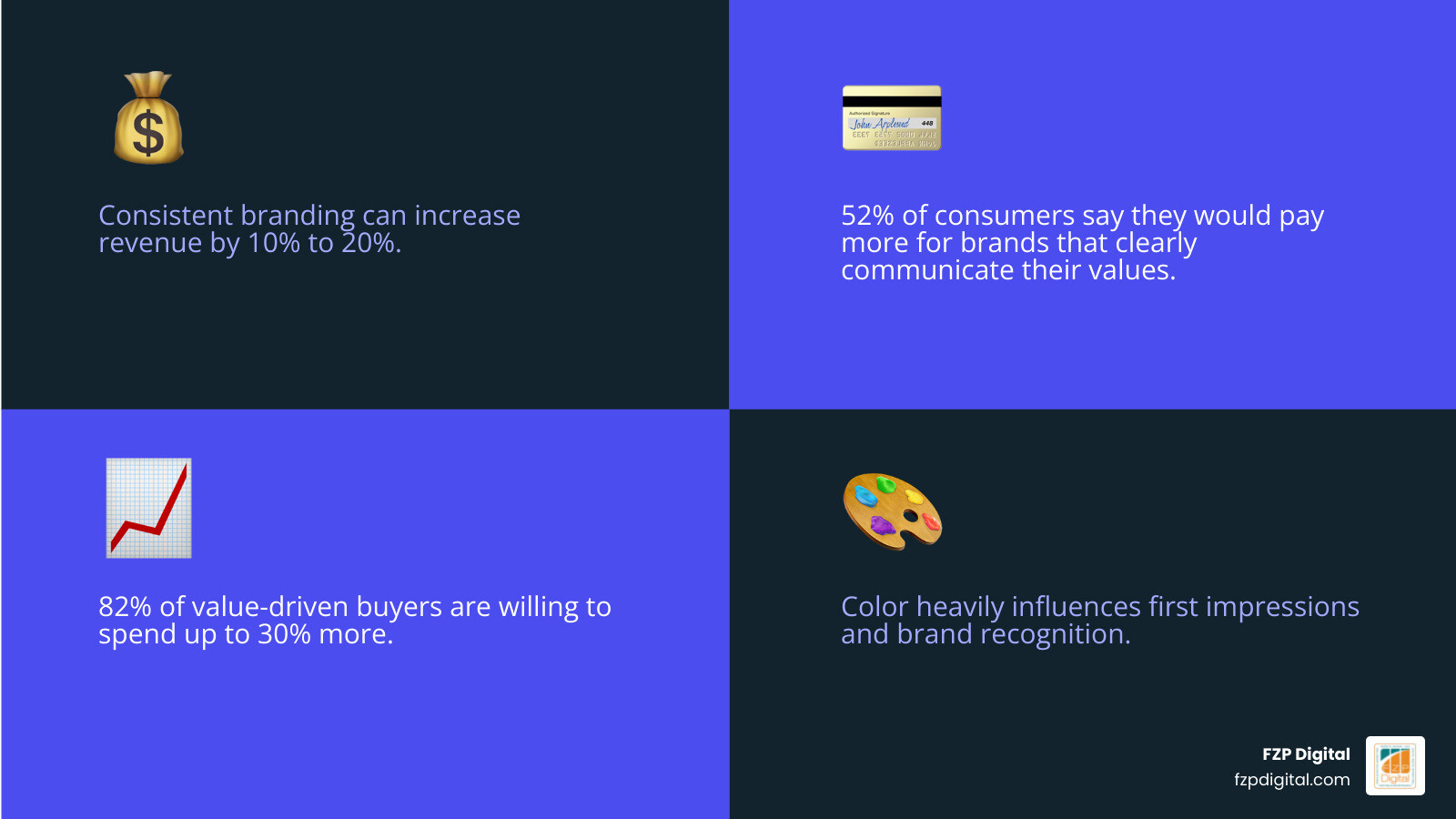
- Consistent branding can increase revenue by 10% to 20%
- 52% of consumers say they would pay more for brands that clearly communicate their values
- 82% of those value-driven buyers are willing to spend up to 30% more
- Color heavily influences first impressions
- Major global brands hold enormous financial value, with Apple at $241.2 billion and Nike at $39.1 billion in Forbes 2024 rankings
No, a new color palette won’t magically fix a bad business model. But a strong identity can absolutely increase trust, recognition, and perceived value when the business behind it delivers.
Applying these lessons to your own business
For local businesses and organizations, brand identity shows up everywhere:
- Website design
- Social media profiles
- Proposal decks
- Signage
- Print materials
- Email signatures
- Event collateral
If your website says premium, your brochure says budget, and your Instagram says “we found this in a rush,” people notice.
At FZP Digital, we see brand identity as part of the bigger picture of digital presence. The same consistency that helps a business look credible also helps it perform better across search, web, and marketing.
If you want to keep digging, start with More info about Branding Complete Guide and More info about What Is Visual Identity And Branding In Design.
Frequently Asked Questions about What Is Brand Identity in Graphic Design
Is brand identity the same as a logo?
No. A logo is one element within a broader system. Brand identity includes the logo, but also the colors, type, imagery, voice, story, templates, and rules that make the brand recognizable across touchpoints.
How long does it take to develop a brand identity?
It depends on scope, research depth, and feedback speed. A professional process often takes around 8 to 10 weeks for a full identity system, especially when strategy, exploration, revisions, and guidelines are included.
Can a small business benefit from professional brand identity design?
Absolutely. In fact, small businesses often benefit the most because a strong identity helps them look established, trustworthy, and consistent even when they’re competing against larger organizations. Good identity design reduces confusion, builds recognition over time, and gives every marketing dollar a better chance to work.
Conclusion
So, what is brand identity in graphic design?
It’s the complete system that helps people recognize, and trust your business. Not just a logo. Not just a color palette. A full visual and verbal framework built on strategy.
When that system is clear and consistent, your business feels more credible. It becomes easier to market, easier to scale, and easier for customers to understand. And when it evolves thoughtfully over time, it stays relevant without losing what made it recognizable in the first place.
If your current brand feels fragmented, dated, or hard to apply consistently, that’s usually not a minor design issue. It’s a signal that the identity system needs attention.
At FZP Digital, we help businesses in Philadelphia, Downtown Philadelphia, Newtown, and Richboro turn scattered visuals into a cohesive brand presence through our collaborative Develop . Design . Deliver process. If you’re ready to make your brand look as strong as the work you already do, explore More info about category/branding.