

How to Create Branding Guidelines Without Losing Your Mind
Why Branding Guidelines Are the Secret to a Brand People Actually Remember

Branding guidelines are the rulebook that tells your team — and the world — exactly how your brand should look, sound, and feel across every single touchpoint.
If you’ve ever cringed at a flyer someone made with the wrong logo, or noticed your website uses three different shades of blue, you already know why these rules matter.
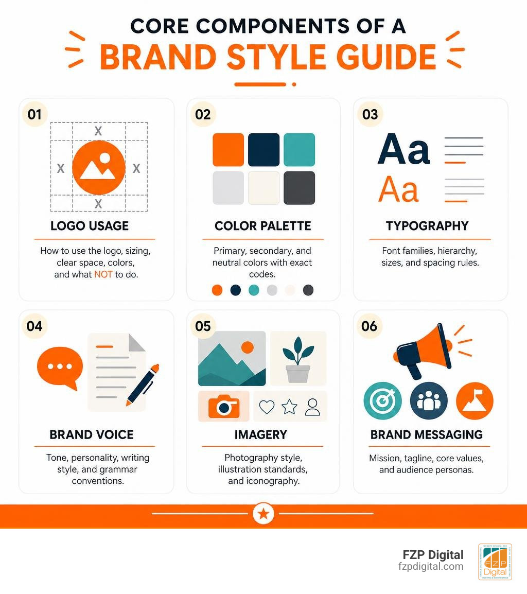
Here’s a quick breakdown of what branding guidelines actually are:
| Element | What It Covers |
|---|---|
| Logo usage | Sizing, clear space, approved colors, what NOT to do |
| Color palette | Primary, secondary, and neutral colors with exact hex, RGB, and CMYK codes |
| Typography | Font families, hierarchy, sizes, and spacing rules |
| Brand voice | Tone, personality, writing style, and grammar conventions |
| Imagery | Photography style, illustration standards, iconography |
| Brand messaging | Mission statement, tagline, core values, audience personas |
Think of it this way: every time someone encounters your brand — your website, a business card, a social media post — they’re either building or breaking trust with you. Consistent brand presentation across all platforms can increase revenue by up to 23%. That’s not a small number.
And it’s not just about looking polished. Loyal customers — the ones who come back again and again — spend 67% more than new buyers. A strong, consistent brand is one of the most powerful tools you have to earn that loyalty.
Whether you’re a small business owner in Philadelphia who’s never thought twice about brand consistency, or a nonprofit leader trying to look credible to donors, getting your branding guidelines right is one of the smartest investments you can make.
I’m Fred Z. Poritsky, founder of FZP Digital, and while my background is rooted in nonprofit financial management and digital marketing, I’ve helped countless businesses in the Philadelphia area build cohesive brands — including the branding guidelines that keep them consistent as they grow. Let’s walk through exactly how to do this without the overwhelm.
Branding guidelines terminology:
What Are Branding Guidelines and Why Do They Matter?
Have you ever wondered why you can spot a Coca-Cola ad from a mile away, even if the brand name isn’t front and center? Or why a single glimpse of the classic crimson red makes you instantly recognize a brand? That’s the power of brand consistency in action.
At its core, branding guidelines (often called a brand style guide, brand book, or design manual) serve as the ultimate roadmap for how your business presents itself to the world. It’s the bridge between your conceptual brand strategy and your daily design execution. Without this roadmap, your visual identity quickly dissolves into chaos. One department might use a bright navy for an email blast, while another uses a soft royal blue on a printed brochure. To your audience, this visual mismatch screams “disorganized.”
This is why understanding what is brand identity is so critical. Your brand identity is the collection of choices you make about how your brand should look and sound. Your brand guidelines, on the other hand, are the concrete rules that protect and communicate that identity. As outlined in Shopify’s guide on brand guidelines, every single touchpoint is an opportunity to either reinforce your brand or dilute it.
When you establish clear, actionable guidelines, you unlock three major benefits:
- Unshakeable Brand Recognition: Repetition builds familiarity, and familiarity builds trust. When your colors, fonts, and messaging remain identical across your website, social media, and physical storefront in Richboro or Downtown Philadelphia, you become instantly recognizable.
- Maximum Team Efficiency: Imagine how much time your team or external partners will save when they don’t have to guess which font to use or what size the logo should be. A clear brand guide means faster asset creation and fewer endless feedback loops.
- Compelling Customer Loyalty: Because loyal customers spend 67% more than new buyers, maintaining a professional, consistent identity is a direct investment in your bottom line. It shows you care about the details, which signals that you’ll care about their experience, too.
The Core Elements of a Comprehensive Brand Style Guide
Creating a comprehensive brand style guide doesn’t mean you have to write a dry, 100-page corporate manual. In fact, some of the most effective guides are highly visual and incredibly easy to navigate. However, to make sure your guide actually does its job, it needs to cover the foundational pillars of your visual and verbal identity.
If you’ve ever felt overwhelmed by the sheer volume of design elements, you are not alone. That’s why many organizations seek out what are brand identity design services to help them distill their essence into a clean, repeatable system. Let’s break down the core elements that every solid style guide must include.

Mastering Logo Usage in Your Branding Guidelines
Your logo is the most recognizable asset in your entire toolkit. It’s your signature. But if it’s stretched, squished, or placed on a chaotic background, its impact is completely lost. To keep your logo looking pristine, your guidelines should clearly define:
- Clear Space Requirements: This is the “breathing room” around your logo. No other text, graphics, or page borders should crowd this area. For example, some brands define this space based on a specific letter height within their logotype (like the height of the uppercase “A” in the Alcoa brand or the locomotive crank in Steam’s logo).
- Logo Variations: Most businesses need more than one logo layout. Your guide should specify when to use your primary horizontal logo, your stacked vertical version, and your icon-only brand mark. If you need help refining these assets, check out The Quick Guide to Designing a Brand Mark Logo.
- Incorrect Usage (The “What Not to Do” Section): This is often the most helpful part of a brand guide! Show visual examples of your logo being distorted, recolored, or placed on low-contrast backgrounds with a giant “X” over them. It leaves zero room for misinterpretation.
- Minimum Sizing: Establish exact minimum dimensions for both print (e.g., in inches or millimeters) and digital (in pixels) to ensure your logo remains legible even on a tiny mobile screen or a promotional pen.
Defining Colors, Typography, and Brand Voice
Once your logo rules are locked in, it’s time to build out the supporting cast: your colors, fonts, and voice. These are the elements that set the emotional tone for your entire business.
- Your Color Palette: Don’t just list “blue” and “gray.” Give your colors unique, on-brand names and provide the exact color codes for every medium. This means listing Hex codes for web design, RGB codes for digital screens, CMYK codes for standard printing, and Pantone (PMS) numbers for specialized corporate collateral. Ensure your color choices meet modern digital accessibility standards (like WCAG 2.0 contrast ratios) so that your text is easy for everyone to read.
- Typography Hierarchy: Typography plays a huge role in user experience. Your guidelines should specify your primary typeface (often used for bold headlines) and your secondary typeface (used for body copy). Clearly define your font weights (such as Regular, Medium, or Bold) and outline the exact hierarchy for headings (H1, H2, H3) and body text.
- Brand Voice and Messaging: A beautiful visual identity won’t save you if your messaging is disjointed. Your brand voice is how your personality shines through in writing. Are you witty and playful like Wendy’s, or formal and authoritative like a medical practice? Distill your voice into three core adjectives, and provide concrete examples of how to write (and how not to write) copy for your website, social channels, and emails. For a deeper dive into crafting this balance, our branding design complete guide covers how visual and verbal elements work hand-in-hand.
How to Create Branding Guidelines from Scratch: A Step-by-Step Roadmap
Ready to build your own guide but don’t know where to start? Don’t worry — we can take this one step at a time. The process of creating a brand guide is highly collaborative, and it’s best approached as an exciting journey rather than a chore.
To help you lay the groundwork, here is our step-by-step roadmap to developing a brand identity that stands out:
- Define Your Brand Strategy and Personality: Before you draw a single line or pick a color, you need to know who you are. What is your mission? What are your core values? If you need a structured way to discover this, check out how to develop a unique brand identity: the 9-step guide.
- Gather Visual Inspiration (Create a Mood Board): Collect images, color swatches, website layouts, and logos that capture the feeling you want your brand to convey. This helps align your team on a cohesive visual direction before diving into design.
- Design Your Core Assets: This is where you design (or update) your primary logo, choose your font families, and establish your color palette. If your current logo is feeling a bit dated, you might want to give your logo a glow up: easy ways to re-edit and revitalize it to better match your modern vision.
- Establish Clear Usage Rules: Once your assets are finalized, write down the specific rules for how they should be used. This includes the spacing, sizing, and contrast rules we discussed earlier.
- Compile and Share: Put everything together into a beautifully branded document or digital hub. Make sure it’s easily accessible to your internal team, external partners, and anyone else who creates content for your business.
Setting Up Rules for Your Visual Assets
To make your brand guidelines truly comprehensive, you must look beyond the logo and typography to establish standards for your broader visual assets:
- Photography Style: What kind of photos represent your brand? Do you use warm, naturally lit, in-the-moment lifestyle shots featuring people with genuine, happy expressions? Or do you prefer cool, high-contrast, professional studio portraits? Providing clear examples of approved imagery ensures your website and social media feeds look cohesive.
- Iconography and Illustrations: If you use icons on your website or in your brochures, define their style. Are they thin, minimalist line drawings, or are they bold, colorful, and filled?
- Digital vs. Print Assets: Make sure your guide addresses the differences in how assets behave on a screen versus on paper. For example, a delicate, thin-line font might look stunning on a high-resolution Retina display but completely disappear when printed on a textured business card.
Tailoring Your Message to Different Audience Mindsets in Your Branding Guidelines
One of the most common mistakes businesses make is writing their brand guidelines solely for themselves. To build a brand that truly connects, you need to tailor your messaging to your audience. But instead of just looking at basic demographics (like age or location), successful brands segment their audience by their mindsets and actions.
This strategic approach is beautifully demonstrated in the University of Kentucky Brand Guidelines, which uses a sophisticated audience framework to shape its communications. Let’s look at the difference between these two segmentation strategies:
| Action-Based Segmentation | Mindset-Based Segmentation |
|---|---|
| Focuses on what the user does (e.g., prospective student, alumnus, donor, local business owner). | Focuses on why they do it and how they feel (e.g., seeking discovery, looking for community, desiring to make an impact). |
| Great for choosing the right communication channel (e.g., email vs. direct mail). | Great for shaping the emotional tone, voice, and narrative style of your copy. |
| Answers: How do we reach them? | Answers: How do we connect with them on a human level? |
By mapping your brand’s core purpose to these different audience mindsets, you can create a messaging map that guides your writers. It ensures your copy always feels personalized, proactive, and clear — whether you’re talking to a nervous first-time customer or a long-time advocate of your business.
Real-World Inspiration: How Successful Brands Do It
When you’re building your own branding guidelines, looking at how global leaders structure their guides can spark incredible inspiration. You don’t have to copy them, but you can learn from how they balance strict rules with creative freedom.
Let’s look at a few fantastic examples from different industries:
- Mailchimp: Mailchimp’s guidelines are famous for being incredibly warm, friendly, and human. Instead of sounding like a dry legal document, their guide actually sounds like the brand itself. They explain the backstory behind their lowercase “c” and show how their quirky, playful personality should shine through in every sentence of copy.
- Slack: Slack takes a highly accessible, digital-first approach. Rather than forcing users to download a massive PDF, they host their media kit and brand guidelines on an interactive website. This makes it incredibly easy for partners to quickly grab the right logo files, check color hex codes, and understand clear space rules in real time.
- FedEx: FedEx is a masterclass in using visual systems to organize a massive parent brand with multiple sub-services. Their guidelines explain how they keep the iconic logo structure identical while changing the color of the “Ex” to represent different services (like green for Ground and red for Freight).
- Alcoa: For a highly technical and precise approach, the Alcoa Brand Guide is a gold standard. It details the historical evolution of their logo and outlines strict rules for clear space, typography weight, and accessibility standards to maintain trust and credibility with global stakeholders.
- Rakuten: The Rakuten Brand Guidelines showcase how a massive multinational group manages more than 70 global services under a “Unique, yet Unified” brand concept. It provides explicit sizing rules, color combinations, and app icon standards to protect their global intellectual property.
- Steam: If you want to see how to handle branding for software, hardware, and physical spaces, the Steam Brand Guidelines are incredibly detailed. They outline specific clear space requirements based on the diameter of the Steam symbol and provide strict rules for licensed partners displaying compatibility logos on physical retail packaging.
Common Mistakes to Avoid and How to Share Your Guide
Even with the best intentions, it’s easy to fall into a few common traps when developing and implementing your brand guidelines. Here are the major mistakes we see businesses make in the Philadelphia area, and how you can easily avoid them:
- Creating a “Dead” PDF Document: If you design a beautiful 50-page PDF, email it to your team once, and bury it in a shared drive, no one is going to read it. Brands grow and evolve! Instead of static files, consider hosting your guidelines on a living, digital brand hub that can be updated in real time. For tips on making your guide highly engaging, check out our guide on how to build a brand guide that people actually read.
- Using Too Many Fonts and Colors: It’s tempting to include a wide array of creative options, but restriction breeds recognition. Limit your palette to one primary color, two to three secondary colors, and a clean set of neutrals. Stick to one primary font and at most two secondary fonts.
- Ignoring Brand Messaging Consistency: Many style guides focus 100% on visuals and completely forget about how the brand speaks. If your website design looks incredibly sleek and professional, but your social media posts are written in a chaotic, emoji-heavy tone, your audience will feel a disconnect.
- Failing to Provide Easy Access to Assets: Your brand guide is only as good as its implementation. Along with the rules, make sure you provide direct, organized links to download the actual high-resolution logo files (EPS, PNG, SVG), official font files, and slide deck templates.
Frequently Asked Questions About Branding Guidelines
What is the difference between brand guidelines and a brand identity?
Think of your brand identity as the actual soul and personality of your business — it’s the choices you’ve made about how you want to look, sound, and behave. Your branding guidelines are the roadmap, the rulebook, and the documentation that helps your team execute that identity consistently. Brand identity is the “what,” while brand guidelines are the “how-to.”
How long should a brand style guide be?
There is no single “right” length! A preliminary brand guide for a local business in Newtown or Richboro might only be 3 to 5 pages long, covering just the logo, primary colors, and basic fonts. A comprehensive brand style guide for a larger organization or franchise can easily range from 15 to 80 pages to cover advanced applications like vehicle signage, digital accessibility, and video production standards. The key is to keep it as concise as possible while still being thoroughly helpful.
How often should we update our brand guidelines?
We recommend doing a quick brand audit once a year. While your core identity (like your mission and primary logo) shouldn’t change constantly, design trends, social media platforms, and website standards evolve. Updating your guidelines ensures your team always has the modern tools they need to represent your business beautifully.
Conclusion: Partner with FZP Digital to Build a Standout Brand
At the end of the day, building and maintaining consistent branding guidelines is one of the most powerful things you can do to stand out, build deep customer loyalty, and grow your business. But we also know that when you’re busy running a company in Philadelphia, Bucks County, or the surrounding areas, trying to design logos, select color palettes, and write style guides from scratch can feel like a recipe for losing your mind.
That’s where we come in. At FZP Digital, we love taking the complexity out of branding and digital marketing. Through our collaborative “Develop . Design . Deliver” process, we work right alongside you to build premium responsive WordPress websites, design memorable logos, and boost your organic search rankings so your ideal customers can actually find you online.
Whether you’re looking to give your current brand a complete glow up or need a partner to build a cohesive design system from the ground up, we’re here to help you navigate the challenge and achieve real, measurable results. We can even help you set up your digital home on top-tier managed WordPress hosting providers like GoDaddy and WP Engine — both of which we highly recommend for speed, security, and reliability.
Ready to stop blending in and start making a real mark? Let’s chat! Explore our branding complete guide to see how we can bring your unique vision to life, or reach out to us today to take the first step toward a brand you’re incredibly proud of.